Table of Contents
As the sales frenzy of the end of the year is approaching, we thought it would be the perfect time to offer our Expert users 15 dazzling new landing page templates.
This landing page pack serves two purposes:
- You can use them to build your next campaign
- You can also explore each landing page’s beautiful design and spruce up your Elementor design skills.
Why learn from our templates you ask?
There’s no better way than to follow our list of landing pages, and paying attention to the special design effect we note for each page. Beyond the design inspiration that these pages provide, they can also teach you a lot about the right way to use Elementor. Our designers build these landing pages according to the strictest Elementor best practices while utilizing the latest features.
Ready? Let’s see what this list includes…
Table Of Contents
- 'The Roasted Bean' Coffee Sale Landing Page
- 'The HT Acupuncture' Clinic Landing Page
- 'Art & Culture Magazine' Coming Soon Landing Page
- ‘DMAgency’ Digital Marketing Agency Landing Page
- ‘Interiors’ Interior Design Landing Page
- 'The Plant Shop' Landing Page
- ‘Sporty Home’ Fitness Equipment Landing Page
- ‘LeaderKey’ Webinar Landing Page
- ‘Lenglish’ English Course Landing Page
- ‘A/B Space’ Shared Workspace Landing Page
- ‘Barnes Dentalt’ Teeth Straightening Landing Page
- ‘Dog Rescue’ Landing Page
- ‘beppp’ Coming Soon Design Blog
- ‘Faroe Islands’ Travel Landing Page
- ‘Glampi’ Camping Landing Page
1. ‘The Roasted Bean’ Coffee Sale Landing Page
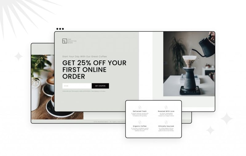
‘The Roasted Bean’ is an elegant template that uses light green colors, which pleasantly complements the colors of raw, fresh coffee beans.
A quick hover over the hero image will reveal a unique hover effect, which hides the white frame around the left and bottom sides of the image. This landing page features products, so you can use it to test-drive our latest
Dynamic WooCommerce Tags.
2. ‘The HT Acupuncture Clinic’ Landing Page
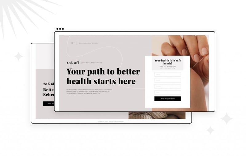
This template is a great example of how to match photography with abstract line design. Notice the smooth transition between the needle, seen in the image, and the wavy line in the background. The incorporation of the wavy lines helps make the page and service feel gentle and soothing.
The light color scheme is used here to create a friendly and calming atmosphere, greatly befitting an alternative medicine treatment landing page.
You can also find this template useful if you are looking for a more conversion-oriented landing page, where the hero section includes a lead capture form. There’s no fussing around here – your visitors will reach your landing page and immediately be able to send in their contact information.
3. ‘Art & Culture Magazine’ Coming Soon Landing Page
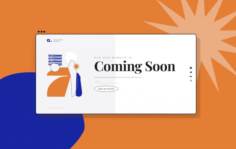
This Art & Culture Magazine landing page features an abstract composition in a flat style, featured as the hero image, correlating with the topic of an Art & Culture Magazine landing page.
The rotate effect is used on ‘Hover’ for the image and the CTA button, adding movement and interaction to this ‘above the fold’ page.
4. 'DMAgency' Digital Marketing Agency Landing Page
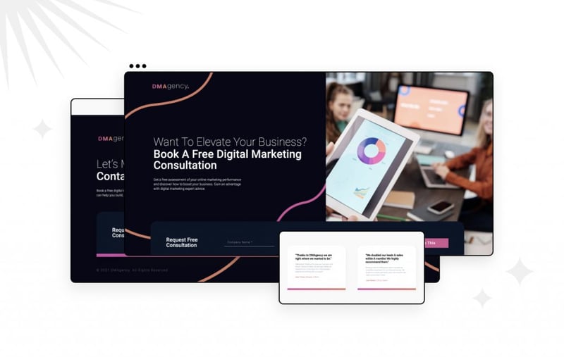
With its bright, happy, and catchy color tones – this landing page helps capture the upbeat vibe which so many marketing agencies aspire to present. This fresh look is further accentuated by the wide use of trendy gradients throughout the page.
Here’s a surprising fact: the twirly gradient line is actually built using 3 separate icons. They are made to move in sync using the Jello entrance animation.
5. 'Interiors’ Interior Design Landing Page
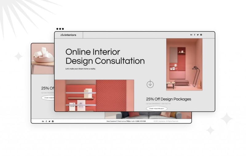
For ‘The Interiors’ landing page, borders and simple thin lines were used to add to the designer vibe and create a sleek UI.
Notice the unique look of the text strip, achieved by using a negative margin on the left and right in order to make the text go up to the edge and beyond.
6. 'The Plant Shop' Landing Page
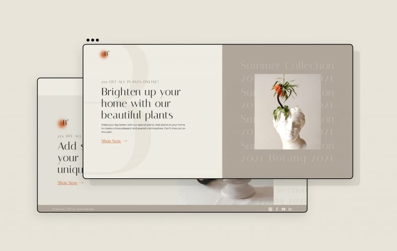
This boutique plant store delivers a sophisticated design by including a multitude of typographical and visual elements and layers, spread in proportion across the page.
This sophisticated ‘boutique’ look is further enhanced by using transparent typography on the hero background. Another noticeable feature is the non-conventional product image composition within the cards, where each product appears attached to a different side of the background.
7. ‘Sporty Home’ Fitness Equipment Landing Page
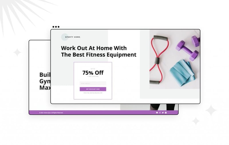
This lively landing page features a vibrant purple color palette. The page also showcases a sticky hero image that follows visitors as they begin to scroll down the page.
Notice the form box in the bottom section of the page that appears to be floating above two columns. This is achieved by placing the form inside an inner section within the right column of the section and setting a negative margin on the column that contains the form.
8. ‘LeaderKey’ Webinar Landing Page
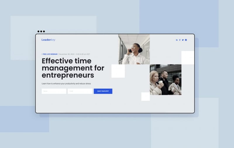
Since this page is for a digital webinar, the square grid design is used to give the page a digital broadcasting feeling.
The square shapes in the hero section are made with spacers. They move horizontally and vertically using the corresponding scrolling effect. Below them, animation for the white square in the background next to the ‘Time management – The key to success’ area is done using the Scale-Up motion effect set on the spacer widget.
9. ‘Lenglish’ English Course Landing Page
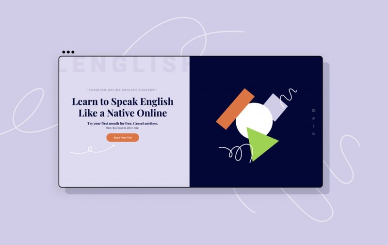
The ‘Lenglish’ landing page incorporates various animation techniques, applied across the multiple shapes that appear on the screen. This page uses a ‘gamification’ type of design with the goal of making the topic of education more friendly and playful, and not too boring and academic.
By using separate SVG icons, each shape in the hero section has its own entrance animation and scroll effects. The spring bounces, the rectangle rotates and the circle expands.
10. ‘A / B Space’ Shared Workspace Landing Page
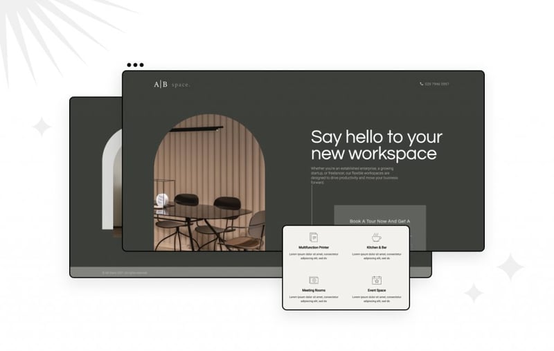
The design for this shared workspace page is very high-end and elegant. Note the shape of the images – rectangular with rounded corners – are representative of arches, windows, rooms, and architecture. This fits the theme of shared space that is being offered on the page.
The arch design for the hero image is done by setting a top-right and top-left border radius. And the stylish green silhouette behind the image in the second section was achieved by using the Box Shadow effect.
11. ‘Barnes Dentalt’ Teeth Straightening Landing Page
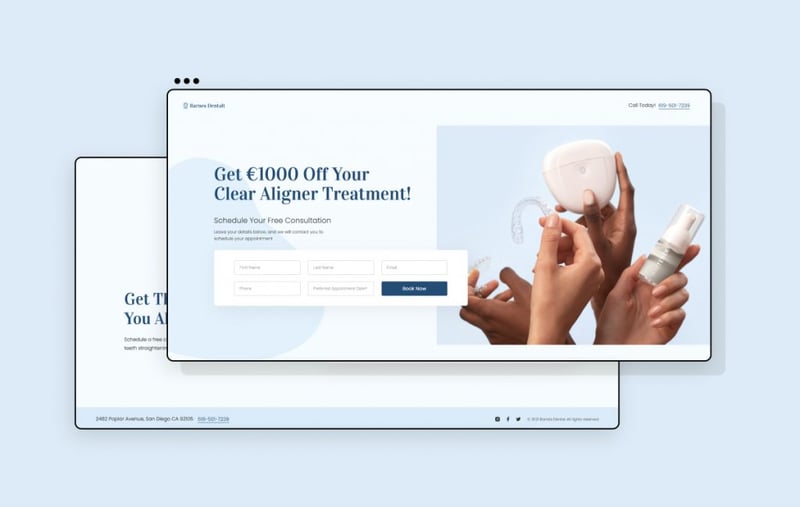
With this template, the designer tried to reduce the stress commonly associated with dental care. This was done using calm, blue tones, smooth abstract shapes, and featuring a friendly non-intimidating font. The design is also quite clean and sterile, which fits the impression dentists wish to deliver.
The ‘100% Quality’ stamp adds social proof and an overall feeling of trust. This was done using 2 widgets, Text and Icon Widgets that share the same motion effect. The text here is ‘live text’ using the title widget, so you can change it whenever you want.
12. ‘Dog Rescue’ Landing Page
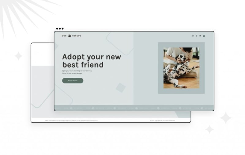
To reflect the playfulness of man’s best friend, our designers used squares with rounded corners to create this canine adoption landing page. All the shapes that appear in the background are made using the spacer widget.
Notice the logo strip which moves as you scroll down the page. This was done using the Icon List widget, with a negative margin set to the right and left so it continues beyond the screen.
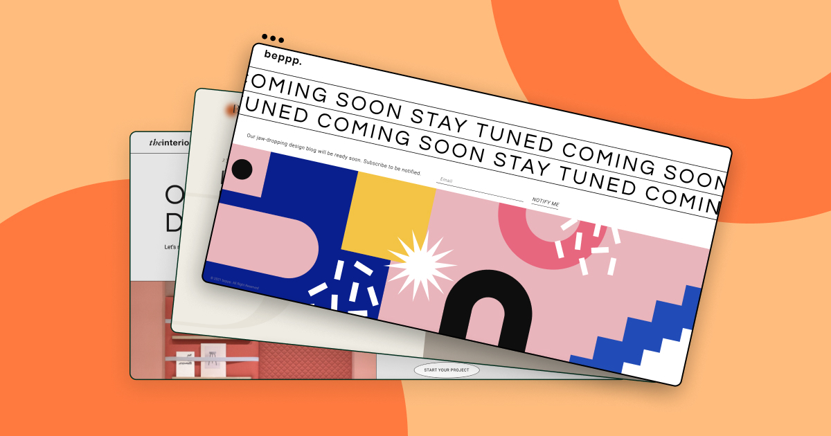
13. ‘beppp’ Coming Soon Design Blog
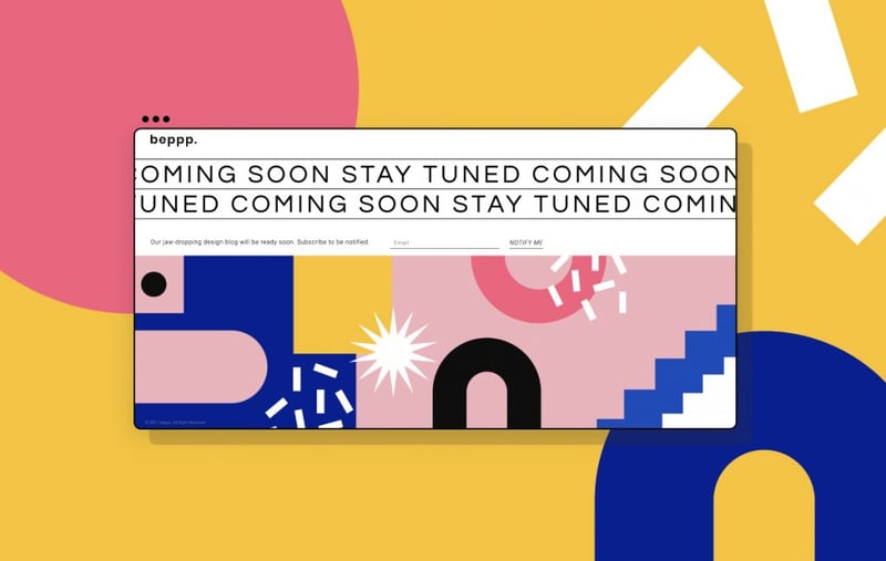
There’s a lot happening on this artsy landing page. If you’re looking for a coming soon page that grabs the attention of your visitors, look no further! In general, this is definitely a template you want to bookmark for future reference of using motion effects to grab attention.
Since it’s a page for a design blog, modern abstract patterns are used for the page. Animations were used to make the page more alive and vibrant. The colorful palette serves to give the impression like something cool is coming soon.
Fun fact: The shapes are all made using a mix of both Icons and Spacer Widgets
14. ‘Faroe Islands’ Travel Landing Page
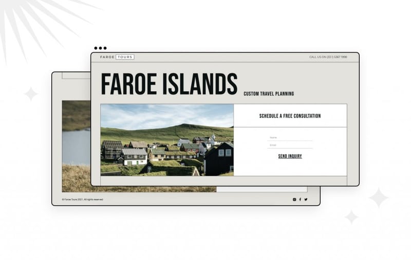
This design is inspired by a newspaper layout. Newspapers give the vibe of something adventurous, something exciting that has a story behind it.
Notice the ‘Days’ label that is attached to each of the trips. This simply required the use of a Heading widget, a black background, and some playing around with padding.
15. ‘Glampi’ Camping Landing Page
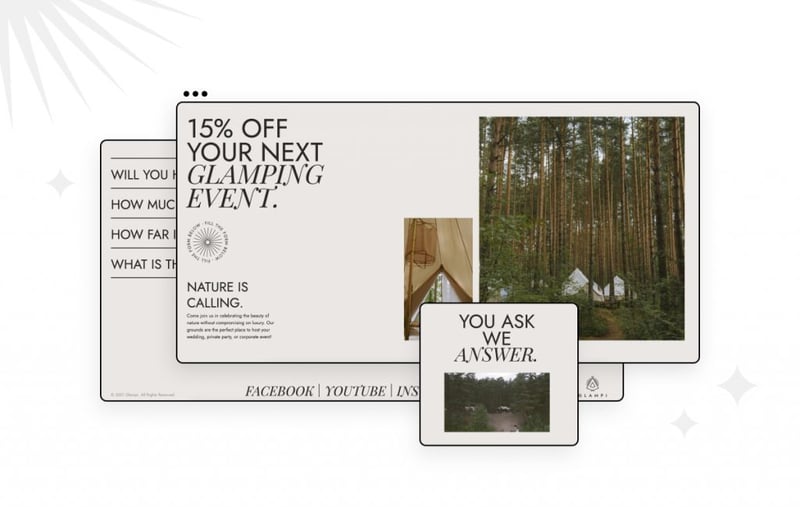
Last but not least, we have Glampi – a camping accommodation landing page that features a wide spread of outdoor images and videos. Don’t tell anyone, but this was actually one of our favorite landing pages 🤫, so we decided to write a bit more about it.
A cohesive design was achieved by incorporating elements from the wilderness into the design. Examples include the logo and the text wheel, which both reference elements of the teepee tents. The simple color palette lets the photos speak for themselves and incorporates earthy tones.
Just like the forests it features, This landing page is definitely worth exploring further. Firstly, there are various unique element layouts throughout the page. These are not your typical symmetrical 2-3 column layouts and nicely exemplify broken grid design.
Second, we invite you to scroll down the page and notice the wide use of animated elements. There’s the image on top expanding as you scroll, the title revealing on top of a video, and the sequenced titles that enter the page from opposing sides.
Click 'Edit With Elementor' & Take'em for a Spin
Looking for fresh content?
By entering your email, you agree to receive Elementor emails, including marketing emails,
and agree to our Terms & Conditions and Privacy Policy.
