Table of Contents
Elementor has always been a leader in terms of user experience and ease of use. However, though we aim to make things simple, there will always be a learning curve. To help you get off to a rocking start, we decided to list the most common mistakes people make in Elementor, and the solutions to those mistakes.
If you realize you’ve made some of these mistakes yourself, don’t beat yourself up about it. Mastering any tool or task means that there’s always a little more to learn. The idea is to keep an open mind if you intend on honing your skills. Let’s go over those common mistakes, and their solutions, so you can take your Elementor skills to the next level.
Mistake #1 – Using an Incompatible Theme
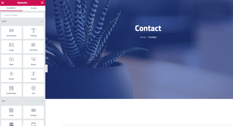
Let’s start off with the first common mistake in Elementor: using an incompatible theme.
Elementor is a universal plugin. It is designed to comply with WordPress coding standards, thus making any theme that follows the WordPress Codex compatible with Elementor. This doesn’t mean, however, that all themes that work with WordPress follow the coding standards, nor does it mean that everyone creates themes with Elementor in mind. Because of this, every once in a while, we’ll hear from users who have problems editing their page.
Here’s are a few common problems that originate from using an incompatible theme:
- Not having a full-width page
- Difficulty removing space below the header
- Not being able to change fonts or colors
Solution: Change Your Theme
There are several solutions to avoiding this mistake:
The simplest is to change your theme to something similar that is compatible. The best place to find WordPress compliant themes is on their repository. Even better, use themes that work well with Elementor like Astra and OceanWP.
Another way to solve it is to contact our support team regarding the troublesome theme and ask them to fix the bug. Alternatively, with a little code-savvy, do it yourself by delving deep into the code and making it compatible with your needs.
Perhaps the best solution is to use the Hello theme and Elementor’s theme builder, the same way we did in a previous Masterclass, to customize everything to work and appear just as you need it to.
Mistake #2 – Using Columns and Spacer Widgets to Position Elements
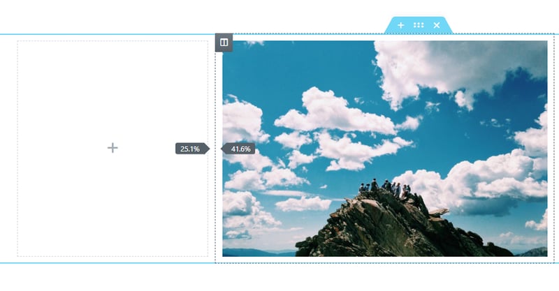
The next common mistake we’ve come across is using columns and spacer widgets to position elements. We’ve come across many users who have been positioning and aligning their elements using extra columns and the spacer widget from day one. Not only is this unnecessary, but it’s also detrimental to your page.
Every time you add a column to your page, you add a markup to your HTML code, which acts as the skeleton of your page. All that extra markup adds up, giving systems more work to do, eventually tipping the balance when it comes to your page’s loading time. Furthermore, using empty ‘content’ elements to arrange your layout gives search engines the wrong impression resulting in a lower ranking for your site.
Solution: Use Padding and Margin
Every single element and widget in Elementor has margin, padding, and Z-index parameters. Many even have additional alignment and positioning options in the Widget content and Style tabs. By using these options, Elementor ensures that you’re only using minimum data to your code. Additionally, keeping this data in CSS code further eliminates the need to add to the markup code. Doing this also allows you to copy/paste the spacing when using the Paste Style option.
Just a quick reminder: The margin value defines the space outside the widget frame, while the padding value defines the space inside the frame, between the frame and the element.
Get used to using padding and margins. After all, that’s what they were designed for.
Mistake #3 – Incorrect Use of the Inner-Section Widget
While we’re on the subject of columns, it’s time to mention another common column mistake:
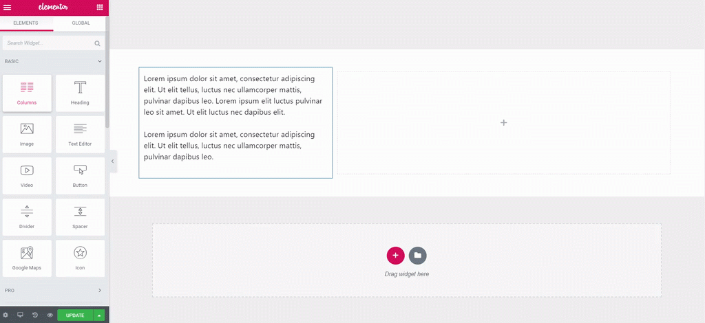
The incorrect use of an Inner-Section widget or what some users call the Column widget.
As you know the best way to add a fresh new section, is to click the Add New Section. Unfortunately, instead of assigning a number of columns for a section, some users have gotten into the habit of dragging in an Inner-Section widget.
Solution: Use Regular Columns
When setting up a section, the best practice is indeed to use the Add New Section button, then selecting the number of columns you want. This not only keeps everything nice and uniform throughout your section, but it allows you to have some things independent, like animated backgrounds and foregrounds, while keeping the markup light.
The Inner-Section widget was designed to allow users to create a distinction within a somewhat uniform section. If all you want to do is add a column to your section, just right-click the column handle and add a new column.
Mistake #4 – Editing Without Disabling or Clearing Cache
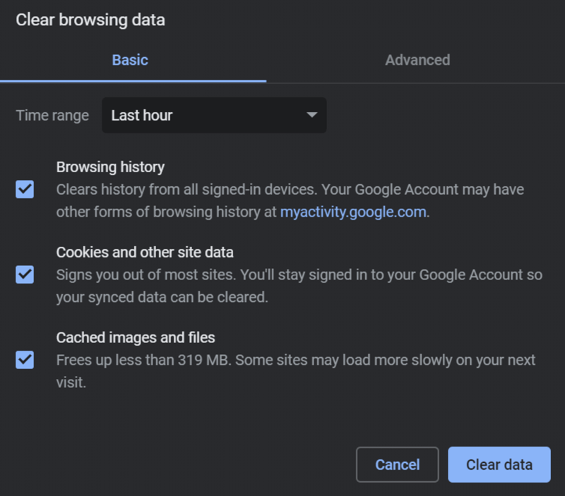
Another common mistake is creating your website without disabling or clearing your cache first. Websites are continually undergoing alterations and updates. It’s something that we take as a given. We found that far too often, users will spend hours making changes to their site on the back-end, only to discover this made absolutely no difference to the site on the front-end, where it’s live.
The caching for our sites is designed to reside on the front-end and reciprocate the requests for content that comes from people visiting your website. A cache holds content data that has popular demand and helps to cuts download time. Most commonly we have the browser cache, but we also have a cache plugin and a website cache on the host’s server.
Unless we let the system know that we are making changes, these caches will continue to send out the content we defined in the first place.
Solution: Clearing Cache
Here are some methods that can help you avoid this mistake:
Refreshing the page in the browser will clear the browser cache. You can do this by pressing Command + R on the Mac or Control F5 on a PC.
You can also go into the browser’s settings and find the delete cache option.
Another way of doing this is to add a question mark after the URL in the address line followed by some gibberish. This forces the browser to search for this information. In doing so, it reloads a fresh version of the page.
Some users use cache plugins like WP Rocket or WP Fastest Cache, that perform the data caching outside the browser to help load the page faster.
Here we suggest you disable the cache plugin on the WordPress dashboard before starting to edit or make changes to your site. If you forgot to do this, use the options in the plugin settings to clear the cache
Occasionally the caching on the Hosting server needs refreshing. We can verify that this is causing problems if the page fails to reload after clicking update in the Elementor editor.
If so, on the WordPress dashboard, go to Elementor >Tools > and in the General TAB, click on the Regenerate CSS button, and then Save. You can find more options for issues like this, in our documentation.
Mistake #5 – Using the Wrong-Sized Images
The next common mistake is using the wrong-sized images. There is no shortage of users who upload images that are either too small or too large for the allocated place on the page. Then tweak the image widget’s settings to force the image to fit. This is also true of users who upload images of varying sizes, to things like image galleries or carousels and find they have the same difficulty. Regular readers will know, and no doubt agree that planning is the key to working correctly and saving time in the process.
Solution: Optimizing Image Dimensions and Size
Planning the sizes and dimensions of each photo and preparing our images in advance, using design tools such as Sketch or Photoshop, or even online sites like Pixlr will save you a great deal of time and hassle.
While you’re working out the image dimensions, you can also work on the file size. High-resolution images that slow down your page loading time will definitely result in large numbers of visitors bouncing from your site. You can use tools like Optimole to automatically reduce image size, or use external services like Tiny PNG.
Mistake #6 – Not Setting Default Colors
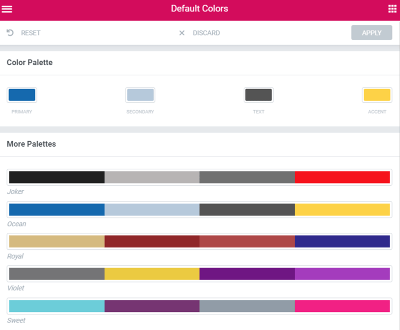
On to the next mistake: not setting the default colors. There are many options in Elementor designed precisely to make users lives easier. Setting your design default colors will, again, save you a great deal of time, as well as ensuring that your color scheme, will remain consistent throughout your website.
Solution: Choose Our Colors in Advance
The best practice would be to do this at the beginning of our page build, once you have your first blank page open in Elementor. In the menu, choose the default colors from the palette and apply them. We actually covered setting this up in the previous masterclass.
Conclusion
This list doesn’t cover all the mistakes users make. There are many others we could have mentioned, for example — pasting text into the text editor, which includes inline styling, instead of cleaning up the text. Getting past these 6 mistakes, however, will set you off on a good start and help you better understand and utilize Elementor.
You’d be amazed at how the proper use of Elementor will immediately show tremendous improvement in the websites you produce.
If you feel we missed any common mistakes that should be mentioned or if you’ve come across some common errors that you or your clients often make using Elementor, please share them with us in the comments below.
Looking for fresh content?
By entering your email, you agree to receive Elementor emails, including marketing emails,
and agree to our Terms & Conditions and Privacy Policy.
