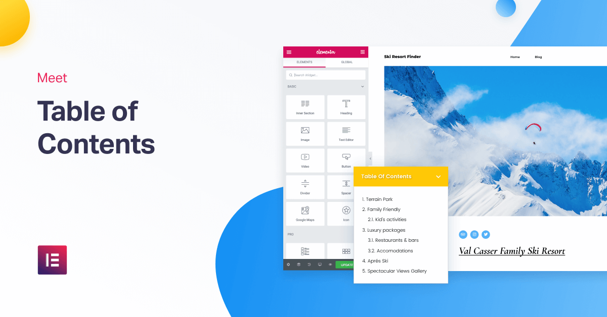
Table of Contents
Readability Boost? Check. Accessibility Boost? Check. SEO Boost? Check. TOC Does It All!
Content marketers, SEO professionals, bloggers, this is the moment you’ve been waiting for!
If you’re someone who creates content, you’ve probably wondered about the best way to add a table of contents widget to your blog posts and pages in Elementor.
Think no more… Meet the new Table of Contents widget!
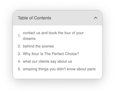
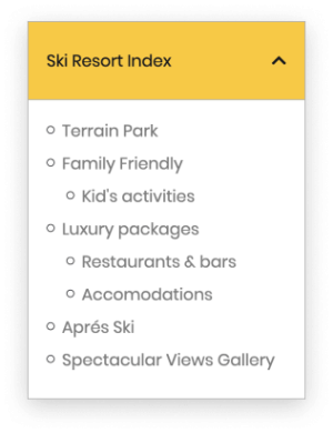
The TOC widget is the most customizable, feature-rich widget of its kind. It considerably simplifies the process of making your content accessible, allowing readers to scan it and get a sense of the structure of what they are reading.
You can set it up for individual pages and posts, or spread it across your entire site with a single click, by using Theme Builder to incorporate it.

Try Out the Actual Widget:
Table of Contents
Overview
What Is a Table of Contents?

Key Advantages
7 Things Only Elementor's TOC Can Do
Here are the 7 winning features of the Table of Contents widget.
1. Absolute Control Over Which Subtitles Get Listed
Are you an H2, or more of an H4 person?
Use the Include setting to pick the exact heading tags you want to appear in your TOC, or only use headings from a specific container in the page. You can also target and exclude certain HTML selectors from appearing in the table. This gives you complete control over which titles get listed in your table of contents, and which are left out.
2. Sticky Table of Contents That Gets Highlighted
A sticky table of contents is great for knowledge base sites, and for many other use cases.
This way, the list of titles always stays in view, no matter how much the visitor scrolls.
By setting a color or an underline for active (when a certain title is in view), we can highlight the area of the page the visitor is currently reviewing. Similarly, we can have the sub-item expand automatically when the visitor reaches that area.
In both cases, visitors get a clear indication of what area they are currently viewing, and can locate their progression throughout the page.
3. Unique List Styles
Not only can you switch between numbered and bulleted lists, but you can also select any icon to be used as the bullet indicator.
You can choose to display the list items as a flat list or as a hierarchical list. This way, even when visitors read your longest Wiki-style pages, they can still have an overview of the entire document.
4. The Most Flexible Table of Contents Design
Table of Contents plugins usually offer a limited range of designs. Corresponding with the way we usually construct our tools, with this widget we offer the most flexible design customization possible.
From word wrap to typography and spacing down to the box design. You can customize this widget to fit any type of website, whether it is a knowledge base or wiki-style site, magazine or an ecommerce site.
5. Minimized Setting for Tablet & Mobile Displays
To make sure the it never gets in the way, we added a set of controls for minimizing the TOC box.
Switch on the ‘Minimize Box’ option, and the Table of Contents box will show an icon to minimize it. Moreover, you can set it as minimized for mobile and tablet displays by default. This way it is still usable for the visitor, and doesn’t take up a lot of space.
6. The Power of Theme Builder & Table of Contents
Until now, there have been limited ways of adding a Table of Contents to a WordPress website: Using anchors, shortcodes, or activating it across your sites.
All of these solutions haven’t provided much flexibility where the table of contents applies.
This is where Elementor’s Theme Builder utility places a big role.
By adding the TOC widget to a Single Page template, you can decide on the exact visibility conditions that will be applied to it.
Want the Table of Contents to only appear on pages from your ‘tutorial’ category? Only for a certain tag? You got it!
By using the Theme Builder’s conditions, you gain a level of flexibility you just can’t get anywhere else.
7. SEO, Google Schema & Rich Snippets
We built this widget with Google in mind. Anyone who has ever dealt with long-form blog posts and tutorials understands the importance of rich snippets. Using this tool, you can instantly improve how your page structure is seen by Google.
Some of our users reported that using a Table of Contents within posts significantly improved their site’s ability to get rich snippets results on Google. If you still are unclear about the helpful aspects of rich snippets, be sure to check out the recent tutorial we published about it.
Bill Gates, 1996: Content is King. Elementor, 2019: Table of Content is Frickin' Emperor!
Boost Your Site Performance
One More Thing... Lazy Load!
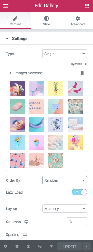
While on the topic of SEO, I wanted to let you know we’ve added Lazy Load to our Pro Gallery widget.
In Pro v2.7, we introduced the Pro Gallery widget. For version Pro 2.8, we improved the Gallery’s load time and performance, as well as added two important functions: Lazy Load & random ordering of images.
With Lazy Load, Instead of loading the entire page, including all the images, the page only loads the required section and delays the loading of the images in the gallery. Only when the visitor scrolls to the image does the image load. This significantly improved the performance and load time of the page.

conclusion
Start Creating Content That Visitors Can Scan!
We’ve prepared a step-by-step video guide that follows the main features of the Table of Contents widget.
Use the Table of Contents widget to improve your site’s overall UX and get the added bonus of boosting your on-page SEO score.
Want these useful features? Now’s the perfect time to get Elementor Pro!
Looking for fresh content?
By entering your email, you agree to receive Elementor emails, including marketing emails,
and agree to our Terms & Conditions and Privacy Policy.
