Table of Contents
You’ve just designed a spectacular website for your client, but suddenly they want to see it on their office’s big screen.
You wonder – how will your website look on a 70 Inch 16:9 TV? 😬
Well, wonder no further! Elementor has your back.
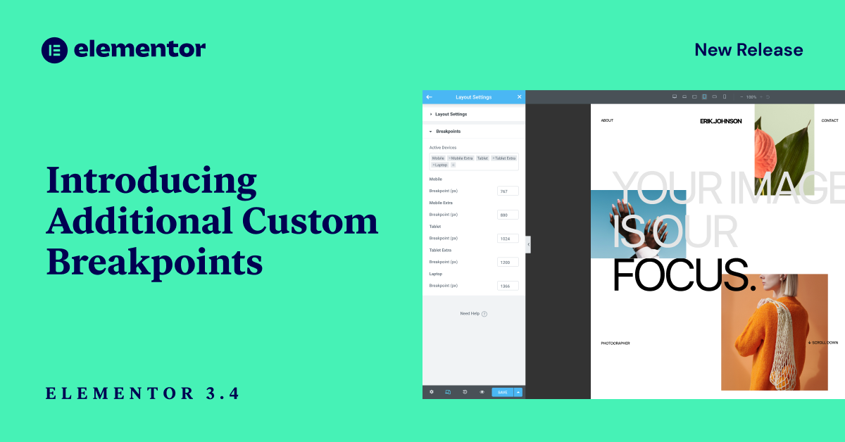
Introducing Additional Custom Breakpoints!

You can now customize your designs for more mobile screens, tablet screens, laptop, and wide-screen devices. You now get six custom breakpoints to play around with, giving you more control and the freedom to create for any device. Let’s dive in and learn more about this feature and about what makes it so unique.
Additional Breakpoints
Break Design Boundaries With Breakpoints
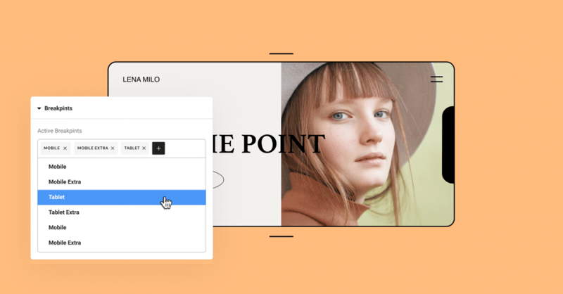
You might have placed a gallery featuring three images in a row but want visitors on mobile to only see two images in a row. This is where breakpoints come in, as they allow you to customize your website’s layout depending on the device and screen size.
Elementor Core 3.4 gives you the power to adjust your design layout according to seven devices.
When using breakpoints, you have complete flexibility to:
- Choose which breakpoints are active. Besides the original Desktop, Mobile, and Tablet, you can now add the breakpoints for more screen sizes.
- Choose the value of each breakpoint. You’re able to manage each breakpoint’s values individually.
- Scale the preview up or down. Zoom out to preview widescreen devices. Work on a smaller screen than the one you’re designing for while seeing the bigger picture.
How to style for different devices using breakpoints
Elementor uses a cascading concept across breakpoints, scaling down for every device except widescreen. An easy way to remember how each breakpoint affects the others is: Desktop is always the default.
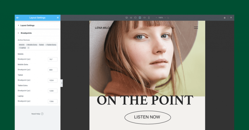
The desktop is the default screen setting that influences all other breakpoints for both larger and smaller screens.
Example: Setting different titles per breakpoint
Let’s look at a simple example to understand how it works.
You set your title a text size of 80px for the default Desktop screen setting. That text size will apply to all other breakpoints.
If you then go to the Tablet breakpoint and set the title size to 60px, it will apply to all smaller breakpoints, including Mobile and Mobile-Extra.
The style you set for Tablet will not apply to larger breakpoints, which in this case includes Laptop and Tablet-Extra. The breakpoints for these larger devices will remain at 80px, the same as Desktop.
Know exactly which styles you set on other breakpoints
With every additional custom breakpoint comes the necessity to understand exactly what is inherited from one breakpoint to another.
That’s why we added a new UI improvement that can help you recognize which styles are inherited from other breakpoints. So, you set the margin on Tablet to 10px, and then moved to Mobile-Extra view.
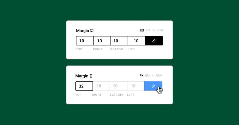
Now you can see that the inherited values on controls such as padding, margin, background images, and every other numeric control are presented as placeholders. In our example, the 10px you set on Tablet will be visible as a greyed-out placeholder on all devices that are smaller than Tablet.
Quick Tip! Remember that you can only change the style per breakpoint for the values that have the device icon next to the title, as seen in the image below.
Performance Improvement #1
Breakpoints That Break the Speed Limit
To optimize the Custom Breakpoints as much as possible, we rebuilt our responsive control loading mechanism. This improved server response time by up to 23%(!), and reduced the memory usage by ~5%. We also saved approximately ~30% off of data traffic to the Editor load. In other words, it made everything run faster and smoother.
Thanks to the updates we put in place, adding custom breakpoints will not have a significant impact on performance, unlike other solutions who use duplicate code to achieve this. Read more about it in our development post.
Performance Improvement #2 & #3
Dropping IE Support and Improving Font Awesome Loading
Elementor 3.4: Make Everything Responsive With Elementor's Additional Custom Breakpoints!
Elementor Version 3.4
Better Breakpoints, Better Performance
The new Custom Breakpoints make it much easier to adapt your designs to different screens.
This version also continues our dedication to providing you with tools that offer the best performance in the world, with three different performance improvements.
Whether you want to customize your design to better fit the latest iPhone (is it 13 already?), your client’s widescreen TV, or landscape devices, take the new feature for a spin and tell us what you think in the comments below.
Looking for fresh content?
By entering your email, you agree to receive Elementor emails, including marketing emails,
and agree to our Terms & Conditions and Privacy Policy.
