Table of Contents
Innovative competition and audiences that become immune to our strategies too quickly, inevitably force us to keep moving forward to stay ahead of the game.
However, new ideas and strategies aren’t always the solution. Sometimes it is the older, proven and well-established ideas, that will do the trick efficiently, and perhaps more effectively.
They just need a little dusting off.
For most of us, whenever we hear the words “I love New York”, the first image that comes to mind is Milton Glaser’s famous I (heart) NY image.
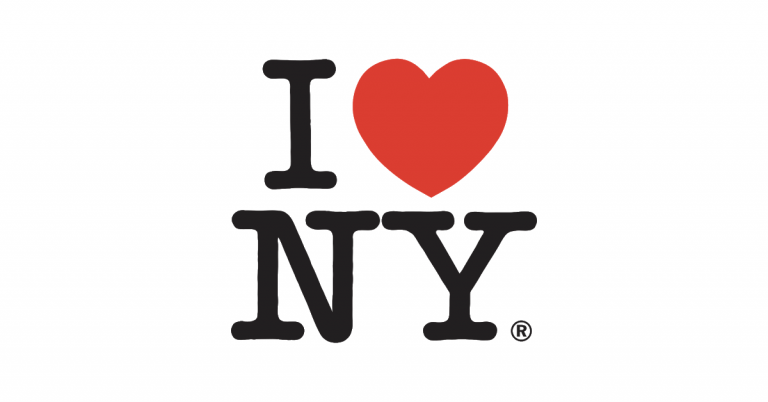
This is an iconic design.
What Is Iconic Design?
An icon is a visual representation of an idea. What makes something iconic is how well the visual representation connects to that idea so that it is intrinsic; the image and the idea are unmistakably connected.
This should be our goal when we sit down to design a web page — to create a design that our audience will always remember, and link to the ideas and content of the page.
If our objective is to create an image that will be common and familiar in people’s minds whenever our client or product is discussed, then we must rely on a dedicated visual language and convey our ideas laconically and clear.
Linking images in this way also help us to get better conversions.
When a design immediately ties-in with the viewer’s reason for visiting our page, it adds to their personal connection with the idea, further intensifying interest and desire, making it easier for them to commit to action at the end of our funnel.
To show you how a clear and cohesive visual language boils down to an iconic design that grabs your audience, we’ll take a generic landing page for a dance school, and transform it into something worth bookmarking, sharing, and talking about.
Identifying the Main Visual Narrative
Taking a good look at the area above-the-fold, at the very top of this page, we can establish that the page is composed of the following elements:
- Image of lead dancer
- Big yellow circle
- Headline
- Logo
- Menu
- Background
- Some text
- Smaller circular elements.
If I were to ask you to close your eyes, which elements would you say are the most memorable?
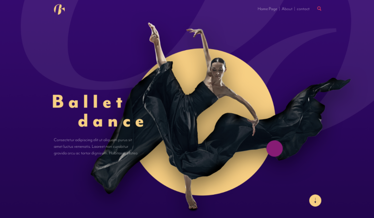
Is it the dancer? Is it the big yellow circle?
We need to identify our main visual narrative and use it as a design concept, a foundation to build upon.
You’ll probably agree that the most memorable element in this top section is the dancer’s magnificent movement and the way that her dress billows and flows.
Another strong aspect is the headline, in an unremarkable sans serif font, making it stationary or rigid in comparison.
These two contrasting concepts, flowing motion and solid rigidness, actually work very well with the idea we need to convey with this page.
Let’s consider the ballet school, the strict training and rigid practice it requires of ballet students, contrasted with the freedom and flowing movement in their dance.
We could equally appreciate a similar contrast occurring between the uniform and rigid tempo of the music and the irregular free-flowing movements of the dancers.
We now have our design concept: Flowing Motion vs. Rigid Consistency
Removing the Visual Noise
The next question we need to ask ourselves is whether or not we need all of these elements?
Does the big yellow circle help to convey the idea of our landing page?
When we think of a dance school, a circle is hardly among the first things that come to mind.
Here is where we need to be empathic or risk distracting or confusing the viewer. This is what we refer to as ‘visual noise’.
Visual noise is made up of all the elements that don’t really have conceptual or formal justification. Removing these elements will clarify our composition, making a stronger impression on our users.
Having established our design concept will prove extremely helpful at this point
Obviously, the big yellow circle is there to contrast the dancer against the dominant background in this section. However, this purple background fails to relate to the concept of flowing motion or rigidity. No matter what color we use, this background does not promote our design concept in any way. If it’s not promoting the main idea, it doesn’t belong.
Once we’ve removed the purple background there’s no need for the yellow circle as it does nothing for our design concept either. The same is true of the two smaller circles to the side of the dancer, that are neither rigid nor flowing.
Removing the superfluous elements not only clarifies the design, it enhances our design concept. Released from the constraints of visual noise, the image of the dancer is free to ‘flow’ more effectively.
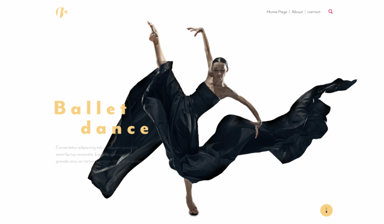
Implementing the Design Concept
Returning to the headline, the letters vary from tall and wide to short and wide, tall and narrow. If this element is going signify rigid consistency, we can do better.
By merely changing the letter case to capital letters, widening and spacing them evenly, the result will serve us far better.
The same could be done for the menu, a relevant part of our design and more than just a navigation tool.
Again, there is something about its design that works with our concept of rigid consistency but there the letters are commonplace. The uneven spacing and the pipe dividers aren’t helping either. Instead, we can capitalize the text, delete the dividers, and space the words and letters equally. We could even take it a step further and change the regular search icon to a square one.
Eventually, the top section starts to look like this…
With our concept of motion vs. rigid consistency working nicely above the fold, there’s no reason why we shouldn’t implement the same principles throughout the rest of the page.
Moving on to the next section, the Meet the Dancers section.
We’ll begin again by removing the visual noise. In this section, we can see a return of the non-functional circles we saw earlier. They’ll be the first things that we’ll remove, and for the same reason.
We also have a couple of images that don’t seem to convey ‘rigidity or flowing motion.
As this is a new section, we could switch the roles around and have the letters of the headline appear more “flowing”, and set the images to appear more consistent and rigid, so that we end up with something like this:
Switching up the roles of the opposing concepts also helps us to establish a clear difference between the two sections while maintaining visual principal in both. Our design concept is becoming clearer and stronger as we progress, moving down the funnel.
On to the third section, where we’ll switch the roles back again because repetition is another thing that firmly establishes an idea in the viewer’s mind.
Here our lead dancer has again been placed in a circle that fails to contribute to our concept. Again, we’ll delete the circle and break the constraints, giving her the freedom to dance and have the letters standing rigidly in contrast.
Three sections down and we can already appreciate how repetition creates the viewer’s familiarity with the connection between a specific visual concept and an idea, drawing this design closer to becoming iconic.
If the initial purpose of this page to generate leads, we ought to add a call-to-action in the 4th and last section. Again, we’ll be switching the roles and have the text convey the flowing motion, and the images the rigid consistency. Adding a signup button will definitely make this more effective.
We also added some basic motion effects to make the dancers come to life and actually move, further enhancing the concept.
With the new design now complete, there is a tremendous improvement.
Just imagine having arrived from an ad campaign, and seeing this (as opposed to the original). We find it striking from first glance. This is a clear and alluring design that leads us on a pleasant noiseless journey, taking us willingly down to the signup button.
…and if we’re honest, we’re getting that tingling in the back of our mind, nudging us to click it.
Conclusions
This feeling that we have achieved when experiencing our new design should be what we’re aiming for from the get-go.
Figuring out the main visual narrative, the image or motif that immediately connects the viewer with our main idea is imperative. By doing so, we establish our design concept and use it as a guideline to focus the layout and elements down to the last detail. We rely further on our design concept to avoid visual noise.
Using contrasts, as we did by pitting flowing motion against rigid consistency, and repetition, strengthen the viewer’s connection and appreciation of the concept.
As with the principles of storytelling in design, iconic design helps us grab our audience, inviting them to relate to our content and ideas, only with greater immediacy.
Great iconic design stays with us long after we’re first introduced to it, and like Milton Glaser’s I (heart) NY, it is implanted in our minds and remains relevant, and even enjoyed, indefinitely.
Something that will undoubtedly keep us ahead of the game.
Looking for fresh content?
By entering your email, you agree to receive Elementor emails, including marketing emails,
and agree to our Terms & Conditions and Privacy Policy.
