Table of Contents
The second iteration of our Monthly Expert Web Creators challenge saw the competition heat up as separating the participants from the podium finishers came down to the wire.
This month’s winners set themselves head and shoulders above the competition which not only piqued our curiosity but also grabbed our attention.
Let’s take a moment to meet our winning experts and unlock the secrets behind their winning submissions.
Time to meet our Ecom winners!
Learn More About Elementor Experts
3rd Place: Md Firdous Ahmad
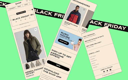
What our judges said: “Functionally it’s a great page with solid use of WooCommerce features – product customization, ratings, and more.”
“An independent web developer and UX designer with a passion for creating an interactive, useful, and delightful user experience focused on creating a more connected, pixel-perfect world,” is how Indian Md Firdous Ahmad describes himself.
Originally built with Elementor, Md’s third-place entry “is intended for users who love to get discount offers during Black Friday sales,” he says. “My inspiration was to create a practical effortless user experience.”
Md reveals the idea got moving as soon as he started brainstorming, “It was just a concept for product lead generation through Black Friday sales which came to life with Elementor,” he says.
He created the page with user experience as his top priority, “Every element’s user flow is simple, the page itself has fewer tasks from interacting, selecting and adding products to cart or wishlist.”
He adds, “I used only two colors and two fonts which have high contrast, consistency, and accessibility for users,” he reveals. “I added a new experience to review the product using a popup form, as the review itself provides authenticity.”
The online fashion store’s page targets anyone with purchasing power between the ages of 16 to 80 and also acts as a lead generation funnel.
Md’s main goal was for “the page to be responsive and pixel perfect across devices no matter what devices users used to access it.”
Built with Elementor using our Hello theme, the page was created by also using the Jet Engine plugin. It was designed with Elementor’s Theme Builder and Global Settings.
MD specializes in storytelling and visual design. “I create amazing responsive WordPress, Ecommerce websites, eye-catching, lead generation, and conversions,” he says.
“I can help you to transform your ideas into an amazing website.”
- Elementorist Since 2020
- 20+ Elementor Websites Built
- Winning Submission →
- Experts Profile →
- Instagram →
- Portfolio →
Joint 2nd Place: Billie Argent
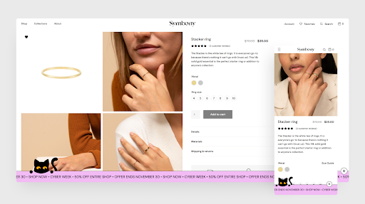
What our judges said: “A great single product page with variations, a promotion bottom bar, interactive animations to encourage scrolling, and more.”
Climbing up the podium, Londoner Billie Argent betters last month’s position by winning joint Runner-Up.
Billie is the co-founder of Passionates, a full-service digital agency specializing in providing design, development, marketing, SEO, and hosting solutions for startups, SMEs, and brick & mortar stores.
Marketed to 18-40-year-old women looking to make purchases in fashion wear, Billie’s second-placed entry ‘Symbony’ is meant to represent “symbolic jewelry”, selling both basic jewelry items and more complex pieces.
“Each piece is handcrafted, ethically sourced, and made to last,” she says. “Collections are inspired by mythology from around the world, and are reflected in the design of each item (currently only basic items on the website).”
The website’s design was chosen to create a smooth easy user experience, says Billie, “The light, clean web design aids the navigation of visitors to find what they’re looking for more easily.”
Breaking convention, the product page only features the most essential of elements. A large product grid showcases the products from different angles.
On the right, the number of reviews is immediately visible. Clicking on the stars scrolls to more detailed reviews.
The product page is intended to build credibility with potential customers through reviews and trust factors by increasing understanding of what the brand stands for. The main objective is boosting sales.
“We aimed to achieve this through a professional design by displaying all the essential elements a user needs to make a decision,” says Billie.
Billie also threw in some subtle feline love, “For this year’s Black Friday sales, we went with a cute Black Friday cat, whose eyes follow you around the website using a mouse track.”
The cat’s tail is a Lottie animation, as well as the rolling text banner at the base of the website. “We chose this format so the sales advertisement leaves the UX unaffected,” adds Billie.
To improve the UX from the default WooCommerce variation dropdowns, Billie says they “used a free plugin named ‘Variation Swatches for WooCommerce’ to convert the select fields into visual colors for the metal type, and numbered circles for the ring sizes.”
She says, “We also created a ‘size guide’ popup with Elementor showing the ring sizes for different locations.”
Custom product fields were added with JetEngine to include more detailed info. Under that, there are custom icons with trust factors. Lastly, related products are displayed using JetWoobuilder.
Built with Elementor using the Astra theme, the page was created by also using WooCommerce, Variation Swatches for WooCommerce, Jet Engine, Jet WooBuilder, Jet SmartFilters, and JetTabs plugins. It was designed with Elementor’s Theme Builder.
Billie’s digital agency, Passionate encompasses the broad set of expertise of their senior experts. “As such, we are able to plan and work on multiple aspects of your project simultaneously, optimizing the overall timeline and cost,” says Billie.
- Elementorist Since 2017
- 130+ Elementor Websites Built
- Winning Submission →
- Experts Profile →
- Facebook →
- Portfolio →
Joint 2nd Place: Simon Berry
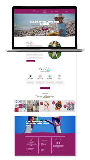
What our judges said: “A fantastic single product family store, with advanced product selection and personalization, great visuals, and smooth UX for both desktop and mobile.”
Also in joint second place, Sussex based Simon Berry is the co-owner of a two-person family web design and digital marketing business he runs with his wife Kate. Simon “switched to Elementor pretty much bang on 2 years ago” during our 2019 Black Friday deal.
Simon’s runner-up entry was originally born when his wife started sewing at the start of the pandemic lockdown in March 2020. This hobby soon turned into a small business.
“So, we had to create an online store for it,” he says. “She makes kids clothes, with bright, fun, and colorful prints that are ethically produced, so we needed the website to also reflect this.”
The British husband and wife duo added a special piece of their heart to the website, “Our daughter features in many of the site images. I think she likes to be in front of the camera!” admits Simon. “So I used lots of Motion Effects to really bring out a fun and happy feel to navigating the site and product pages.”
Since there was a huge choice of fabrics, which changed by season or special promotion, they needed to create a fully customized, dynamic template to accommodate all the different purchase options and fabrics.
“This meant using loops and dynamic tags via Elementor and ACF Pro to populate each product page with the correct WooCommerce product information,” says Simon.
“We added a few custom options to the WC Product editing page too, so that everything we needed to display and allow customers to make bespoke choices was possible.”
The website was created for parents wanting to break away from the boring high-street “blue for boys and pink for girls”, with a focus on maximizing ethical fabrics, prints, and designs.
As the main customer demographic were parents, particularly mothers, “we looked to capitalize on this with the UI/UX to make them smile whilst browsing the site and product pages.”
As this is a fully functioning web store that takes daily orders, they knew getting users excited with what they were seeing, such as good quality images to view using the lightbox function would help generate orders.
Simon says, “And it seems to be working just great.”
The website has additional functionality for the Fabric Galleries, which were added via a CPT in the Dashboard, then grouped into categories that auto-populate both the Product pages assigned as well as the main Galleries pages.
By automatically displaying new and/or seasonal fabrics on the Product Page as well as the various makes on the main Galleries pages, Simon was able to cut down the workflow time it took to add new fabrics to the website.
Built with Elementor using our Hello theme, the page was created by also using ACF Pro, Dynamic.ooo, Ele Custom Skins, WooCommerce, and Rank Math plugins. It was designed with Elementor’s Theme Builder and Global Settings.
Simon has over 14 years of experience in providing online digital marketing and business development solutions to help SME-sized businesses boost their online visibility having worked with a broad client base in both public and private sectors including; Automotive, Charities, Utilities, Trades, Construction, and Retail.
“I specialize in Website Design, eCommerce Development, and SEO, whilst also working hard on business development to help grow our client base,” he says.
“We love getting stuck into new projects and coming up with creative and engaging ways to attract customers to your business.”
- Elementorist Since 2019
- 30+ Elementor Websites Built
- Winning Submission →
- Experts Profile →
- Facebook →
- Portfolio →
1st Place & Community Choice Winner: Rodrigo Valdez
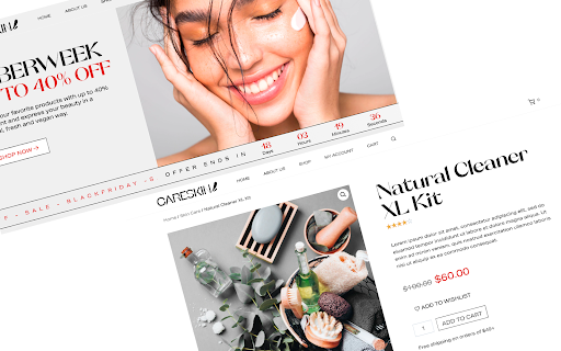
What our judges said: “A great makeup product page with ratings, timed promotions, conversion popups, product description, and a good spread of CTAs. Looks like the real deal!”
This month’s Grand Champion Web Creator and Community Choice Winner is Rodrigo Valdez, an independent creative hailing from Paraguay.
Having partnered with companies, public figures, and local market agencies to create more than 50 responsive websites in the past 5 years alone, Rodrigo also happens to be a veteran Elementorist.
Rodrigo explained his inspiration for his first-placed product page, “I created a brand for the challenge. The target audience was women.”
He notes that he wanted to disrupt the typical narrative, “I wanted the look and feel of the brand identity to be diverse without stereotypes, and environmentally friendly with natural products.”
The target audience is women aged 15 to 50 years looking for online purchases of health and beauty products. Apart from driving purchases, the website was also designed to increase brand exposure.
“The website has inspiration from websites such as the online stores of Lacoste, Calvin Klein, etc,” says Rodrigo who went for “a minimalist user interface following good UX practices”, as he wanted it “to achieve great performance in loading times and speed.”
The homepage design, which focuses on the week of promotions such as Cyber Week or BlackFriday, shows the user that the entire store is discounted by highlighting several popular products. Each product has a featured discount.
Depending on the situation, the pop-up helps the user perform an action, on the homepage or (non-product) pages in general.
“I was looking for lead generation by asking the user their email address by way of subscribing to promotions,” reveals Rodrigo.
“On product pages, a popup is activated showing a remaining time counter for the end of the offer (in order to encourage ‘add to cart’ or ‘buy’ actions).”
Built with Elementor using the Kadence WP theme, the page was created using Elementor, Elementor Pro, FlyingPress, Flying Images, SaveSVG, and Jet Compare Wishlist plugins. It was designed with Elementor’s Global Styling and Theme Builder.
Rodrigo’s list of services includes creating high-performing websites as well as optimizing existing websites to increase performance and speed.
His commitment is to create experiences “MADE IN IDEALS”, as he understands that the decision to create an experience for your clients, and the team with which you choose to build it, is a very important decision.
“That is why we make our promise to you: to do our best and always strive to do the right thing for your project, your users, and your team,” says Rodrigo. “Our quality standards remain among the highest before signing a #MadeInIDEALS product.”
“We work together with various people, who become our companions on a great journey.”
- Elementorist Since 2018
- 60+ Elementor Websites Built
- Winning Submission →
- Experts Profile →
- Instagram →
- Portfolio →
Our Next Monthly Experts Challenge: One Form To Rule Them All
Well done to each of our winners, and heartfelt thanks to all our participants.
For our next Monthly Experts Challenge, it’s your chance to build the ultimate form with Elementor’s Form Builder. Let your creative juices flow and show the world how original you can be with forms.
Our panel of judges and community members will check your form’s context, user flow, creative design, and even try out the form to see it actually works. Our internal panel will also give bonus points to those who use a custom ‘thank you’ page.
Here’s how to enter:
- Show off your finest Form on your Elementor Experts Network profile page.
- Label it “Experts Challenge – Elementor Form Builder Edition”.
- Drop your Elementor Expert link in our official Hub post.
- Be sure to comply with our Terms & Conditions.
Submissions are open from 6 PM (GMT+3) November 30 until December 14.
All winners will be announced on our official Hub and Facebook Community page on December 22.
So get designing and send us your entries before it’s too late!
Looking for fresh content?
By entering your email, you agree to receive Elementor emails, including marketing emails,
and agree to our Terms & Conditions and Privacy Policy.
