Table of Contents
As web designers, we spend so much time pushing pixels around above the fold on late-night, caffeine-fueled searches for that epiphany moment where you strike the perfect balance between usability and design. But what if that moment doesn’t come? What do you do if you’re stuck with your design? I’ve been there, and I’ve come up with a hack to get your design flowing – start at the bottom.
Behold the mighty footer. Despite resting at the end of your page, sometimes thousands of pixels out of view, the footer is not the end of your user experience. It’s your chance to leave an impression.
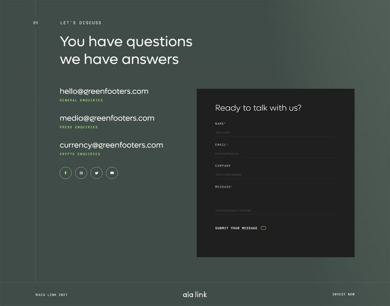
Footers of the past were dumping grounds for miscellaneous links, but a solid footer is a gateway to further engagement. It can tell a brand’s story, create brand trust, and can often make the difference as to whether users engage with your CTA’s or delve deeper into your website.
A good footer contains well-designed and carefully considered components, and getting it right can provide a strong foundation and hierarchy from which to design the rest of your website. Users look for footers, and no footer is too far away. Here are my tips for designing a killer footer with Elementor.
Table Of Contents
Provide the Essentials and Avoid Frustration
Scrolling to the bottom of a site to find essential links is a design pattern we’ve all been taught. Yet often, we scroll to the end of a beautiful website to see a footer missing things we’re instinctively looking for. Make sure you include the following widgets in your footer:
1. Social Links
Yes, we need them! If I can’t find them in the header, I’m going straight to the footer. You’re with me, right?
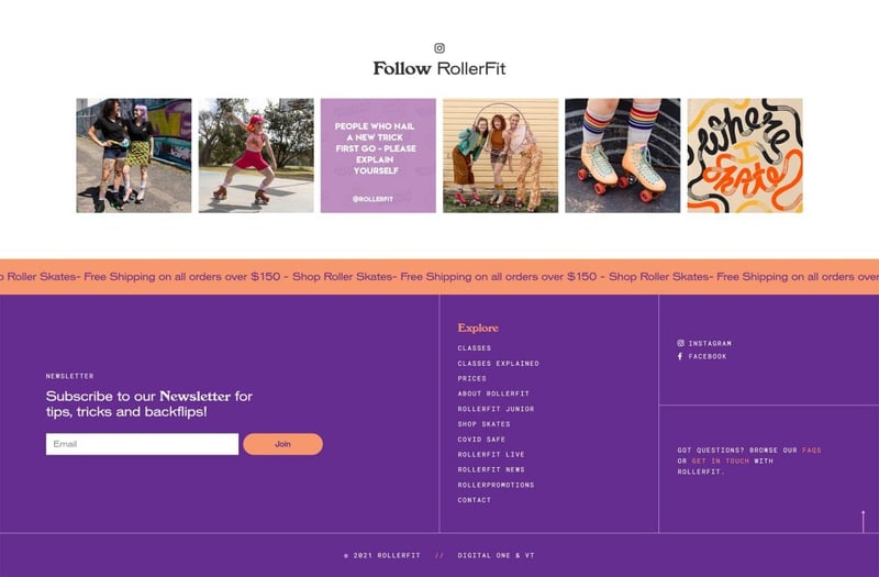
- Use the social icons widget, but mix it up and use text links or add an Instagram feed directly in the footer.
- Instead of using just one social widget, why not duplicate it for each icon, set its position to inline, and animate each one. Tassssty!
You don’t have to just slap these in a column — you could use absolute positioning to have them floating on your footer or even create them as a popup that appears as you scroll the website.
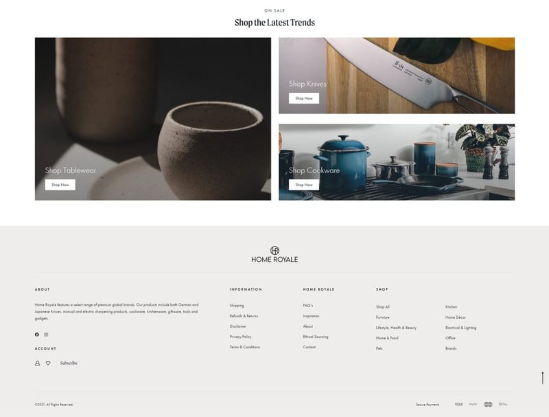
2. Navigation
Take people where they NEED to go. It could be your last chance.
- Make your menus short, clear and easy to understand.
- Provide useful links, for example: if you’ve got a shop or a membership site, include links to account management, orders, help, resources, etc.
- If you’ve got lot’s of menus to include, balance them out with alternative column widths and additional widgets like Account Icons.
3. Lead Gen or Sign-Up
It’s your time to holllllaaaaa! And visitors are expecting you to!
- If you’re a brand and don’t have a mailing list, you’re doing it wrong. A footer is a great place to pop in a quick subscription form and we’re used to finding it there. No need to annoy them with pop-ups!
- If you don’t have enough space for a chunky form try making it inline. Did you know that you can control the field and button width of Elementor forms? What a world.
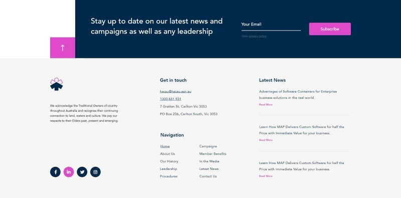
- Make it engaging. Instead of your average “thanks for signing up message”, why not try using a pop with some creative copy. You can set your form to sign up to your mailing list and trigger a pop-up!
4. No Surprises
We’re creatures of habit, and when we want answers, we’re scrolling straight to the bottom!
- Contact information, privacy policies, terms, shipping rules….just a few of the things we expect to find in a footer. Experiment with navigation layouts to balance out all of this important information. If things are feeling text-heavy, introduce some graphic elements or some more space.
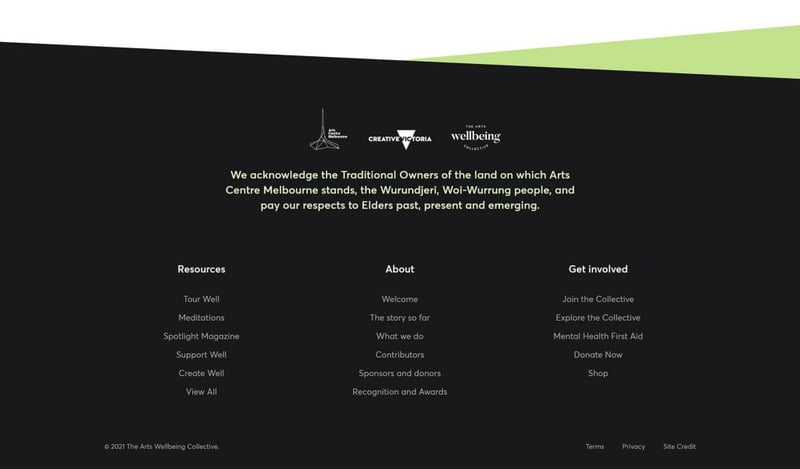
- With your copyright, you better be using the Dynamic Year feature on your heading! This way you don’t have to update the year…every year. Use the Before & After options to append words to the year.
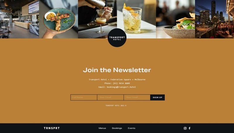
Get on Brand
You’ve heard this before, all brands have a voice and if you didn’t hum a lyric or burst out in song..I’m a little disappointed in you. Hopefully your footer has a bit more personality! The footer could be your last chance to communicate your brand message. It doesn’t have to be bold; sometimes, less is more. But don’t dial it in.
Include a Logo or Brand Elements
Doiiiii, right? You’d be surprised! So many footers I’ve come across when rebuilding websites have missed the mark when it comes to showing off a brand’s logo or branding elements.
- Experiment with inline positioning to put your logo in nonstandard locations in your footer. Balance is everything, and sometimes a logo on the left just doesn’t cut it.
- Apply subtle motion effects to your brand elements, such as a slide-in from the top or sink-on hover for a more “high-end” experience. Go easy here, excessive motion effects can quickly turn your beautiful cascade into a landslide.
- If you’re feeling creative, why not try adding in a lottie animated logo or some text? Or even the text on svg path widget with your brand’s tagline?
Include a Brand Message
I can’t explain the joy I feel when I get to a footer and stumble across some witty copy or a captivating CTA.
- A short, funny, engaging, to-the-point summation of what you’re all about is sometimes just what your user needs to make that next click. Remind them why they’ve stayed to the end. We connect more with human brands, so include a human, authentic message.
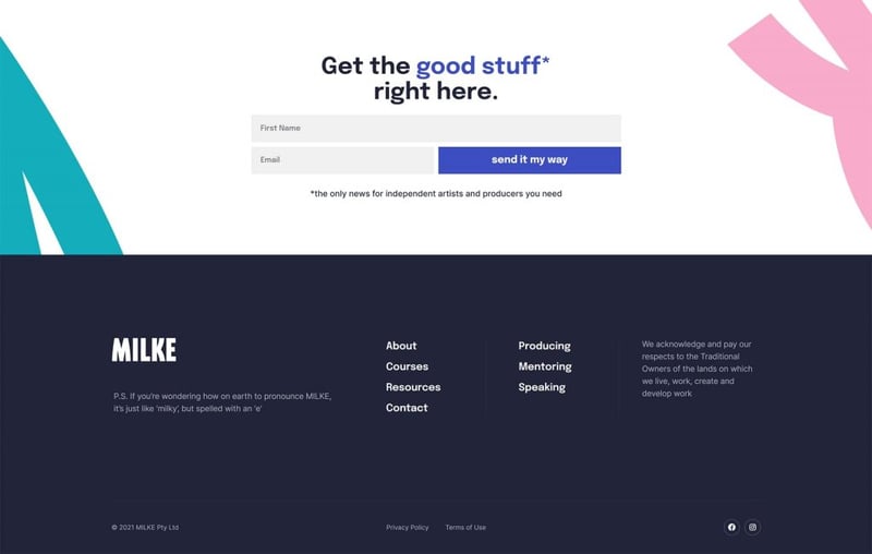
Choose Your Colors Wisely
Since we’re designing from the footer up, take your brand’s strongest color and start there. It’s all about balance.
- Generally, you want your footer to be distinguishable from the rest of your website. I prefer a darker footer as they are easier to balance out, but if you want to keep it light, consider using a subtle border or a dark CTA to separate your footer from your content. If you want it to blend, you’re going to need lots of white space!
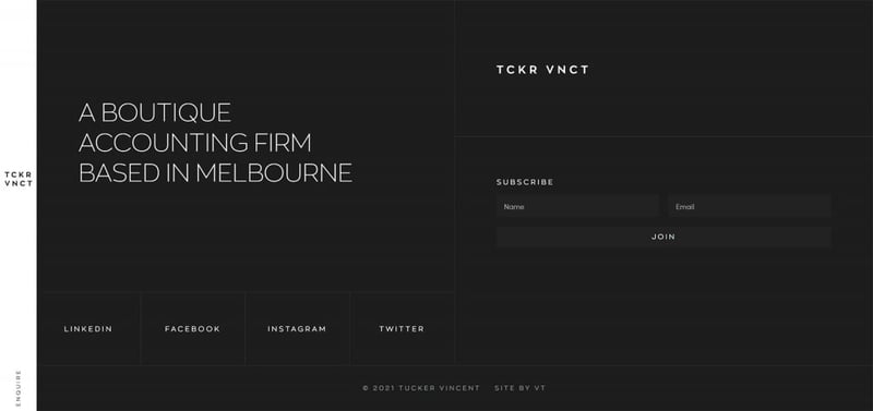
- Sometimes your footer might feel flat, so experiment with some texture using background overlays or break up sections using borders. You could also add some flare using a looping gif as your background image; just be careful not to overdo it.

Spend Time on the Layout and Enhance the Elements
Once you’ve put all your elements in a section or two, it’s time to knuckle down and give each element some love, starting with your layout. We’re building a foundation for the rest of your website design, so getting it right here will make the rest easy.
Be Creative With Your Sections/Column Layouts
Are you still building footers like you’re using a theme with 3 or 4 columns? Stop right now! You can literally create unlimited layouts with Elementor.
- Experiment with inner sections or use plugins that enable flexbox to create unique column layouts. Remember you can align elements within each column. The only limit is your imagination here.
- Go full width; you might like it! If you’re worried about padding, stick to 20-40px, its a nice safe range.
- If things are feeling a little boring, consider adding subtle hover effects to columns or buttons. You can do a lot with the background overlay option.
- Remember your spacing! Elements need space to breathe. This is the foundation of all design. I generally like to ensure there is at least 40px between columns.
- Got an important CTA? Why not add it as a sticky section to the bottom of your site?
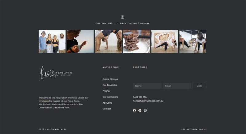
Master Inline and Custom Width on Your Widgets
I’ve mentioned it a few times already, and I’ll mention it again because this literally changed my life. Hit that advanced tab and head on down to the positioning options, you won’t regret it.
- Don’t just stack your widgets. We’re not playing Tetris. By enabling custom positioning, you can control the width of widgets, allowing them to sit together within your columns. Add some padding to balance them out.
- Want to pop a line between some elements that are inline? A quick cheat is to give one of the icons padding and margin on one side, and then set a border on the same side! Hey presto, you have a line between two inline objects.
Push Yourself
It’s easy to fall into some patterns when designing, especially if you’re churning out websites like a Norwegian dairy farmer. Snap out of them.
- Push yourself! You’ve come this far. If you’re getting stuck, look for some inspiration on sites like awwwards or dribble.
- Google is your friend. There are heaps of snippets of code or tutorials on youtube that can teach you how to take things to the next level. Such as creating a Reveal Footer Effect, a scrolling text marquee, css to span in alternative font styles. If you’ve seen it somewhere, look it up!
It’s up to you to keep learning and using the resources we have available. No excuses fam!
Responsive Responsive Responsive
99% of my footers look good on mobile. Can you say the same? Let’s make that a yes.
- Make sure once you’ve nailed your desktop footer design, you pop it down into responsive mode and check on the following:
- Is there equal and enough padding on your footer section
- Is there nice spacing between your stacked columns and widgets
- Are your headings readable and clear
- Are your menus still nice, or do you need to make an alternative mobile menu?
- Do you need to hide columns or widgets to keep the design balanced on mobile?
- Are your forms and popups working responsively too?

Grow Your Kit Collection, Save Time Later
Now that you have an amazing, well-balanced, on-brand, engaging footer, tell me that designing above the fold hasn’t gotten easier! But before you show off to your client or close the books on this design, save it as a template and export it using Elementor’s Template Kit export feature.
The next time you’re stuck on a design, you can dive into your kits collection and import a template to rework to make another solid foundation.
Final Thoughts
So elementor fam, the next time you’re stuck on a design or finding nailing the balance impossible on your next project, why not try building from the bottom up? Pop the above the fold design to the side for a moment, pull out the foot spa and give some attention to your website footer. If you can make all those important elements work in a structured space, the rest of the design is going to be easy! Trust me, your resident footer fetishist.
Want to talk about all things design with Zoe? Click here to learn more about footers or the various design services that she offers
Share Your Insights and Build Your Brand via the Experts Corner
The Experts Corner is a platform that enables you to write an article about your personal experience and expertise in a particular discipline (i.e. web design, building a successful business, etc), which will be published on the Elementor blog and all of the Elementor social media channels.
This is an excellent opportunity to build your brand, cement your reputation as a thought leader, and discover potential business opportunities.
Looking for fresh content?
By entering your email, you agree to receive Elementor emails, including marketing emails,
and agree to our Terms & Conditions and Privacy Policy.
