Table of Contents
Design is increasingly becoming more complex. Modern design processes require having a tight cross-functional collaboration between all teams involved in the creation of the product. When the time to market plays such an essential role in product development, design teams strive to optimize the process to create products fast but without sacrificing user experience.
To make this happen, product teams change the way they design digital products — they introduce design systems to make the design process more transparent and predictable.
In this article, we will explore the concept of design systems and key steps to building new design systems.
What Is a Design System?
A design system is a collection of reusable components, guided by clear practices, enables a product team to create a product faster. Think of a design system as a single source of truth for the product teams allowing them to design and develop products.
Many designers find themselves wondering about what they should include in their Design System. Every organization has different needs, and it’s impossible to provide a universal list of elements that every design system should use. However, there are some elements that many design systems share:
Components and patterns
Components are functional elements of design. Think of them as building blocks of your design system. Combined, the components form libraries that designers refer to and use when they create products.
Patterns are the protocols that provide a form of construction manual for designers to refer to when using components.
Style guides
Style guides are deliverables that focus on graphic styles (colors, fonts, illustrations) and their usage. Styles guides should be created in consideration of brand values (i.e., using brand colors for functional elements such as call-to-action buttons).
Design principles
Design principles are the guiding rules that help the teams to make meaningful design decisions. Design principles reflect the shared beliefs of the design team.
How to Build a Design System in 10 Steps
Steps:
- 1. Analyze Your Current Design Process
- 2. Identify the Brand’s Alphabet
- 3. Conduct a UI Audit
- 4. Define Design Principles
- 5. Create Component/Pattern Library
- 6. Define Rules
- 7. Establish a Governance Strategy
- 8. Define the Structure of Elements
- 9. Ensure That All Teams Use the Shared Language
- 10. Communicate Changes
1. Analyze Your Current Design Process
To better understand the kind of design system you would like to implement, you need to start by reviewing and analyzing the current approach for design at your company. Find the answers to the following questions:
- What is the design process that your company follows?
- What are the existing tools that your company uses?
It’s also recommended to evaluate the level of design maturity of the product teams. This knowledge will help you estimate the time required to introduce the system to your organization.
2. Identify the Brand’s Alphabet
The visual language that designers will use should be based on the alphabet of a brand. The alphabet includes brand identity (brand and product values) and brand language (colors, fonts, shapes, animations, voice, and tone). Define a brand’s identity, as well as its language, by reviewing the brand’s guidelines and interviewing stakeholders, then refer to this information when you work on design principles and style guides.
3. Conduct a UI Audit
One of the most dangerous problems in product design is design duplication, which leads to fragmentation, and fragmentation leads to inconsistency. Identifying duplication of design elements helps a team to avoid the scenario in which team members build an element from scratch only to find that a similar version of it already exists.
That’s why classifying all the visual components within the product should be the first task that the design team does before building a design system. You need to look at the visual qualities of your design elements. This activity has two goals:
- Highlight the areas with the most significant inconsistencies within the product.
- Identify the most important and most used elements and components of the product.
A UI audit is a multi-step process. It’s essential to identify principal UI properties such as colors, fonts, imagery first, and only then, analyze how these properties are to be used in the components. Use a tool like CSS Stats to see how many unique colors, typefaces you have in your style sheets.
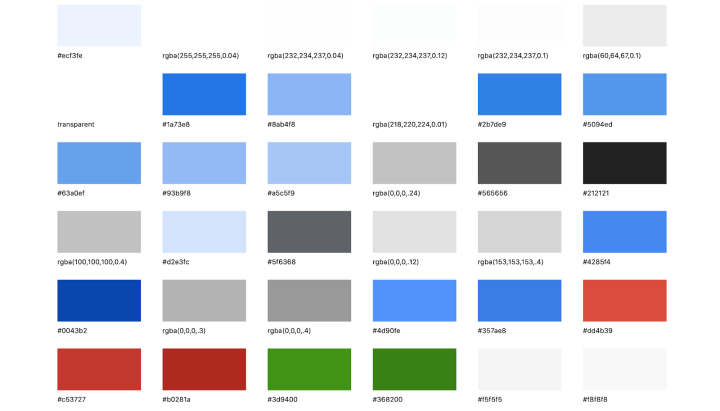
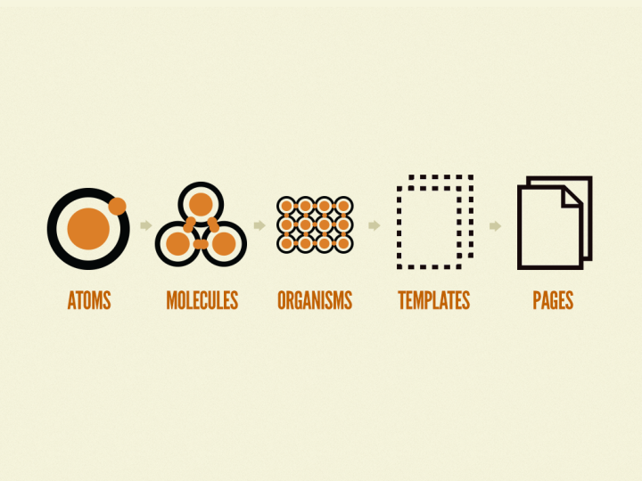
After you have information about styling, you can explore the components. Brad Frost’s Atomic Design methodology will help you to break down every web page into individual elements (atoms, molecules, and organisms).
4. Define Design Principles
Understanding the reasons behind design decisions is critical to creating an exceptional user experience. That’s why when it comes to establishing the design principles for a system, it’s essential to coordinate teams around a clear set of goals to maintain consistency and balance.
Design principles should answer three fundamental questions:
- What we are building,
- Why we are building it
- How will we build it
It’s vital for design principles to genuinely reflect the values of your organization and be with the overall vision.
5. Create Component/Pattern Library
Collect all functional and decorative parts of your UI — input fields, buttons, forms, images, to name a few — evaluate them according to the needs of the project (in accordance with user needs/business goals), and leave only what you need.
6. Define Rules
One of the main goals of a design system is to extend the creative direction. The system should not lock designers in a particular design direction. Instead, it should give designers and developers a framework that provides enough freedom to explore various approaches before they select one to follow.
In her book, “Design Systems”, Alla Kholmatova defines two types of rules:
- Strict rules. Designers have to follow a rigorous process for introducing new components and patterns in the design system.
- Loose rules. Loose rules act more like recommendations, rather than strict constraints. Designers and developers can skip the rules when they believe that without the rules, they can create a better design.
By finding a balance between strict and loose rules, we find a sweet spot between strictness and flexibility.
7. Establish a Governance Strategy
Design systems are dynamic, and they are always evolving. That’s why it’s crucial to define the process of approving changes in your design system. Creating a clear governance strategy is essential to making sure that your design system can adapt to changes.
In the article, Team Models for Scaling a Design System, Nathan Curtis defines three different models of governance:
1. Solitary model: In this model, an “overlord” (a directly responsible individual or a group of individuals) rules the design system.
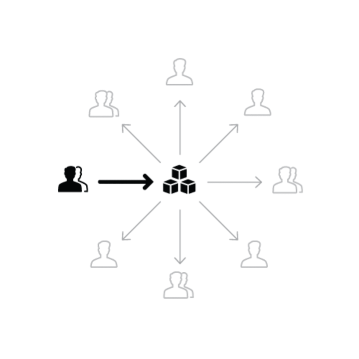
2. Centralized model: In this model, one team is in charge of the system and guides its evolution.
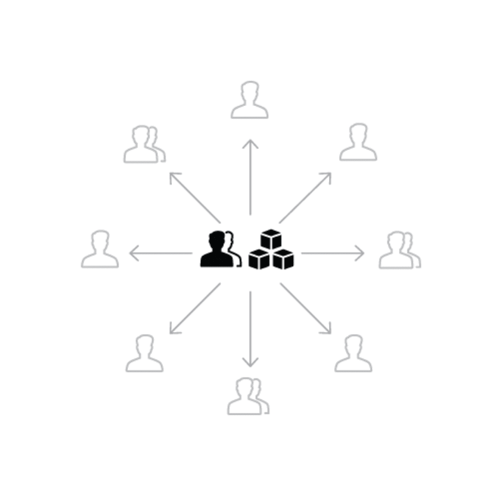
3. Federated model: In this model, several people from several teams are in charge of the system.
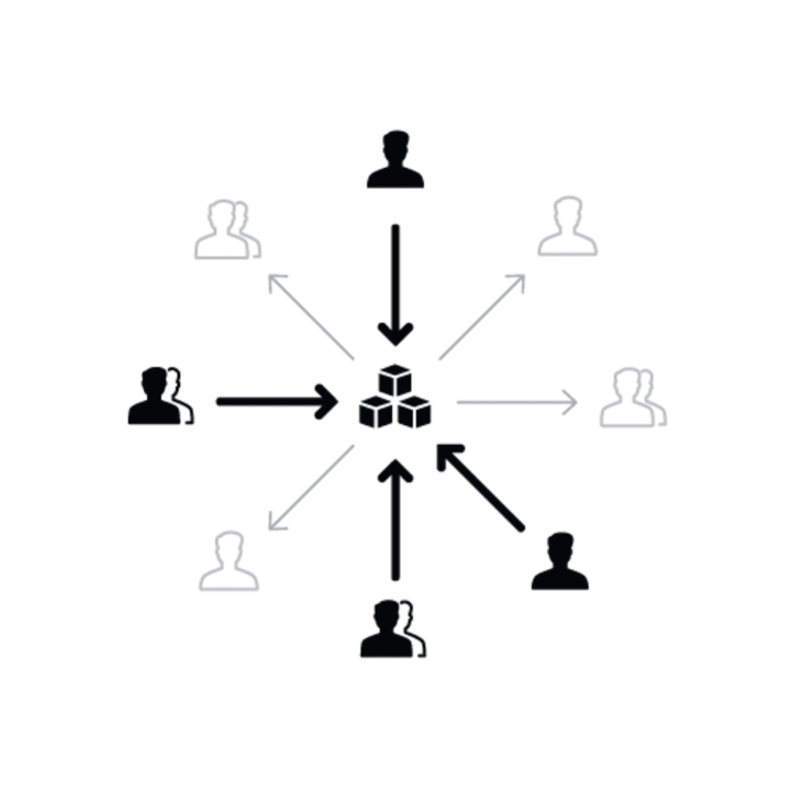
Each of the models has strengths and weaknesses, but the solitary model is the most fragile among them because it has a built-in risk — when one person is in charge of so much, that person can quickly become a bottleneck to the completion of many tasks.
In many cases, it’s possible to use a combination of models. For instance, the Salesforce team’s model is a combination of centralized and federated models. Salesforce’s Lightning Design System has a core team responsible for managing the system, but there are also contributors who act as a federation of practitioners.
8. Define the Structure of Elements
Many design systems suffer from the duplication of functional elements— team members create components that are too focused on a single-use case. As a result, the system becomes inflexible, and its users (designers and developers) have to create new components each time they need to cover a new scenario.
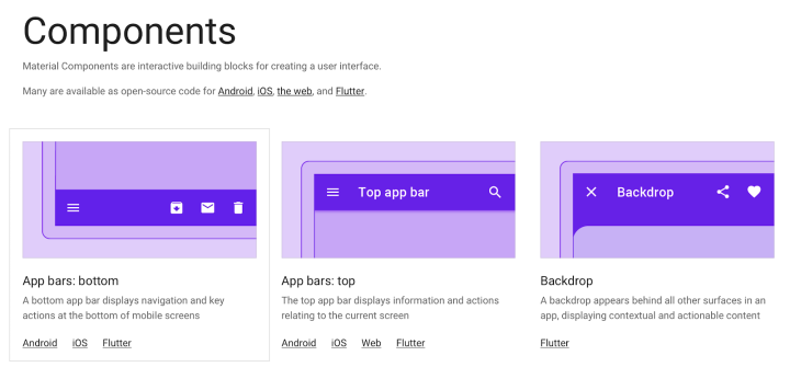
If we analyze any successful design system like Material Design, we notice that such systems are highly reusable. High reusability allows designers and developers to use Material Design as the foundation for their products.
It’s recommended to develop components that are not tied to a single-use case but can be reused in multiple contexts. To be reusable and scalable, components need to be the following:
- Modular. Modular components are self-contained — they don’t have any dependencies. Modularity helps to create reusable and interchangeable components.
- Composable. It’s possible to create new components by combining existing components.
- Customizable. It’s possible to adjust and extend components to make them work in a variety of contexts.
9. Ensure That All Teams Use the Shared Language
The fundamental purpose of a design system is to facilitate the work of the teams, which is why encouraging everyone to use it is even more important than building one. Design systems should be integrated into the teams’ workflow, become a key part of a designer’s and developer’s daily productivity, and deliver value to the team members.
If you’ve just started incorporating a design system into your organization’s design process, conduct a series of interviews to understand how people use it, and use this information to adjust your design system.
10. Communicate Changes
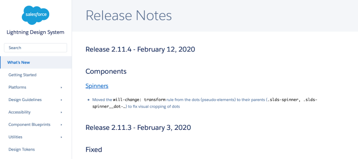
A design system isn’t a static collection of artifacts; it is a by-product of your product design that evolves together with the organization. Once the teams start to use a design system, it’s vital to communicate changes and updates to the entire organization. Ship updates regularly and with a changelog. The log should tell users what changes were introduced in the new version and how the upgrades will impact their work.
Examples of Design Systems
Here is a couple of popular design systems.
Material Design by Google
Material Design is a design language developed by Google in 2014. The idea of creating this design language was simple — to give designers and developers a tool that will allow them to create intuitive and beautiful products. Material Design is a very adaptable system that can be used for various products.
Lightning Design System by Salesforce
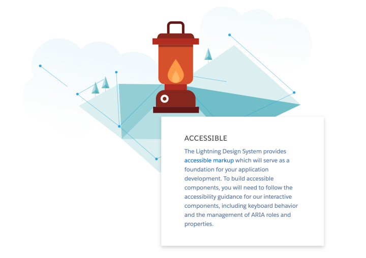
Lightning Design System enables product teams to build rich enterprise experiences and custom applications with the patterns and establish best practices that are native to Salesforce.
Conclusion
A well-crafted design system serves as a North Star to your product development. It becomes a part of an organization’s DNA that helps product teams produce more consistent user experiences and amplifies a design-driven culture. Design systems encourage people who work on the product to look beyond the building blocks and to think about the purpose of their design.
With Elementor 3.0, you get to manage your design systems from one page, easily.
Looking for fresh content?
By entering your email, you agree to receive Elementor emails, including marketing emails,
and agree to our Terms & Conditions and Privacy Policy.


