Table of Contents
With Elementor 2.5, you got access to a brand new design tool – custom positioning.
Custom positioning gives you a lot of flexibility and power over the design of your layouts. However, as Josh tells you in the webinar video, “with great power comes great responsibility”, and you’ll want to make sure you use this newfound power in an effective way.
To help, we’ll cover eight tips for how to effectively use the new custom positioning functionality in Elementor.
How to Use Custom Positioning in Elementor
To activate the custom positioning feature, you’ll use the new Custom Positioning section in the Advanced tab of the Elementor side panel:
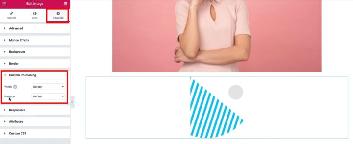
From there, you can change the Position drop-down to Absolute or Fixed to activate custom positioning.
Once you do that, the widget will appear to “float” at the top of the section because it no longer takes up any vertical space.
From there, you can drag it to the position where you want it to appear.
Now, let’s talk about some tips and common mistakes to avoid for the new custom positioning options.
8 Tips for Using the Custom Positioning Feature
If you want to see these tips in video format, you can also follow along with Josh and Hadas in the webinar video above.
1. Understand Fixed vs Absolute Positioning
Elementor 2.5 lets you use two types of custom positioning:
- Absolute – the element is positioned relative to the column/section that it’s inside. It will move along as the visitor scrolls.
- Fixed – the position is fixed to the visitor’s viewport and will stay there even when the visitor scrolls.
2. Use Custom Positioning to Define Width, Not the Style Tab
Let’s take an example of an image and say that you want to change its width and size (while using custom positioning).
Normally, you’d go to the Style tab and adjust the Width of the image there. However, you should use a different approach with custom positioning because custom positioning lets you also adjust the size of the widget itself.
So, first go to the Style tab and make the Image → Width equal to 100%. This will make the image fill 100% of the widget.
Then, to control the size of the widget itself, you can go to Advanced → Custom Positioning and change the Width setting to Custom:
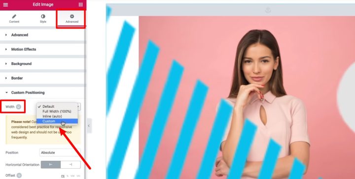
Then, you can use the slider to adjust the widget size or use drag-and-drop on the widget itself. And because the image fills 100% of the widget, the image will automatically resize as you change the width of the widget in the custom positioning settings.
Most of the time, you should use this Custom option for the width. But other custom positioning width options are:
- Full Width – makes the widget take up the entire viewport.
- Inline (Auto) – makes the size of the widget restricted to the size of the content that’s in the widget. This can cause issues in absolute mode, and isn’t ideal for most situations.
3. Use Relative Units for Better Responsive Design
Absolute positioning can be tricky when it comes to responsive design. To make for a better design on all devices, you should try to use relative units as much as possible when changing the width. By “relative”, we mean units like percent or view width (VW), rather than absolute units like pixels.
4. Use Horizontal and Vertical Offsets Properly
To make sure your absolute positioning looks correct at different screen sizes, you need to properly use the horizontal and vertical offset functionality:
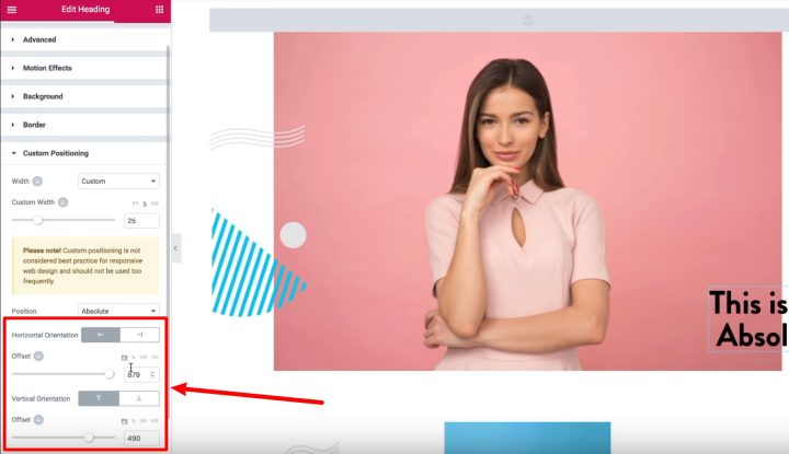
For example, if you want to place a widget near the right side of the page, there are two different ways you could do that.
First, you can choose the left orientation and enter a large value (like 800 px). This will position your widget ~800 px from the left side (effectively putting it on the right side for most devices). However, this will cause issues on different screen resolutions.
A better approach would be to choose the right orientation and use a small value (like zero). This ensures that, no matter what a user’s screen size is, the widget will always be oriented on the right.
The same approach applies to the vertical orientation options.
You also have the ability to set different offsets for different responsive breakpoints when needed.
5. Use Z-Index to Control the Depth of Each Element
With absolute positioning, you’ll have a lot of situations where two or more widgets are placed “on top” of one another. To control which widgets appear in the foreground, you can use the normal Z-Index setting.
6. Remember How Columns Work for Responsive Design
Custom positioning lets you move widgets to any location. However, these widgets are still relative to the column they’re inside, which can potentially cause an issue in responsive design.
For example, if you have a three-column layout, you could use custom positioning to drag a widget from the left-most column into the center column.
However, while this might look fine to desktop visitors, it will cause a problem for mobile visitors because Elementor stacks the columns vertically on mobile.
So rather than having three columns side-by-side, you’ll have three columns on top of another and the element will no longer appear in the middle column like it does on desktops.
Long story short, you need to pay attention to the widget’s relation to the column it’s inside.
7. Use Overflow Hidden to Fix Responsive Width Problems
Depending on your design, you might run into an issue where a widget with custom positioning exceeds the width of a column on mobile devices.
This causes an awkward situation where visitors can “horizontally scroll”, even though you don’t want this functionality:
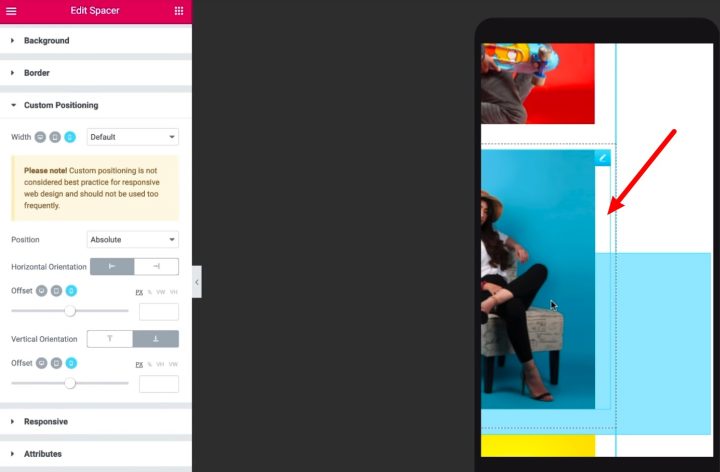
To fix this, you can set the Overflow option to Hidden in the Section → Layout settings. Then, everything that exceeds the section will be cut off, which eliminates the scrolling issue.
8. The Duplicate Functionality Still Works!
If you use right-click to duplicate an element with custom positioning, it might seem like it didn’t work.
Don’t worry! The duplicate functionality still works just fine. However, because each element has the exact same custom positioning, the two elements are perfectly stacked on top of each other (making them look like one element).
All you need to do is drag one of the elements a bit and you’ll see both elements.
Final Thoughts
That wraps up our tips on how to best use the new custom positioning feature in Elementor.
If you have any questions about custom positioning, ask away in the comments!
Looking for fresh content?
By entering your email, you agree to receive Elementor emails, including marketing emails,
and agree to our Terms & Conditions and Privacy Policy.
