Table of Contents
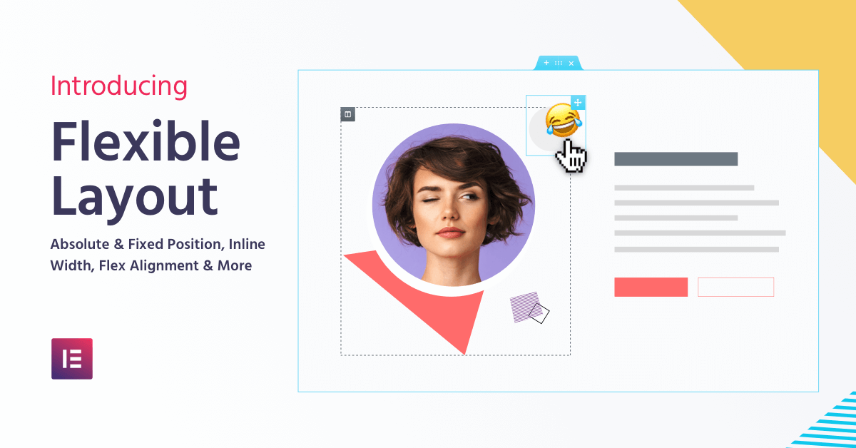
#elementor's Flexible Layout: Freehand Web Design Never Before Possible on WordPress
Calling all web-designers!
Elementor is yet again pioneering a change that will make WordPress web design far more flexible than ever before – Meet Flexible Layout!
Flexible Layout includes a set of advanced positioning capabilities that help you fully customize your design and layout workflow.
Ready? Take a deep breath, we have A LOT of new and exciting features to cover. Let’s dive in!
Inline Elements
Side-By-Side Widgets
Want to place 2 buttons side by side in the same column? Now you can!
Before, each widget took up 100% of the column, since it was using Elementor’s grid layout. Now, you can set the widget to be ‘Inline’, meaning the widget will take up the minimum width that it holds.
You can now set the widget’s specific width for pixel perfect customization.
freehand Web Design
Move Elements Using Absolute Position
Designers never had a way to work freehand when designing in WordPress. Now – they finally do, with Absolute Positioning.
Go to any widget, choose ‘Position: Absolute’, and you will be able to drag the widget to any location on the page, regardless of the grid. Point anywhere on the screen, and simply drag the widget there.
Absolute position has a bad reputation in terms of responsive design. In Elementor, we allow you to set a separate custom position for mobile, tablet and desktop devices using percentage, VH, VW or pixel units.
With Absolute position, you run the risk of getting a horizontal scroll when the element exceeds the limits of the page. Luckily, we added an Overflow Hidden control, which condenses all of the section widgets inside and removes any unwanted scrolls.
follow on Scroll
Pin Elements Using Fixed Position
Do you enjoy using sticky positioning for widgets? Then you will LOVE fixed position. Set your widget to have a fixed position and place it wherever you like. Now your element will scroll alongside your user.
Confused by the difference between Sticky and Fixed?
Sticky is a scrolling effect, which is relative to the section it’s placed in, Fixed position, however, is relative to the user viewport. That’s it!
Distribute Elements Across
Flex Horizontal Alignment

Along with inline elements, we added a new horizontal alignment option for columns.
Once you place several widgets inline in a single column, you can easily align and spread them across the column using 6 optional settings:
- Start
- Center
- End
- Space Between – meaning Widgets start and end at the edge of the column, with equal space between them.
- Space Around – where Widgets are spaced equally and the edges are half of the space.
- And Space Evenly – where Widgets have equal space between, before and after them.
Distribute Elements down
Flex Vertical Alignment

Speaking of alignment, have you ever built a services section with buttons that are not properly aligned?
Besides Top, Middle and Bottom vertical alignment, you also get 3 new flex options:
- Space Between
- Space Around
- And Space Evenly
Responsive Columns
Hide Column Per Device
Elementor has a useful mobile editing setting for hiding and showing sections and widgets from appearing on desktop, tablet, and mobile devices.
Now, we added the option to hide columns as well, so you can easily hide or show them according to which device the visitor is currently using.
Newspaper-Style
Improved Text Editor Columns


Workflow Improvement
Remember Last Tab
Performance Improvement
50% Faster Editor Loading
Since day one, a key feature Elementor has been known for is its high performance, seen in all aspects of the product. Fast loading pages, fast responding controls, we have been, and still are, the fastest page builder for WordPress. ‘No more drag and wait’ was a slogan I really liked back in the day.
Now, we managed to considerably speed up an important aspect of Elementor – the editor loading time.
We managed to reduce our editor loading time by over 50%, meaning you can start working much faster!
WordPress Web Design, Now More Flexible Than Ever Using Elementor
Summing up
SPREAD THE NEWS ABOUT V2.5
Are there any web designers in your Rolodex not using WordPress? This is the best time to get them to make the switch to WordPress!
The new Elementor Core 2.5 version gives web designers freehand design capabilities that were never before possible on WordPress. These options are extremely useful for both designers and marketers, and expand your freedom to create beautiful layouts however you imagine them.
Share Elementor v2.5 with your web designer friends – and let us know if you managed to convert them to WordPress users 🤗
Looking for fresh content?
By entering your email, you agree to receive Elementor emails, including marketing emails,
and agree to our Terms & Conditions and Privacy Policy.


