- Add a Flexbox element to the canvas. For details, see Add elements to a page.
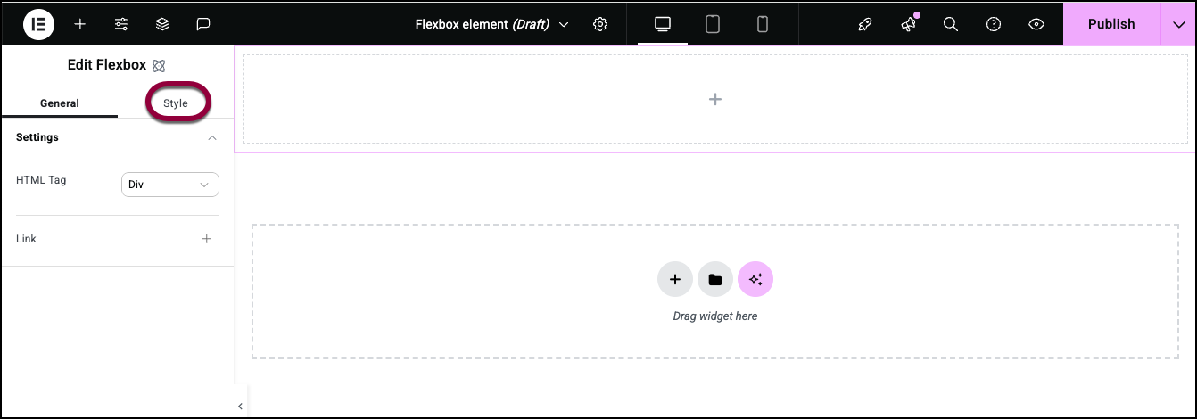
- In the panel, click the Style tab.
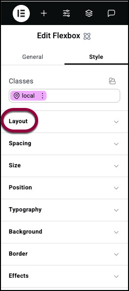
- Open the Layout section.
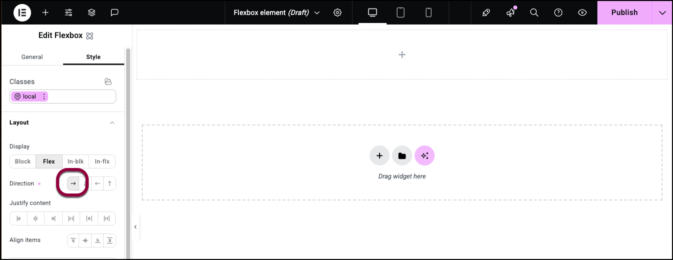
- Set the direction to Row.
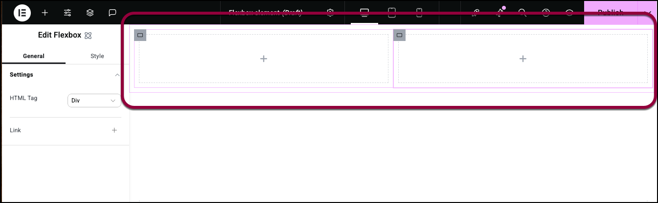
- Add two child Flexboxes inside the first Flexbox.
The two child containers should be side by side.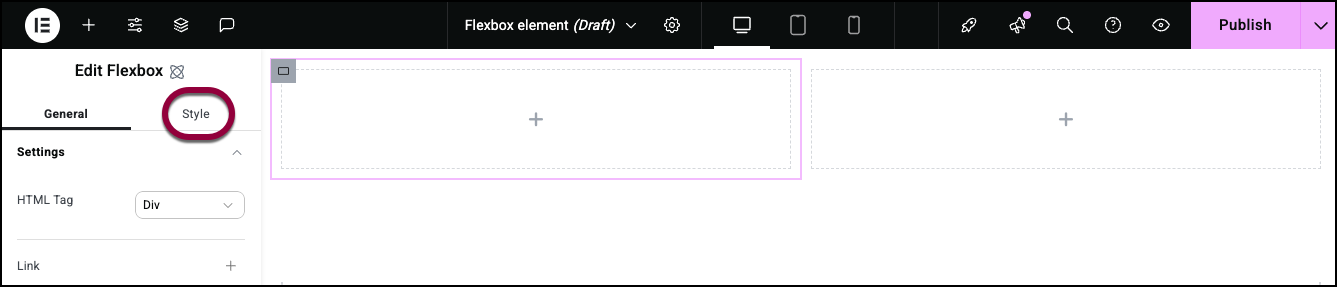
- Select the container on the left by clicking it and click the Style tab.
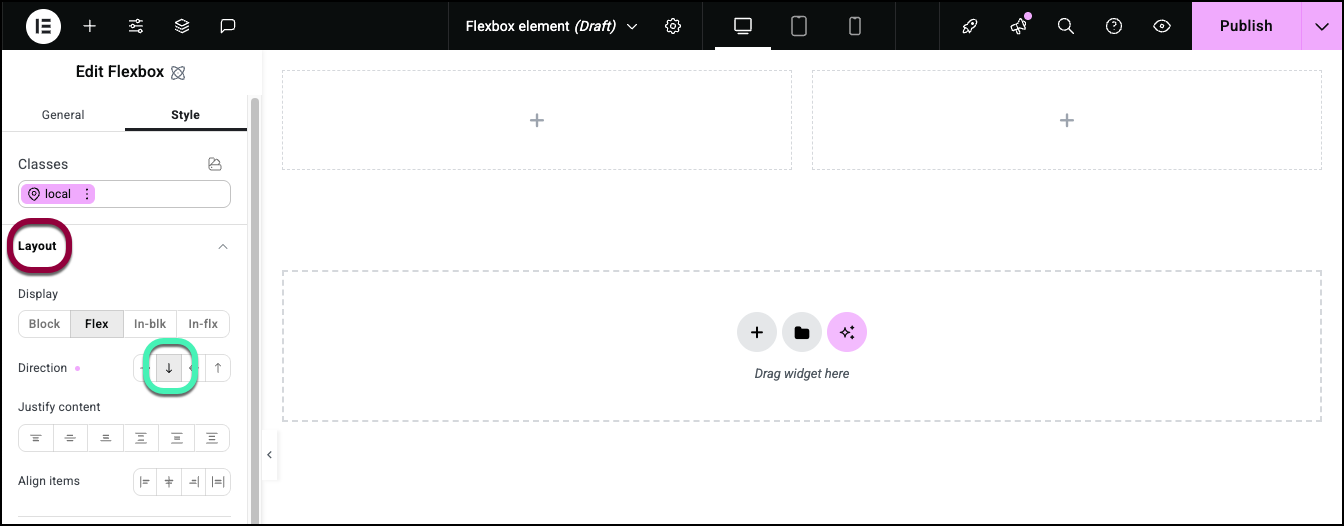
- Open the Layout section and set the direction to Column.
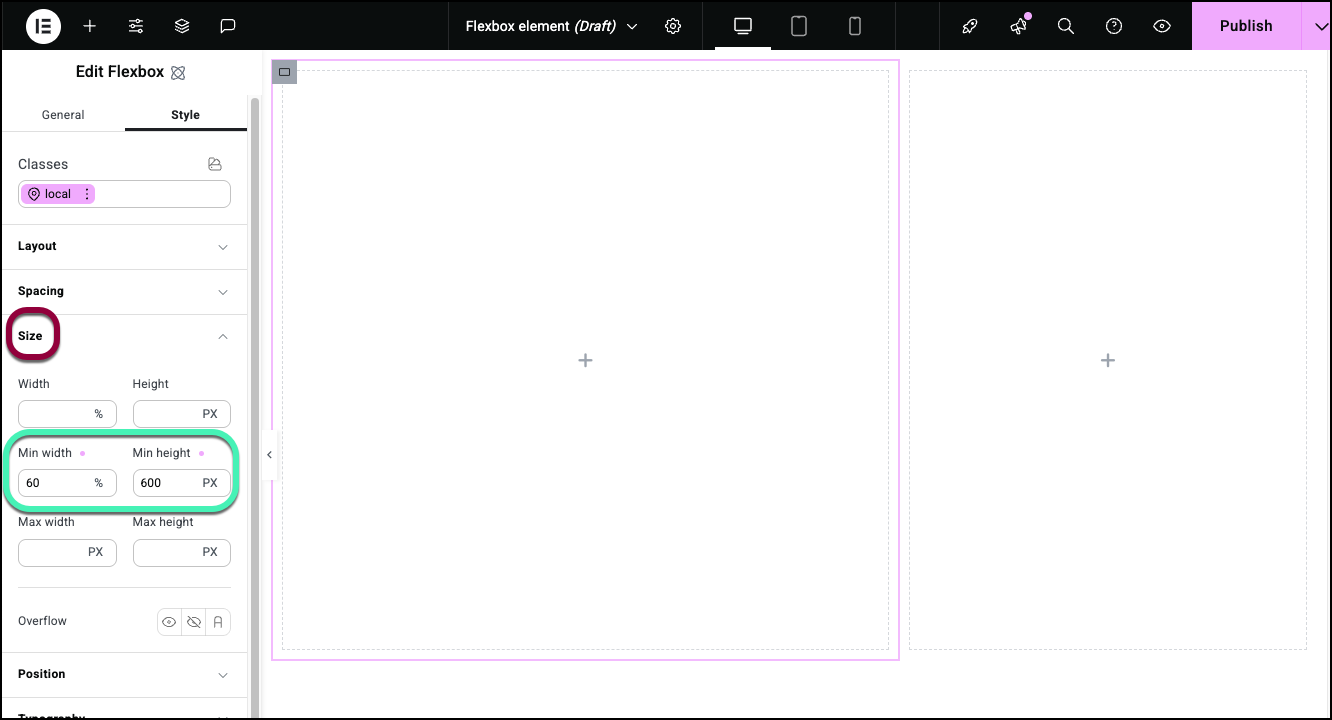
- Open the Size section and set the Min Height to 600 PX and the Min Width to 60%. For details, see Style tab – Size.
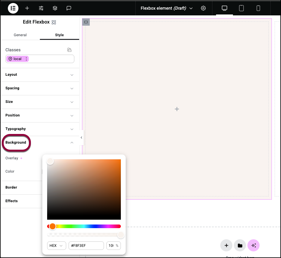
- Open the Background section and add a background color. For details, see Style tab – Background.
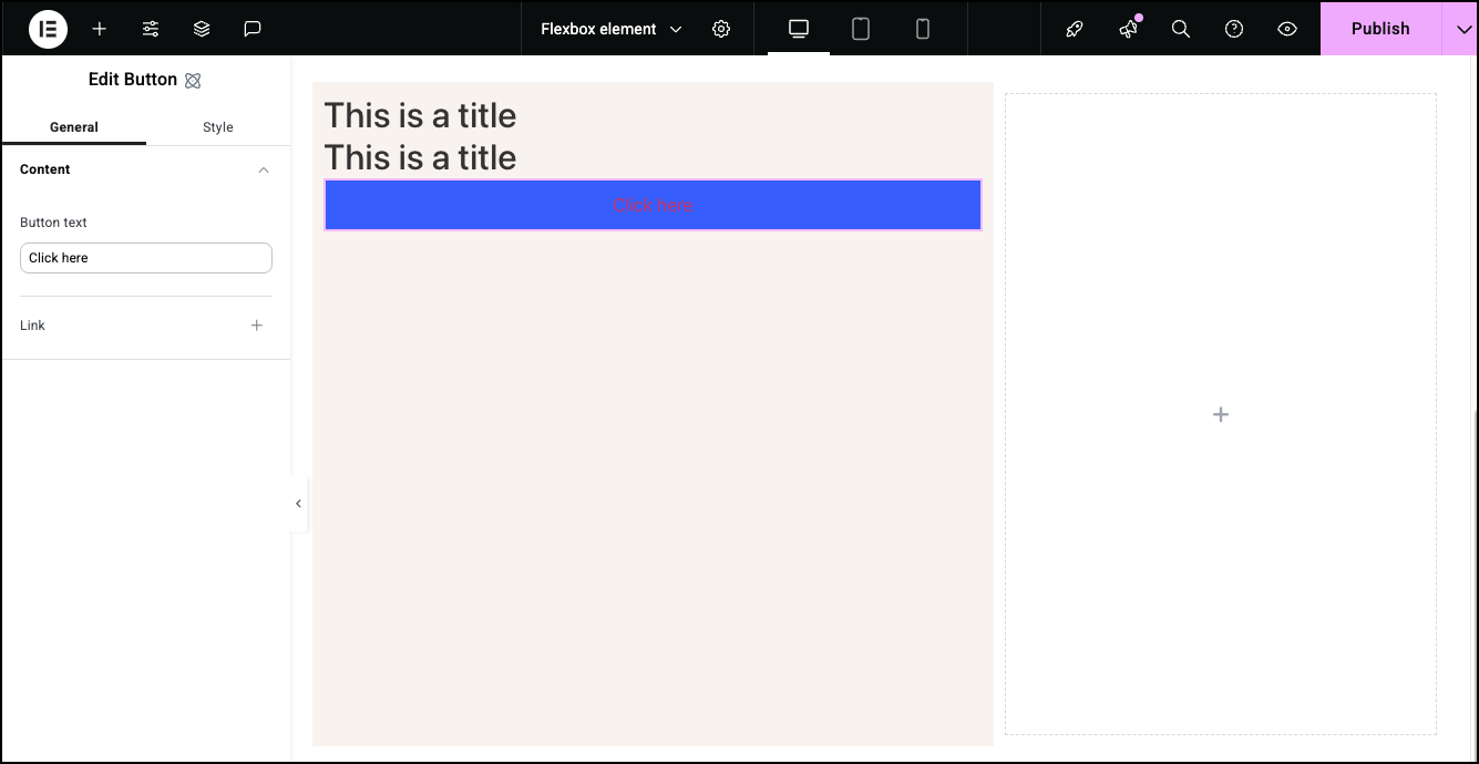
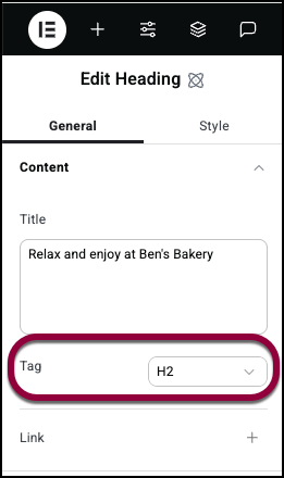
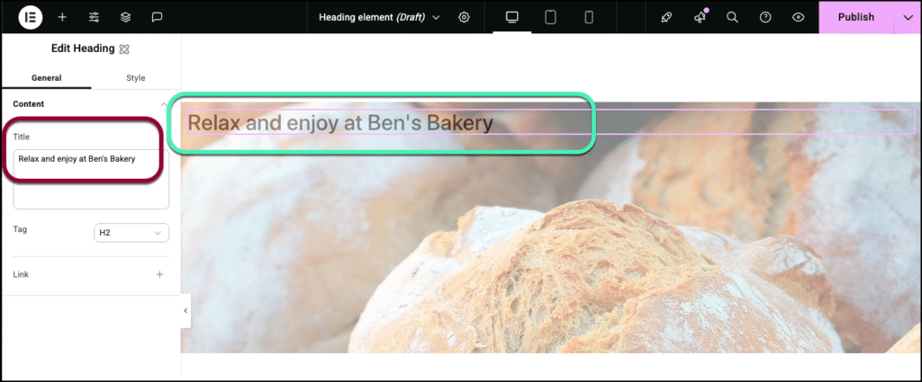
- Add two Heading elements and a button.
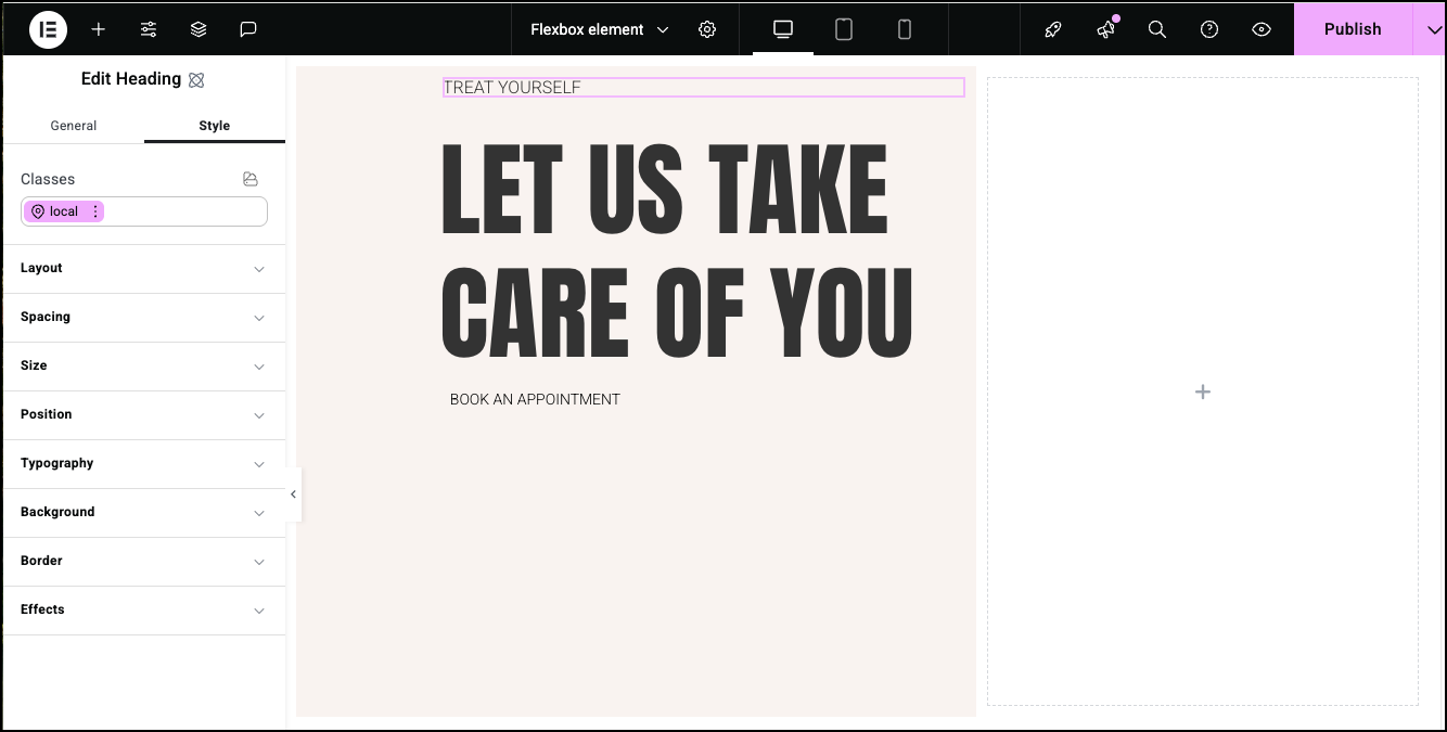
- Add content and styling to the Heading and Button elements. See Heading element and Button element for details. For details on positioning, see Style tab – Spacing, Style tab – Size and Style tab – Position.
- Select the Flexbox on the right.
- Click the Style tab.
- Open the Layout section.
- Set the Height to 600 PX and the Width to 40%.
- Open the Background section.
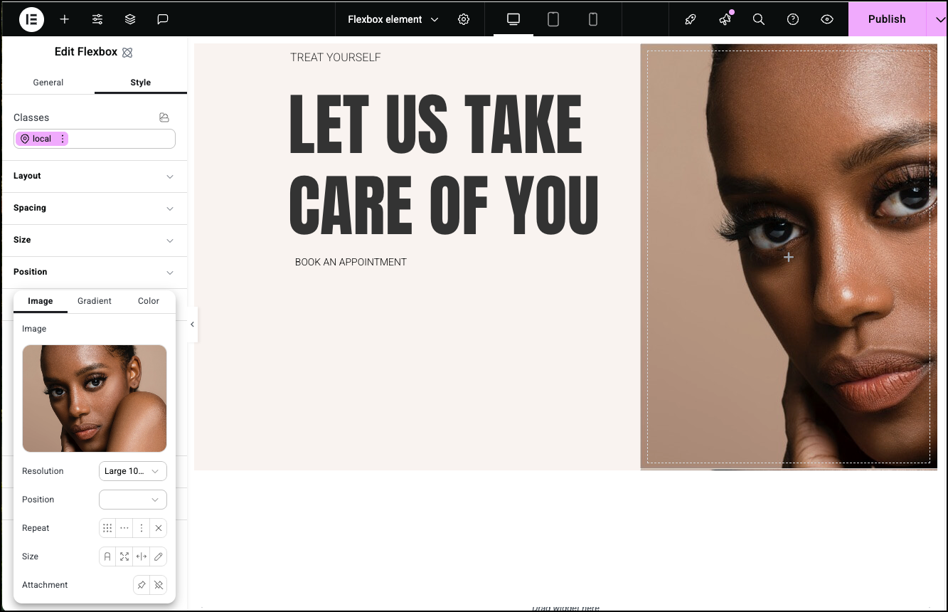
- Add an image as the background. For details, see Style tab – Background.