Button element

Last Update: May 27, 2025
Who can use this feature:
This article is for Editor v4 users. If you’re using Editor v3, check out the relevant article here: Button Widget

Add and delete the element

The widget 3 Button element 1

To access and use a widget:

  1. In Elementor Editor, click +.
    All available elements are displayed.

  2. Click or drag the element to the canvas. For more information, see Add elements to a page.

To delete the widget:

  1. On the canvas, select the element by clicking it.
  2. Press the delete key on your keyboard. For more information, see Delete elements from a page.

What is the Button element?

Buttons on a website are crucial in guiding user actions, providing clear calls to action, and enhancing overall user engagement. Buttons let you add interactive and visually appealing buttons on your site.

Common use case

Blair is building a website for a gym. At the top of the homepage they want to add a button to the Hero section. Visitors clicking the button will go to a registration page. a striking button that will draw the attention of potential customers.

Instead of using stars for their ratings, Jaime decides to use dollar signs for the value rating and hearts for their reaction rating. In addition, they decide to value will be ranked 1-5, while reaction will be ranked 1-10.

The result 1 Button element 3

Additional use cases 

  • Use the Button element to create a stunning portfolio gallery. Each Button can be linked to a project page or a detailed view.
  • If you’re hosting an event or webinar, the Button element can help you create visually appealing banners or posters.
  • Use Buttons to display before and after transformations for home renovations, fitness progress, or any other transformation journey.

Add a Button element: Step-by-step

  1. Add the Button element to the canvas. For details, see Add elements to a page.
    Add teh element to the canvas scaled Button element 5
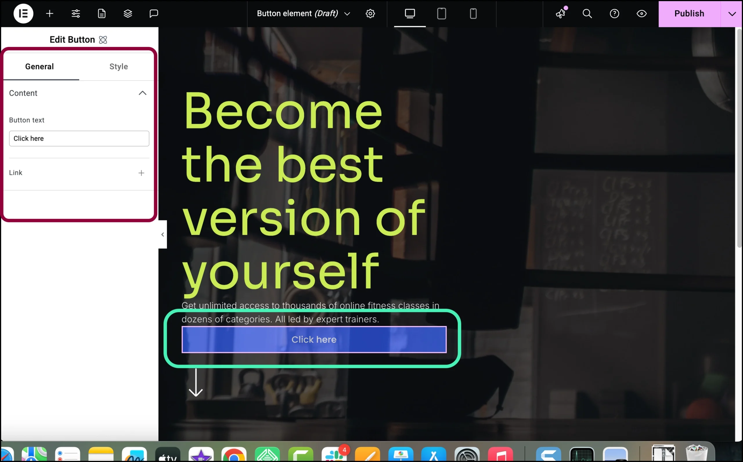
    The options for the Button element appear in the left panel.
    Enter get started scaled Button element 7
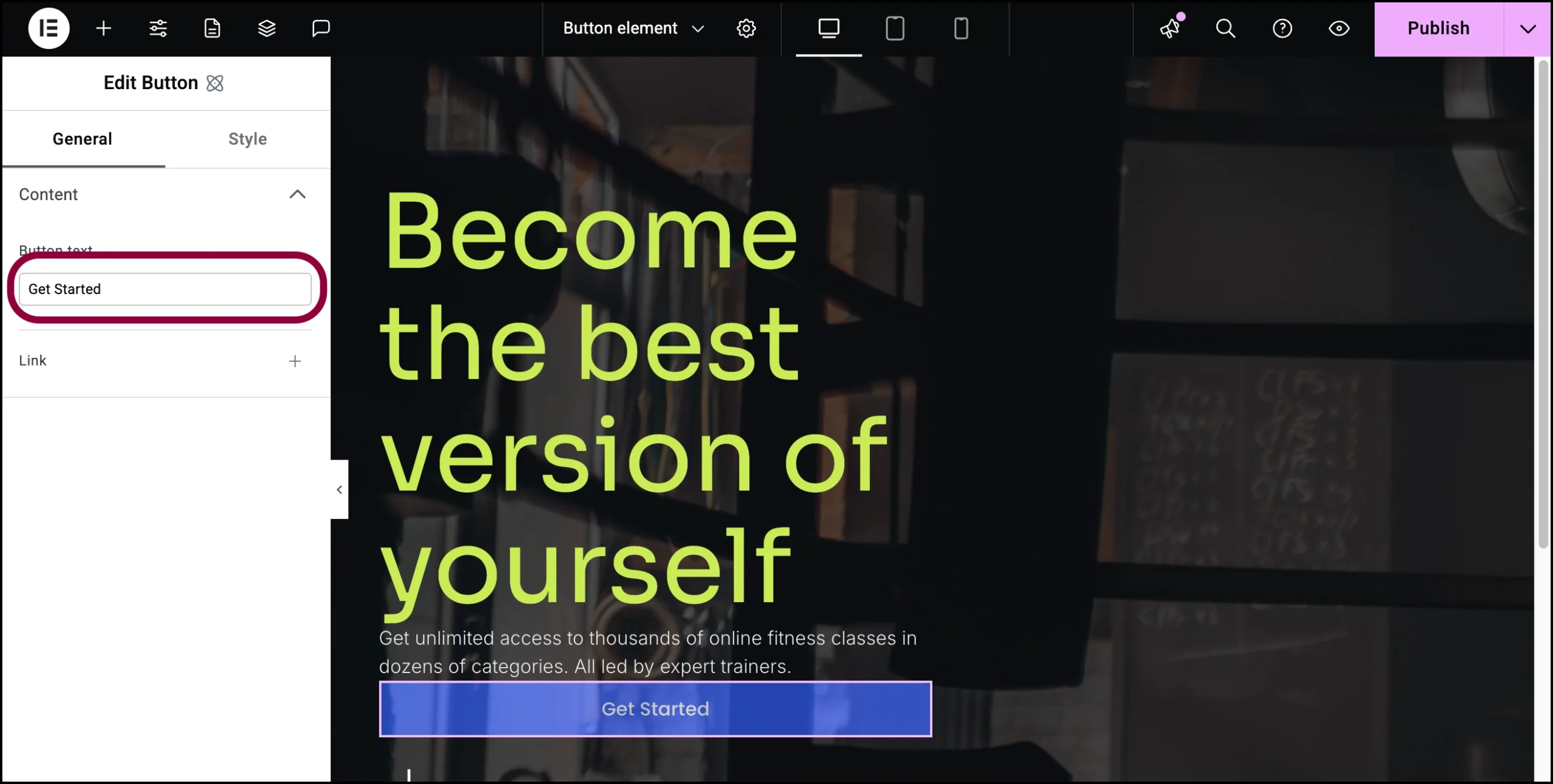
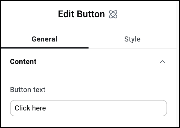
  2. In the General tab, in the Button text field, enter Get Started.
    We want the button to link to a registration page.
    Click the plus sign 2 Button element 9
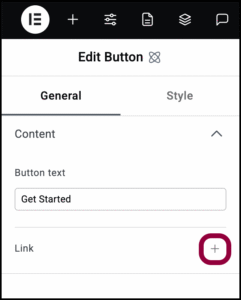
  3. Click the plus sign next to Link.
    enter the url 2 Button element 11
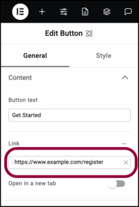
  4. In the Link text box, add the URL of the page you want to link to.
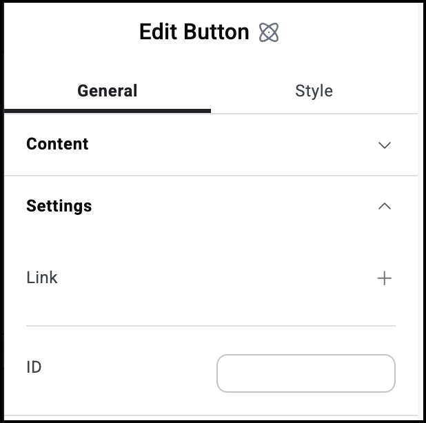
    The button is a little big for our design, so let’s make it smaller.
    Open the size field 1 Button element 13
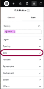
  5. Open the Size field.
    Set the size to 200 1 Button element 15
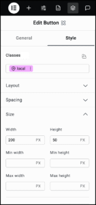
  6. Set the Width to 200 and Height to 50.
    Click the Style tab 3 Button element 17
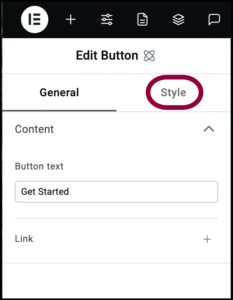
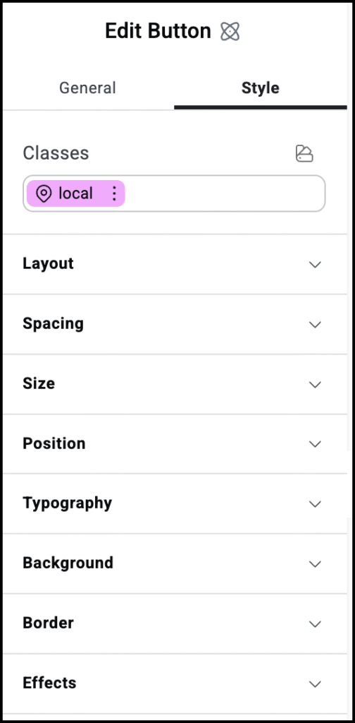
  7. Click the Style tab.
    Let’s change the text style to match the rest of the site.
    open the typography field 1 Button element 19
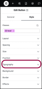
  8. Open the Typography field.
    typography settings 1 Button element 21
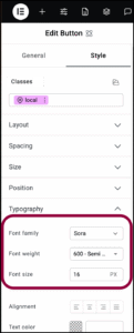
  9. Use the Font Family dropdown to select Sora. For details, see Style tab – Typography.
  10. Use the Font Weight dropdown to select 600.
  11. Use the Font Size field to select 16.
    The design calls for a transparent background.
    open the background field 1 Button element 23
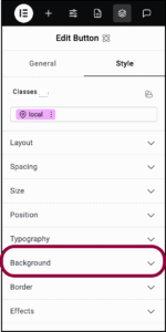
  12. Open the Background section.
    click the trasparent patch 1 Button element 25
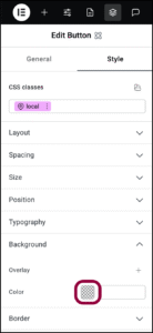
  13. Click the color swatch to open the color picker. For details, see Use the color picker.
    Set opacity to 0 1 Button element 27
  14. Set the opacity to 0%.
    Now let’s shape the button. In this case we want a rounded button with a white border.
    Open the Border section 1 Button element 29
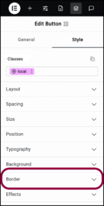
  15. Open the Border section.
    Click the adjust borders icon 1 Button element 31
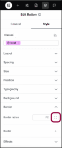
  16. Click the Adjust Borders icon.
    Set the border radius 1 Button element 33
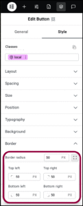
  17. Enter 50 in the number field for all the corners.
    click the border plus sign 1 Button element 35
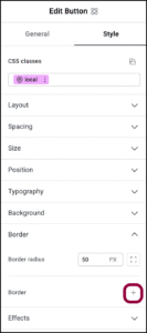
  18. Click the plus sign by Border.
    Set border width to 2 1 Button element 37
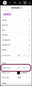
  19. Use the number field to increase the Border width to 2.
    Set border color 1 Button element 39
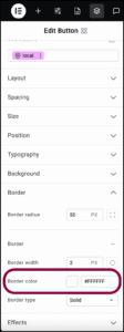
  20. Set the color as #FFFFFF.
    To help the button stand out, we can change its appearance when users hover over it. Hover is called a state and elements can be edited to change appearance depending on its state. For details, see Element states.
    Click the ellipses 1 Button element 41
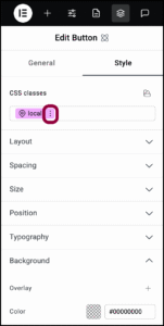
  21. In the Classes text field, click the ellipses next to the word local.
    Select hover from the dropdown 1 Button element 43
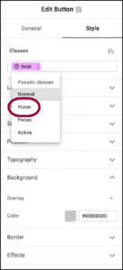
  22. Select Hover from the dropdown menu.
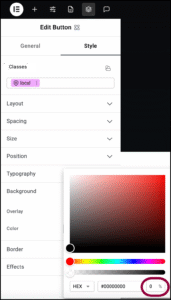
    Notice the word hover appears in the Classes text box and is colored pink. This indicates that we are now editing how the button will appear when visitors mouse over it.
    Open the color picker 2 Button element 45
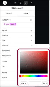
  23. Click the swatch by Color to open the color picker.
  24. Change the Hex color number to #FFFFFF and the opacity to 100%.
    When users mouse over the button it turns white. 
    The result Button element 47
    The button is ready.

Settings for the Button element

You can customize your elements using content and style, offering you great flexibility in tailoring them to your needs. Click the tabs below to see all the settings available for this element.

General tab 4 Button element 49

The text that appears in the button.

Click the plus sign to enter a link. Visitors clicking the button will open the link. 

Open in a new tab: If the Button contains a link, toggle on if you want the link to open in a new tab.

Style tab 2 Button element 51

See the individual articles on Style options:


On this page

Share this article