Add and delete the element
Add the element to the canvas
To access and use a widget:
In Elementor Editor, click +.
All available elements are displayed.Click or drag the element to the canvas. For more information, see Add elements to a page.
Delete the element
To delete the widget:
- On the canvas, select the element by clicking it.
- Press the delete key on your keyboard. For more information, see Delete elements from a page.
What is the Atomic Form element?
Forms allow visitors a way to communicate with you. The Atomic Forms elements gives you the flexibility to design forms to your exact specifications.
The Atomic form element is different from other elements. It essentially acts as a wrapper containing other atomic elements. These atomic elements are:
- Label: A text-based element used to create the form’s labels.
- Input: Used by visitors to submit information.
- Text area: A type of input field, but designed for longer, text-based messages.
- Checkbox: Used when visitors are asked to submit Yes or No type information.
- Submit button: The button visitors click to send the form information to the site.
Common use case
Alex is building a webpage where people can respond to a wedding invitation. The form will collect the RSVP’s of all invitees.
Additional use cases
- Use a form to build a subscription list for a newsletter
- Use a form to poll your customers about their favorite products or features.
- Use a form to collect contact information of potential clients.
Add an Atomic Form: Step-by-step
- Add the Atomic Form element to the canvas. For details, see Add elements to a page.
A simple form is added to the canvas and the Atomic Form options appear in the left panel.
For our form, we’re going to collect the following information:- First Name
- Last Name
- Mailing Address
- Attending?
- Vegetarian Meal?
- Special requests or needs.
The default form already contains fields for first and last name. Now let’s add a field for Mailing address.
- Click the + icon in the top bar to open the Element panel and scroll down to the Atomic Form section.
- Drag a Label element into the form, plaing it below the last name field.NoteIt can be difficult arranging the elements in a form. We suggest using the Structure window. For details, see Use page structure to navigate your page.
- In the panel, change the label to Mailing address.
You can change the name of these elements in the Structure window to help keep things clear.Tip - In the panel, change the label to Mailing address.
- Drag an Input element to the form and place it under the label.
- Change the label next to the checkbox to say Attending?
- Right click on the container with the checkbox and select Duplicate.
- Click the label next to the second checkbox and change the text to Vegetarian Meal.
- Select Atomic form.
In the panel, open the Actions after submit field and select Collect submissions. - Under Email settings, enter the recipient’s email.
With these settings, responses will be sent to the email address you enter and available from WP Admin. For details, see Manage form submissions.
Every form must have a success message, for when the information is submitted correctly and a Fail message for when the submission did not work. Let’s customize these. - In the Structure window, open the Success Message field.
- Click Paragraph.
- You can now edit the success text.
The form is now ready for use.
Settings for the Atomic Forms element
The settings for the Atomic Forms element focus on what happens when a visitor submits a form. The atoms that make up the form have their own settings which are detailed below.
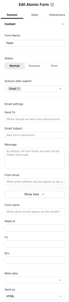
Form Name
You can give the form a name to make it easier to identify.
States
Each form has three different appearances:
- Normal: The default appearance, before the form has been submitted.
- Success: How the form appears after it has successfully sent.
- Error: How the form appears after it was unsuccessfully submitted.
Actions after submit
Determines what happens after visitors successfully submit a form:
- Email: Sends the submission information to a designated email address.
- Collect submissions: Stores the information submitted by visitors in a database which you can access from WP Admin. For details, see Manage form submissions.
Email settings
These settings only appear if you choose Email under Actions after submit.
- Send to: The email address where the submissions will be received.
- Email subject: The subject line of the email that will be sent to the email address in the Send to setting.
- Message: Any text and form information that will be sent in the email. The default setting is [all-fields], includes all the form information in the email.
- From email: Add the email from which the email will be sent.
- From name: Determine under what name the email will be sent. This may help you filter these emails later.
- Reply-to: Edit this email address if you want to reply to these emails and have these replies sent to a different address.
- Cc: Send a copy of these emails to another address.
- Bcc:Send a blind copy of these emails to another address.
- Meta data: y default, the emails sent by the form includes metadata such as the Time, Date, Page URL, User Agent (Browser information), Remote IP (IP address of the person submitting the form), Credit (the software that created the form).
- Send as: Use the dropdown menu to determine if the email sent by the form is in HTML or plain format.
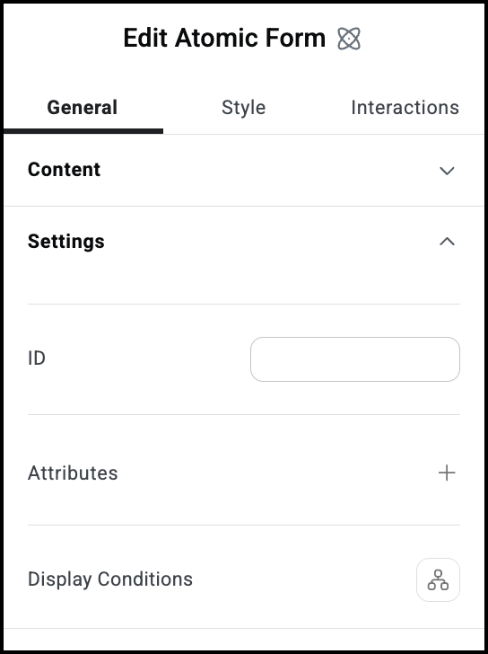
ID
Allows you to tag individual elements on a page. This way you can link to this specific element.
Attributes
Attributes are used by developers to target certain elements in order to customize them. For details, see Add and delete attributes.
Display Conditions
Show or hide elements depending on different conditions. For details, see Show and hide elements on a page.
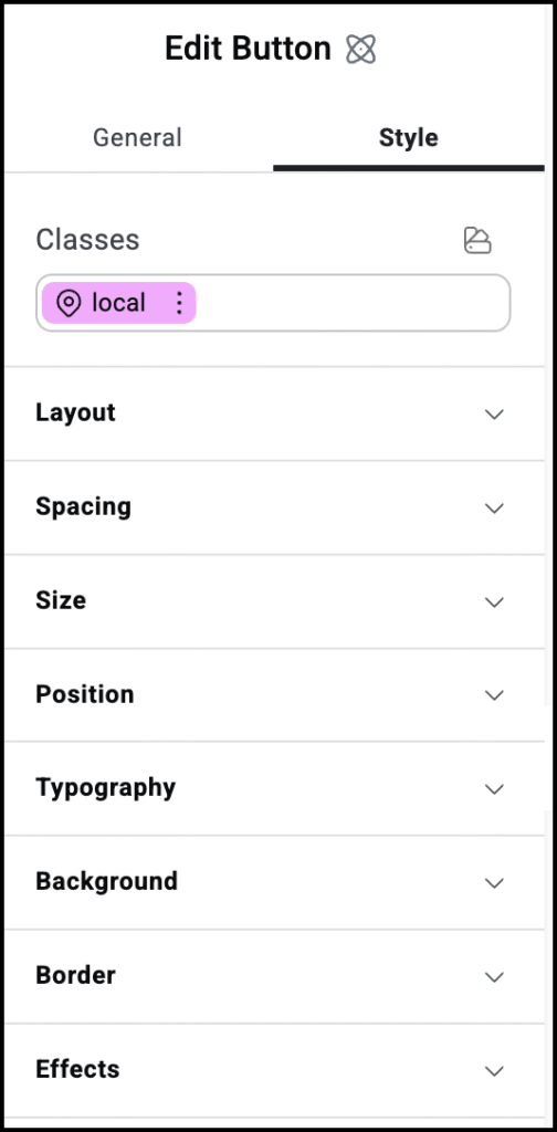
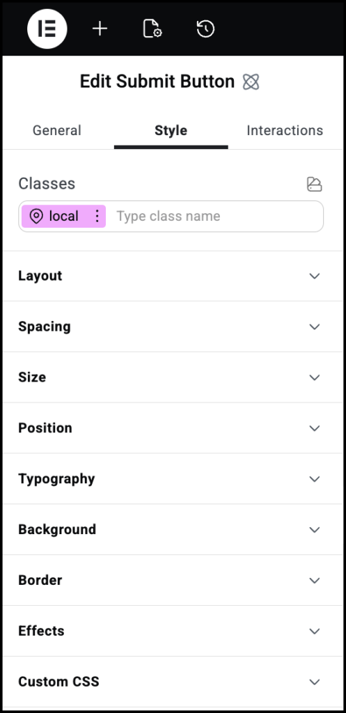
Style options
See the individual articles on Style options:
Settings for the Input atom
The Input atom is where visitors will add the information they’re submitting.
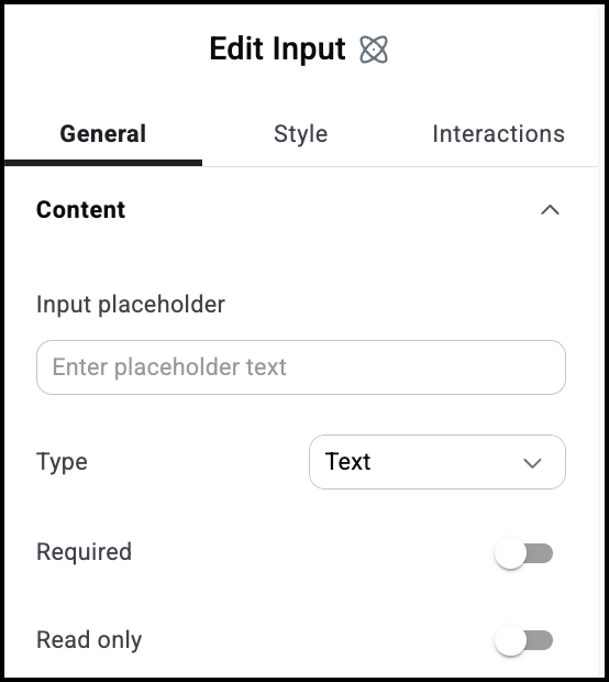
Input placeholder
The text that appears in the unput box by default.
Type
Set the type of information visitors can enter in the field:
- Text
- Number
- Tel: Telephone number
- Password: Input is hidden
Required
Use the toggle to mark this as a required field. If visitors don’t fill in this field, they won’t be able to submit their form.
Read only
Use the toggle to mark this as a Read only field. Visitors won’t be able to fill in this field.
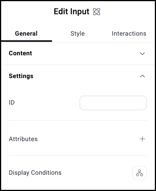
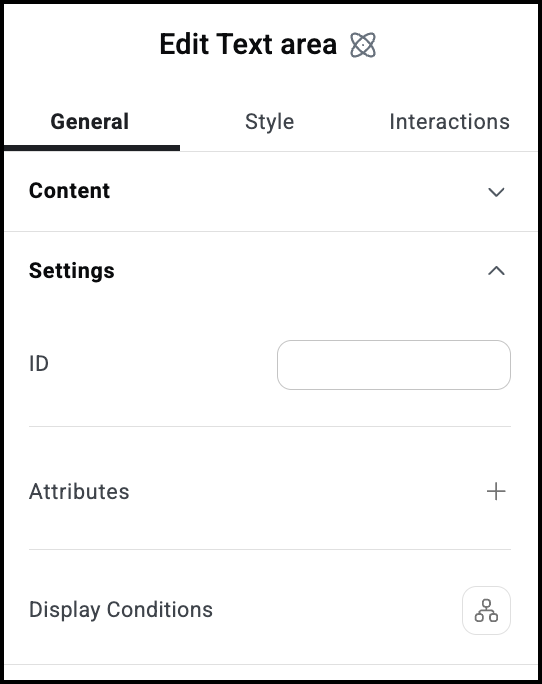
ID
Allows you to tag individual elements on a page. This way you can link to this specific element.
Attributes
Attributes are used by developers to target certain elements in order to customize them. For details, see Add and delete attributes.
Display Conditions
Show or hide elements depending on different conditions. For details, see Show and hide elements on a page.
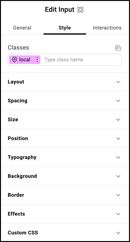
Style options
See the individual articles on Style options:
Settings for the Label atom
The Label atom is a text atom that is generally used to describe input fields.
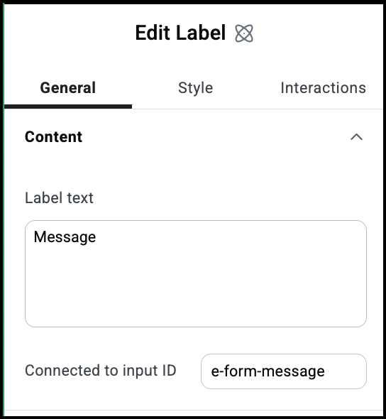
Label text
The text of your label.
Connected to input ID
Labels are generally used to describe an input field. This is the the input field associated with the label.
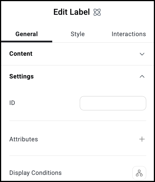
ID
Allows you to tag individual elements on a page. This way you can link to this specific element.
Attributes
Attributes are used by developers to target certain elements in order to customize them. For details, see Add and delete attributes.
Display Conditions
Show or hide elements depending on different conditions. For details, see Show and hide elements on a page.
Style options
See the individual articles on Style options:
Settings for the Text area atom
The Text area atom is a text atom that is generally used to describe an input field designed for longer text.
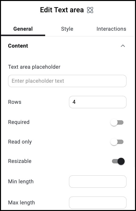
Text area placeholder
The text that appears by default in the text box.
Rows
Determines the height of the text box.
Required
Use the toggle to mark this as a required field. If visitors don’t fill in this field, they won’t be able to submit their form.
Read only
Use the toggle to mark this as a Read only field. Visitors won’t be able to fill in this field.
Resizable
Toggle on to allow visitors to expand the text box by dragging the right corner of the box.
Min legnth
The smallest number of characters a user must enter into the text box in order to submit the form.
Max length
The largest number of characters a visitor can enter into the text box.
ID
Allows you to tag individual elements on a page. This way you can link to this specific element.
Attributes
Attributes are used by developers to target certain elements in order to customize them. For details, see Add and delete attributes.
Display Conditions
Show or hide elements depending on different conditions. For details, see Show and hide elements on a page.
Style options
See the individual articles on Style options:
Settings for the Submit button atom
The Submit Button atom sets the text, look and feel of the button used to send and/or store the form information.
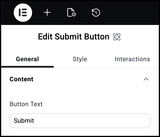
Button text
The text that appears on the Submit button.
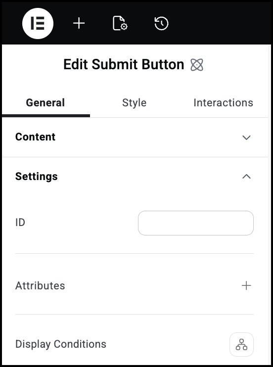
ID
Allows you to tag individual elements on a page. This way you can link to this specific element.
Attributes
Attributes are used by developers to target certain elements in order to customize them. For details, see Add and delete attributes.
Display Conditions
Show or hide elements depending on different conditions. For details, see Show and hide elements on a page.
Style options
See the individual articles on Style options:
Settings for the Checkbox atom
The Checkbox atom is used when visitors need to submit Yes or No type information.
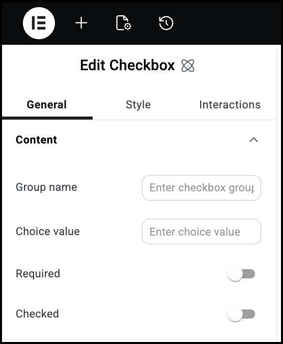
Group name
You can group multiple checkboxes as a set.
Choice value
Choice value is used when you want the submission text to differ from the checkbox label. For instance, if you had a checkbox labelled Color 1, but you want is to appear as Red in the submission, you could label the checkbox as Color 1 and enter Red as the Choice value.
Required
Use the toggle to mark this as a required field. If visitors don’t fill in this field, they won’t be able to submit their form.
Checked
Use this toggle if you want the box to be checked by default.
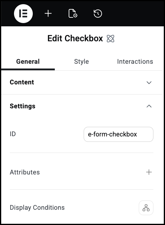
ID
Allows you to tag individual elements on a page. This way you can link to this specific element.
Attributes
Attributes are used by developers to target certain elements in order to customize them. For details, see Add and delete attributes.
Display Conditions
Show or hide elements depending on different conditions. For details, see Show and hide elements on a page.

Style options
See the individual articles on Style options:

