Table of Contents
Branding isn’t just something that comes about based on a person’s individual design tastes or preferences. There’s a lot of research and thought that goes into the development of one’s visual branding.
When we develop a brand’s visual style, there are a number of components to sort out — like logos, color schemes, and typography. Imagery is also an important matter to hash out as it will affect everything from the kinds of images used on the website to the graphics that go in the company’s newsletter, blog, and social media posts.
But how do you decide which type of imagery fits the brand best — photos and videos vs. illustrations?
Today, we’re going to zero in on the imagery component of branding and, specifically, why and when you might choose to use illustrations. We’ll examine the benefits of using illustration in web design as well as different kinds of illustration styles you can use.
Table of Contents
Why Should You Use Illustrations in Web Design?
While it might be tempting to relegate illustrations to the background of an otherwise visually uninteresting space, they can serve a greater and more versatile purpose in web design. Let’s look at some of the reasons why and motivations for choosing illustrations over other types of imagery:
Convey Tone and Style
Visuals in general can communicate a lot about a brand’s style to users. There are some limitations to how much can be communicated through a static photograph or a short video clip though.
With illustrations, you can be more overt with your style and tone — sometimes in an exaggerated way — than you can be with real-world imagery. Take the home page for Sour Patch Kids, for example:
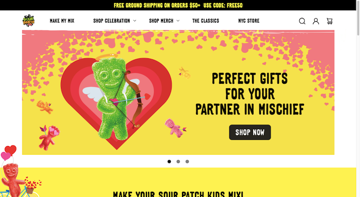
The candy “kids” on their own seem cute and fun. However, a photo of what the actual gummies look like won’t convey the tone and message the brand is trying to share. The illustrations on this site (and in their cheeky marketing campaigns) do.
The illustrations in this design place the kids in different scenarios — riding a bike, getting hit by Cupid’s arrow, and popping up around every corner. This demonstrates the playful and oftentimes mischievous side of the brand.
Depending on the type of illustrations you use, they might add extra context about your brand or frame individual components on your site in a more accurate light. They don’t always have to be used in a lighthearted fashion though. Illustrations can also add mystery and depth to a design.
Stand Out with Unique Creations
Even if you don’t do your own illustrations from scratch, there’s something about them that can feel more creative than photos or videos of people, landscapes, and products. There are different kinds of creativity that can be conveyed through illustration, too.
For instance, a design that uses flat, geometric shapes and lines might work well for companies in the science, mathematics, and technology fields. That kind of logical and structured design is a type of creativity just as much as a work of art is.
Just look at a website of an illustration agency like Inky and you’ll see the kinds of diverse creations you can come up with using illustrations:
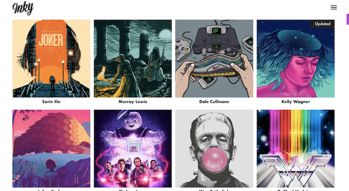
Illustrations — regardless of their style or how extensively they’re used in a design — can elevate the look of your digital product. They also enable designers to experiment with characters, objects, and landscapes that don’t exist in this world.
Add a Recognizable Brand Mascot to the UI
Digital brands as well as ones with physical establishments may want to use a mascot instead of just a logo to represent them across all their marketing and sales channels. This is only something you can do with illustrations.
There are a couple of ways to use a mascot on a website. One way is to create a caricature (like the Sour Patch Kids) that follows the visitor on their journey around the site. Another way is to take the pictorial mark from the logo — or an offshoot of it — and use it in your designs, photos, and pages like a watermark.
We see this latter type on the Olive Garden website:
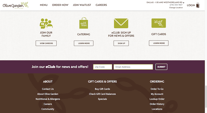
The olive branch pictorial mark appears very subtly throughout the design. We see three instances of it in the screenshot:
- On the Olive Garden bag above “Catering”
- On the card above “Gift Cards”
- As the textured background in the footer
It’s also used as a placeholder when images haven’t fully loaded into the website menu:
This is a great example of how to make your illustrated “mascot” follow visitors around — either guiding them to key areas of the page or simply being there to reinforce the branding.
Create Digital Worlds Your Visitors Have Never Seen Before
There’s not a whole lot of world-building you can do when you’re designing solely with photographs. There’s nothing wrong with that if your website imagery is meant to complement your content.
That said, if you want to tell a story and create a world of your own through visuals, illustrations are the way to go. Your digital world doesn’t even need to be fully immersive or otherworldly. Illustrations can depict a world similar to ours, only digitized.
Yoast’s home page does a good job of striking a balance between the two:
Search engine optimization is not an easy topic to visualize. Yoast could’ve designed its site with a bunch of screenshots of its WordPress plugin. Instead, it’s used illustrations to paint an abstract portrait of what it’s like to win at the SEO game.
Bring Complex Concepts or Lengthy Stories to Life
Illustrations are also valuable when it comes time to explain something complex to website visitors — like the general brand concept, its history, the steps involved in a process, relevant data, and so on. This can all be broken down through text, but it’s going to be much easier for visitors to digest the information through visuals.
One way we see illustrations used for this is in explainer animations or videos. Like this one on the Relish home page:
While the concept of relationship coaching isn’t too hard to grasp, the short and easy-to-follow video quickly summarizes the users’ pain and the app solution.
Illustrations can also be used to create data visualizations, step-by-step graphics, timelines, and more. If you or your clients are struggling to communicate an idea or tell a story through just text or photos, illustrations may be just what you need to save the day.
How To Use Illustrations in Web Design: Step-by-Step Guide
There are certain things to do before you start using illustrations in your designs.
Step 1: Figure Out Why
Do you have a clear understanding of why you’ve chosen to use illustrations over photos or a typography-based design? If you’re not sure, or you’re just trying to adopt a new trend, review the section above once more and make sure the illustrations serve a purpose.
Step 2: Find Your Style
There are different types of illustrations you can use on the web. We’ve already seen a few examples above, but that’s just the tip of the iceberg.
Before you move to the next section and explore different types of illustration as well as ways to use them, make sure you’ve sorted out your brand’s style and personality first. Once you know what sort of look and tone you’re going for, it’ll be easier to pair it with a style of illustration.
Step 3: Decide How Much of the Site Will Be Illustrated
A website doesn’t need to be covered in imagery — that goes for a design that uses photographs as much as it does for illustrations. That said, you should figure out how many illustrations you actually need.
For instance, do you want to create a totally immersive digital world? If so, the majority of your visuals will be illustrated. On the other hand, you might want to use illustrations sparingly if you’re using them to visually guide people through the site instead of as storytelling or world-building element.
Step 4: Build Your Illustration Toolkit
If you’re planning on designing something truly custom, you may need to hire an illustrator to help you out with that piece. However, there are lots of tools available that can help you create and add illustrations to your website on your own.
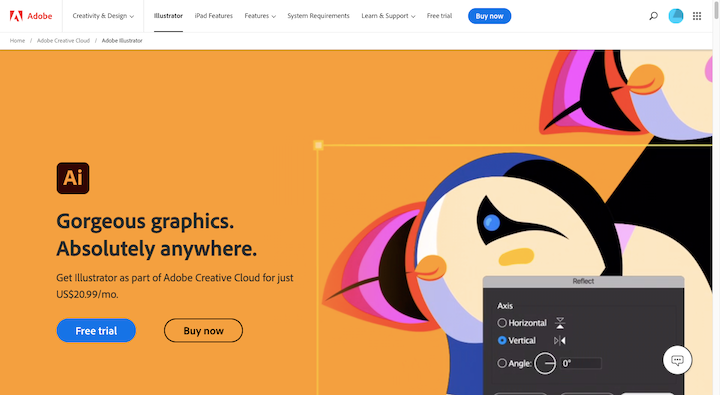
To start, you can design illustrations with software like Adobe Illustrator:
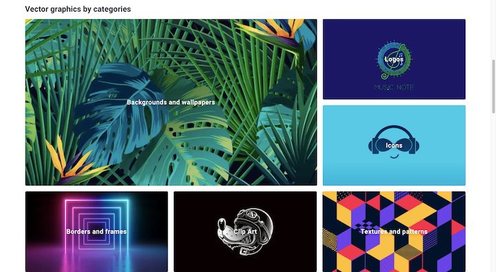
You also have the option of licensing stock vector images from a site like Shutterstock:
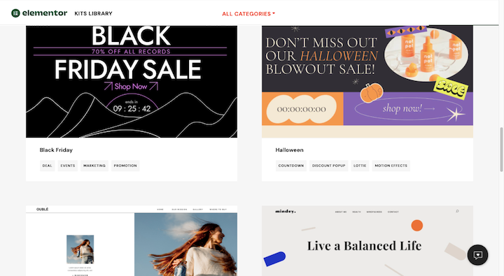
Another option is to start with an illustrated template. The Elementor Kits Library has a variety of them:
By the way, Elementor also makes it easy to integrate illustrations into your web design. When you edit a website with Elementor, you’ll have access to tools that allow you to:
- Instantly upload an illustrated template
- Embed an illustrated video or graphic
- Change the background of a section to an illustration
- Add a Lottie element
- And more
Bottom line: If you think you’ll be leaning more towards designing illustrated WordPress sites in the future, there are plenty of tools you can use to help you create beautiful illustrations, including Elementor.
16 Great Examples of Web Design Illustrations
Next, we’re going to look at 16 examples of web design illustrations (in addition to the five we previously examined). We’ve broken them up into four different types to help you find inspiration for the specific style you’re looking for:
Flat Illustrations
Flat design refers to website interfaces that are completely two-dimensional.
Flat illustrations, in particular, tend to be eye-catching, yet minimal and unassuming all at once. This means you can use flat illustrations as a complement to your content, but not overwhelm visitors with overly strong visuals. What’s more, vector illustrations always look sharp and are scalable, which is fantastic for responsive design.
Let’s look at some examples:
1. The New Yorker
This first one is from The New Yorker:
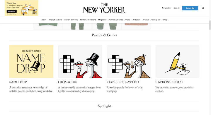
This magazine has long been known for its cartoons as well as the illustrations that accompany its articles. So it’s no surprise that the brand also has a distinguished-looking mascot named “Eustace” who appears occasionally in the digital and print versions of the magazine.
2. Copper
Another great example of a brand embracing illustrations is Copper. The CRM’s blog pairs custom-made illustrations with each post:
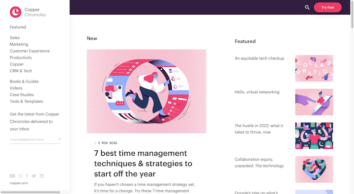
It’s clear that the featured illustrations are designed using a style guide for the blog. Pink is the dominant color in (most of) the graphics and they all use the same kind of cartoonish figures.
3. Goddard School
If you’re interested in using an illustration as the background, The Goddard Family of Schools website has a good example of how to do this right:

The colors are light enough where, at first glance, it appears that this is just a textured background. Upon closer inspection, it becomes apparent that this flat design contains icons related to childhood education, which falls right in line with the purpose of the site.
4. CrowdHealth
CrowdHealth is another brand that’s gotten flat illustrative design right:
This illustrated video does a nice job of addressing the users’ shared pain before explaining the benefits of the health insurance alternative.
Semi-flat and 3D Illustrations
One of the problems with designing an interface to be completely flat is that it can cause usability issues for some users. Without three dimensions, it can be tough to tell which parts of the website they can interact with.
In recent years, flat design 2.0 has been introduced to deal with that issue. This design trend isn’t three-dimensional the way actual 3D web design is. It’s more like a semi-flat design. So, most of the UI is flat. However, key elements appear to exist on various planes through the use of shadows, highlights, gradients, and other textures.
Both of these non-flat design techniques can be used in illustrations. Here are some examples:
5. Chuck E. Cheese
The Chuck E. Cheese website uses a combination of flat and 3D illustrations. The background and decorative elements are flat while the mouse mascot is three-dimensional:
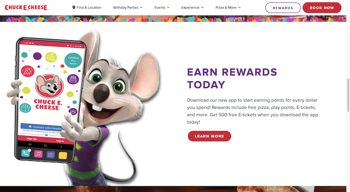
Considering the mascot has a real-life counterpart, the 3D likeness on the website works well. Plus, it makes the brand feel more lively and interactive than a flat rendering of the mouse would be.
6. 23 and Me
23 and Me uses illustrations to highlight the features of its software:
The content on the phone screen is what 23 and Me users will see when they use the app. However, the designer has added flat illustrations that appear to pop out from the screen to emphasize the value of the genetic testing service.
7. Compose.ly
Compose.ly is another company that uses illustrations to visually explain the benefits of a digital product:
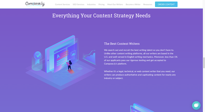
This design, however, doesn’t rely on motion to convey space. Instead, the design places planes at 90-degree angles to one another. Shading is also used to give the illusion that there’s a light source above them the people in the graphics.
8. Barkbox
Barkbox has a good example of a subtle semi-flat design:
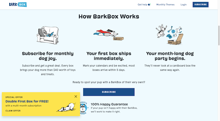
The dog mascots that follow customers from the website to the physical box they receive each month are flat illustrations. However, there’s a textured surface scratched out beneath them to give them the sense of not being three-dimensional.
Interactive Illustrations
If you want to make a website feel more alive, 3D illustration is certainly one way of going about it. Depending on your skill level with illustration or the design budget you’re working with, you might want to take it a step further and animate your illustrations.
If you go this route, you can create a number of things:
- Interactive hero sections
- Individual Lottie animations
- Full explainer videos
We’ve already seen some examples of interactive illustrations. Let’s take a look at some more:
9. Updata One
Updata One is a business intelligence community. As the homepage says “We make sense of information”. That’s not necessarily the easiest idea to capture with photographs or videos — at least not in a visually interesting way.
That’s why these abstract illustrated animations work so well:
While the content revolves around the illustrations, they serve more like a navigational element, compelling visitors to keep scrolling to discover more.
10. BetterUp
More and more, we’re seeing companies skip the downloadable PDF report formats for digital ones. Or they do as BetterUp has done here and provide a digital summary page that teases the full report:
One of the benefits of creating a landing page like this is you get to use animated illustrations to create unique data visualizations.
11. Recurrency
Recurrency is a good example of how to skip the explainer video and instead create a more succinct description of what you do:
In this hero image, we see a general overview of how the one-click AI-powered distribution process works. It takes the technology out of the equation and simplifies it in visual terms that visitors will understand.
12. MeanPug Digital Agency
One last interactive illustration example we should look at is on the MeanPug Digital Agency website:
The hero image has a very basic design. Rather than bog it down with photography, the designer’s chosen to keep the simple vibe going. A number of Lotties appear on the screen before disappearing, which adds a fun, creative touch without feeling over-the-top.
There’s nothing complex about adding Lottie animations to a website, by the way. Elementor has a dedicated Lottie widget to help you out.
Hand-drawn Illustrations
If you’re an illustrator or want to try your hand at creating your own for an upcoming website, there are so many avenues you can go with it. Line drawings. Sketches. Caricatures. The below examples will show you what some of the possibilities are:
13. Marlow
Marlow is a company that makes pillows. While visitors will find real photos of their pillows on the site, they’ll also occasionally stumble upon these sleepy illustrations:
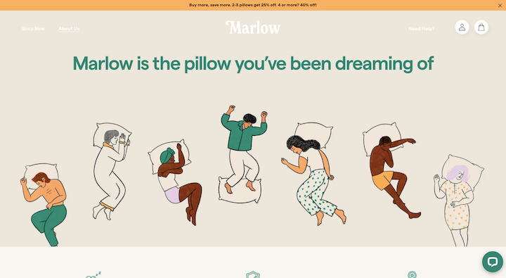
The graphic might not seem particularly meaningful at first glance. However, these sketches remind me of that meme you see on social media making fun of people’s sleep positions. Essentially, these illustrations suggest to visitors that anyone — side sleepers, back sleepers, abnormal sleepers — will love these pillows.
14. Misfits Market
Misfits Market is another one that uses an illustration that might not look like it means much at first, but is actually telling visitors a lot about the brand:
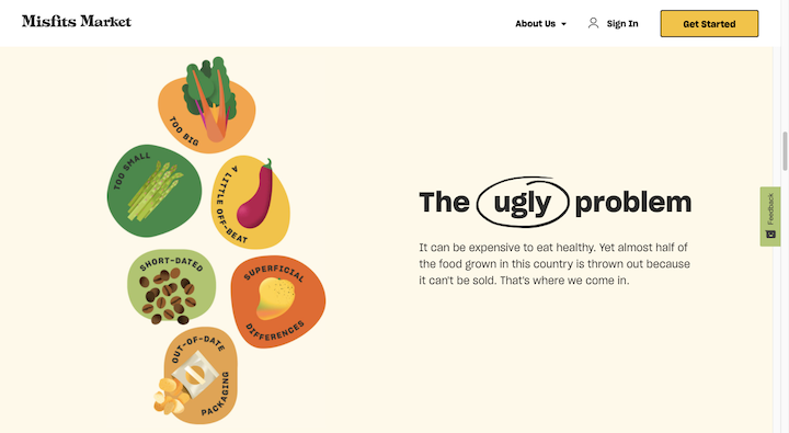
Misfits Market is a company that sells boxes of produce. In order to sell them for so cheap, they sell misshapen or ugly produce that would otherwise get unpicked and thrown at. If you look closely at the raw and imperfect details of the illustrations on the left and the sloppy circle on the right, the illustrations are symbolic of the brand’s offering.
15. Airbnb
Most people these days know Airbnb. They also know that the company sells real-world rentals and experiences, which is why the website is generally full of photos. However, there’s an “Inspiration for your next trip” section on the home page that breaks from the mold:
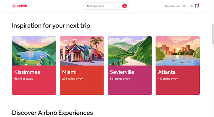
Perhaps because it’s providing trip inspiration that the designer felt an illustrated version of these top locales worked well. It makes sense. They look like the most idyllic version of each of the destinations.
16. Cleo
The website for money app Cleo feels like you’re walking through a trippy cartoon from the 90s:
Everything feels so outlandish, but that’s part of the brand’s charm. The app’s conversational UI curses at users and roasts them just as much as it hypes them up. There’s no way a website with photos or videos could accurately convey what users will encounter when they step inside the app.
Make Your Website Stand Out With Illustrations
When you create branding and a website for a new client, one of the first things to consider is what style of graphics you will use. Photos and other realistic imagery? Or illustrations?
Photos and videos are common these days, which is one reason why illustrations in web design often stand out. But that’s not all. Illustrations can be very effective storytelling and world-building tools, too.
Whether you’re about to start on a new website for a client, or dying to redesign a website in need of a makeover, it may be time to experiment with illustrations.
Looking for fresh content?
By entering your email, you agree to receive Elementor emails, including marketing emails,
and agree to our Terms & Conditions and Privacy Policy.
