Table of Contents
This week, we examine several ways to use design elements to tell a story, directing the viewer to the main message of your webpage.
We love storytelling and not just on the receiving end. Publicists, promoters, politicians and pedlars, anyone selling an idea, product or service, relies on the human need and love of story.
What is Story?
Story or narrative is defined as “a spoken or written account of connected events.” But we know that stories are not limited to speech and text. Moreover, stories can be told with the aid of visual elements, just as easily and successfully. From prehistoric cave paintings to Pixar’s Wall-E (2008), human minds have been scanning groups of visual elements (in close proximity) to deduce a logical connecting pattern. This pattern, linear or not, is the narrative.
The question is how, as authors or designers, do we ensure that all our audience members understand the story the way we intended?
The easiest way for the human mind to understand a pattern, is by comparing new information to known patterns. Relying on a well-known and elementary structure of story makes it easier for the audience to focus on the content itself, saving the audience time, confusion, and possibly frustration.
What Is Efficient Story Structure?
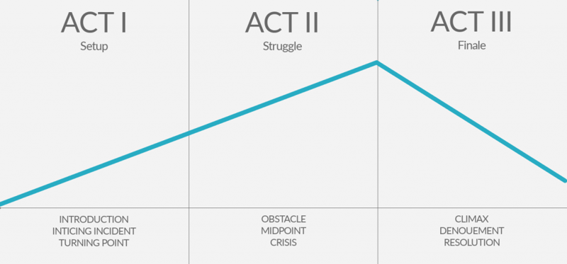
If we want to tell our story efficiently and convey our message swiftly and directly, we must rely on well-established story structures, those first discussed by. Those structures were first discussed by Aristotle who explained that all narrative has three main parts or ‘acts’:
Act 1
The audience is exposed to the characters, their relationships and their setting (the environment they live in). Here we also have an “inciting incident”, a call-to-action, a reason or catalyst that motivates the main character/protagonist to move forward with a series of events.
Act 2
The momentum of the events rises, as the outcome of actions becomes progressively worse, solving the main problem, caused by the inciting incident becomes more desperate.
Act 3
An action or choice results in a resolution of all most or all of the main problems.
Two and a half millennia past, and the theory behind story has made some wonderful developments. But whether you subscribe to Robert McKee’s famous story seminars, Christopher Booker’s The Seven Basic Plots, or Melanie Anne Phillips’ more recent Dramatica, the basic principles haven’t changed whether we’re using words or pictures.
Spoken or written stories rely on grammar and words found in dictionaries and thesauruses. In comparison, the basic materials and tools we could use to create a story in pictures seem meager and limited.
…or is it?
What Is Story in Web Design?
When telling a story using web design elements, we shouldn’t forget that we can still rely on the principles of non-web design:
- Color
- Line
- Shape
- Values of light (and darkness)
- Form
- Composition
- Perspective
- Space
- Texture
All elements and principles that designers or consumers of design are well aware of. Elements that, when applied to a hyper-digital environment, gain a whole new dimension.
You could suggest that turning the leaf of a page is equal to scrolling down a page, in terms of viewer engagement. But unlike page turning, the actions of scrolling and clicking animate motionless design elements.
Therefore when creating a visual narrative on web pages, we have far more design principles to consider:
Animation
Take all the principles and elements of non-web design that were once fixed in value and location, and let them loose; Blend from one color to another, brighten and cast shadows, shift position and point-of-view, shrink or expand in size, morph from one shape and to another.
Beyond the boundaries physical materials, outside the box you are only limited by your imagination and ingenuity (and your clients’ brief, if we’re honest).
Functionality
All the activity within the design action can be set as a reaction to a user’s action; scrolling could trigger transitions, hovering could highlight an element.
Embedded Elements
Enabling use to create a medley of different mediums, combining video and audio. Directing users to click on hyperlinks create further engagement. And it shouldn’t be news to you that these also drive up your SEO.
Needless to say, without story structure these elements amount to nothing more than cool decoration. But how are we to know whether a story exists among the visual elements or not?
We already pointed out that story is the connecting pattern created in the audience’s mind. Storytelling, however, means that the pattern is predetermined by an author or a designer in our case.
To help discern whether or not a designer is indeed telling us a story through their choices of composition and color on their web page, we have some basic criteria to follow:
Message
The main idea that the website is trying to convey to the visitor. Or, to borrow storytelling lingo ‘the moral of the story’.
Emotion
The emotion or feeling that is used as a vehicle to convey the message to the audience (happiness, fear, nostalgia etc.). It is a feeling that the design awakens in the viewer by using certain conventions of composition and color, and deliberately pulling at those strings, to invoke a particular feeling in us, to affect the way we perceive and interpret the information that the site is presenting. All this is to drive the viewer, to convince them to eventually commit to an action.
Characters
These are the main figures, the stars of the story on the web page. Chief among them is the hero, who in many cases is, in fact, the viewer.
Opening Scene
This is our Act One, the exposition where we establish the setting the tone, presenting a problem (inciting incident), or perhaps a solution to a known problem. All this helps to pull the audience in, and entices them to stay, to continue reading and engaging.
It should have a hook, that also hints of what is to come in the following sections.
Story Development
This our Act Two , where on our story develops, by expanding upon our opening scene.
Call to Action
The point to where the story leads the user; the moment when the situation in the story has left the viewer no choice but to take action and create the solution and resolution to the situation. In short, Act Three.
Examples of Storytelling Through Design
The following examples were chosen, not just for their interesting use of design elements, but also for the way in which the design drew the viewer to action, on its own merits.

This website is a website for Camp Natkam, a youth camp in northern Spain.
Even without understanding the text, written in Catalan, in the opening scene we sense a clear and specific emotion. This site is related to something playfully youthful, happy, sporty, energetic and fun. The splashes and scribbles of color give us that feeling that kids could have contributed to this design, and they were having so much fun doing it. Notice the recurring colors, like the teal, or turquoise and the orange or terracotta that create a sort of motief that teases to follow it down the page and join the fun.
The characters of this particular story are of course the children, who have had a wonderful time, as well as those who are promised this wonderful experience in the future.
There may also be elements of nostalgia for the adult visitors revisiting memories of themselves when they were younger and going to a summer camp. Perhaps then hoping that their children will enjoy a similarly wonderful experience here.
The overall message in this site’s story is this: if there is one place that can almost guarantee the wonderful experiences of nature, activities, and friendship — that place is Camp Natkam. Finally, we find the call to action: an invitation to join the camp …and perhaps live happily ever after.
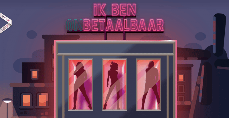
This site was created by Exxpose, a nonprofit organization dedicated to fighting human trafficking. You may recognize this site, and the previous example, as they have both being created using Elementor (both sites have also appeared in our monthly Showcase in the past).
At the top of the page, we have our opening scene (known in movies as the establishing shot). The feeling, or emotion, is that something here is sinister, seedy and shady. Here there’s a dark Amsterdam skyline and in the foreground a facade of a building familiar to the red light district. Scrolling down we discover that the facade is, in fact, a vending machine, using the same symbolic colors, selling something as ‘priceless’ a human being, as a cheap commodity. This is Act one. We have a setting, a situation, and a problem.
And suddenly there’s action. We’re now in the second part of our story ark. This printout receipt appears. It’s clearly printed on used crumpled paper. The receipt documents the outcome of purchasing sexual services, the reality of people forced to work in the industry, and what these people, mostly women, suffer as a result. Things are going from bad to worse, and continue that way in a snowball effect.
Suddenly, in Act three, there is hope. The receipt is shredded, thrown away and turned into money that helps these victims rather than continues to fund immoral activities. Still, we’re drawn downwards as, as we find out how we can help the victims and stop human trafficking, making it illegal and putting tax money to good use. We learn how we can take action now, to make this happen: -share the video, donate or follow the site. This is the end of the second act and the beginning of the third. It’s the cusp of the last part of the story ark. Notice that the tone has slowly turned from dark to light. There is hope. There is a solution. If we take action, the right action, this story will have a good or happy ending.
The characters of this story are clearly the people who are being forced into the industry. There’s powerful use of emotion that makes us feel that having been made aware of these facts, we too are part of this story. Here the viewer is the classic hero on the journey, and having witnessed this terrible injustice throughout Act 2, knowing that there is a solution at the beginning of Act 3, this is what the designer has led us up to and where they leave us.
At the place where we must decide if we are going to take action and save the day.
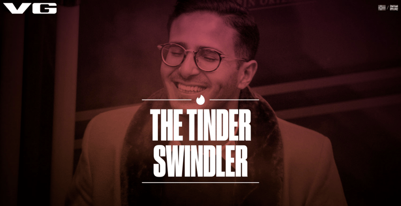
What we have here is an actual story, a true and troubling story, told through great use of mechanics of the design elements themselves. It is the story of the investigation of the Tinder Swindler, an unscrupulous man who has seduced and swindled young women out of millions.
The format is episodical. You might see the parts as chapters in a book, or episodes of a TV series. In Act 1 we have the setting, the storyteller introduces us to the Tinder Swindler, a catchy nickname for the criminal. We’re also introduced to Cecilie, one of his victims.
The emotion is the same form of suspense we are familiar with from TV crime drama or documentaries. At the beginning of the story, things are good. Then things become bad real fast, and throughout Act 2 they get progressively worse.
Each of these episodes, clever use of a series of video clips and animated gifs, draws us in and hooks us very quickly.
By the end of Act 2 we’re dying to know – does this guy get captured, is there going to be a happy ending?
The message here is clear: to generate awareness of the Tinder Swindler and his crimes.
The call to action, which is less direct, asks that visitors keep their eyes open for this criminal, who is still at large somewhere in the world.
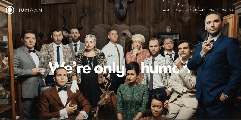
The Opening scene on this agency’s welcome page is very stylized and very dramatic, probably drawing on our experience of Agatha Christie murder-mysteries, creating a similar emotion.
We’re drawn to the attributes, the odd accessories, that each character has. There is clear mental engagement. We’re trying to solve a puzzle.
It gives us the impression that this agency has a unique style, and that they’re adventurous and avant-garde. This alone gets the intrigued visitor to continue scrolling down,
where we’ll find a series of portraits. Some are stills some animated. But each one is an essay about the person in the portrait. They give us an idea of their sense of humor, what styles they like. Some are more eccentric than others. We continue to get a peek into what life is like at this office. We learn the in-jokes and catch up with the cool stuff that goes on throughout the day.
This is something that a TV sit-com does very well. It establishes the fact that there is great chemistry among a colorful group of people and have shared some intimate details about their inner circle, they invite you to join them and be a part of this wonderful lifestyle.
Summary
Web design is an exciting new frontier in narrative and storytelling. It will, in fact, become more so as design and visual innovations continue to create more possibilities.
There are probably as many ways to tell a story as there are story types. Regardless, if a story is to be told in a clear way, if it is to achieve a specific experience and lead to a specific action we must rely on the basics that are the common denominators of story and have existed as such since the dawn of time.
There are many great examples of storytelling through design out there. Choosing these examples was an arduous process. If you can think of other great examples, please share them in the comments. Who knows where the inspiration may lead?
Looking for fresh content?
By entering your email, you agree to receive Elementor emails, including marketing emails,
and agree to our Terms & Conditions and Privacy Policy.
