We’re still settling down from the Black Friday and Cyber Monday madness, and Christmas season is already here. Before you get swept away by all the holiday commotion, let us indulge with you with our latest showcase.
This month, our list features an American seniors home website, as well as an industrial manufacturer’s site from India. We were highly impressed by how engaging such sites can turn out, even if on the surface, the subject matter is not exactly an “exciting” niche. Apart from these two, you will find design agency sites from around the globe, a talented Israeli animator, a major retail fashion brand from Singapore and more. Let’s begin.
10
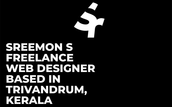
Sreemon S is a freelance Web Designer from India, with over 4 years of experience. His portfolio website is minimalistic, giving his works center stage. The Hero section is visually divided into two parts, the lower part features a background video, which merges into the shape divider below – beautiful execution.
Sreemon’s use of large-sized and bold black & white typography and large images draw the visitor’s attention to his straight-forward messaging and portfolio, achieving his main objective of attracting new clients.
09
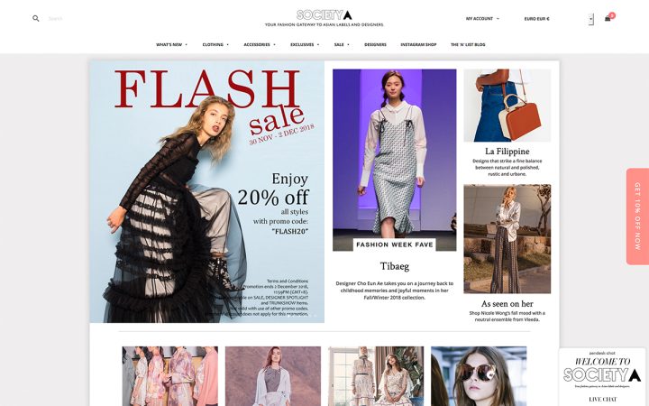
Established in 2014, SocietyA is a multi-label online and retail fashion brand that features garments, shoes, bags, and accessories for women, from leading, and up-and-coming Asian designers and labels.
SocietyA’s eCommerce website demonstrates Elementor’s capabilities for building an advanced website, loaded with content. First of all, it speeds up the development process when creating multiple pages. Second, the flawless integration between Elementor and the GeneratePress theme that the developers used enables the designers to implement Elementor widgets easily and create a seamless mobile navigation experience. These factors become even more significant when dealing with online stores. We also liked the magazine-like layout.
08
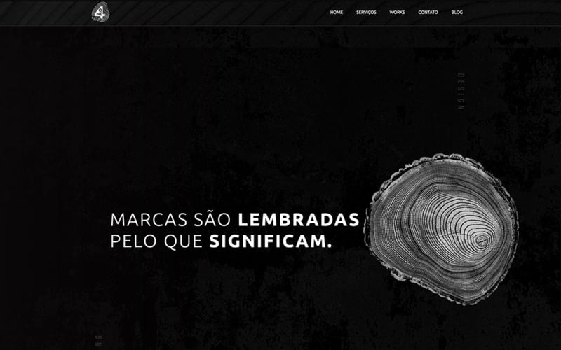
This website belongs to 4One, a branding and strategical design Studio based in Curitiba, Brazil. The designer created an eye-catching design language related to the tree trunk illustration; from the studio’s logo to icons and the background.
4One’s website may look a bit static compared to other design agency websites, as they hardly use any animated effects. However, its layout and the tree trunk based design language create a professional look and conveys thoroughness, which we truly appreciate.
07
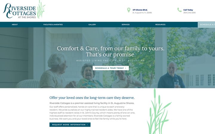
Riverside Cottages is an assisted living facility in Florida, whose vision is to break the stigma of the traditional “nursing home.” Their website has been recently redesigned with Elementor, and we liked the outcome.
It’s not an easy task, designing and building a website for elderly people (or for their kids who would be the ones doing the research). However, the designer managed to build a clean and professional looking site, and incorporated the right messaging and images, addressing potential residents. The menu and the testimonials really stand out, thanks to their size. The color scheme that is based on shades of greens, alongside Cattail silhouettes, produces a soothing and welcoming look & feel, reinforced by images of content residents and caring staff members.
06
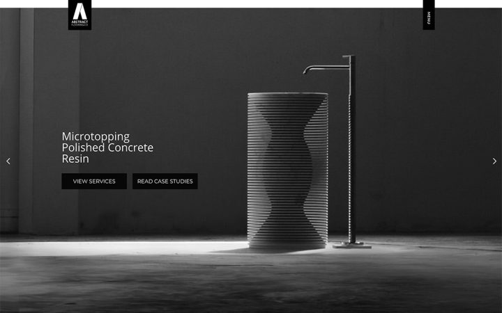
The International company Abstract Flooring Co provides various concrete flooring solutions and works with an array of architects, interior designers & everyday clients. Recently they opened their Australian branch after 40 years of activity in the UK.
The Australian website that they launched is clean, minimalistic, and functional. The designer placed the focus on the company’s portfolio, as reflected in the Hero Section, which displays different works, as well as the captivating flipping Call-to-Action buttons. The only section with a different color from the rest of the page is the testimonials section, which is highlighted in green.
05
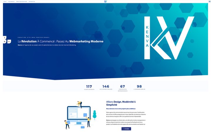
Kenva is a French agency specializing in website creation & marketing. Their site demonstrates a stylish use of animations: The Hero section features an animated particle effect, in addition to the animated logo. Scrolling down triggers entrance animation for texts and illustrations, as well as subtle parallax effects.
The services pages maintain a similar layout, presenting the agency’s workflow in stages, again using entrance animation and animated headlines. We loved the result – a very dynamic, yet elegant design.
04
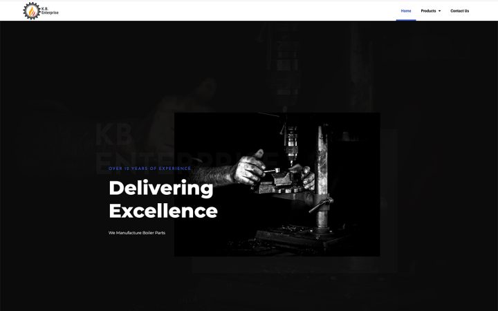
Boiler parts are probably not the most riveting topic for most of us. But the people behind K.B. Enterprise, a leading Indian manufacturer and supplier of boiler components, created an appealing website, and convinced us that boiler parts actually can be interesting!
The right combination of high definition images and messaging, both on the homepage and product pages, and the tasteful font pairing, created a successful modern-looking corporate website.
03
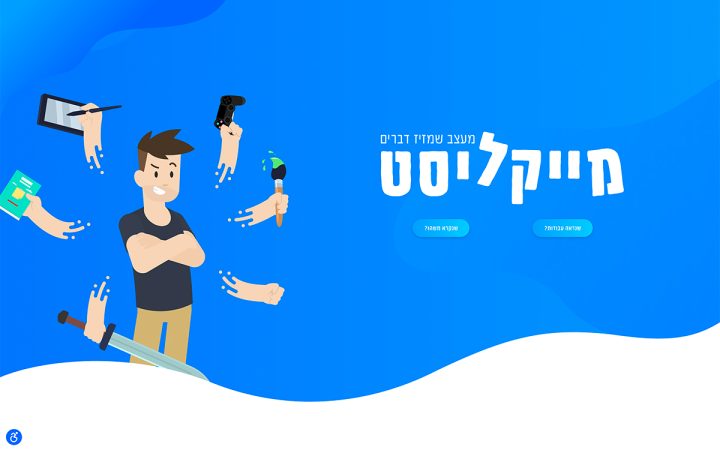
Michael Farber is a talented Israeli self-taught designer and animator. He created a website that functions as a showcase of his skills, as well as his personal blog.
Michael’s animation and illustration skills are evident. He crafted great illustrations from scratch and incorporated Elementor’s entrance animation and wavy shape dividers. Add to this his funny microcopy and the result is a unique, refreshing and lively website.
02
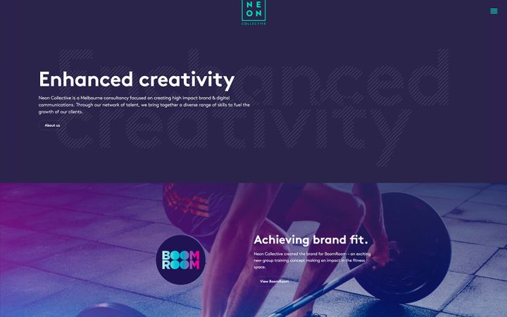
Neon Collective is a Melbourne consultancy focused on creating high impact brand & digital communications. Neon’s website is simply structured and functional while maintaining consistency in its inner pages: A clean violet hued Hero Section displays the page title and a marketing message below using large typography.
The white section underneath contains details regarding the agency workflow and services, accompanied by matching icons. All the pages also wrap up with a Call-to-Action button. What is most striking is the color palette, which is comprised of purple, green, and white, visible throughout the pages, including all of the images; those in the case study pages.
01
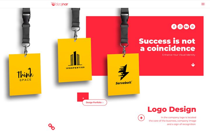
A design studio from Serbia, Dizajnar provides a complete solution for creating a brand identity: logo design, website design, corporate identity, and more. Their homepage captures the visitor’s attention right from the start, using stunning entrance animations, together with the layer effect created with the z-index, and floating elements. The main elements are centralized and the colors are saturated, resembling the CMYK color model from the print world.
The homepage sections are separated with dotted Divider widgets in a broken grid style, giving the page a very modern “asymmetrical” look. A sliding sidebar menu as well as a floating menu, complement the dynamic animated design.
Think your Elementor-based website or landing page should be featured in our next Top 10 Websites column? Give it a shot!
