Greetings, Elementors! As with every month, we’re thrilled to present to you our showcase, consisting of 10 websites created by Elementor users around the globe. And this time, the list includes a wedding photographer, premium chocolate brand, iOS application that helps babies sleep better, famous fruit brand from North America, and more.
Let’s kick it off.
10
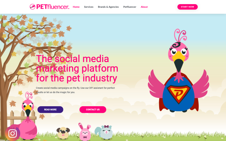
Founded in 2018, the German-based Petfluencer is a digital agency for professional influencer marketing in the pet industry ecosystem. Petfluencer maintains an extensive database of petfluencers and matches companies, manufacturers and agencies with petfluencers via its platform in order to match them with suitable data, create and implement social media campaigns.
The key figure — the store’s presenter — is a cute pink flamingo. Throughout the site, you can see illustrations of this amusing flamingo in different positions corresponding to different texts. The color of the site is, appropriately, pink with light touches of complementing purple. Since the company deals with a specific niche of animal lovers, it would be easy to make them connect to these playful and childlike illustrations. There’s a contrast between the texts and illustrations but this is ultimately how the magic is created. This lighthearted attitude can also be seen in the staff photos, which also display a personal side, helping the target audience connect and listen.
Design & Development: Thomas Poschen
Theme: Hello
Plugins: Advanced Custom Fields, Essential Addons Pro, Happy Addons, Gravity Forms, Translate Press, Updraft Plus, Yoast
09
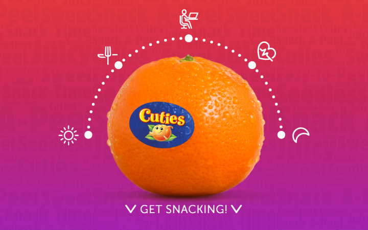
Cuties is a famous original mandarin brand, marketed in North America as the ultimate power snack that rises above the sugary and salty snacking alternatives. Cuties have recently launched their microsite to educate consumers on how to create nutritionally balanced “customized” snacks with Cuties. This site provides Cuties-inspired healthy snacks to satisfy cravings with healthy substitutions.
The Cuties website starts off with a sort of an animated table of contents, triggered by scrolling, presenting the things we’re going to see. The first section is for the parents and explains how children can consume mandarins throughout our day. If it is in the morning for breakfast, as a snack during the day, while working or at school, before doing any activity, or even before bed. When we start scrolling down, the various sections are revealed one-by-one, according to the table of contents, and the color palette also changes according to daytime (starting with yellow and ending with blue).
The choice of a rounded Sans Serif font complements the round mandarin, the images selected for the site illustrate the part of the day the customer is at, and serve as an opening to each section, together with a title that explains how mandarins help us through that part of the day. Overall, the site is designed in a welcoming and playful, yet educating way — one that can easily be understood by children.
Design & Development: Sun Pacific
Theme: Underscores
Plugins: Yoast SEO
08
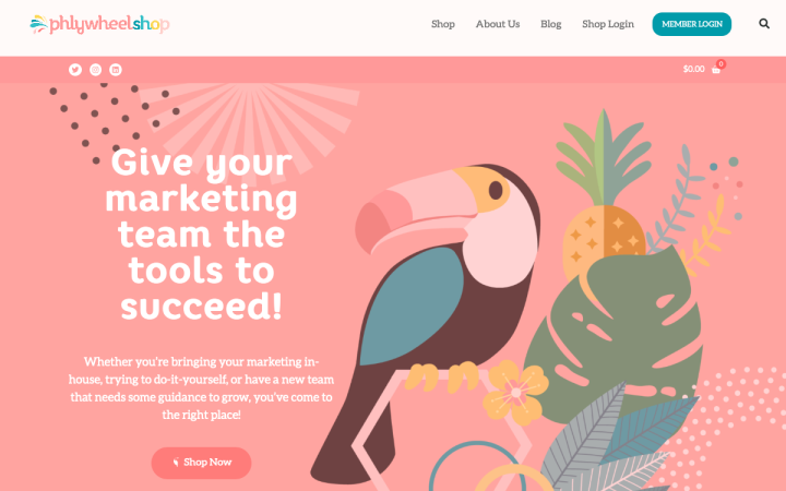
The Phlywheel shop site is part of the Phlywheel.com, a woman-founded DIY marketing platform that includes education, digital tools, consulting/coaching, and community resources to help entrepreneurs with marketing, at a fraction of agency costs.
The site is designed in a trendy pop style, with bright and cheerful colors that repeat throughout the site, whether it’s in the studio photos and the employees’ clothes, the section backgrounds, or the office’ ambiance photos. The cheerfulness continues with the choice of rounded fonts. What balances this vibe is the structured layout of the site which is very “square”. It can be seen in the images, the two-columned text blocks, and the color-stripped sections.
Design: Fernanda Sana/Tara Hunt, Truly Inc.
Development: Tara Hunt, Truly Inc.
Theme: Hello
Plugins: WooCommerce, Element Pack Pro, Elementor Addon Elements, LearnDash, LearnDash Design Upgrade Pro, LearnDash Notes,
LearnDash Visual Customizer, LearnDash WooCommerce Integration, TI WooCommerce Wishlist Premium, Yoast SEO
07
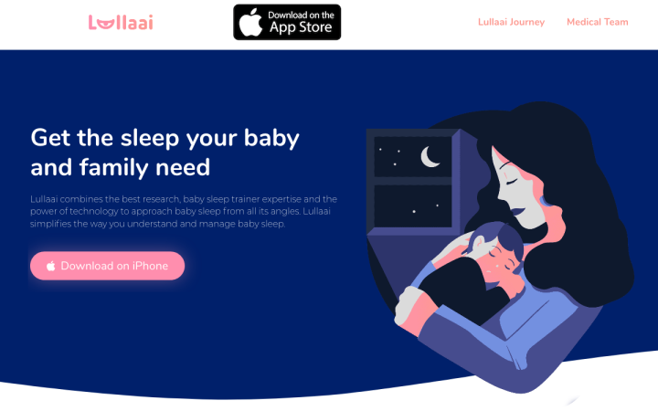
Lullaai is an iOS app that automatically tracks your baby’s sleep patterns and through artificial intelligence helps your baby sleep through the night. It was just launched in Spain and will be available in more markets soon.
At first glance, Lullaai’s site looks like another startup site. But once we delve into it for a few seconds, the unique vector illustrations catch all our attention and help us understand what this app is all about. We can see the different characters with minimalist expressions, which still manage to convey a lot of emotion. The entire site has a dark blue color that matches well with the hi-tech environment on the one hand, and the calmness that this specific app provides, on the other. Another deeper look into the illustrations reveals subtle animations that spruce them up even more.
Design: Daniel Valledor, Natalia Balska, Timur Nizov
Development: Arturo Macías – Quality Devs
Theme: OceanWP
Plugins: WPML, Yoast SEO, Social Reviews and Recommendations, Updraft, GA Google Analytics, Bodymovin for WP – Lottie Visualization Plugin
06
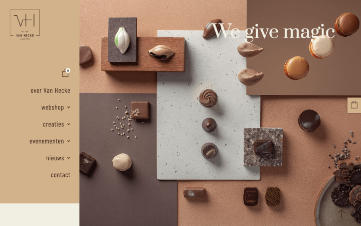
Since 1937, Chocolates Van Hecke has been an established name in the Koestraat in Ghent, Belgium. The family has been producing artisanal and high-quality chocolate creations for four generations.
When visiting their site, the impression received is of a premium chocolate brand. The brown shades blend well with the product, and the choice of a rounded serif font for the headlines is also very appropriate as chocolate pralines are usually slightly rounded with sharp corners. The use of lightweight text, as well as the thin golden frame of the photos, adds more prestige to the site.
Design: Hot Topic
Development: AppCom bvba
Theme: Hello
Plugins: WooCommerce, WooCommerce Bookings, SendCloud, Mollie
05
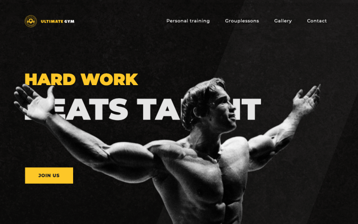
Ultimate Gym from Belgium is not only a place to train with dumbells and barbells but also someplace to have fun in a group lesson like pilates, yoga, spinning, BBB, trampoline class, or to relax in a sauna. They also offer a functional training zone, boxing zone, squash court and supplements bar.
The first image we are exposed to is of the young and muscular bodybuilder, Arnold Schwarzenegger, compellingly spreading out his hands. The contrast between the yellow and white texts with the black background and the yellow, creates a dramatic look. The site is decorated with all kinds of diagonal elements and entrance animations or motion effects, creating a dynamic look & feel, naturally associated with sports and gyms.
The hierarchy of the bold-weighted Sans-Serif font and the lightweight text body helps to illustrate the vision and goals of the gym. The choice of linear-styled icons matches perfectly with the large headlines and even replaces them in different places, creating an interesting balance on the site.
Design & Development: Nicolas Vanlerberghe
Theme: Hello
Plugins: Elementor Extras, The SEO Framework, WP Fastest Cache, Image Optimization Service by Optimole
04
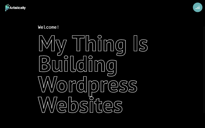
Raphael Gal builds customized, dynamic websites for artists (Producers, DJs, Painters). He adds custom post types according to their specific needs so that later they can easily update their site with new releases, galleries, etc., easily and by themselves.
Raphael designed a scrolling site with a succinct, straightforward, no BS approach that is visible in the menu’s copy and the running headlines. When scrolling down, the light “turns on” and we enter Raphael’s world. Throughout the site, there are loads of entrance and motion effects, and a play between two fonts — the Monospace font, associated with the coding world, and a modern Serif font, associated with the modern design world. This is probably because Raphael himself lives between these two worlds.
Everything is designed on a black background with slight playful movements, that can be seen in the bubbles that move from side to side, and the text that lights up in a hover mode. The color scheme is very simple — black, white and turquoise, leaving the spotlight for the texts and pictures.
Design & Development: Raphael Gal
Theme: Hello
Plugins: WP Fastest Cache, Yoast SEO
03
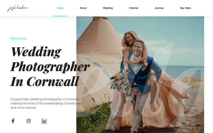
Josh Harkon is a commercial & wedding photographer from the UK, capturing weddings and commercial events for almost six years.
The site Josh has built for himself has a clean and modern design that gives the proper focus and respect to the photos taken, and these in return, create the atmosphere. The choice of the Playfair serif font for the headlines is wise, as serif fonts are associated with the wedding world (and wedding invitations in particular). It transmits formality and softness. The combination with the modern Monserrat font gives the site the contrast it needs to stay trendy and fashionable.
Design and Development: Joshua Harkon
Theme: Hello
Plugins: WP Fastest Cache, Yoast SEO
02
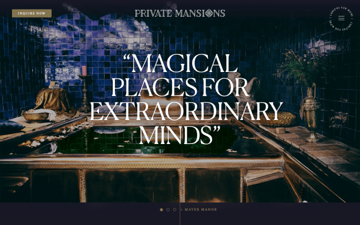
Established in 2013 in Amsterdam, Private Mansions offers a unique collection of luxurious mansions and inspirational design spaces for private hire.
Their site boasts a classic mysterious style, reminiscent of the European early 20th century bohemian lifestyle. It is evident in the serif Lydian font typical of church design, the dark and polished backgrounds and above all — the photos in which the setting is also Victorian. What’s more, these photos come to life with the use of motion effects. Nice!
Design: Kamiel van Kessel
Development: Bas van Woerkom
Theme: Hello
Plugins: Comet Cache, Disable Comments, Really Simple SSL, Redirection, SVG Support, Robin Image Optimizer
01
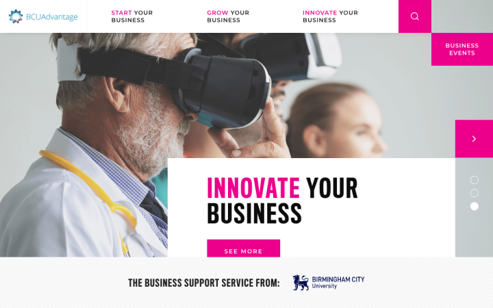
BCU Advantage is the business support service from Birmingham City University (BCU) in the UK. Their support helps entrepreneurs achieve their business goals through collaborations with BCU experts, business specialist and recruitment professionals along with partner organizations and funding bodies.
When entering the BCU website, a slideshow welcomes the visitor with pictures that describe what BCU has to offer, with a big title and a button inviting us to understand more about the various courses. Also, the main menu does not display headlines but rather engaging call-to-actions. The fun thing that happens (very satisfying for people with OCD) is the cube that initially sticks out, then fits precisely into the sticky menu upon scrolling down — great joy!
The contrast between the colors pink and black gives the impression of a serious institution (black) that is also supportive (pink). The sans serif fonts produce a very modern look & feel, and the white backgrounds with images of people or technological spaces only reinforces this look & feel. The entire site is structured using squares and boxes, and everything has a clear grid — a design suitable for a place that talks business, where everything has to be neat, clear, and in order.
Design & Development: KIJO Creative
Theme: Custom
Plugins: Activity log, Admin Menu Editor, Better Search Replace, CF Page or Post Duplicator, CPT UI, Essential Addons for Elementor, GDPR Cookie Consent, Google Analytics for WordPress by MonsterInsights, Gravity Forms, HT Mega – Absolute Addons for Elementor Page Builder, Import Eventbrite Events Pro, Insert Headers and Footers, iThemes Security Pro, Make Column Clickable Elementor, Members, Simple 301 redirects, Simple Custom CSS and JS, WP Mail SMTP, Yoast SEO, WP Rocket
Think your Elementor-based website or landing page should be featured in our next Top 10 Websites column? Give it a shot!
