2019 is here, yet we still have a small debt to you from 2018 – the December showcase, of course!
This month, our top 10 list includes a wide range of websites: a few stylish corporate sites, an Indonesian brand for Hijabs, an American adventurous photographer team, a young designer from the UK, a new boutique hotel in Tel Aviv and more. We loved the outside-the-box approach that part of the designers demonstrated. I sure hope they will encourage you to push your boundaries this year and experiment with the myriad possibilities Elementor offers.
Let’s get into it!
10
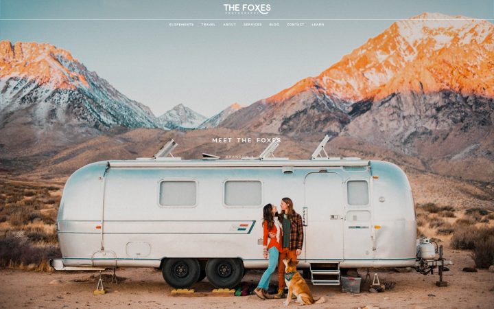
Gabi and Brandon are an elopement photographer team, have been on the road since 2014, exploring the epic spots in North America. They got their start in photography capturing rock climbing, landscapes, and other scenes from their travels, but eventually found their calling in photographing adventure elopements and small outdoor weddings.
As you would expect, Gabi and Brandon’s website features breath-taking photos taken in dramatic sceneries. The full-width hero images stretch all over the Above the fold, including the transparent header. Other beautiful photos are neatly arranged in a gallery on the About page. We also liked their minimalistic font and engaging content.
09
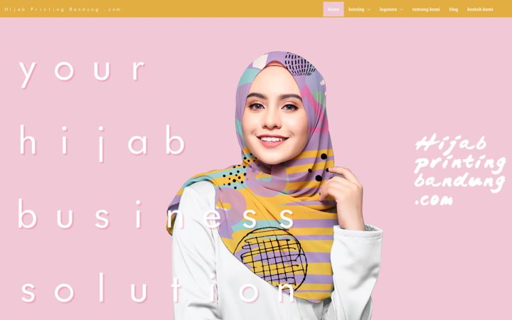
Located in Indonesia, Hijab Printing Bandung is a manufacturer of Hijabs, that also provides business partner solutions for women interested in starting their own Hijab business.
The website they recently launched captured our attention with its vibrant and unusual color scheme, perfectly matching the Hijab printing on the hero image. We like how the designer implemented our Sticky Scrolling effect on their How to Order page. Nicely executed!
08
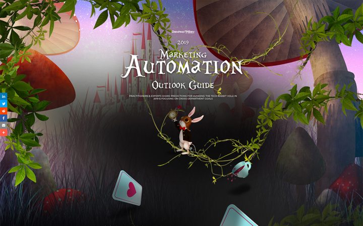
Demand Gen Report is an American online magazine for B2B marketing professionals. In the microsite they built – Marketing Automation Outlook Guide – B2B experts share their predictions for avoiding the Tech Rabbit Hole in 2019. The rabbit hole is the reason why the designer decided to create an Alice In Wonderland themed design.
This site demonstrates Elementor’s capabilities to design and create a variety of websites. The designer built the site from the ground up using a photoshop mockup and from there continued with Elementor. The use of parallax effects on the tree branches, a playing card and a tea cup, produces an animated experience as close to the original as it can get. The playful subpages, combined with a fanciful font and images, complement the fairy tale-like theme.
07
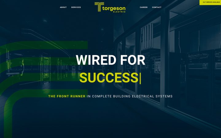
Torgeson Electric is a leading provider of complete building electrical systems, based in Topeka, Kansas, and owned by its employees. This is yet another prime example of a corporate website with a consistent layout and structure.
The electric theme is apparent on Torgesen’s site, through many design and marketing elements: The company’s logo, which incorporates electric wires shaped like the letter T, the same wire shape that appears on different pages with an entrance animation effect, the blue and yellow color scheme, and the slogan “wired for success”. The design succinctly reflects Torgesen’s brand identity.
06
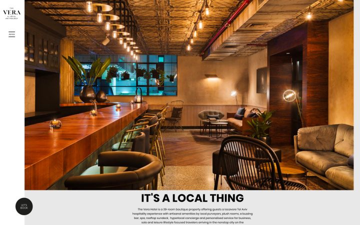
Built on the foundation of one of Tel Aviv’s most heralded streets, the Vera Hotel is a 39-room boutique hotel with artisanal products homegrown by locals – from soap and scent makers to the liquor mixed in the cocktails served at the bar.
Sleek and modern looking, their website has a simple structure without visual distractions, with large high-definition images and typography, and concise copy. Their magazine and city guide strengthen their connection to their surroundings, creating an image of the quintessential Tel-Aviv experience.
05
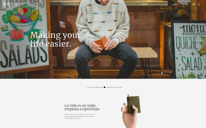
Bram is a young accessories brand based in Barcelona, manufacturing handcrafted leather wallets. Their online store – the Slim One Collection page, has an eye-catching colorful collage of wallets that are contrasted by backgrounds of rich earth tones. The mosaic tiles and wallets change every few seconds, drawing more focus to the product.
The Product page is meticulously designed, well organized and incorporates an engaging microcopy. The designer’s efforts to create a suitable design for the product are certainly visible. All in all, we get the impression that the same effort and attention to detail were put into manufacturing the wallets, as were invested in the site design.
04
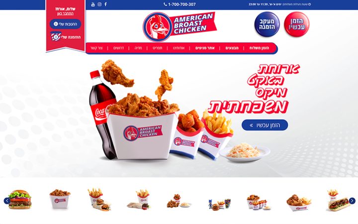
American Broast Chicken is a new snack bar in Israel, franchised by a famous American brand. The website they created for their Israeli audience boasts an abundance of design elements, images of menu items and deals. Along with the American flag colored scheme and the parallax confetti effect, visitors might feel like they landed in a 4th of July celebration.
With this vibrant and dynamic layout, the American Broast Chicken website manages to create an attractive offer to its potential customers, who are probably mostly kids, teenagers and families.
03
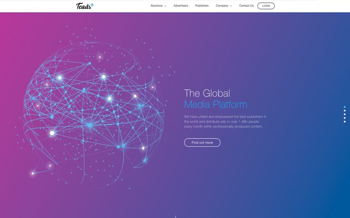
Teads is a global media platform that empowers leading publishers around the world and distribute ads to over 1.4 Billion people every month. They recently revamped their website with Elementor. We were particularly impressed with the result as it shows how Elementor can be used for building large websites with multiple pages.
The site maintains a solid, consistent and clean full-width layout, and is easy to navigate. The homepage’s Above the fold features a slider with five different background images clearly conveying the concept of a global company. This idea is reinforced with galaxy-themed background images and floating rounded elements on several pages. It’s also worth mentioning the cellular mockup animations on the inRead Format page – beautiful. This is a highly professional-looking website.
02
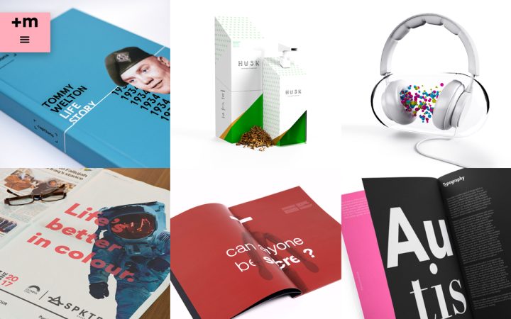
Adam Welton is a graphic designer from the UK, specializing in brand identity and campaigns. His portfolio site is super-dynamic, and even somewhat interactive – hovering on some of the elements triggers movement that merges with the general flow of the page. The use of entrance animation and parallax effects completes this dynamism.
Adam designed his website from scratch on a full-width canvas layout, leaving huge white spaces between his different accompanied by large typography and bright colors. This design puts the focus on Adam’s portfolio, which is exactly what he aimed for.
01
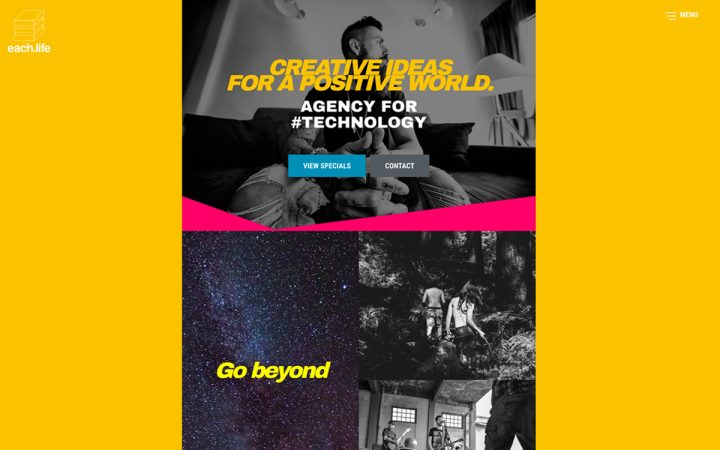
Based both in the USA and Germany, Each.life is an agency for technology, media, entertainment, and the arts.
The website they built is a great representation of the Brutalist design we recently discussed. It is hyper-vibrant, with bright saturated colors, 80’s and 90’s-themed images that change color on hover, and typography games. Some of the headlines are transparent and have graffiti-like background images. All of these elements combined together, create a visual-element-overload, and throw us back to the late decades of the 20th century. Some will appreciate the design, others will find it excessive. In any case, we loved it.
Think your Elementor-based website or landing page should be featured in our next Top 10 Websites column? Give it a shot!
