It took some of you less than a month to get the hang of our new Motion Effects feature and bring it to an impressive level worthy of our monthly showcase. We were blown away by the unique ways users from around the globe implemented the Rotate, Horizontal, Vertical & Scale Scroll, as well as the Mouse Track and 3D Tilt Mouse Rotate – they demonstrate best how a creative vision can come to life by designing original animated websites.
This month, the list includes sites from a German fan of Zine Culture, an American brand and online store for bicyclists’ accessories, a Dutch online campaign for the criminalization of prostitution, and an Israeli paintball/laser tag venue.
Let’s check them out!
10
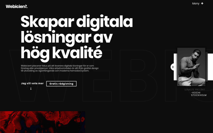
Kicking off our list is Webicient, a Stockholm-based digital web agency focusing on web development, graphic design, and SEO.
The devil is in the details, right? Webicient’s website shows how incorporating amusing small visual and textual elements gives an extra edge to a page that at first glance appears simple. To be more precise, I’m referring to the small Call-to-Action box on the right side of the Above the fold, the semi-animated icons, writing an answer upside down and floating elements in the background. The inner portfolio pages are clean and informative, providing all the necessary details and paying a proper attention to the agency’s work.
Design & Development: Webicient
Theme: OceanWP
Plugins: Elementor Slider Revolution, Yoast, W3 Total Cache
09
If you’re a design buff, you’re probably familiar with the Zine Culture trend that has made a come-back in recent years, especially thanks to social media. Shutterstock recently covered this trend extensively:
“Heavily leaning on the principles of collage, and largely influenced by the use of the photocopier (in earlier decades), zines are still loyal to paper cutouts and noise and grain textures with rough-edged layers. The style is uniquely undesigned; it is a raw look that stands out in a polished digital world.”
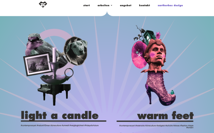
Anja Reimann, a freelance designer from Germany, is a passionate fan of Zine Culture. Her compositions tell a story using a lavish collage style. Anja’s website design has a simple structure but this fact actually lets her work speak for itself, and there’s a lot to speak about! brilliant – original, imaginative, and even hypnotizing. The hover effects completely change the colors, producing a psychedelic effect. The hourglass loader icon is a neat addition. You should check it out!
Design & Development: Zartherb
Theme: GeneratePress Pro
Plugins: Autoptimize, Duplicate Post, Dynamic Animations for Elementor, Dynamic Visibility for Elementor, Elementor Addons, Inline SVG, LoftLoader, Statcounter, Sticky Header Effects, Simple CSS, WP Scrollbar, WP Super Cache, Yoast SEO
08
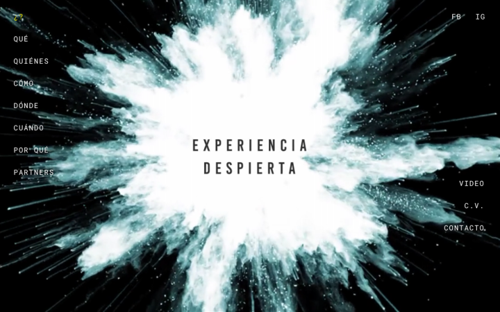
Experiencia Despierta is an organization that promotes a shift in consciousness to achieve awareness about climate change and global environmental concerns. A team of journalists, artists and communicators offer free live shows “to ignite the leap in society’s consciousness and give testimony to humanity’s journey into a new sustainability and re-generation paradigm.”
The designer of their website created a story, presenting the organization’s activity – who? what? where? when? – and then answers why. The hero section features an explosion that perhaps represents a revolutionary transformation humans need to make to save our planet. Scrolling down reveals an amoeba, which alters its shape when scrolling up or down, symbolizing thought evolution. The conspicious yellow color acts as a warning sign of the hazards that humans cause to the environment.
Design: Somos
Development: Shiny Octopus
Theme: GeneratePress
Plugins: Really Simple SSL, Simple Custom CSS and JS, SVG Support, UpdraftPlus
07
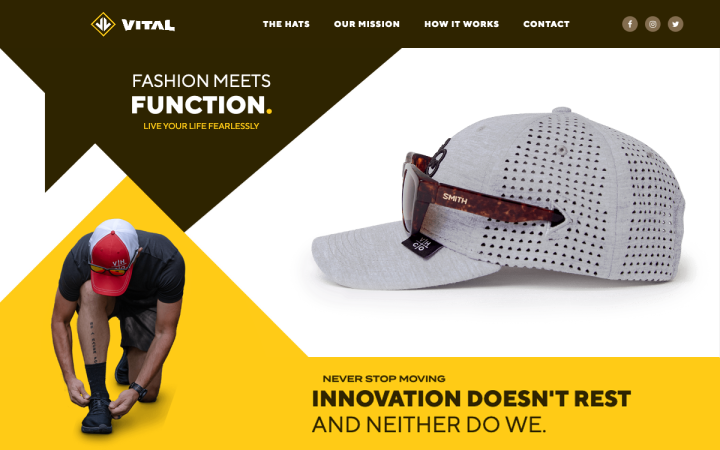
This one-page website belongs to Vital Hat, an American baseball cap brand with a patent-pending technology ensuring that sunglasses of all types will be securely fit into your hat, leaving you free to move around freely without worrying where your glasses might end up.
Vital Hat’s site design is based on their logo and incorporates triangular shapes throughout the page down to the footer. This dynamic geometrical design is combined with an earth-tone color palette, athletic images, powerful copy, and a trendy demo video, producing a young look & feel.
Design & Development: Campaignium
Theme: GeneratePress
Plugins: Sticky Header Effects for Elementor, WooCommerce, Google Tag Manager, Hotjar, Font Awesome
06
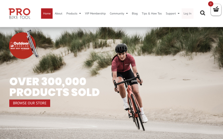
Founded in 2015, Pro Bike Tool pride themselves on providing top quality, hi-end accessories for bicyclists. They recently redesigned their website and the result reflects the brand – it is highly professional.
This multipage site has it all: an impressive homepage with a clear hierarchy and engaging content, an online store with highly descriptive product pages, a VIP membership area, a community page, an active blog, and even a Tips & How To page with a user-friendly video player. The images used in the different pages are all high quality, and the sale popups are a cool addition. It is evident that a lot of work has been put into this website, and it paid off.
Design & Development: Cameron Prudames
Theme: Astra
Plugins: ACF Pro, Akismet Anti-Spam, Beeketing For WooCommerce, Connects – Mailchimp Addon, Custom Post Type UI, Duplicate Page, Duplicator Pro, Dynamic Conditions, Elementor Blocks for Gutenberg, Elfsight Instagram Feed CC, Essential Addons for Elementor, Facebook Live Chat For WordPress, Flexible Elementor Panel, Formidable Datepicker, Formidable Forms Pro, Formidable Logs, Formidable MailChimp
05
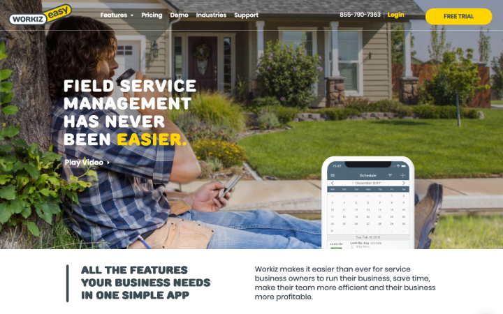
Workiz is a SaaS-based software that provides scheduling, invoicing, CRM, and reporting solutions to its users. Workiz lets you manage any small to large field service business using a streamlined and simple workflow.
Workiz’ website presents a unified design language based on their foldable multi-tool logo. It is visible in the alternating yellow and white colors, as well as the rounded font, and the button and image shapes. The hero image perfectly conveys the message on top: “Field service management has never been easier”. We loved how the multi-tools on the homepage unfold when the visitor scrolls down. The same effect is applied to the company’s logo inside the header, when scrolling up or down. It’s also worth mentioning that the company has created a page for each of their potential client industries. It shows their thoroughness and professionalism.
Design: Wicked Brand
Development: Manta Web
Theme: WP Bootstrap
Plugins: Jet Addons , Smart Slider 3 Pro, Insert PHP Code Snippet
04
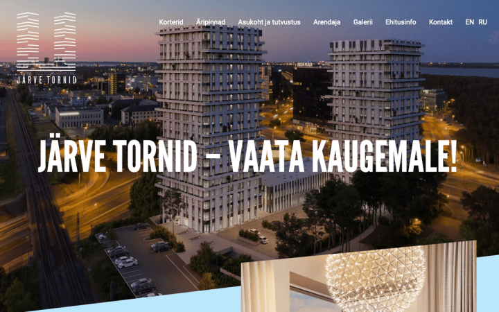
Järve Towers are two modern high-rise buildings in the heart of Tallinn, Estonia. This is a luxury project designed by Martin Aunin, a top Estonian architect.
The two towers and their relative position in the landscape are mirrored in the main motif of the website’s design. The designer took the contour of the two towers and simplified its shape into two diagonal lines. These two lines appear throughout the page as major visual elements, complemented by the diagonal-shaped sections and images. The grid is split into two columns, each one representing one of the buildings. What’s more, the subtle use of our Parallax effect simulating the rising buildings, takes it up a notch.
Design & Development: Blueglass
Theme: Phlox Pro
Plugins: ACF, WPML, Gravity Forms, WP Rocket
03
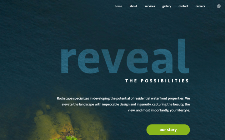
Rockscape is a Canadian company specializing in developing the potential of residential waterfront properties. They do this by elevating the landscape with a purpose-built design and ingenuity, capturing the beauty, the view, and the resident’s lifestyle.
The central theme of Rockscape’s design is pebbles (it also looks like a leaf, perhaps it’s both?). The company’s logo is made up of pebbles, the sections and images are cropped like pebbles, and real pebbles also appear on the hero image, with the transparent title “rock solid”. The transparent headings allow the visitor to delve deeper into the pictures. The About page impressed us with the way they presented their values, using again the pebbles with an animation effect that unites them and expresses the sum of their parts.
Design & Development: Revel Design. Technical support by Creative One
Theme: Bare Bones
Plugins: Essential Addons, Yoast, SVG Support, Preloader
02
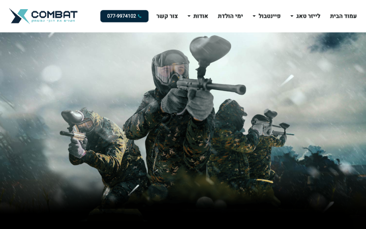
X-Combat is a paintball and laser tag venue outside of Tel-Aviv, Israel, offering participants a simulated warfare experience in a mock battlefield. The entire venue is covered, enabling activity in any weather.
Their website demonstrates the features of our Motion Effects to the fullest as if we had released it for them. Well, to be frank, the site’s theme is a perfect fit. Right from the start, on the welcome page where visitors choose between the paintball and the laser tag areas, they enter a 3D world, which the designer created using the mouse rotating effects.
A click on either one of the games leads visitors to a playful inner page that shows a sophisticated use of rotate, vertical, and horizontal scroll on different elements: images of soldiers, a laser beam shooting out of a rifle, a rotating hand grenade, bullets raining down and more. This is simply a fun experience and excellent, creative use of Elementor’s Motion Effects.
Design & Development: Genesis
Theme: Hello
Plugins: Jet Elements, Google Tag Manager, Leader for WP, SVG Support
01
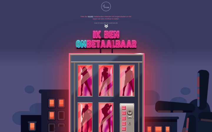
Closing our list is a one-page site depicting the hidden world behind prostitution in the Netherlands, using an interactive timeline. It is part of a campaign to criminalize the purchase of sex, which to date has collected more than 50,000 signatures.
The designer of this project created a timeline that simulates the process, from the moment a client buys sexual services from a prostitute to the resulting consequences. They used the different scrolling effects, as well as sticky scrolling to emphasize the transactional nature of the Dutch sex industry. The designer leads readers down the page, using visual elements to enable them to grasp the information quickly, and directing them to take action. Ingenious!
Design & Development: Kite Media
Theme: Astra
Plugins: Elementor Extras, Font Awesome
Think your Elementor-based website or landing page should be featured in our next Top 10 Websites column? Give it a shot!
