Table of Contents
Many of our readers have requested a real estate website template kit, and now it’s finally ready and available! As many real estate professionals know, prospective property buyers are always looking for more information about the properties on the market, and a polished, professionally-built real estate website can go a long way in their buying process.
Our team of designers has created this template kit which caters to real estate business owners (and business owners at large) who are looking to build a website that showcases the properties they can offer to prospective buyers. This type of website focuses exclusively on the characteristics and details of each property, in order to draw clients’ attention to the uniqueness and overall quality of each one.
In terms of visual design, the template’s general look and feel is clean, simple, and full of neutral color tones. This design choice was made in order to put the crisp, large-sized photographs center stage. The underlying goal, as we described, is that the architectural details and beauty of each property be as accentuated and visible as possible.
Rest assured, although this month’s template kit is geared towards real estate business owners, the kit’s design is highly versatile and flexible so that businesses of all industries can use it for their company websites. Some examples of these business-types are such as law offices, marketing agencies, consulting firms, and so on. Of course, the options are endless. What’s also very helpful about the template is that its flexibility is true for the design choices as well. While we chose neutral, warm colors for the kit, these colors can be easily swapped with other color palettes that will still suit the simple yet engaging square-shaped layout.
Homepage: Clear & Consistent

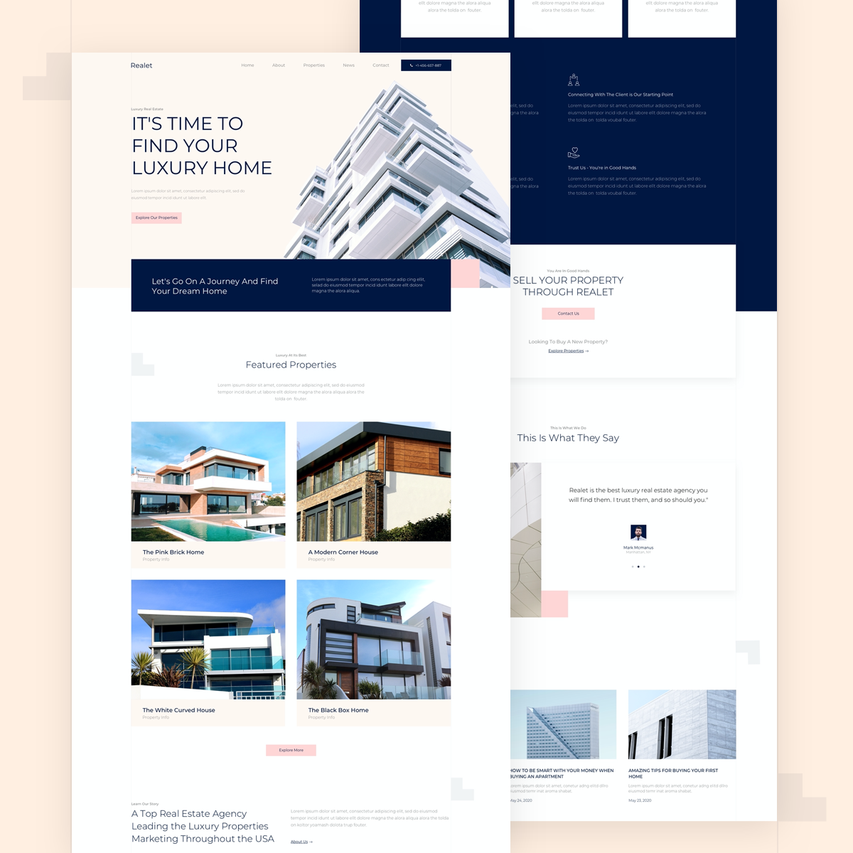
One of our favorite things about this homepage is how we were able to apply the website’s color scheme fluidly throughout the site. The hero section is the starting point for the pale, neutral colors we introduce to the website visitor: light beige, a soft navy, and a pastel pink. The hero section’s building illustration encapsulates all the colors that you’ll find throughout the entire website. This is especially effective for the design of the pink call to action buttons, as they are tied in well to the design scheme while also having a subtle yet visible presence.
We also found it important to enhance the design details around the testimonials widget and throughout the homepage at large. Examples of these details include the different structures and layouts, combined with a slick and architectural layout with a clear design language. In practice, we applied these design principles by adding subtle square shapes such as the white boxes and pink square around the image. We saw this as an additional design opportunity to utilize the warm, inviting color scheme in a creative, thematic way.
In general, we saw the homepage of the template kit as the perfect place to use the Testimonial Widget, and add unique design features to give it an inviting personality. Prospective clients are always eager to learn what other customers have to say about their experiences. And, logically, the more attractively you can present this information, the better. Clarity is key when your goal is to communicate your business value.
When you choose to insert the homepage template into your website, take note that this template is a ‘Page’, which you download from:
Editor > Open Library popup > Pages tab > scroll the page and find it or search for “Real Estate”
Single Property Page: Finest Details

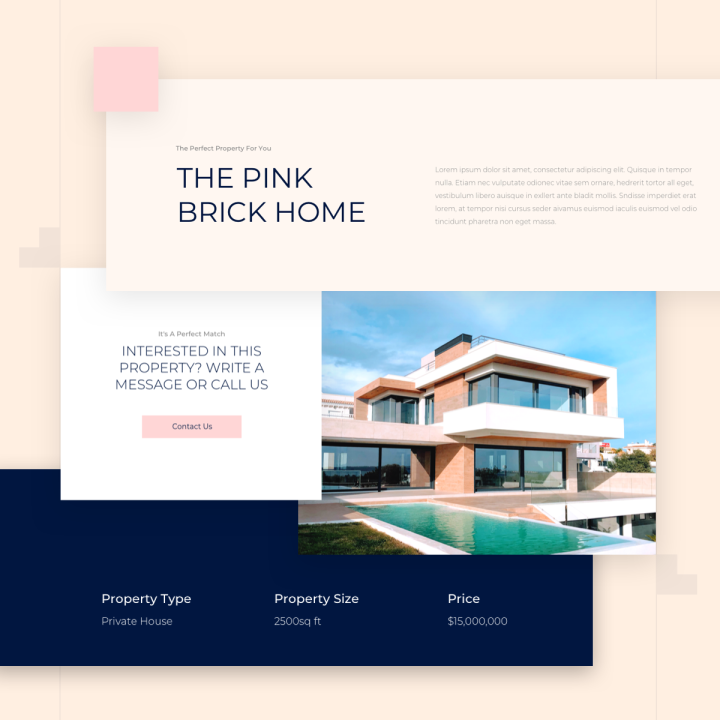
The template kit has many unique design features, and you may notice a distinct motif of lines and grids that are present throughout the entire template. This is true for the choice of typography, where we chose Montserrat in a thin-weighted grey, consistent with the light grey lines in the margin. Overall, these design details represent an architectural theme, and with the grid-based structure of the template’s overarching layout.
On the single property page specifically, we thought carefully about how to use information hierarchy when presenting the property information, creating a contrasting yet complementary relationship between the two headings and the paragraph text, both in the same typeface yet with varied styling choices. We chose a dark, soothing navy blue for the largely sized (60px), upper case, lightweight heading, coupled with a darker gray, slightly thinner version of Montserrat, sized at 16px.
In terms of the design workflow involved when using this template for your website, the kit’s single page can be seen as a wonderful example of how to use Custom Fields. These are actually especially helpful for creating a real estate website. With the many technical details that website visitors will want to know about each property, using custom fields makes it a lot easier for web designers to provide the information in an efficient, consistent way. Custom Fields are also a game-changing time saver. Web creators of all backgrounds know that creating and maintaining a website is a time-consuming process, and any way to simplify your workflow and make data easier to upload can only make things easier.
The Single Property Page is a Single Post template. You can insert these by doing the following:
WP left panel > Templates > Theme Builder > Add New > Choose “Single Post” > Library popup > scroll the page and find it or search for “Real Estate”.
Properties: Places With Personality
The Properties page is where potential buyers can really get a sense of the style and character of the homes that your real estate business works with. This is why the presentation of each photograph is so crucial. We decided to maximize the potential of the Posts Widget and customize the image size, spacing, margins, and color scheme to really bring out the best in each property.
The Properties page is an Archive page template. You can insert these by doing the following:
WP left panel > Templates > Theme Builder > Add New > Choose “Archive” > Library popup > scroll the page and find it or search for “Real Estate”.
Time to Start Building
We look forward to seeing the real estate business websites you build with this template kit. One of its strongest virtues is that it caters to the exact website needs of showcasing real estate properties, but is versatile and flexible so that businesses of all disciplines can find it useful. When looking to impress potential clients, a well-designed, polished website is the first step in the right direction.
To see the full Luxury Real Estate Template Kit, check out this demo.
If you have Elementor Pro, all you have to do to enjoy this cutting-edge kit is to go into Elementor, open the template library, and search for ‘Luxury Real Estate’.
Here’s a short gif showing how to search for the kit:
Which templates would you like to see next? Let us know in the comments below.
Looking for fresh content?
By entering your email, you agree to receive Elementor emails, including marketing emails,
and agree to our Terms & Conditions and Privacy Policy.


