Table of Contents
We are sure that no matter which website you’re working on, who the client is, or what your product might be, one of your main objectives for your website, is gaining as many leads as possible.
Since many of our users are web creators, we thought it would be a good idea to demonstrate an example of a web creator’s site offering professional web design and site-building.
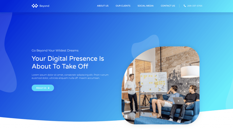
What we have here is a basic site, you may recognize the template — it’s our recently released Digital Agency template kit. As you can see, it includes a homepage, About, and Contact Us pages.
Step 1: Contact Info
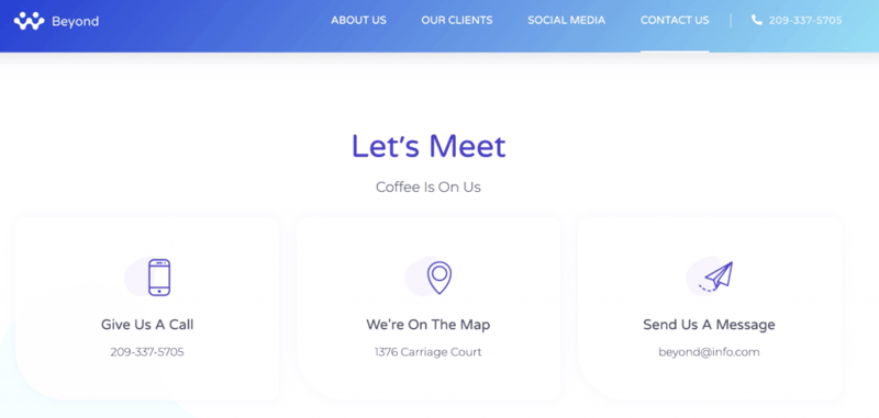
First off, make sure that all your contact information is on the page and easy to locate. It may seem obvious, but you would be surprised how many people forget this essential step. So much so, that we’re making a point of listing it as the first step. So, double-check your contact info, and be sure that it’s up-to-date.
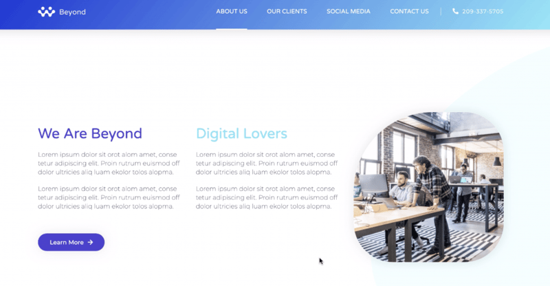
We want to hook your visitors before they bounce, so think of it as an elevator pitch: present your business and services briefly, and clearly.
To do so, we first need to answer two key questions:
What is it that we do? And how do we do it?
We want to engage users right off the bat, giving them the necessary info to instantly whet their curiosity, driving them to explore the rest of your site.
Step 2: Contact Form
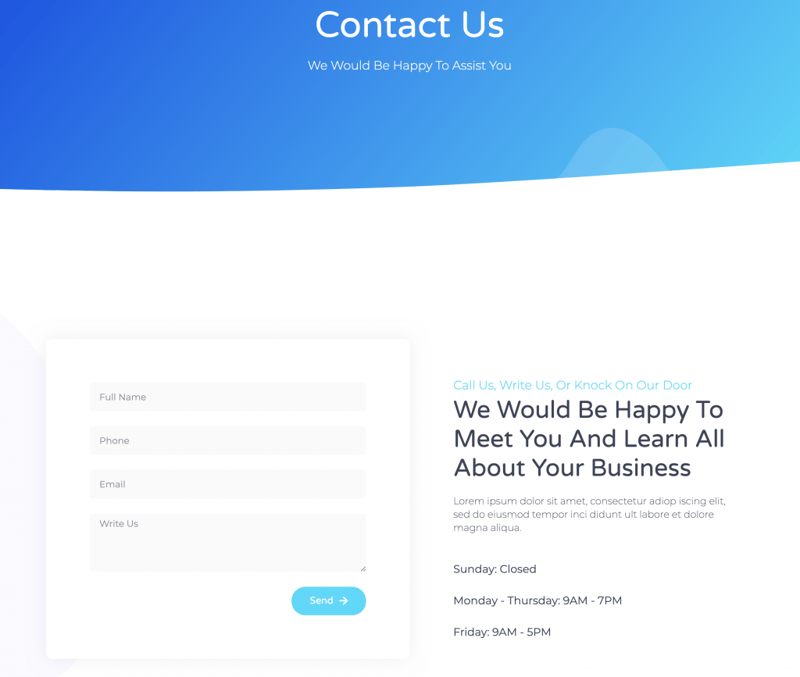
Because we want to encourage the interested visitor to submit their contact info, it’s best to keep the contact form short. Once submitted, this visitor becomes a new lead with whom we will initiate contact.
Oh, and to avoid any embarrassment, we suggest that once you’ve set up the form, be sure to test it and make sure that it works!
If you’re looking for a collection solution for your submitted leads, check out HubSpot plugin for WordPress, which automatically saves leads to a list you can view and manage through your dashboard.
Step 3: Popups
Next, we’ll set up popups.
You might be asking: What is the point of popups?
And the answer is — Leads, leads, leads!
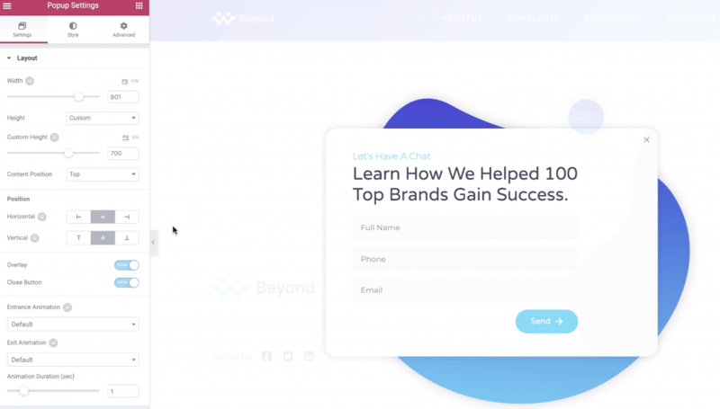
The Digital Agency Kit features an example of an email button that triggers a popup with a CTA. This popup proposes a quid-pro-quo, offering valuable business information in exchange for the visitor’s contact information.
We could also use ‘time-delayed popups.’ If for example, a visitor remains idle on the page for ten seconds, a popup is triggered to appear and suggest that they subscribe to your newsletter.
Alternatively, try out ‘exit popups’ that are triggered as the visitor exits the page, prompting them to subscribe, you know, in case they forgot.
Speaking of things that we can’t ignore, social media plays a crucial role in marketing and is a vital means of generating conversions.
Step 4: Social Buttons

Some users don’t have the time to fill out forms; some who will bounce at the mere sight of a form no matter how short we’ve made it.
However, if they are interested, even a little, they will be willing, perhaps even prefer to follow you on Twitter or Instagram.
Adding social buttons is one of those things that we can do faster than you can spell ‘widget,’ and without having to install any additional plugins.
Now here’s an interesting fact: Over 500 hours of video are uploaded to YouTube every minute. Why? Because users increasingly prefer to watch content than read it.
Step 5: Video With Lightbox
So step five is adding a video to your page. We’ll make it stand out by framing it with a lightbox and adding an eye-catching cover.
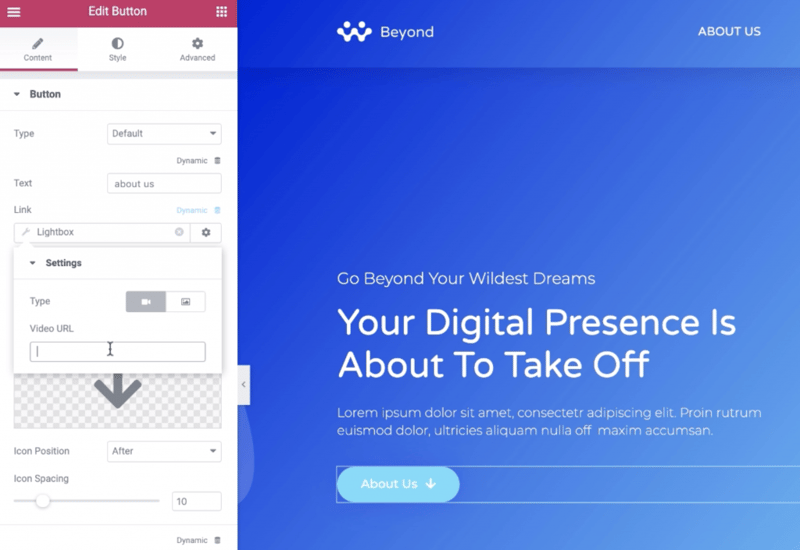
We’ll do this by editing the button options in the editor panel. We’ll click on the dynamic option, and in the menu, we’ll select lightbox, then click on the lightbox option again to edit the details of your lightbox, and then enter your video’s URL.
After watching your video, visitors are much more likely to ‘get’ what you are offering and be more inclined to connect with your business.
Step 6: Countdown Timer
One last optional step to maximize leads is to add a Countdown Timer. “A countdown what?” I hear you ask (through the screen).
Well, it turns out that this is one of those little things that we’ve been kind of taking for granted, that is actually useful for generating leads and sales.
In the Monday Master Class Video, we show an example of using a countdown timer to promote a webinar.
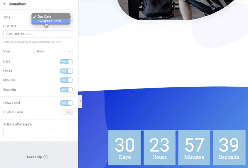
Adding an evergreen countdown timer will drive more potential clients to the webinar. Perhaps it’s FOMO or genuine interest. The fact is that every time a visitor arrives on your landing page and sees your counter ticking down, they’ll check out your webinar.
Summary
As professional digital marketers, we are well aware that website creation is a highly competitive field. This is especially true when it comes to lead generation. Now you can get ahead of the game by leveraging Elementor’s toolkit to add your contact info, a contact form, popups, social buttons, video, and a countdown timer. By taking advantage of these features, you can build magnetic sites that will jumpstart your success.
Have your own tricks for improving lead generation? Share them with us in the comments below.
Looking for fresh content?
By entering your email, you agree to receive Elementor emails, including marketing emails,
and agree to our Terms & Conditions and Privacy Policy.


