Table of Contents
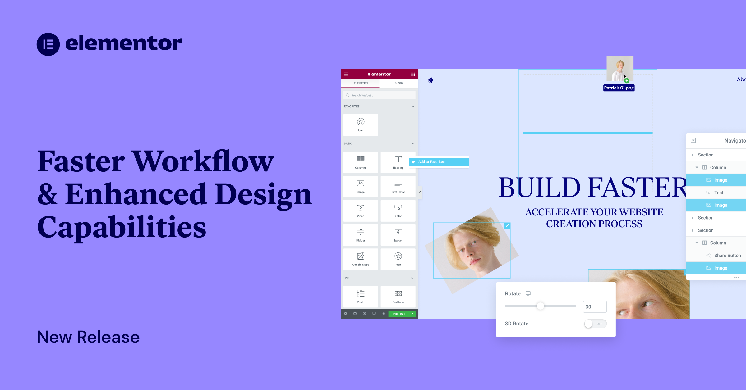
Web Creators constantly look for ways to work faster and create innovative designs that keep their users engaged. To accelerate your project turnaround time, Elementor 3.5 includes three new workflow capabilities that help you shave significant time off your creation process, including Mark Widgets as Favorites, Drag from Desktop, and Multi-Select.
Elementor 3.5 also includes new features to expand your design repertoire, empowering you to create highly sophisticated websites within Elementor, while reducing the number of plugins and custom code needed to achieve the same advanced appearances, including Transform, Text Stroke, and Word Spacing.
In addition to the new workflow and design capabilities, the Experiments UI is getting a new look, making it easier for you to understand the stability of each experiment, as well as a new experiment for improving your website’s performance — Inline Font Icons.
Faster Website Creation Process
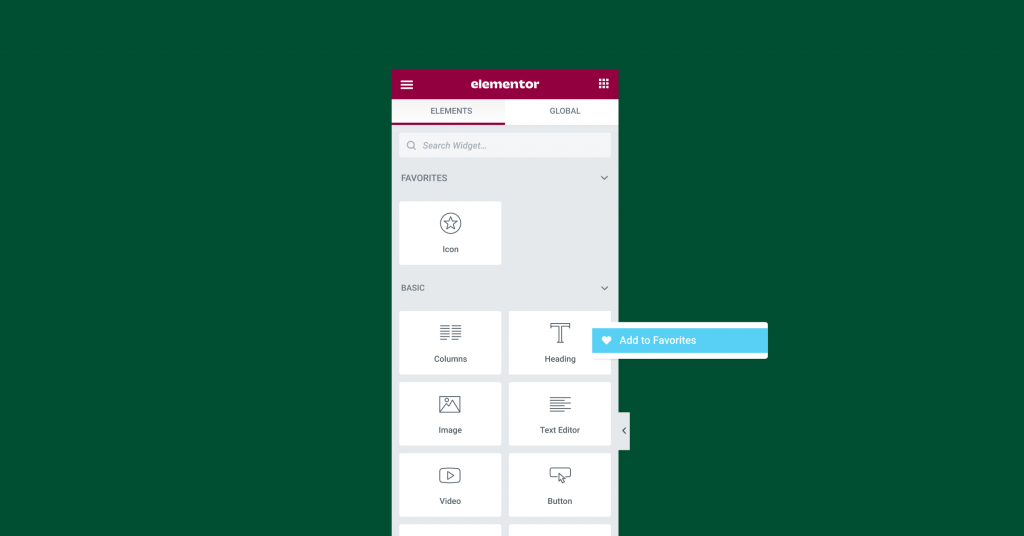
Mark Widgets As Favorites: Personalize Your Editor Panel
As you build with Elementor, you’ve probably noticed that you tend to gravitate towards specific widgets and end up using them more often than others. By pinning your most used widgets to the ‘Favorites’ section you can personalize the Editor Panel to your own needs, and find your favorite widgets faster.
Drag From Desktop: Bring Media and Template Files Directly Into the Editor
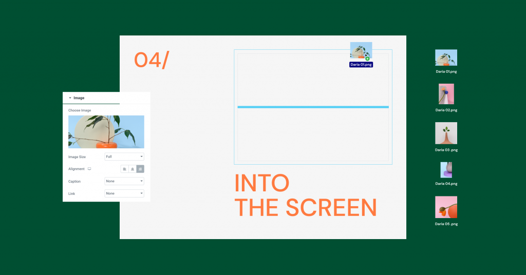
Inserting media and template files (.json) into your Editor has never been easier. This update enables you to drag one, or several media or template files directly into your Editor.
Media files can be dragged into an existing widget on the page (image, video, or GIF), or they can be dragged into the editor, having the corresponding widget added automatically. Media files that have been dragged into your Editor will also be added to the Media Library, while template files (.json) will be added to your template library.
Multi-Select: Impact Several Elements at Once
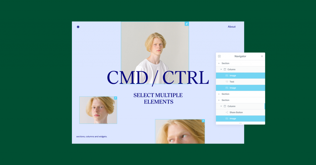
Just like clicking CTRL/CMD on your desktop allows you to select a number of items at once, you can now do the same to sections, columns, or widgets in your editor, or in the navigator. Leveraging Multi-Select, you can impact multiple items at once, to: copy, delete, duplicate, paste, paste style, and reset style.
Enhanced Design Capabilities
Transform: Increase Interactivity With Unique and Animated Designs
Thinking outside the box, adjusting and animating elements makes your website unique, enhances user engagement and curiosity. This, in turn, empowers you to increase the amount of time users spend on each page and the number of pages they visit.
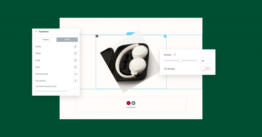
With Transform, you can enjoy all the capabilities of CSS Transform without writing any code. Adjust the layout of elements on your page by rotating, skewing, offsetting, scaling, or flipping them in their normal state or upon hover. For example, you can rotate an image by 45° so it appears slanted instead of an upright in its normal state. Alternatively, you can have the image upright in its normal state, and have it transform upon hovering by 45° so it becomes animated and slanted. To achieve animated designs that are even more advanced, try pairing Transform with Motion Effects.
Text Stroke: Make Your Headings Pop
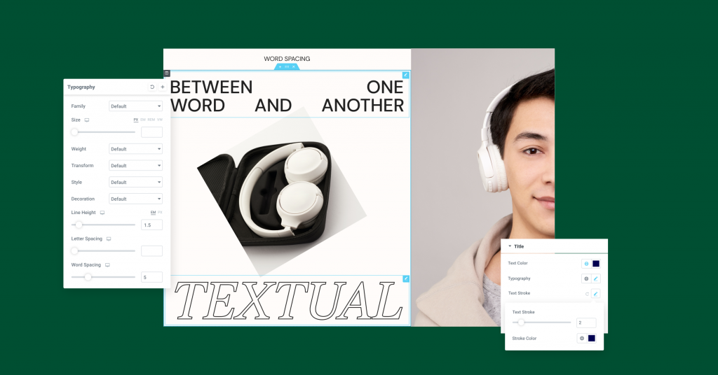
Headings that pop grab your users’ attention and help them focus on specific parts of your page. To increase your design flexibility, headings got a new control — Text Stroke, allowing you to add an outline to them.
With this control, you can also design transparent headings, with just an outline to them, to create stunning visual effects, where it seems like the letters have been cut out and the background can be seen through them. To achieve this look, set the headline color to transparent, and choose a Text Stroke of a color that’s different from your background, to make it stand out.
Word Spacing: Optimize Your Users’ Reading Experience
Adjusting the distance between words can improve your users’ optical experience and help you better convey your message. With the new Word Spacing control, available in any textual widget, you now have greater control over the distance between one word and another, just like the letter spacing control. This enables you to further customize your website’s appearance, and utilize more fonts.
Experiments Updates
New Experiments UI: More Confidence To Enable Experiments
The Experiments user interface has been redesigned to improve the visibility of experiments, and their stability. Experiments are divided into two sections, the top half lists experiments that are in the alpha and beta stage, whereas the bottom section shows more stable experiments. Additionally, to make troubleshooting easier, you can enable or disable all experiments with a single click.
Inline Font Icons: Faster Page Load
As part of our commitment to continuously make performance improvements, so your website can load rapidly, Inline Font Icons are now supported in the inline SVG experiment. When the experiment is turned on, CSS and Woff size on each page load is reduced by up to 111KB, to achieve faster page load.
Design or Workflow… Why not Both?
Elementor 3.5 is packed with impactful improvements that streamline your workflow, so you can significantly reduce the amount of time it takes to create your websites.
This update also includes new design capabilities, so you can create captivating, unique, and stunning websites that keep your users engaged, and encourage them to keep coming back.
Try out these new features and let us know what you think in the comments below.
Looking for fresh content?
By entering your email, you agree to receive Elementor emails, including marketing emails,
and agree to our Terms & Conditions and Privacy Policy.
