Table of Contents
How to Enable the Beta
First off, it’s important to note that the 3.14 beta version should not be used on live, production sites. We know you’re excited, but remember, this version is still in its testing phase. It’s a chance for us to iron out any kinks before the official release.
To enable the beta version of Elementor, follow these steps:
- Go to your WordPress dashboard.
- Click on Elementor in the left sidebar to open the Elementor settings page.
- Navigate to the ‘Tools’ tab.
- Click on ‘Version Control’.
- You’ll find an option to enable the ‘Beta Tester’ feature. Check the ‘Enable Beta Tester’ box.
- Remember to save your changes.
Once you have enabled beta testing, you should be able to see and update to the beta version in your WordPress updates page.
[Pro] New Nested Carousel
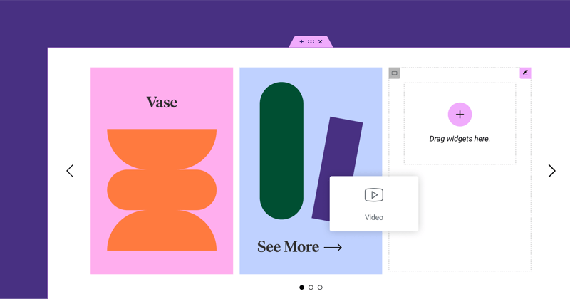
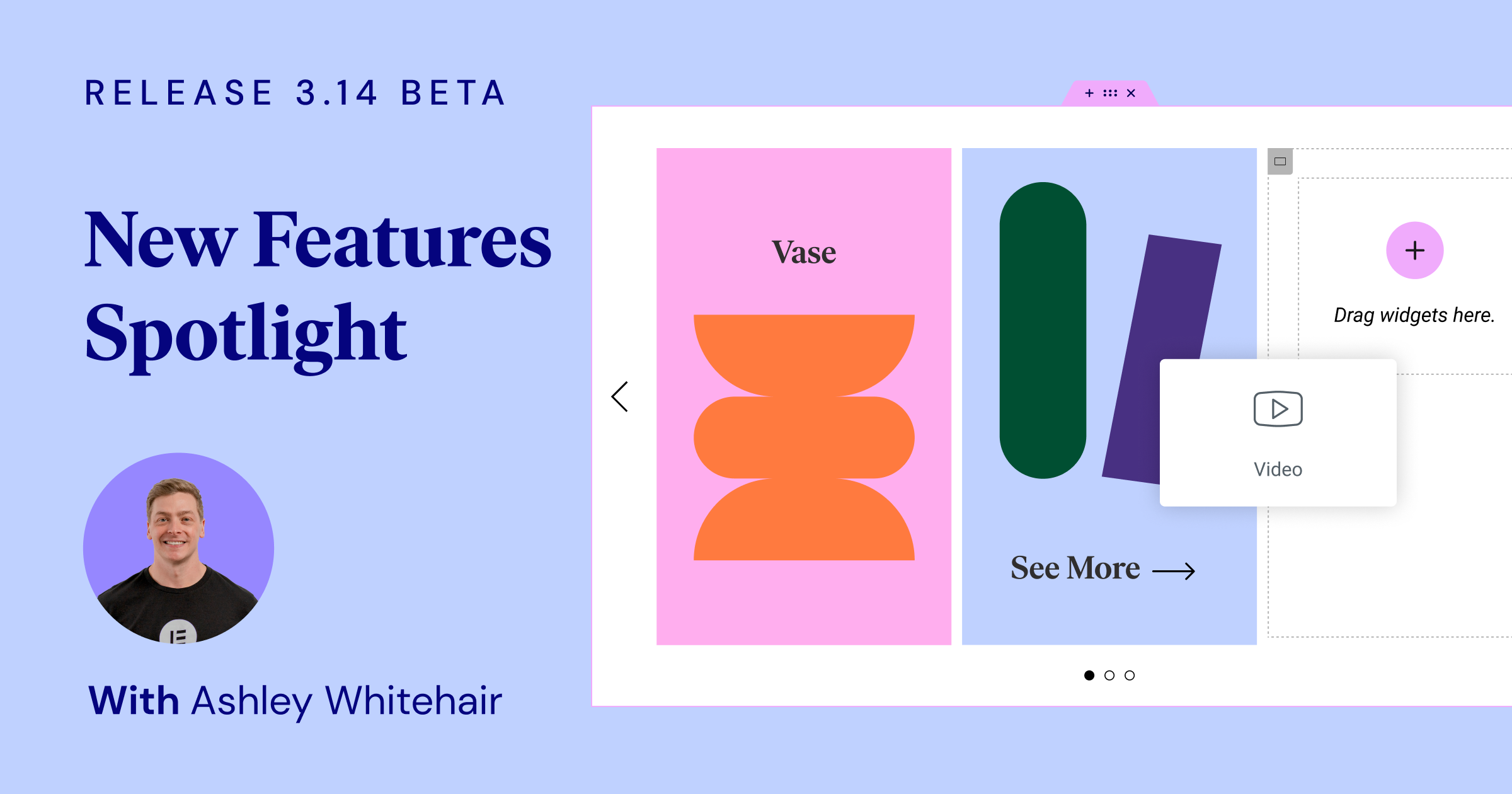
Kicking off our Elementor 3.14 beta feature spotlight is the transformative Nested Carousel widget. As aptly demonstrated by Ashley, this feature provides a far greater degree of control and creative freedom when displaying various types of content. With this, you will be able to nest elements within each slide of the carousel to create endless design possibilities.
It was clear from Ashley’s tutorial that the Nested Carousel offers a great deal of flexibility. He showcased how easy it is to craft a carousel, populating slides with images, text, and even other Elementor widgets. In effect, the Nested Carousel emerges as a powerful and versatile tool in your web design toolkit.
The Nested Carousel, simply put, offers you an infinite canvas within each slide to populate with any Elementor widget you wish. The result? Unprecedented design freedom.
For more examples and in-depth information, be sure to watch Ashley’s full presentation.
[Pro] Static Item Position in the Loop Grid
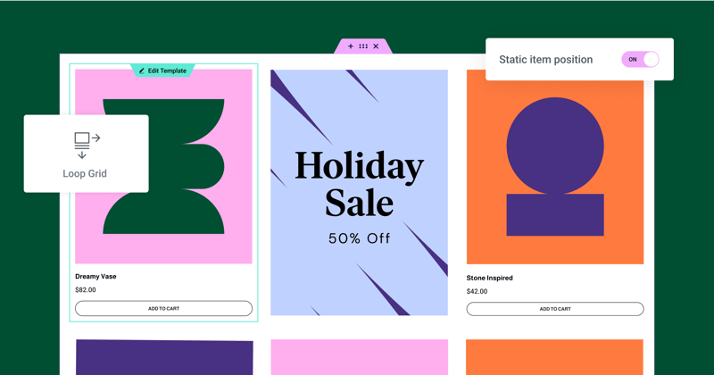
Elementor 3.14 beta introduces a standout addition – the ability to define a Static Item Position in your Loop Grid. This handy feature lets you spotlight specific content, like an event, product, or any piece of content you’d like to highlight, right within your regular content loop. Imagine it as your personal billboard within a sea of posts or products.
As Ashley explained during his demonstration, you can use this feature to break up your regular content flow with a static item, like an image, a contact form, or a video. You decide where it should go, and Elementor does the rest. The chosen static item replaces a post or product in the specified position, shifting the rest of your content along. “We’ve interrupted that flow and we’ve told Elementor we want to display this image in this grid,” he stated.
He also pointed out that this new feature offers a range of customizable options. You can control the position of the static item in the grid, decide whether it appears just once or at regular intervals, and even adjust the layout of the alternate template by changing the Column Span option. It’s about injecting creativity into your grids.
To access the Static Item Position feature, remember to have the Loop Feature enabled on your website. You can find this in your WordPress Dashboard → Elementor → Features. With this new feature, your grids are not just about regular posts or products – they’re about showcasing anything you like. As Ashley enthusiastically stated, “the possibilities are endless.”
Don’t forget to check out Ashley’s full presentation for a comprehensive understanding and additional examples.
New Global Styles Preview
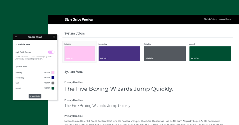
As many of you know, global styles are the backbone of your website’s design system, ensuring a consistent use of colors and fonts across your site. This new feature takes it a step further, offering a real-time preview of your global styles.
In Ashley’s words, “Not only do we have the ability to set global colors and fonts, which is a fantastic option anyway, but we’ve got this visual representation now of what those colors are.” With Global Styles Preview, your site’s design system comes to life, providing a better understanding of your colors and fonts in a larger context.
When you activate the Global Styles Preview from your Site Settings, your entire page is covered with the Style Guide Preview. This visually striking layout showcases your global colors and fonts as they appear on a webpage, offering a glimpse into your website’s design DNA. Changes made to global styles automatically update your preview, enabling real-time design adjustments.
Another user-friendly feature that Ashley highlighted is the seamless transition between the preview and the color or font picker. Clicking on a color or font in the Global Preview automatically opens the respective picker, making your design process a breeze.
This new feature is active by default for Elementor Hosted websites and can be manually enabled for Plugin websites. It’s not just about setting global colors and fonts anymore; it’s about experiencing them. As Ashley concluded excitedly, “I was incredibly excited to see this. I hope you are too.”
Watch Ashley’s complete presentation for further insights and examples.
UI & UX Improvements
One-Click Addition of Elements
One of the most significant improvements is the ability to add elements or widgets to your page with a single click. This new feature deviates from the older method where you had to drag widgets into specific containers or columns. With a single click on any widget in the panel, it automatically adds to the last container or column you were focused on. This makes designing a page more fluid and efficient, reducing the time spent dragging elements around. Just ensure the correct container or widget is selected, so Elementor knows where to place the new widget.
Visual Indication of Page or Site Parts
To make the transition between different page sections more seamless, Elementor 3.14 introduces a new feature – a visual indicator for page parts such as headers, footers, and loop items. This is particularly useful when designing pages with theme parts, where you had to click directly on the handle to switch between them. Now, a semi-transparent overlay appears when hovering over any part of the page. Clicking on this overlay lets you edit that specific part without having to precisely click on the handle.
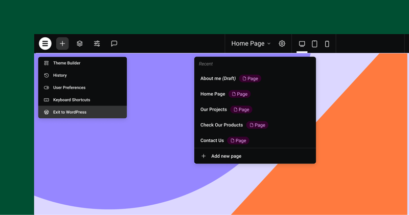
Top Bar Enhancements
Elementor 3.14 comes with an updated Top Bar that offers a centralized area for many of the actions performed in Elementor. The Top Bar was first introduced in Elementor 3.12 and has now seen further improvements. The new features include the ability to add a new page directly from the Top Bar, cutting down the need to switch between the Editor and the WordPress Dashboard. Also, it now features a button called “Exit to WordPress,” which leads you back to the backend of the website part you were working on. These updates are designed to promote best practices and improve the user experience.
Additional WooCommerce and WordPress Functions
Another useful update is the integration of additional WooCommerce and WordPress functions directly within Elementor.
Within Elementor’s Site Settings, you can also set up your shop page if you have a WooCommerce website. This reduces the need to switch between Elementor and the WordPress Dashboard. Similarly, a toggle to allow comments on a page or post is now accessible directly from Elementor Page Settings.
New Shortcuts
Elementor 3.14 introduces new keyboard shortcuts to make your workflow even faster.
For Mac users, you can open the “Page Settings” panel by pressing CMD + SHIFT + Y and the “User Preferences” panel with CMD + SHIFT + U.
For PC users, the same can be achieved using CTRL + SHIFT + Y and CTRL + SHIFT + U respectively. These shortcuts offer quicker access to essential settings, helping to save time and increase productivity.
Additional Styling Options
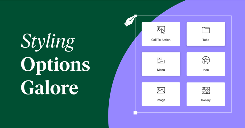
Tabs Widget Updates
The Tabs widget now includes a toggle for the mobile mode switch to the Accordion layout. This enhancement gives users control over layout transformations. Another added feature is the horizontal scroll in the Tabs, improving navigation.
Icon Widget Changes
The Icon widget now offers a ‘Fit to Size’ feature, particularly useful for custom SVG icons. This feature removes unnecessary space around the icons, ensuring optimal alignment.
New Divider in Menu Widget
The Menu widget introduces a styled divider between menu items, offering design choices such as solid, double, dotted, or dashed lines.
Image Widget Enhancements
Ashley, during the demonstration, noted, “The new ‘Object Position’ feature in the Image widget offers users the ability to customize the positioning of the images, providing much-needed flexibility in their designs.”
Call to Action Widget Updates
The Call to Action widget now harmonizes its styling options with the Button widget, including button padding, box-shadow, and text-shadow options.
Gallery Widget Improvements
The Gallery widget allows for individual lightbox settings for each gallery, overriding the default site settings if needed. This update adds another layer of customization at the widget level.
Performance and Accessibility
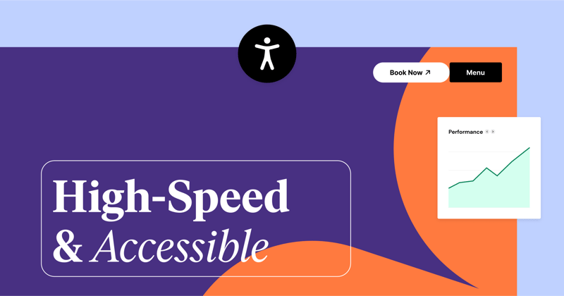
Performance and accessibility have seen significant enhancements in the latest update. Ashley delved into these, stating, “Button, Accordion and Toggle widgets, as well as the Video Playlist widget, have been upgraded for improved performance and better compliance with W3C recommendations.”
The Button widget now includes conditional ROLE attributes, while the Accordion and Toggle widgets meet all W3C guidelines. Meanwhile, the Video Playlist widget adopts a lazy load mechanism for images, reducing initial page load times and boosting SEO through the addition of missing ALT attributes.
Ash further emphasized these updates’ critical role in user experience and invited users to explore the changes via the official GitHub post and the developer’s blog.
Closing Thoughts
That’s a wrap on what’s new and improved in the Elementor 3.14 beta version! As we can see, there’s a lot to look forward to. From Ashley’s informative demo, it’s clear that the team behind Elementor is making significant strides to enhance our web building experience. These updates not only bring fresh design possibilities but also aim to streamline our workflows. So, why not give these new features a test run? Your feedback is highly valued—it helps Elementor evolve to better suit your needs. So, don’t hesitate to share your experiences with this beta version. We’re all in this together, working towards making web design better, one update at a time. Happy exploring!
Looking for fresh content?
By entering your email, you agree to receive Elementor emails, including marketing emails,
and agree to our Terms & Conditions and Privacy Policy.


