
Table of Contents
Over the past few months, Elementor joined the few plugins to cross the one million active installs mark. There are a variety of reasons that explain why Elementor has become an industry leader, but three key reasons include our clear vision, the support of our community, and how these two sides are synergetic.
The Elementor community has been fundamental to our success. Since day one, users supported us, helped spread the word, mentioned and shared our work. We quickly grew from the ground up, and we certainly don’t take this for granted.
While the first couple of years included positive support pretty much across the board, as we grew, reaching over a million active installs, other voices began to appear. This makes sense – a million users, a million needs and wants.
Uproar Over Right-Click
For Elementor v2.1, we made significant modifications to the interface and moved the editing handles from a frontend menu to a right-click menu. This update prompted a lot of conversations in the Elementor community. Some liked the change, other less so.
Why we Made the Change in the first place
We see Elementor as the new standard solution for building websites on WordPress. This puts great importance on offering a clean design interface, enabling users to focus on their design.
When you think of it, no other software displays the delete and duplicate buttons on the frontend, not even basic software like Word or PowerPoint.
Right-click has become standard practice for interfaces, and combined with keyboard shortcuts, provides users with a streamlined process. The multiple frontend handles caused much confusion among our users, and sometimes also created conflicts when handles became hidden, invisible or partly covered by other elements.
The transition to right-click also allowed for additional and crucial capabilities such as copy-paste styles, the recent navigation tree and more.
Voices for and against the change
Following the right-click release, raging posts popped-up in the Facebook community. We also received email complaints, and even a few bad reviews made by users who, apart from right-click, really loved our product.
This was the worst reaction we’ve ever received, and I must admit, it took us by surprise. We spent a long time checking and proofing this change, along with an extended Beta period. We thought it was going to be accepted with open arms, and that users would experience it as a significant UX improvement.
We read all the comments, talked personally with many users, and did our due diligence, attempting to understand what went wrong in our process.
Listening to your feedback
While we have a clear vision for our product, we have just as much regard to listening to user feedback. In fact, about 80% of our product features come directly from user feedback.
For right-click, we came to the conclusion that while the change needed to happen, we were too fast to release it. As I am writing these lines, several weeks after the update, it seems that users have grown accustomed to it, even the ones who complained at first. We might have been better off introducing this change in steps, and gradually letting users get used to it.
In the past few months, we worked hard to make it easier for all users to adjust to Right Click.
Here is what we did:
Differentiation of Right-Click Actions
During our user-research, we realized that the extra click was not really the main UX issue. In previous versions, users already had to hover over a handle area to show the handles.
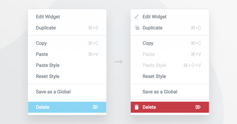
Upon examination, the real issue seemed to be the difficulty in recognizing which right-click item did what. To deal with this problem, we added relevant icons to the edit, duplicate and delete and add column buttons. To make it even easier, we added a red background to ‘Delete’, which now appears on hover.
Better Keyboard Shortcuts
Gradual Change
I must emphasize that the feedback to the right-click was mixed. We received much encouraging feedback regarding the change. Users complimented the increased accessibility, as well as the added value of the copy-paste features.
In the latest release of 2.2, we decided to cater to the users who missed the old handles, and offer them a way to bring back the frontend handles alongside the right-click menu. We understand the difficulty in shifting work methods and want to provide a more gradual transition to the right-click.
Improving how you Get Started
As part of our aspiration in offering the best user experience, I want to share a new education resource we are planning for our site. This resource will help users learn how to use Elementor better, and develop an efficient work process.
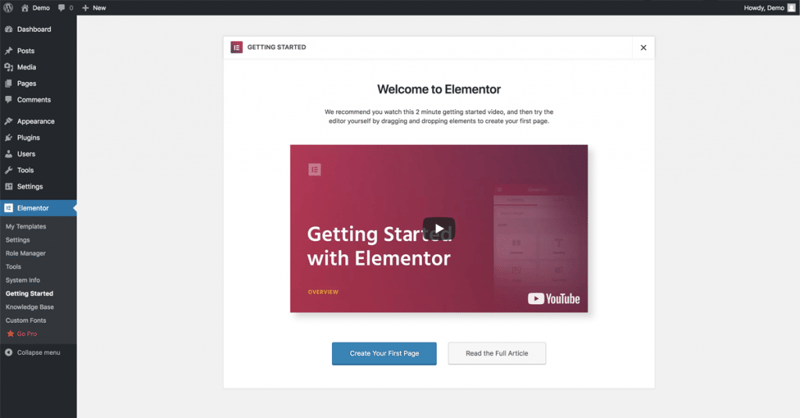
If you install Elementor 2.2 on a new site, you will notice we added a ‘Getting Started’ window, that includes a short introductory video. This is the first of many steps we plan to make that will help ease the onboarding process for our page builder.
Moving Ahead With Our Vision
The other main reason that enhanced our growth, besides the community, is the fact that we are a company led by a clear vision for our product, and not just numbers.
We set out to build Elementor with a clear idea of improving WordPress web design. We came from this industry, after experiencing the roles of both theme company and design studio, and aimed to revamp it.
The main difference between this approach and a strictly growth-based approach is that we sometimes make unpopular changes, and we do so to optimize the product, not to increase sales.
This approach also fuels us to improve the smallest details of our product, and not just to innovate for the sake of innovation.
Renaming Widgets
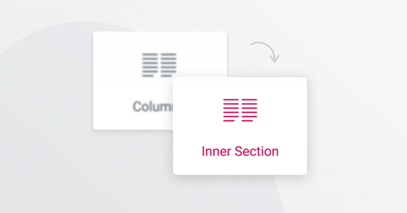
As I already mentioned, we take our role seriously. Our team tries to take into close consideration the smallest details, even widget names. We recently changed the name of the ‘Columns’ widget to ‘Inner-Section’.
During a continuous period of user-research, we found a disturbing commonly repeated mistake made by users of all levels. When users needed to add a column to an existing section, instead of doing it using the ‘Add new column’ option in the right-click, users mistakenly dragged in a Columns widget.
This rename brought on some displeased voices in the group earlier today. I totally relate to the frustration, since our team also now needs to re-do several of our YouTube tutorials and Docs that refer to the previous name of the widget.
Nevertheless, we made the change because we have to consider the greater good of our million users, as well as our future users.
What We Learnt
Changes can be intimidating, especially with regards to interfaces. You are used to a certain way of doing things, and your brain develops processes to make automatic behaviors that take less effort. A change – whether it is UI-based, relocation, a new job… requires developing new automated processes, and can often be quite frustrating. But you do get used to it after a while (I read somewhere it takes two weeks).
If you are an Elementor user, you are part of our project. It means you share our vision and our long-term and continuous task – to build the ultimate solution for building websites. We always strive to be the best, to get feedback and to progress. To accomplish this, we need to make changes continuously.
We are developing new ways to make these changes in a more streamlined and less obtrusive manner. We ran a recent user survey, started developing a broader QA department, prolonged our Beta versions and set out to create better in-product as well as online education resources.
Summing Up
I wrote this post to offer our perspective, in regards to the recent updates. I also wanted to let you know that although we are growing, the same user-oriented mentality leads our way. We plan to find new ways to improve the communication with each and every one of you, our users, all the while continuing to develop a robust, community-driven product.
Looking for fresh content?
By entering your email, you agree to receive Elementor emails, including marketing emails,
and agree to our Terms & Conditions and Privacy Policy.


