help center

On this page

Create page transitions for your site

Last Update: May 1, 2024
Page Transitions create a smoother surfing experience for your website visitors. There are two types of these transitions:
  • Page transitions: Add special effects when users go from one page of your site to another. The new page loads while the effect is taking place, making it seem like the page loads immediately. 
  • Preloader: A preloader adds a visual timer, such as a spinning circle, that shows visitors a page is loading. This is an indication that visitors should wait for for the page to load. Preloaders can operate when visitors arrive at your site and when they navigate between your site’s pages.

If you use both a preloader and page transitions, the preloader will be active when visitors first arrive at your site, and page transitions will work when they navigate between your site’s pages. 

Access the page transition controls

Page transitions are part of the site settings.

To access site settings:

  1. In the Elementor Editor, from the top bar, click the Site Settings CiBO01FtS3j5YMXRd1dO4BG8g6BA847FGceH332A8tIFYY3Xm2h9VXNpamrSWKWHXi0 Ew3npyEnPY9v VfRyoWmzxveXLpVR5f8qJUvK5K Create page transitions for your site 105 icon.
    image Create page transitions for your site 107
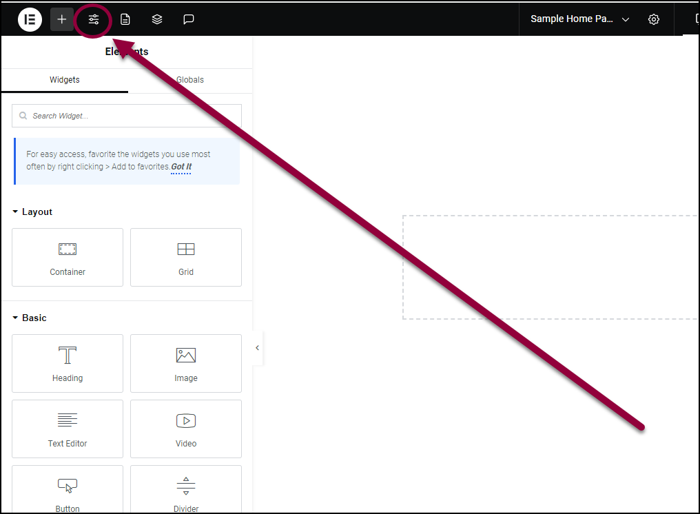
    In the panel, the Site Settings menu appears.
    Site settings menu with page transitions highlighted Create page transitions for your site 109
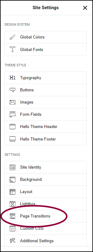
  2. In the panel, click Page Transitions.

    Settings for the page transitions

    You can customize page transitions using the menu in the panel.

    Click the tabs below to see all the settings available for page transitions.

    page transition options Create page transitions for your site 111

    Set the number of symbols for your rating system. Most rating system allows only up to a maximum of five or ten, but the Rating widget allows you to choose any number of rating icons. 

    Enter the number of symbols you want to represent the rating. For example, enter 3 to display the possibility of a 3 star rating.

    Icon allows you to switch out the star symbol for another symbol. Click the star Star button Create page transitions for your site 113  to choose a symbol from the icon library. Click the SVG button SVG symbol Create page transitions for your site 115  to upload an SVG image. 

    Set the alignment so the rating symbols will appear on the left edge, right edge or center of the widget.

    page transition preload options Create page transitions for your site 117

    From the Type dropdown menu choose:

    • None
    • Animation
    • Icon
    • Image

    If you choose Animation from the Type dropdown menu, you’ll have the following options:

    • Animation: choose  Circle, Circle Dashed, Bouncing Dots, Pulsing Dots, Pulse, Overlap, Spinners, Nested Spinners, Opposing Nested Spinners, Opposing Nested Rings, Progress Bar, Two Way Progress Bar, or Repeating Bar.
    • Animation Duration (ms): Use the slider or manually enter the value in the field.
    • Preloader delay (ms): Use the slider or manually enter the value in the field.
    • Color: Use the color picker to select a color for the animation. For more details, see Choose a color or Use global fonts and colors
    • Size: Use the slider to make the animation bigger or smaller.
       

    If you choose Icon from the Type dropdown menu, you’ll have the following options:

    • Icon: Select an icon from the icon library or upload your own SVG.
    • Animation: From the dropdown menu select from the following options Spinning,  Bounce, Flash, Pulse, Rubber Band, Shake, Head Shake, Swing, Tada, Wobble, or Jello.
    • Animation Duration (ms): Use the slider or manually enter the value in the field.
    • Color: Use the color picker to select a color for the animation. For more details, see Choose a color or Use global fonts and colors
    • Preloader delay: Use the slider increase or decrease the preloading time.
    • Color: Use the color picker to select a color for the animation. For more details, see Choose a color or Use global fonts and colors
    • Size: Use the slider to make the animation bigger or smaller.

    If you choose Image from the Type dropdown menu, you’ll have the following options:

    • Image: Select an image from the media library or upload your own. For more details, see Adding images and icons.
       
    • Animation: From the dropdown menu select from the following options Spinning,  Bounce, Flash, Pulse, Rubber Band, Shake, Head Shake, Swing, Tada, Wobble, or Jello.
    • Animation Duration (ms): Use the slider or manually enter the value in the field.
    • Preloader delay: Use the slider increase or decrease the preloading time.
    • Width: Use the slider to make the image wider or narrower. 
    • Width: Use the slider to determine how large the image can be.
    • Opacity: Use the slider to make the image more or less transparent. 

    Experience the page transitions as visitors would see them.

    Disable Page Transitions

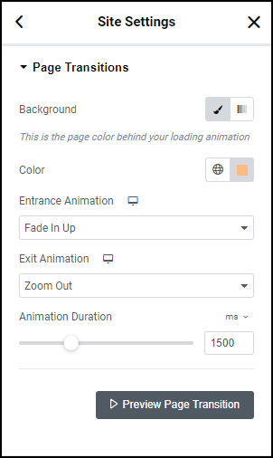
    By default, page transitions apply to all internal links on the page. Clicking a link will start the transition process.

    You can disable page transitions for selected links, by adding a Custom Link Attribute:`data-e-disable-page-transition|true`. This attribute will disable the transition functionality for that specific link.

    To add an attribute to a link:

    1. In the panel, click the cog icon cog icon Create page transitions for your site 119 next to the link.
      Click the cgo icon next to the link Create page transitions for your site 121
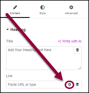
      This will open the link attributes.
      Enter custom attribute Create page transitions for your site 123
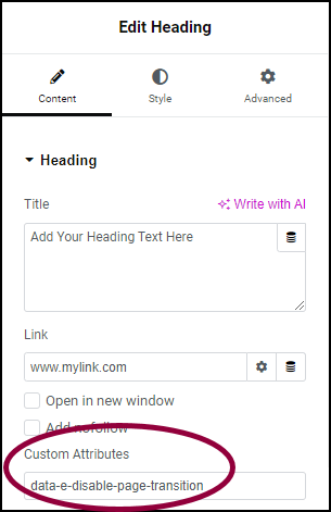
    2. In the Custom Attributes text box, enter: data-e-disable-page-transition|true

    Have more questions? We’re more than happy to assist.

    Link is copied to clipboard!
    On this page

    Is this article helpful?

    Share this article