Design your site for any device
When you design a site, you can never be sure if visitors will be accessing it from a PC, a tablet or a mobile. Best practice is to design your site to be compatible with different devices. At minimum your site should work with PCs, tablets and mobiles.
Web browsers define these devices by their visible screen width or viewport. For instance, by default the Elementor Editor defines devices with a viewport over 1024px as PCs, devices with a width between 1024px and 767px as tablets and devices with a width under 767px as mobiles. The point at which the view shifts from device to device (for example, 767px) is called a “breakpoint.”
Since one design won’t usually work for all devices, the Elementor Editor allows you to customize your design for different devices. For instance, your menu may appear as horizontal text when seen on a PC and a dropdown menu when viewed on a tablet or mobile. Breakpoints define when these switches will take place.

To learn more about the basics of responsive design, see Responsive design.
View your site on different devices
In order to create a responsive site, you need to see how your site will look on various screen widths. Elementor Editor provides a quick way to test your site on multiple screen sizes.
To view how your site will look on different screen widths:
- Open the page in the Elementor Editor.
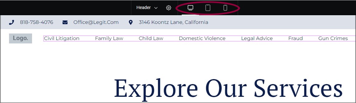
- In the top toolbar, click the icon representing a screen width you would like to view. By default, there are three icons: one representing PC view, one representing table view, and one representing mobile view. If you add additional screen widths, they will also appear here. For more information about adding more screen widths, see Add and customize breakpoints.
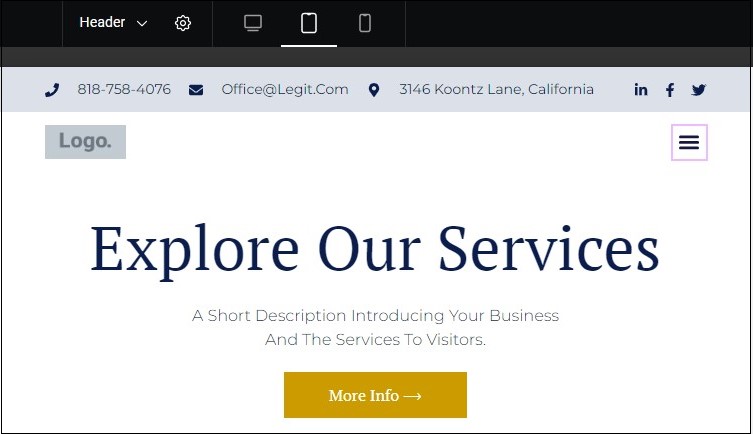
The above shows a site in tablet view.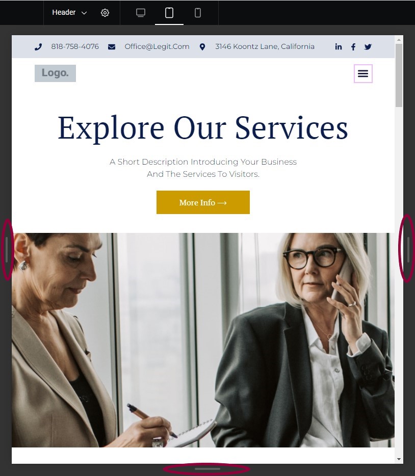
If you are not in PC view, there are handles to the left, right and bottom of the screen. Click and drag these handles to change the screen size.
Edit for different devices
Elementor Editor allows you to customize many element settings for different devices. Settings that can be customized for different devices are marked with a device icon – 
To edit a setting for a specific device:
- You can switch between device settings by clicking the icon next to the setting and selecting a device from the dropdown.
If you’re editing your site for a particular device, we recommend that you select that device from the top bar first. See the example below.
Example of editing an element for a specific device
In this example, we’ll change the typography of a heading so that it appears differently on PCs and mobiles.
Before you start, open or create a page that contains a Heading widget.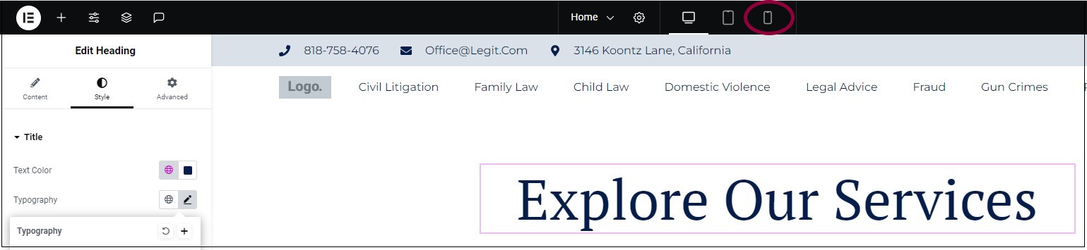
- From the top bar, click the mobile icon.
- Select the Heading widget.
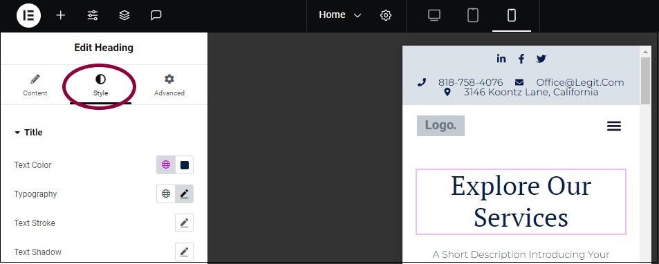
- In the panel, click the Style tab.
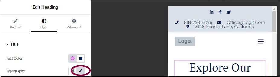
- In the Typography setting, click the pencil icon
.
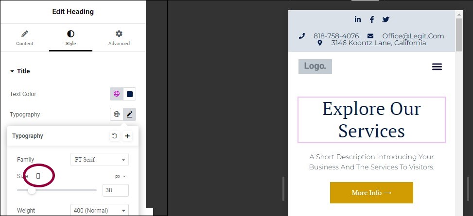
The icon by the Size setting shows that we are changing the size of the text for mobile.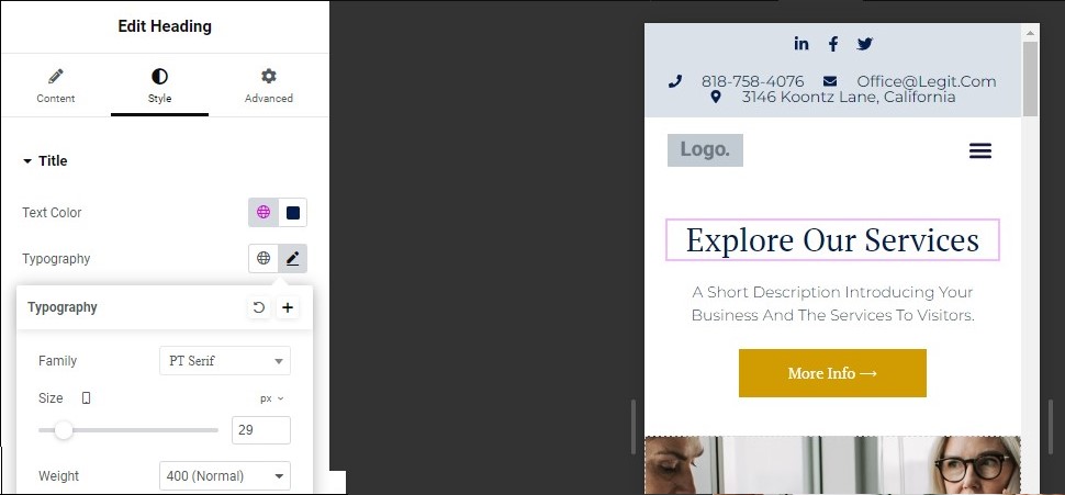
- In the panel, use the Size slider to change the font size so the heading fits on one line.
You’ve changed the way this element will appear on mobiles.
To see how this same page will look on PCs: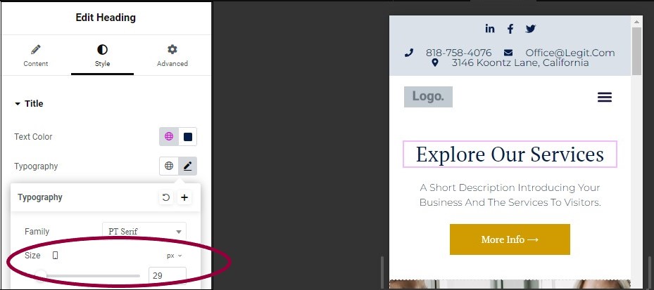
- In the panel, under Typography, go back to the Size setting.
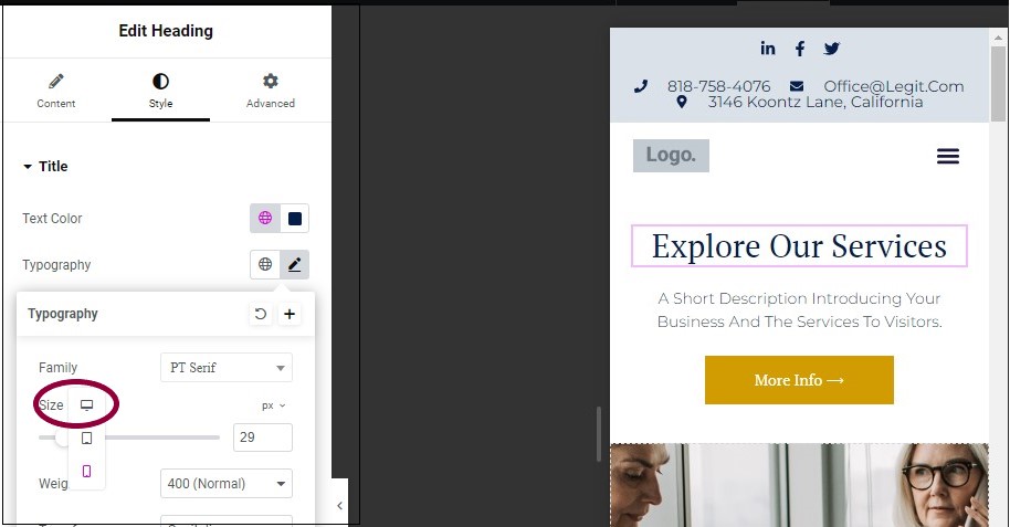
- Click the mobile icon
, and select the PC icon
from the dropdown list.
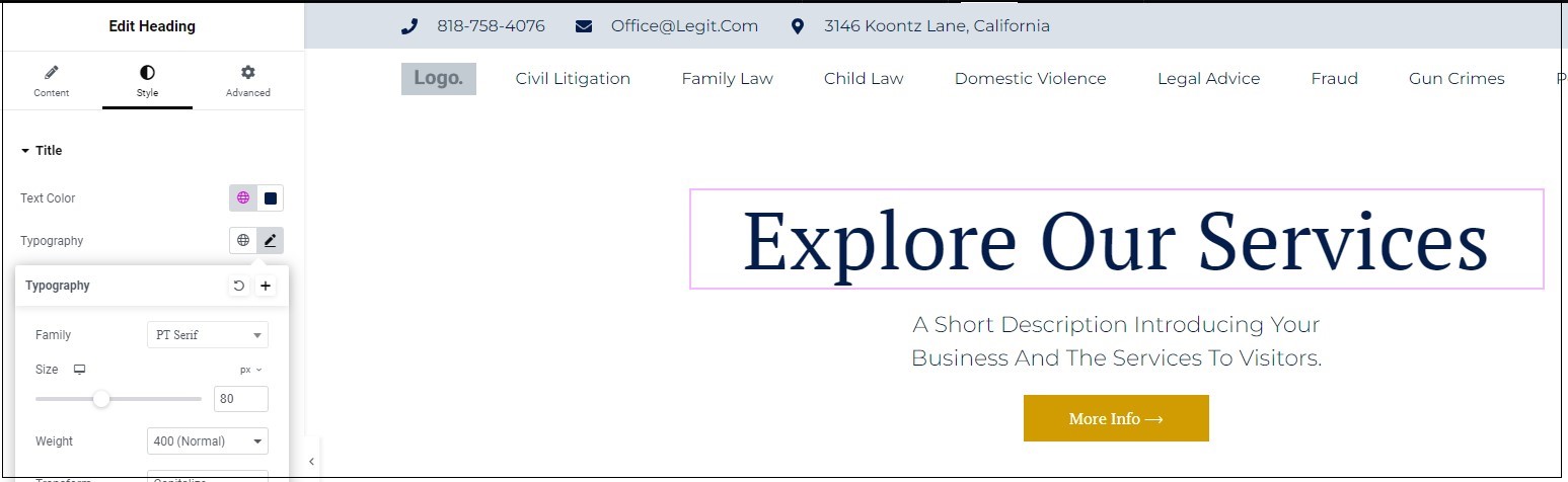
The PC version of the page appears.
Add and customize breakpoints
By default, the Elementor Editor creates pages for three types of devices – PCs, portrait tablets and portrait mobiles, with breakpoints of 1024px for tablets and 767px for mobiles. Some creators want the option of creating their own breakpoints or adding additional devices for greater design flexibility. Such tablets can include widescreen PCs, landscape tablets and mobiles and more.
Using the Elementor Editor site settings, you can edit the breakpoints of the default devices and add additional devices with their breakpoints.
For example, if you set a Tablet breakpoint to 1300px, a laptop with a screen width of 1300px will display the tablet layout. Always consider the pixel width when defining your breakpoints to ensure your design appears correctly on the intended devices.
Like standard breakpoints, custom breakpoints use inherited values. To learn more about inherited values, see What are inherited responsive values?
Access breakpoints
Breakpoints are accessed through the Site Settings.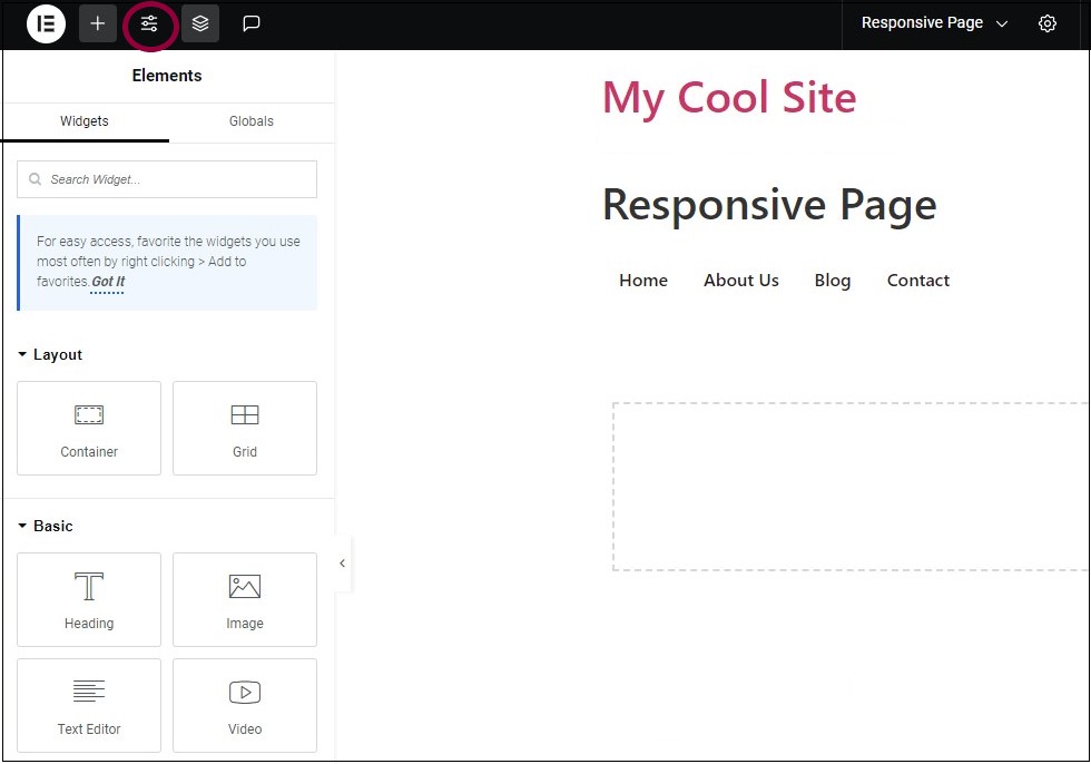
- On the toolbar, click the
icon to select Site Settings.
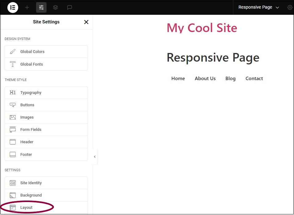
- From the menu, under Settings, select Layout.
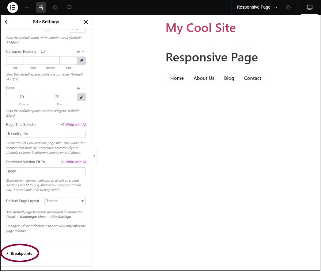
- In the panel, scroll down to Breakpoints and expand it.
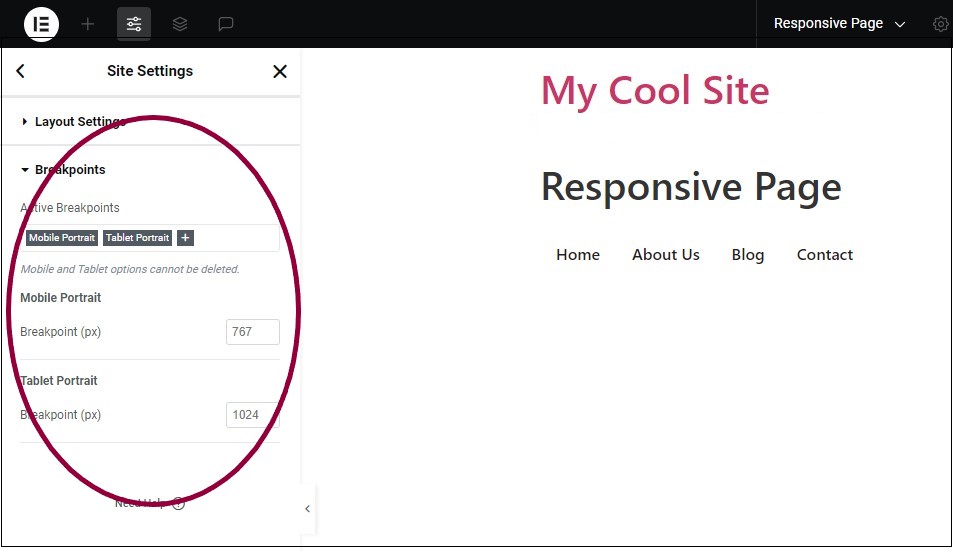
You can now edit the breakpoints.
Add a breakpoint
For creators who want to accommodate a greater range of devices and uses, you can add additional breakpoints.
- Access the breakpoint menu as detailed above.
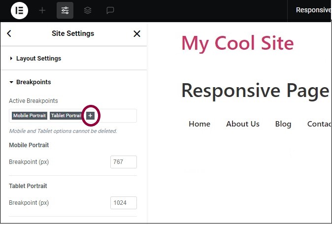
- In the Active Breakpoints section, click the plus icon
.
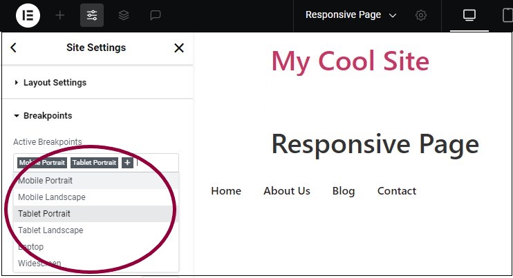
- From the dropdown menu, select one of the six breakpoint options, for example, Table Portrait. You can edit the default setting of each breakpoint.
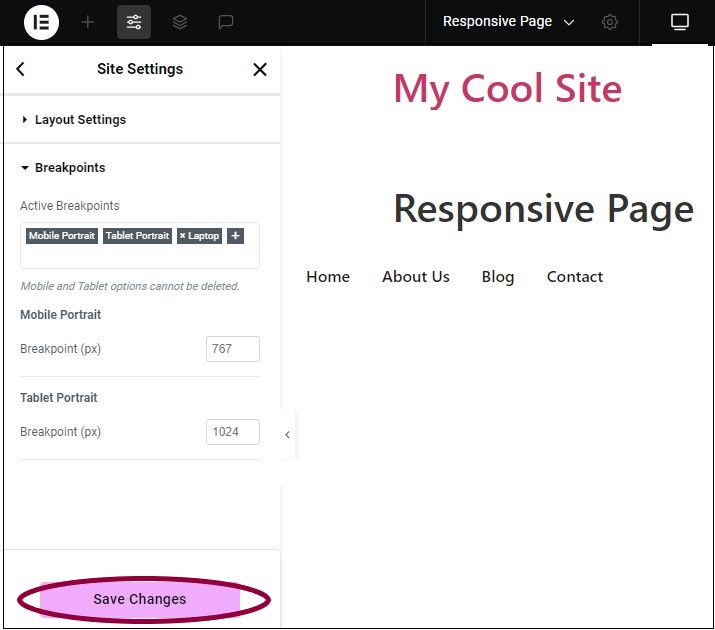
Customize a breakpoint
Elementor allows you to customize screen widths to accommodate new devices.
- Access the breakpoint menu as detailed above.
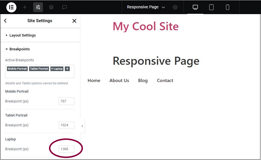
- In the panel, in the Breakpoint (px) text box, enter a new breakpoint value in pixels.
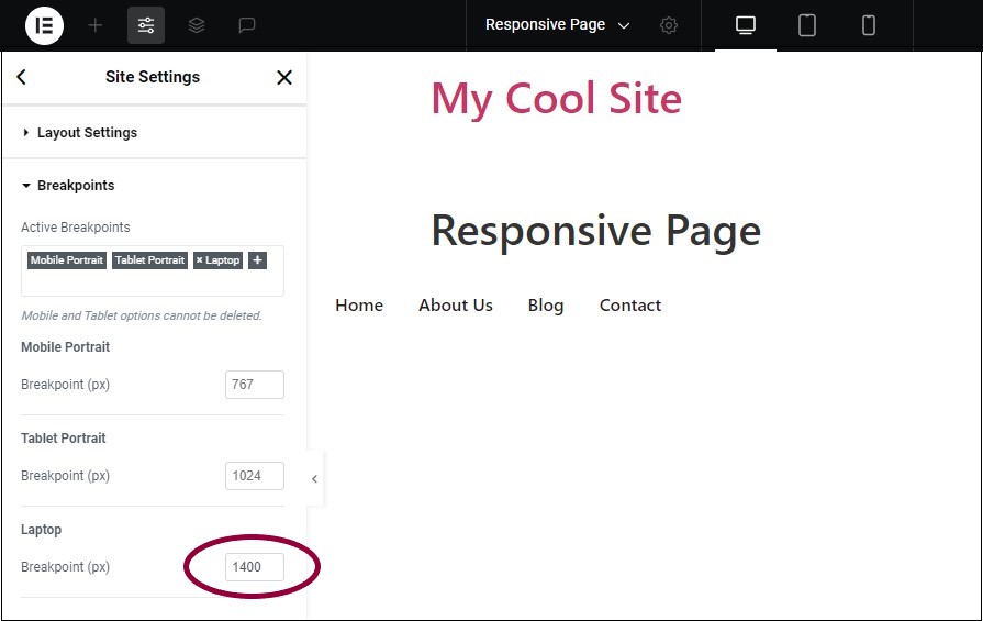
The new number you entered will define the screen width for that breakpoint.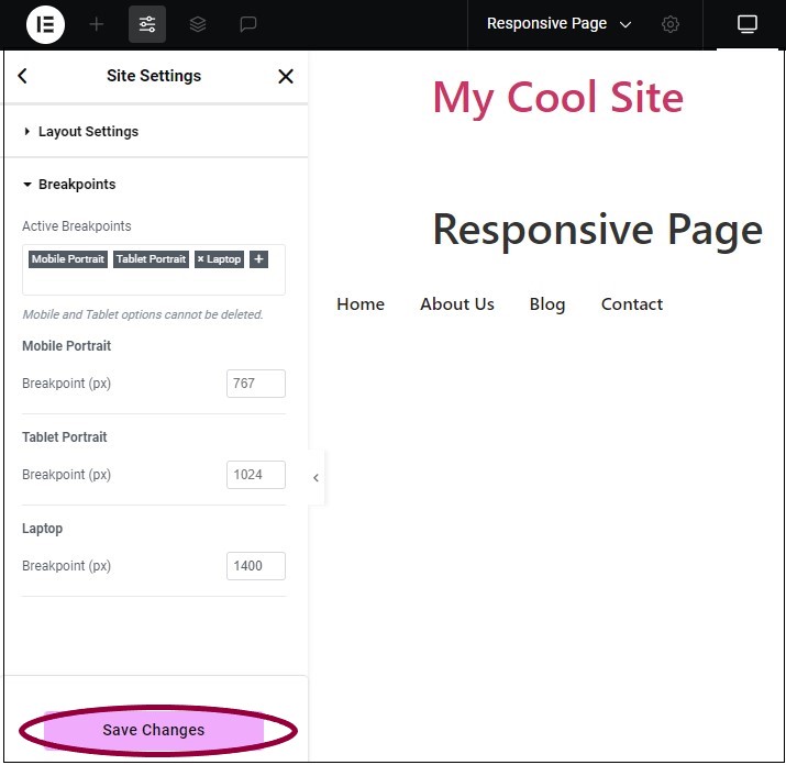
- Click Save Changes.
Delete a breakpoint
You may want to delete breakpoints to simplify your design and design process.
- Access the breakpoint menu as detailed above.
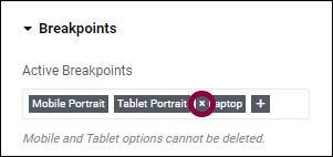
- Click the X icon next to the breakpoint name.
- Click Save Changes.

