Add the widget

Add the widget to the canvas
To access and use a widget:
In Elementor Editor, click +.
All available widgets are displayed.Click or drag the widget to the canvas. For more information, see Add elements to a page.
What is the Inner Section widget?
The Inner Section widget allows you to create nested sections within a section, enabling you to organize your page content more effectively and create complex layouts. You can add and customize various elements such as text, images, buttons, and other widgets inside each section to make your design the way you want.
Common use case
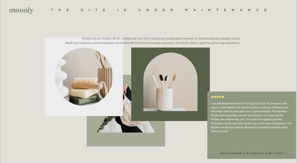
Maria is designing a product website and wants to capture visitors’ attention right from the homepage. Their strategy involves integrating key elements like product images, descriptions, and reviews into the hero section of the site.
To execute this, Maria opts for the Inner Section widget, leveraging its capability to segment the section into multiple columns. In one column, they showcase images of the product, while in another, they add its features and benefits. Additionally, Maria incorporates testimonials from satisfied customers and strategically places links to the brand’s social media profiles within one of the columns.
Additional use cases
- Creating a pricing table with different subscription plans.
- Designing a portfolio section with thumbnails and project descriptions.
- Building a team member section with photos, bios, and social media links.
- Crafting a testimonial carousel with quotes and client photos.
- Setting up a contact form alongside contact information and a map.
Add an Inner Section widget: Step-by-step
- Add the Inner Section widget to the canvas. For details, see Add elements to a page.
- By default, the inner section contains two columns.
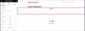
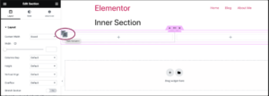
- You can add or remove columns by right-clicking on the column handle icon
 .NoteYou can have up to a maximum of 10 columns.
Actions you can perform with the Inner section widget
Make your inner section stay in a column when the sticky feature is enabled
You can create a customized layout where inner sections stay in the column while being sticky. To learn the process, follow these steps:
- In the Inner section, go to the Advanced tab.
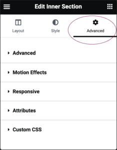
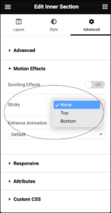
- Under the Motion Effects section, in the Sticky field, select between Top or Bottom from the dropdown menu.
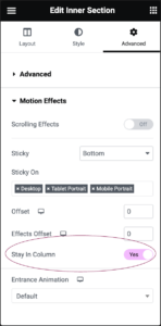
- Upon selecting Top or Bottom, an option labeled Stay in Column will appear. Toggle the Stay in Column option to Yes to make your inner section sticky behavior.
Settings for the Inner Section Widget
You can customize your inner sections using layout, style, and other advanced parameters, offering you great flexibility in tailoring them to your needs. Click the tabs below to see all the settings available for this widget.
Layout tab
The Layout tab provides options for controlling the structure and arrangement of the inner section.
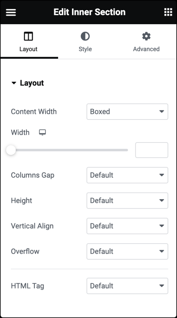
Content Width
Allows you to specify the width of the inner section’s content area. You can choose between Boxed and Full Width layouts.
- If you select Boxed, an additional option for Custom Width appears, enabling you to set a specific width for the content area.
Columns Gap
Determines the spacing between columns within the inner section. You can choose from predefined options like Default, Narrow, No Gap, Extended, Wide,Wider, and Custom.
Height
Offers options for defining the height of the inner section. Choices include Default, Fit to Screen, and Min Height, enabling you to control how much vertical space the inner section occupies.
Vertical Align
Specifies the vertical alignment of the content within the inner section. Options include Default, Top, Middle, Bottom, Space Between, Space Around, and Space Evenly.
Overflow
Determines how content within the inner section behaves if it exceeds the specified dimensions. Options include Default and Hidden, allowing you to control whether overflowing content is visible or hidden.
HTML Tag
Allows you to choose the HTML tag used to wrap the inner section.
Structure
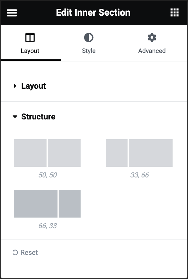
The Structure options allow setting the layout or arrangement of columns within that section.
The default options 50,50, 33,66, and 66,33 define the distribution of columns within the Inner Section widget.
Each option represents a different layout where the total width of the section is divided into two columns, with each column occupying a specified proportion of the total width.
Style tab
The Style tab offers a wide range of options for customizing the appearance of the inner section.
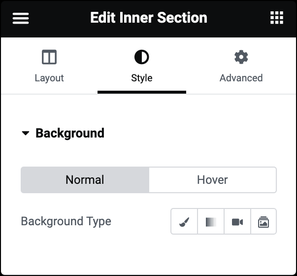
Background Type
Set the background style for the inner section in both the normal and hover states. You can choose from various background types, such as solid color, gradient, image, or video, and customize the specific properties accordingly. For more details, see Create a Background.
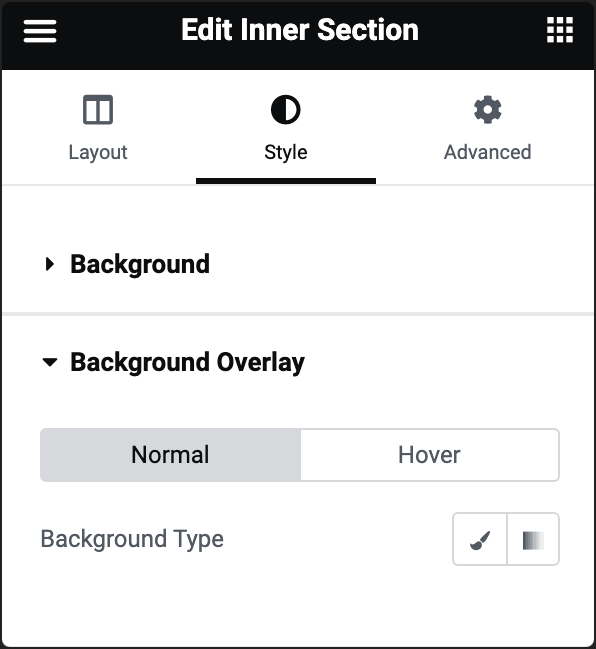
Background Type
Lets you apply an overlay to the background of the inner section in both the normal and hover states. You can choose from various overlay types, adjust opacity, and blend mode to create the desired effect.
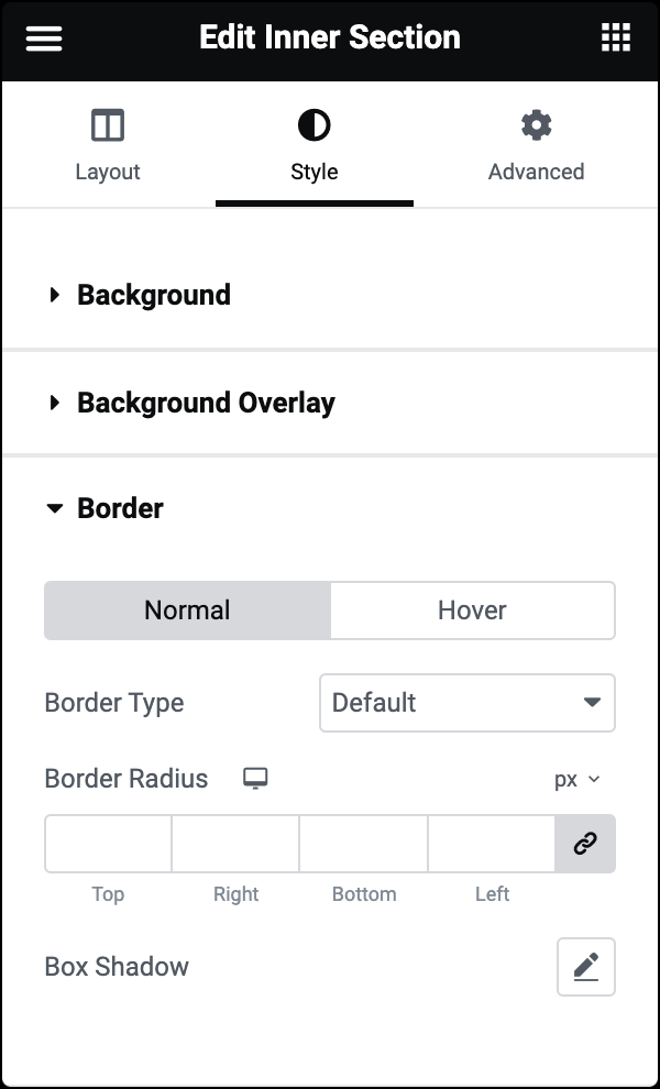
Border Type
Choose the border type for the inner section. For more details, see Border type.
Border Radius
Set the border radius to control corner roundness. For more details, check out Border radius tools.
Box Shadow
Set to apply a box shadow. Learn more about shadows.
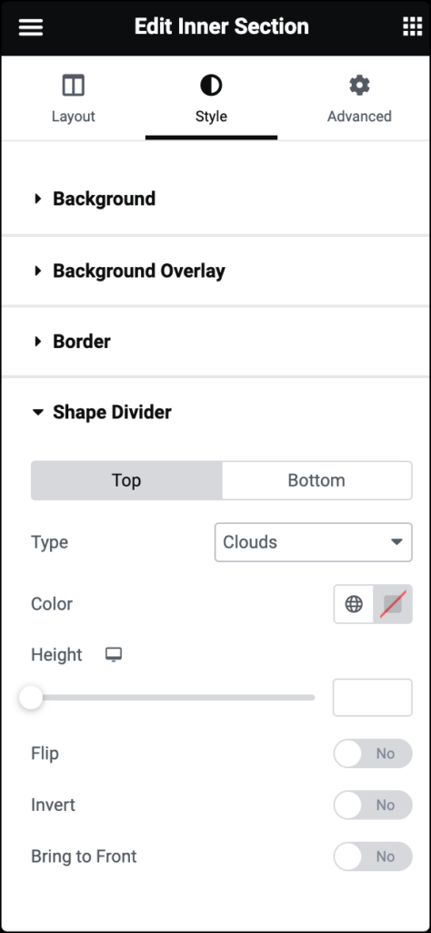
Shape Divider
Allows you to add decorative dividers at the top and bottom of the inner section. You can select from various shapes and customize properties like color, width, height, and flexibility to create visually appealing transitions between sections.
Options include various shapes like waves, curves, and zigzags.
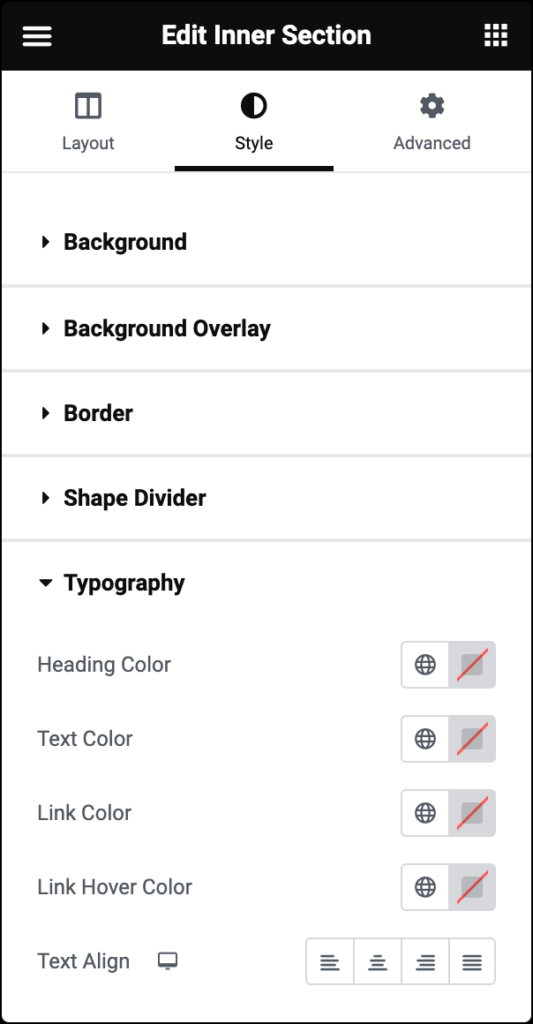
Typography
Customize the typography (font styles) of text within the inner section. You can adjust properties like heading color, text color, link color, link hover color, and text alignment.
Advanced tab
The Advanced tab provides options to control inner section position, adjust spacing, add custom code, and more.
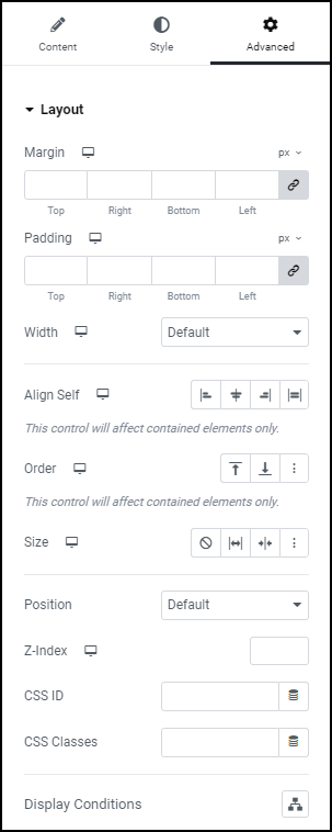
Advanced
Learn more about the Advanced tab settings.

