Introduction
The container layout tab controls how items are arranged in a container. See below for a summary of these controls.
Layout tab
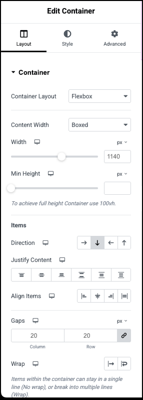
Content Width
Control if the elements in the container will be boxed, or take up the entire width of the container. Select between Boxed or Full Width options in the dropdown
So, should you use ‘Boxed’ or ‘Full Width’ when placing a new container in a layout?
| If | Use |
| You want to adjust the width of the content inside the container but not the container’s width | ‘Boxed’, and adjust the container’s content width using the width control |
| You want to adjust the container’s width but not the container’s content width | ‘Full Width’, and adjust the container’s width using the width control |
| You want to adjust the container’s width and the container’s content width | ‘Full Width’, adjust the container’s width using the width control, and adjust the container’s content width with padding in the Advanced tab |
Width
Control the container’s width or the container’s content width in PX / % / VW. This control applies a different effect depending on whether Content Width is set on ‘Boxed’ or ‘Full Width’.
Boxed
When Content Width is set on ‘Boxed’, the width control allows adjusting the width of the content inside the container.
Full Width
When Content Width is set on ‘Full width’, the width control allows adjusting the container’s width.
Min Height
Control the minimum height of the container’s content. Use the slider or manually enter a value to set the desired minimum container height in PX or VH.
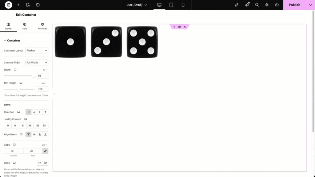
Items
The following controls are available. These apply to all the elements within the Container.
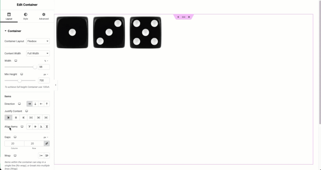
Direction
The direction option is the most basic, but also most important of container layout options. Choose between Row, Column, or the Reversed options depending on your needs and layout.
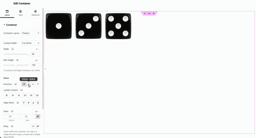
- Row: Items are positioned horizontally
- Column: Items are positioned vertically
- Row Reverse: Items are positioned horizontally but in reverse order
- Column Reverse: Items are positioned vertically but in reverse order
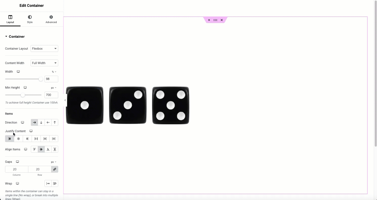
Justify Content
The justify content property defines the alignment along the item’s center axis. It also helps distribute the space leftover in the container between the items.
The following justify-content options are available in the editor:
- Flex Start: This justifies the content to the starting edge of the container.
- Center: This justifies the content to the center of the container
- Flex End: This justifies the content to the ending edge of the container
- Space Between: This creates space between the content in which the first item is placed to the starting edge and the last to the ending.
- Space Around: This creates equal space between container and the items.
- Space Evenly: This creates equal space between items without regards to the container.
Align Items
The align items property attempts to align the items on their center axis. Depending on the direction chosen, it will align all the items within the container.
The following options are available.
- Flex Start: This aligns the items to the starting edge of the container
- Center: This aligns the to the center of the container
- Flex End: This aligns the items to the ending edge of the container
- Stretch: This will attempt to stretch the items to fit the container*
*Stretch will only be applied if items do not have a defined width.
Combining Properties
Many times you will combine the alignment and justification properties to achieve your goals. In the following example, a container’s direction is set to row. The items are aligned to the center. A justification property may then be applied to achieve the desired result.
Content Gap
Use the Gap option to add space between the elements. it can be used along the align and justify properties for even more control of your design. The slider or value may be entered into the field in PX, %, or VW (Viewport Width).
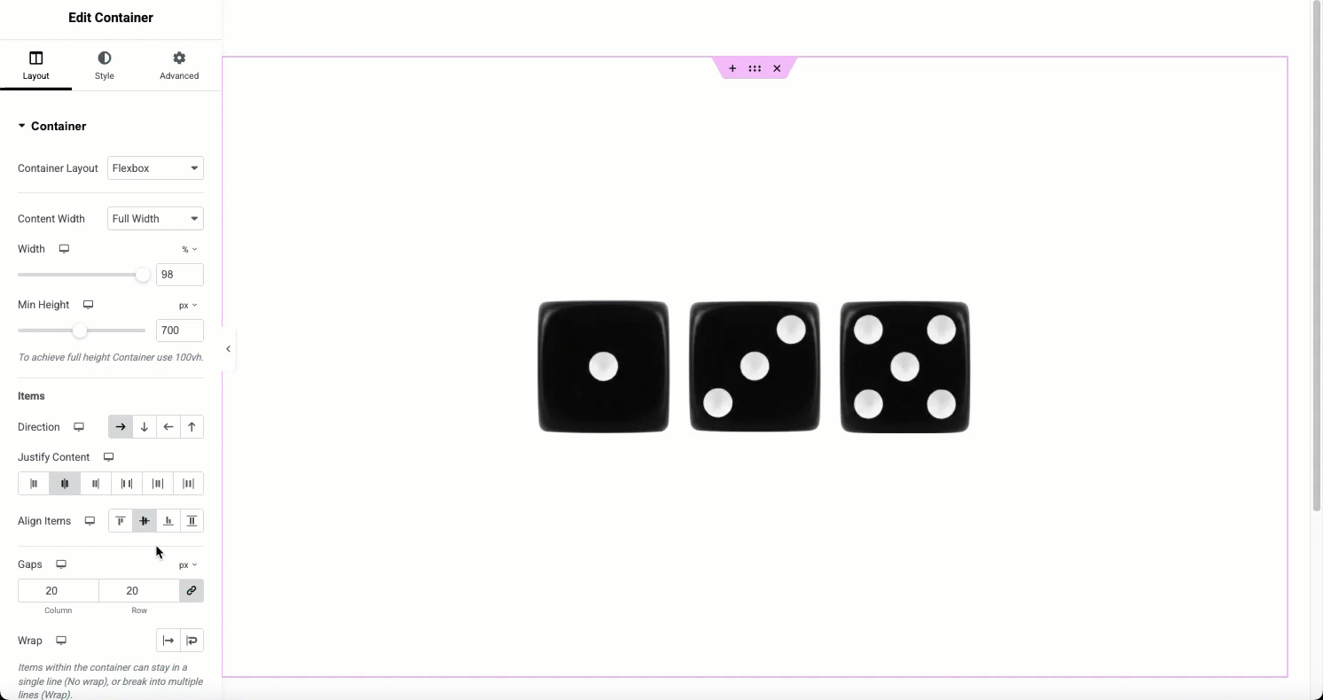
This setting can be set individually for responsive layouts.
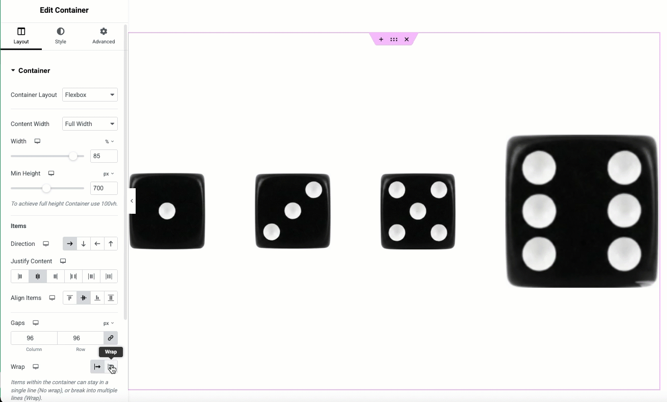
Wrap
When wrap is applied, it will allow elements that use a defined width to wrap into multiple lines rather than forcing the items to a single line. This can be used to create multi line elements all in the same container.
Example: A large heading widget may be placed above several smaller horizontally aligned elements. This would have been achieved by using an inner section with columns in the past but can now be better optimized.
Align Content
The align content property is only displayed if the wrap property is used. It is similar to the justify content in that it uses the available space to distribute the elements. You may choose between center, flex-start, flex-end, space between, space around, and space evenly. These will apply the same functionality as used above to justify content.
Additional options
Overflow
Control if the content of a container does not fit within the viewport, should the overflowed content be hidden, or visible, causing horizontal scrolling. From the dropdown selector, choose Default, Hidden, or Auto as needed by your design.
- Default allows the overflow of items outside the container
- Hidden hides the overflowing items. The overflowing items are not accessible
- Auto creates a scrollbar when content overflows to keep the items accessible. This setting allows for swiping across the content in mobile views.
HTML Tag
From the dropdown menu select the most appropriate for your container from the options. Containers may also be made clickable by selecting the “a” tag.
its content is regarded by search engines. This setting can be set individually for responsive layouts.
Next steps
Now that you’ve learned about the settings in a container’s Layout tab, read about the container settings in the Style tab.
To get the most out of Elementor, check out the Elementor Academy for helpful learning resources. If you come across any issues or need help, please contact our Support Center.

