Add the widget

Add the widget to the canvas
- In Elementor Editor, click +.
All available widgets are displayed. - Click or drag the widget to the canvas. For more information, see Add elements to a page.
What is the Blockquote widget?
The Blockquote widget lets you add quotes or text excerpts within your webpage. It helps to visually separate the quoted text from the rest of your content, making it stand out to your readers.
You can customize these quotes to look just the way you want. Additionally, you can make them Click To Tweet quotes, which means users can easily share them on Twitter by clicking on them.
Common use case
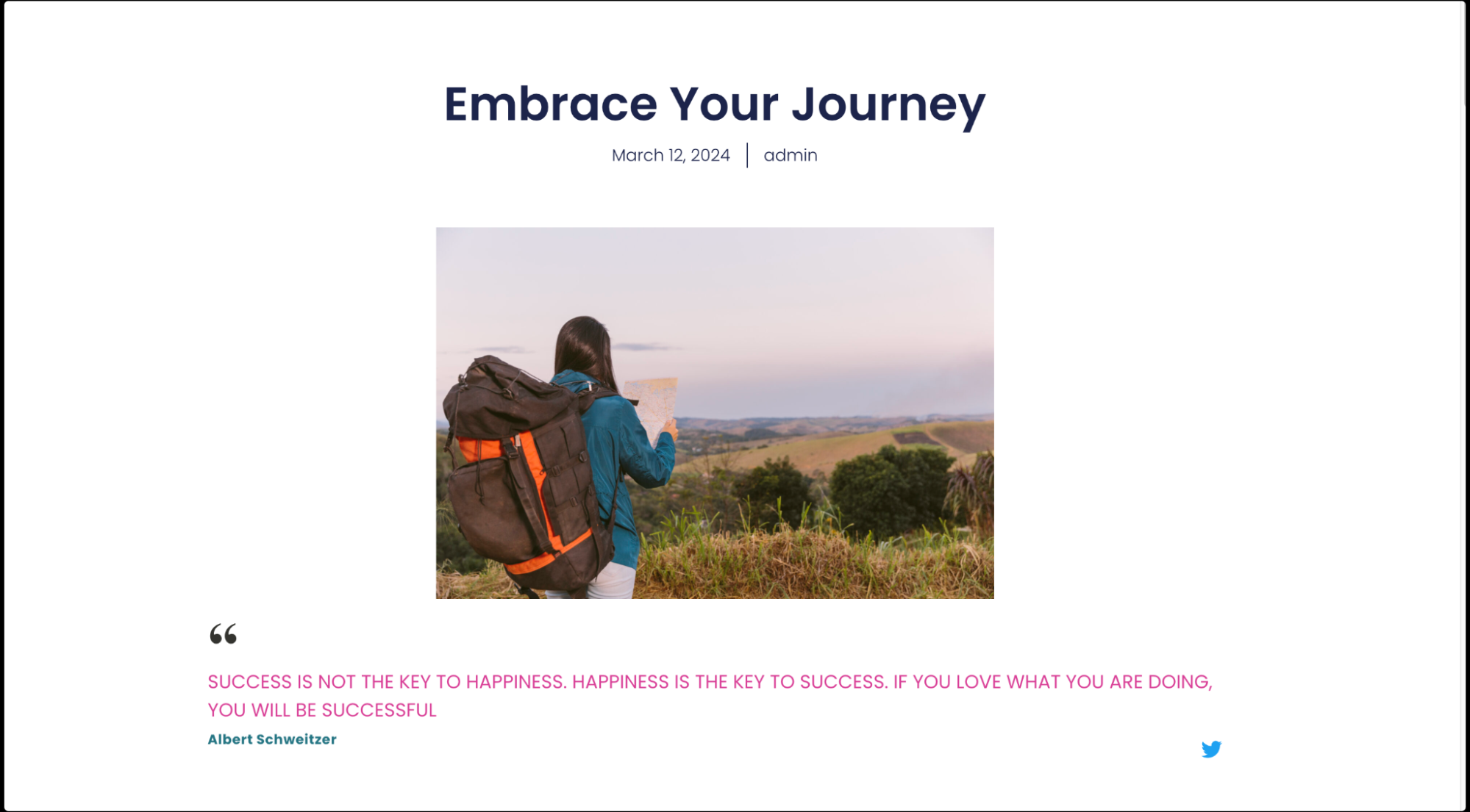
Mark is building a website for a personal blog. They want to include inspirational quotes from famous authors and thinkers throughout the posts. With the Blockquote widget, Mark inserted these quotes in a visually appealing way.
By customizing the style of the quotes, they make them fit seamlessly with the website’s design. Additionally, Mark decides to enable the Click To Tweet feature for some of the quotes, allowing readers to share the wisdom with their Twitter followers with just a click.
Additional use cases
- Display customer reviews or testimonials in a visually appealing manner.
- Feature memorable quotes or phrases to inspire and engage website visitors.
- Showcase excerpts from articles or blog posts to entice readers to explore more content.
- Present important information or instructions in a visually distinct way on landing pages or sales pages.
Add a Blockquote widget: Step-by-step
- Add the Blockquote widget to the canvas. For details, see Add elements to a page.
- In the Content tab, under the Blockquote section, from the Skin field, choose the blockquote skin – options include Border, Quotation, Boxed, and Clean.

- If you select Quotation, Boxed, or Clean skins, the Alignment field appears. You can align the quote to the left, center, or right.

- If you select Quotation, Boxed, or Clean skins, the Alignment field appears. You can align the quote to the left, center, or right.
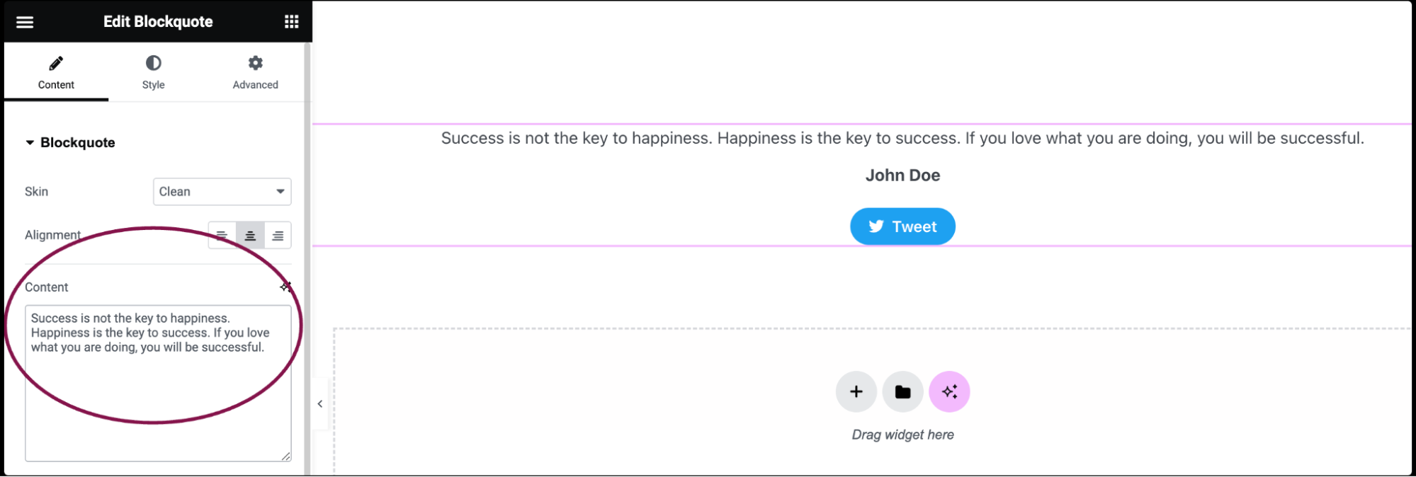
- In the Content field, type or paste the blockquote content. You can also use Dynamic Tags to pull data automatically from WordPress or plugins like Advanced Custom Fields or WooCommerce.
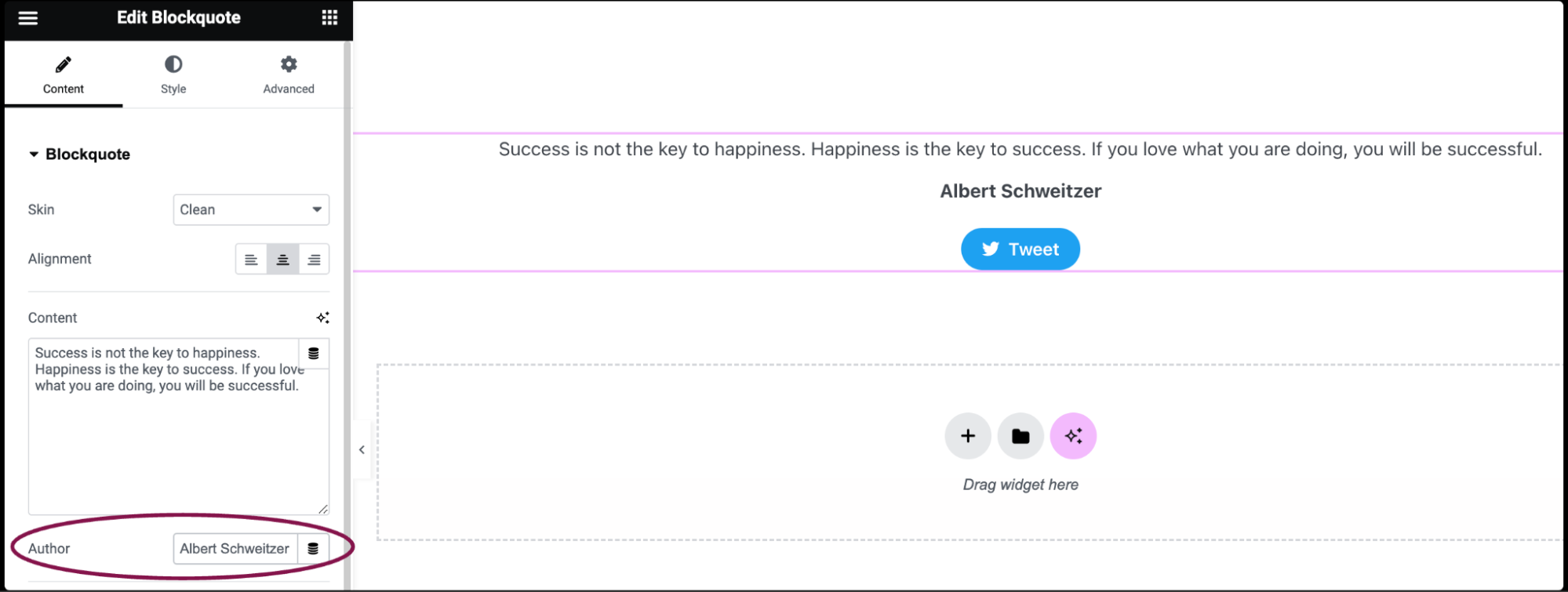
- In the Author field, input the name of the author.
- Toggle On/Off the Tweet Button. The button is enabled by default and displays a Twitter button underneath the quote.
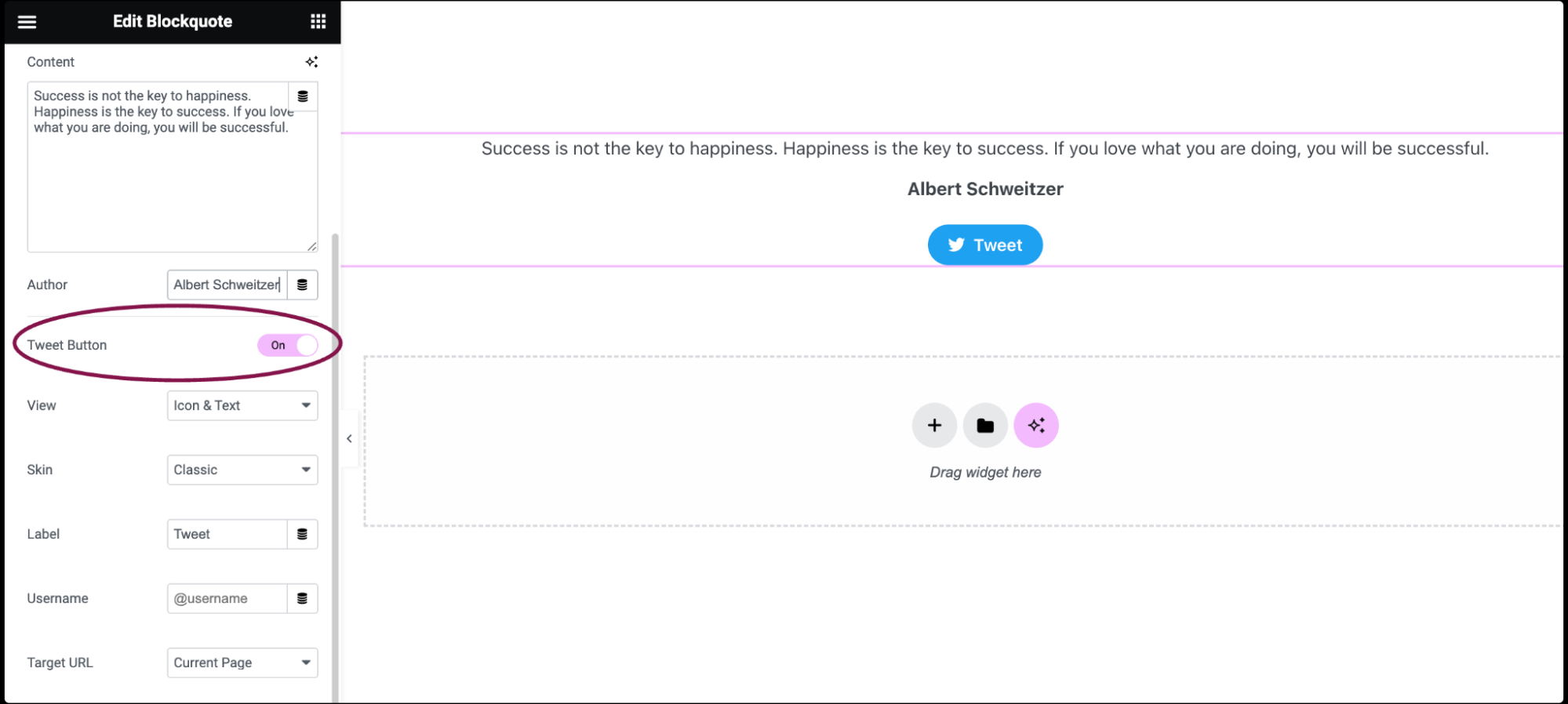
- In the View field, choose between Icon & Text, Icon, or Text only.
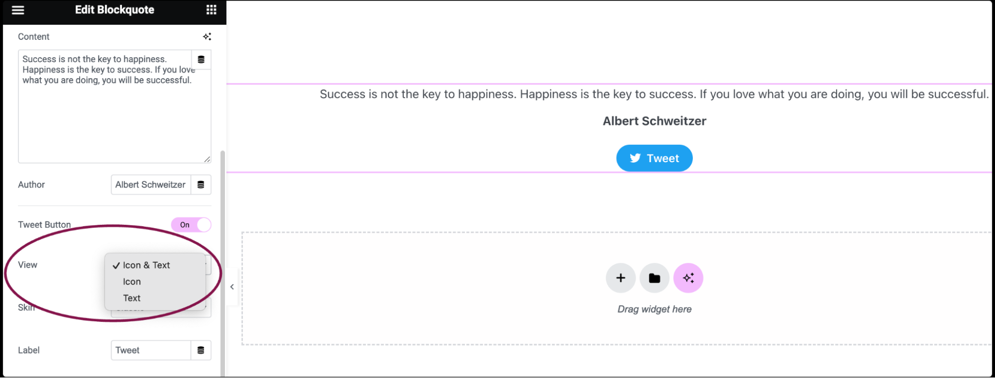
- In the Skin field, select between Classic, Bubble, and Link for the Tweet button.
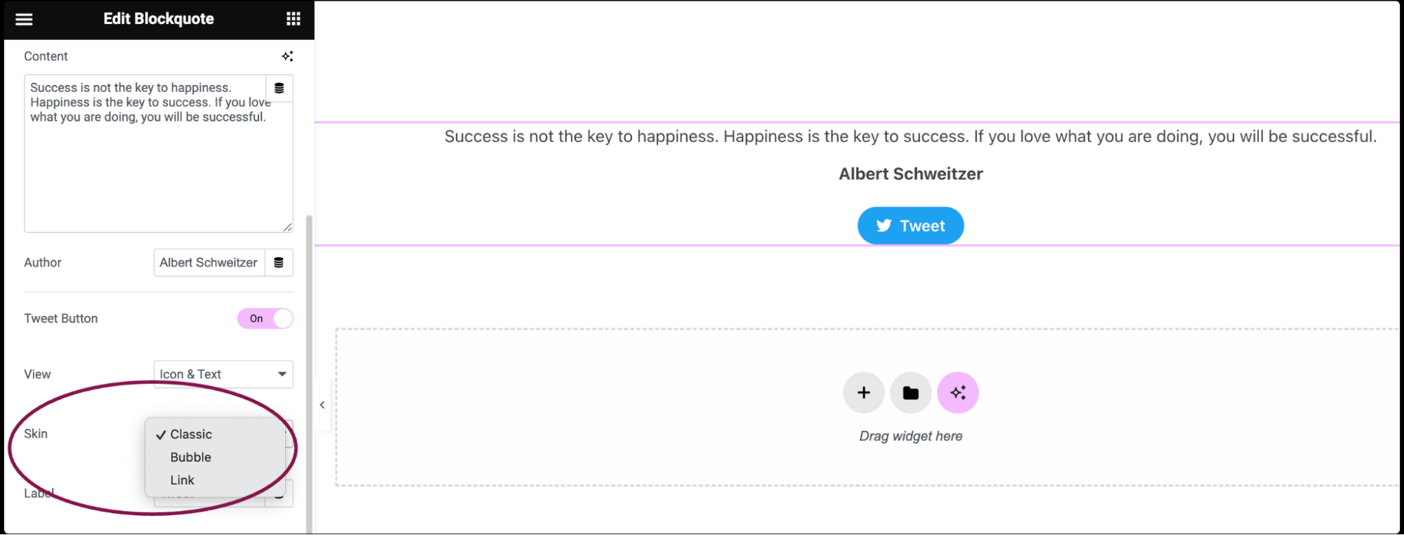
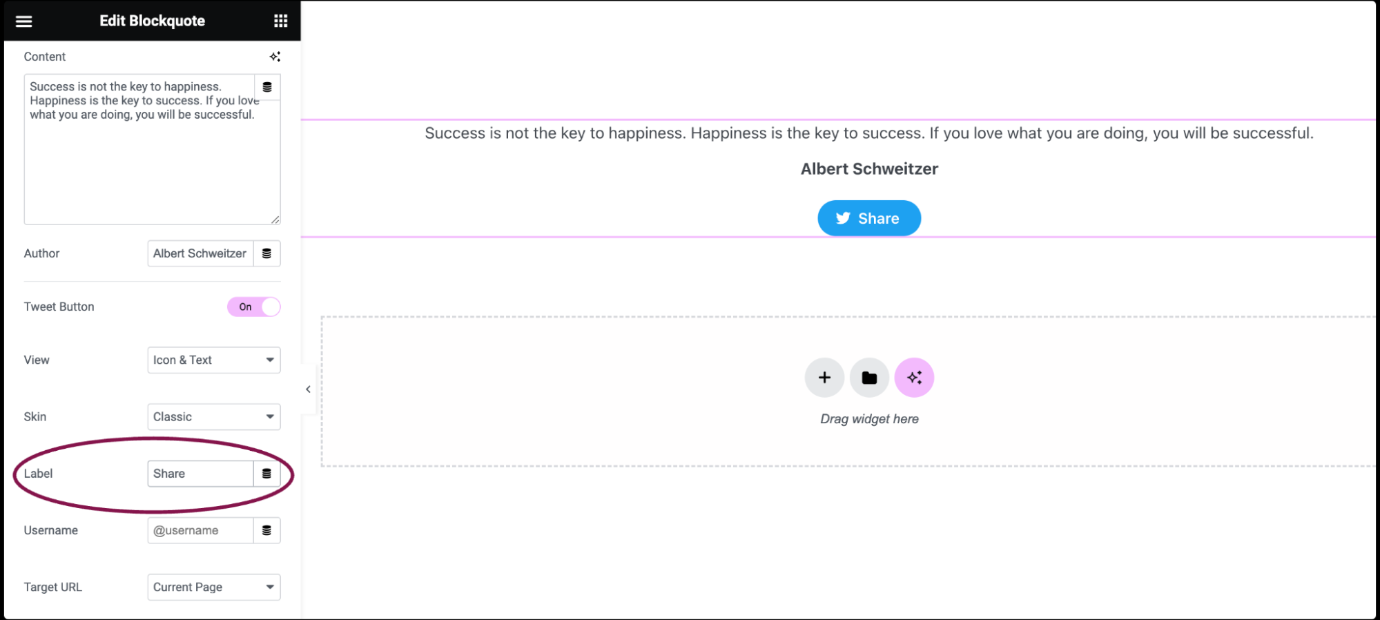
- In the Label field, type a label for the Tweet button. It’s the text users will see on the button.
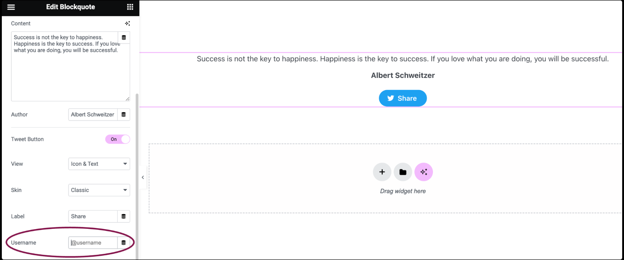
- In the Username field, add your Twitter account username (e.g., @your_account). This adds a via @your_account mention to the tweet when users share the quote.
- In the Target URL field, choose between the Current Page, None, or add a Custom Link.
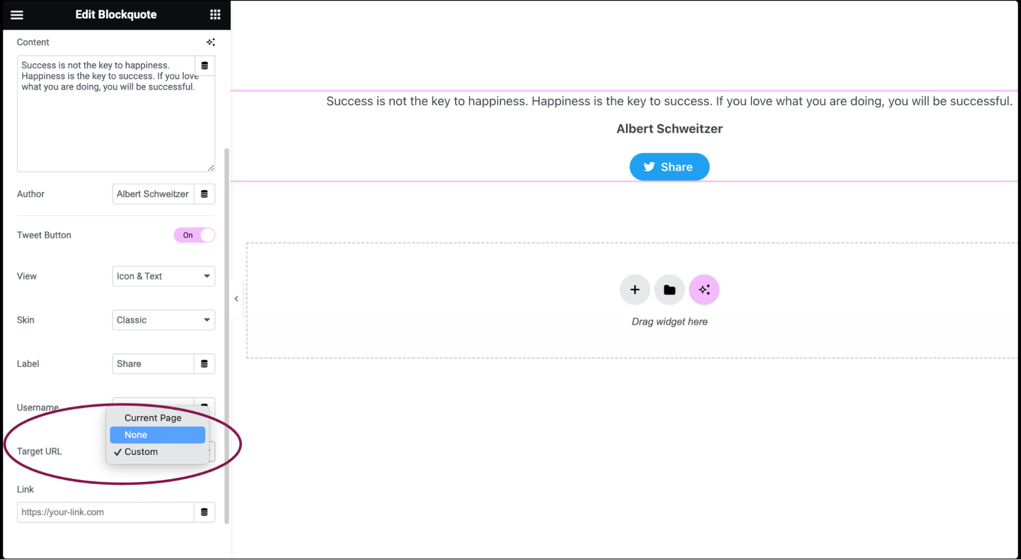
- Current Page: The URL of the current webpage will be included in the quote shared on Twitter
- None: No URL will be mentioned in the shared quote on Twitter
- Custom Link: Add a specific URL of your choice. When users click on the shared quote on Twitter, they’ll be directed to this custom URL
Settings for the Blockquote widget
You can customize your widgets using content, style, and other advanced parameters, offering you great flexibility in tailoring them to your needs. Click the tabs below to see all the settings available for this widget.
Content tab
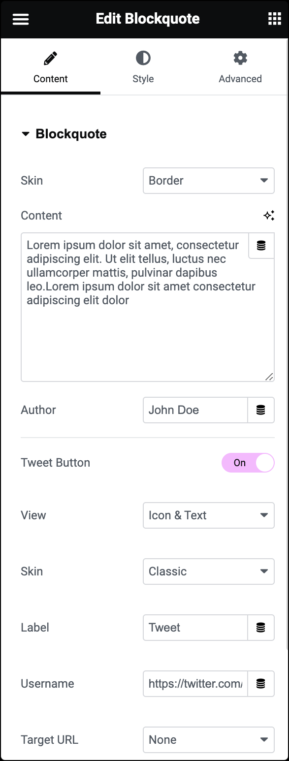
Skin
Choose the Blockquote skin, selecting either Border, Quotation, Boxed, or Clean.
Alignment
If you select Quotation, Boxed, or Clean skins, this field appears. You can align the quote to the left, center, or right.
Content
Type or paste your Blockquote content. You can also use Dynamic Tags to pull data automatically from WordPress or plugins like Advanced Custom Fields or WooCommerce.
Author
Enter the Author’s name.
Tweet Button
Toggle the Tweet Button On or Off. This button is enabled by default.
View
Choose between Icon & Text, Icon, or Text only.
Skin
Choose between Classic, Bubble, and Link.
Label
Type your Label.
Username
Type your Twitter Account username.
Target URL
Choose between the Current Page, None, or a Custom Link.
Style tab
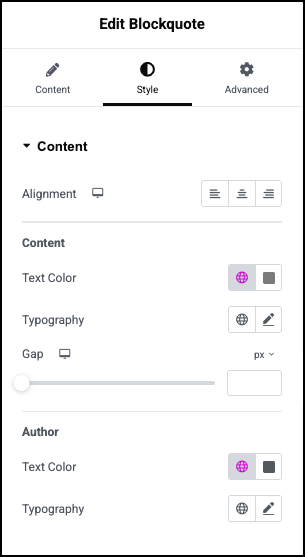
Alignment
Set the position of the blockquote:
 to the left
 centered
 to the right
Text Color
Choose the color of the quotation text.
Typography
Set the typography options for the quotation text For more details, see Typography.
Gap
Set the amount of spacing between the quotation text and the author.
Author
- Text Color: Choose the color of the author’s name.
- Typography: Set the font style for the author’s name. For more details, see Typography.
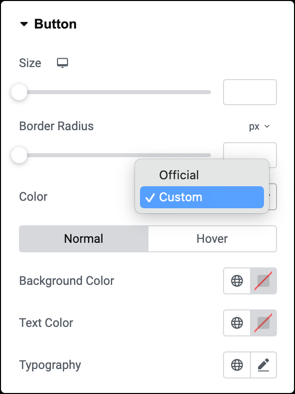
Size
Use a slider to adjust the button size.
Border Radius
Use a slider to set the border radius to control corner roundness. For more details, see Border radius tools.
Color
Select the Official Twitter colors or set your own Custom color.
Note: Custom color will also let you choose a Hover mode for the button. Hover lets you set a transition duration. This is the length of time it takes for the button to change its appearance.
Normal
Determine how the button appears by default.
- Text Color: Set the color of the button’s text.
- Background Color: Add a background color to the button. For more details, see Create a Background.
Hover
Determine how the button appears when moused over.
- Text Color: Set the color of the button’s text.
- Background Color: Add a background color to the button. For more details, see Create a Background.
- Transition Duration: Determine the duration of the hover animation.
Typography
Set the typography options for the button text. For more details, see Typography.
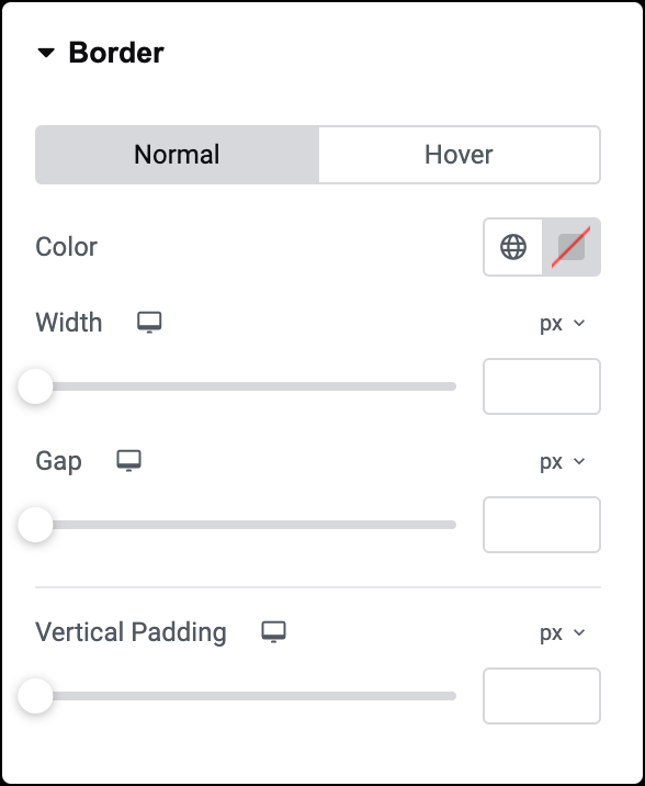
Color
Choose the color of the border for normal and hover states.
Width
Set the border’s width for normal and hover states.
Gap
Set the space between the left border and the quote text for normal and hover states.
Transition Duration
Set a transition duration for the hover state. This is the length of time it takes for the border to change its appearance.
Vertical Padding
Set the top and bottom padding around the content.
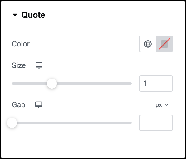
Color
Select the color of the quotation mark.
Size
Adjust the size of the quotation mark.
Gap
Set the spacing between the quotation mark and the quote text.
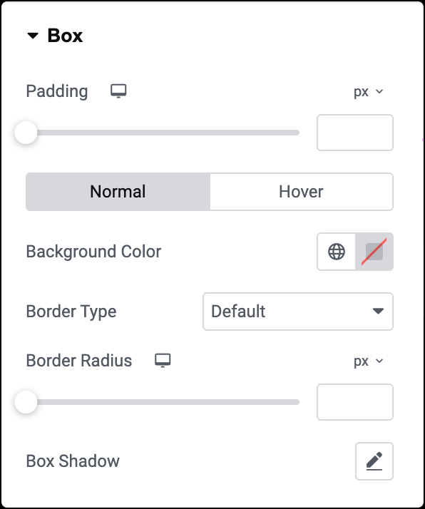
Padding
Adjust the padding around the quote text.
Background Color
Choose colors for the box for its normal and hover states.
Border Type
Select border type for its normal and hover states. For more details, see Border type.
Border Width
If border type is selected, adjust the thickness of the border around the box for its normal and hover states.
Border Radius
Set how round the corners of the border should be for normal and hover states. For more details, see Border radius tools.
Box Shadow
Click the 🖋️ icon to add a shadow to the box for its normal and hover states. Learn more about shadows.
Transition Duration
Determine the duration of the hover animation.
Advanced tab
The Advanced tab provides options to control widget position, adjust spacing, add custom code, and more.
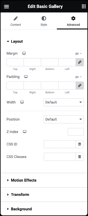
Advanced
Learn more about the Advanced tab settings.

