Add the widget

Add the widget to the canvas
- In Elementor Editor, click +.
All available widgets are displayed. - Click or drag the widget to the canvas. For more information, see Add elements to a page.
What is the Animated Headline widget?
The Animated Headline widget allows you to create eye-catching and engaging website headlines. It enables you to animate headline text elements that rotate or include highlighted animation.
Additionally, this widget lets you easily customize the animation effects, speed, and styles to match your website’s design and branding.
Common use case
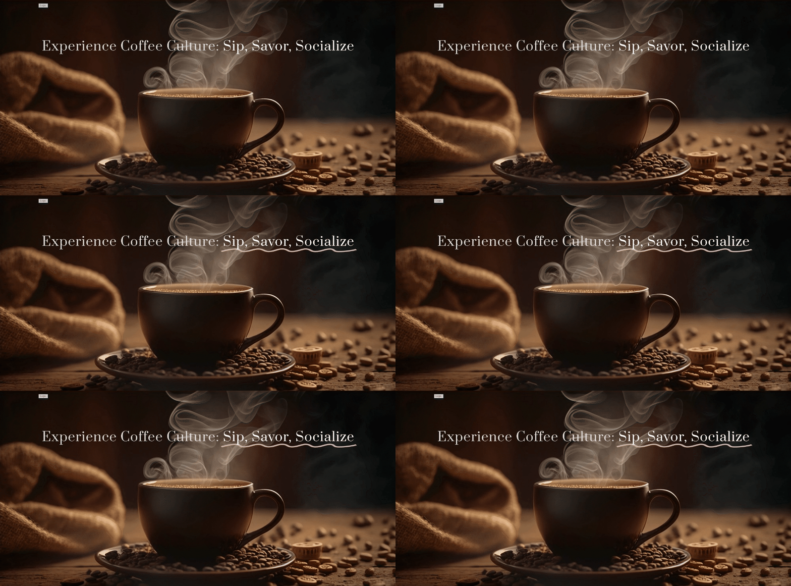
Matt is designing the homepage of a website for a trendy coffee shop. He wants to create an engaging headline that captures visitors’ attention and conveys the café’s unique atmosphere. Using the Animated Headline widget, Matt crafts a dynamic headline that reads, “Experience Coffee Culture: Sip, Savor, Socialize!”
With the widget’s animation effects, each word gently fades in, drawing the eye and inviting visitors to explore further.
Additional use cases
- Highlight product features.
- Showcase testimonials.
- Promote special offers.
- Announce events or promotions.
- Encourage newsletter sign-ups.
Add an Animated Headline widget: Step-by-step
- Add the Animated Headline widget to the canvas. For details, see Add elements to a page.
- In the Content tab, under the Headline section, from the Style field, select either Highlighted or Rotating style.
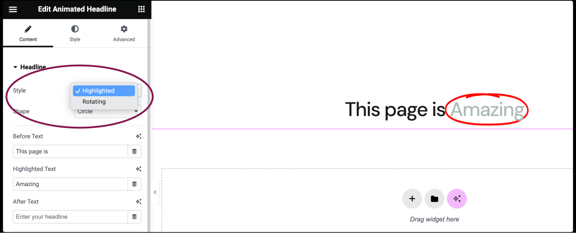
- If Highlighted style is chosen, the following customization options become available:
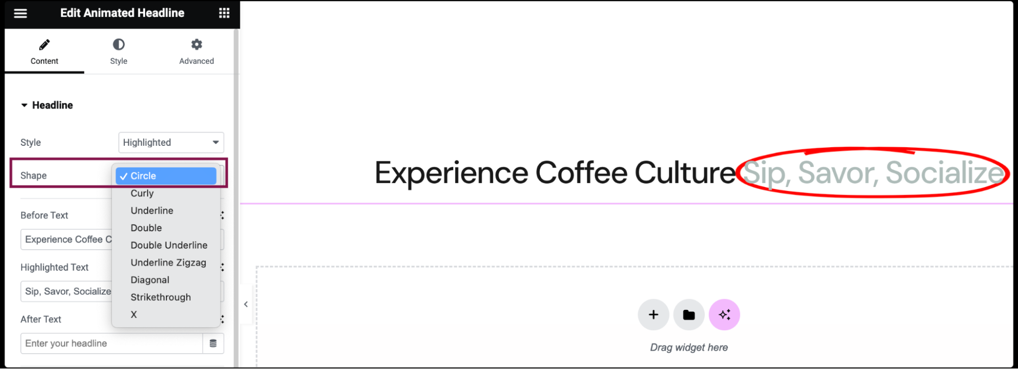
- In the Shape field, choose the shape of the highlight, including Circle, Curly, Underline, Double, Double Underline, Underline Zigzag, Diagonal, Strikethrough, and X.
- In the Before Text field, type the headline text that will appear before the highlighted text.

- In the Highlighted Text field, type the text that will be highlighted.

- In the After Text field, type the headline text that will appear after the highlighted text.

- In the Shape field, choose the shape of the highlight, including Circle, Curly, Underline, Double, Double Underline, Underline Zigzag, Diagonal, Strikethrough, and X.
- If Rotating style is chosen, the following customization options become available:
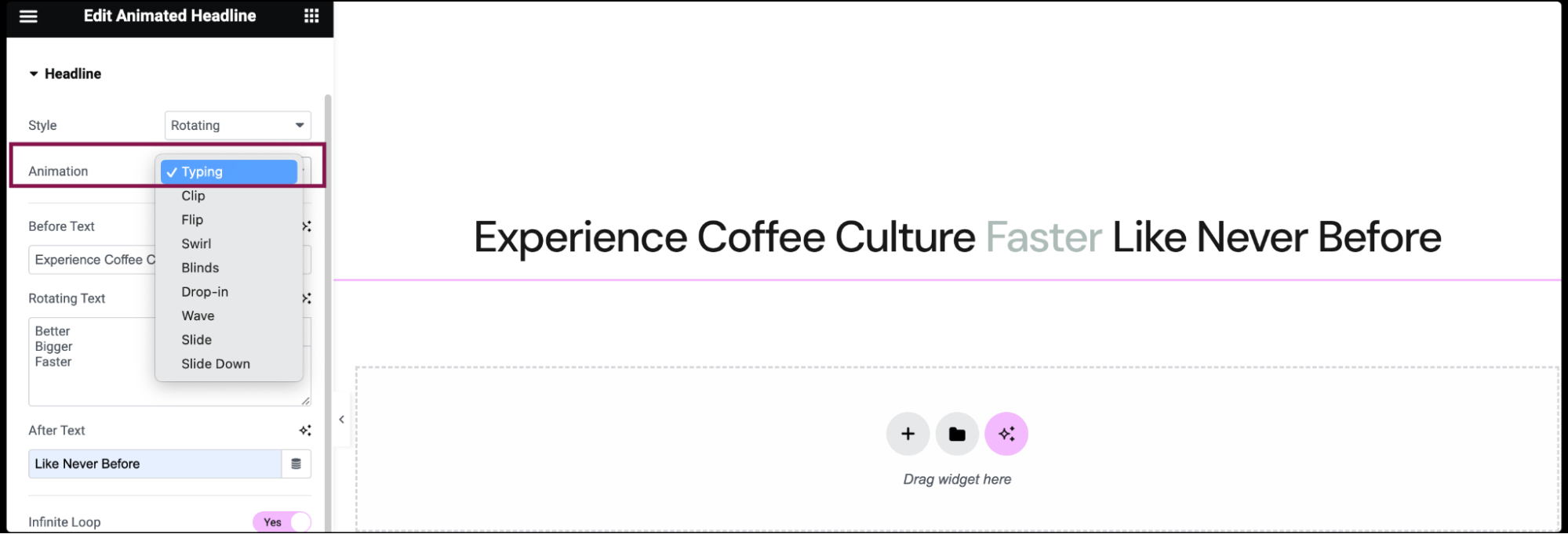
- In the Animation field, choose the animation of the rotating text, including Typing, Clip, Flip, Swirl, Blinds, Drop-in, Wave, Slide, and Slide Down.
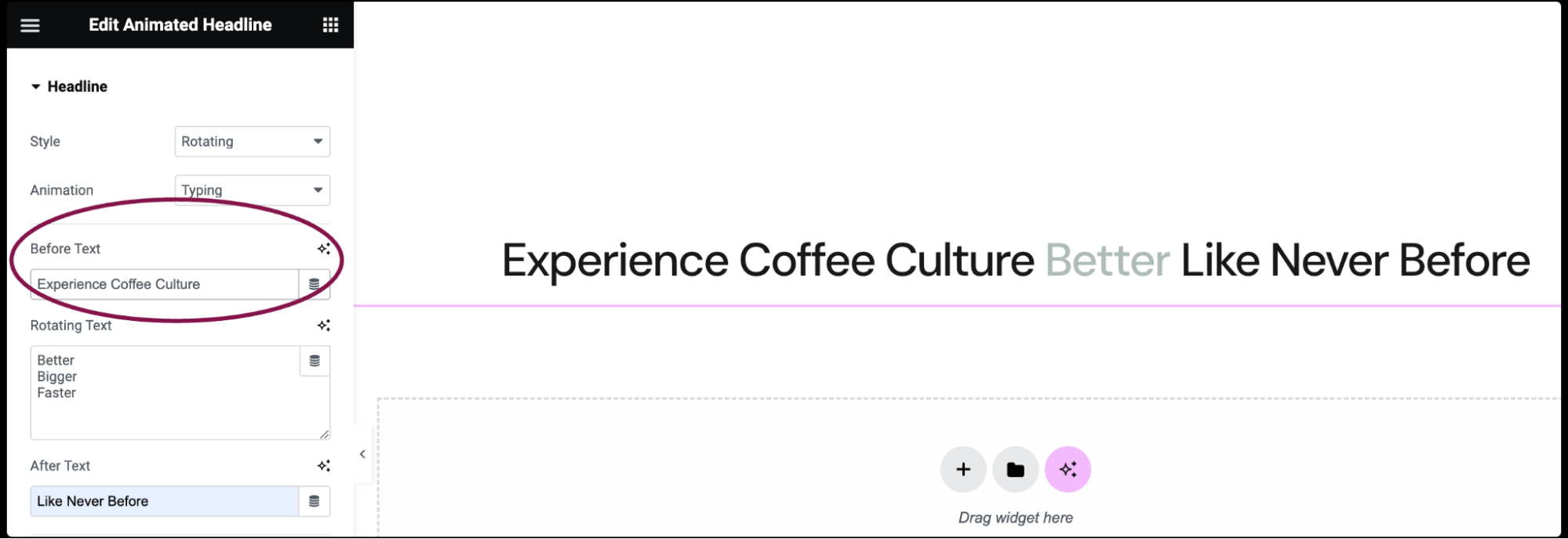
- In the Before Text field, add the headline text that will appear before the rotating text.
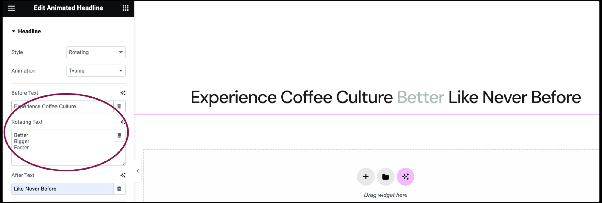
- In the Rotating Text field, add the list of rotating text, in the order of rotation.
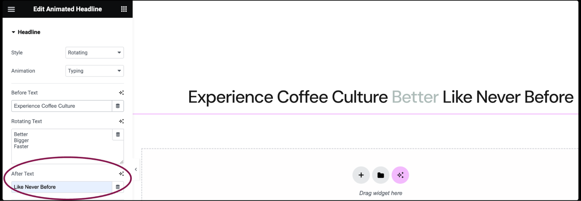
- In the After Text field, add the headline text that will appear after the rotating text.
- In the Animation field, choose the animation of the rotating text, including Typing, Clip, Flip, Swirl, Blinds, Drop-in, Wave, Slide, and Slide Down.
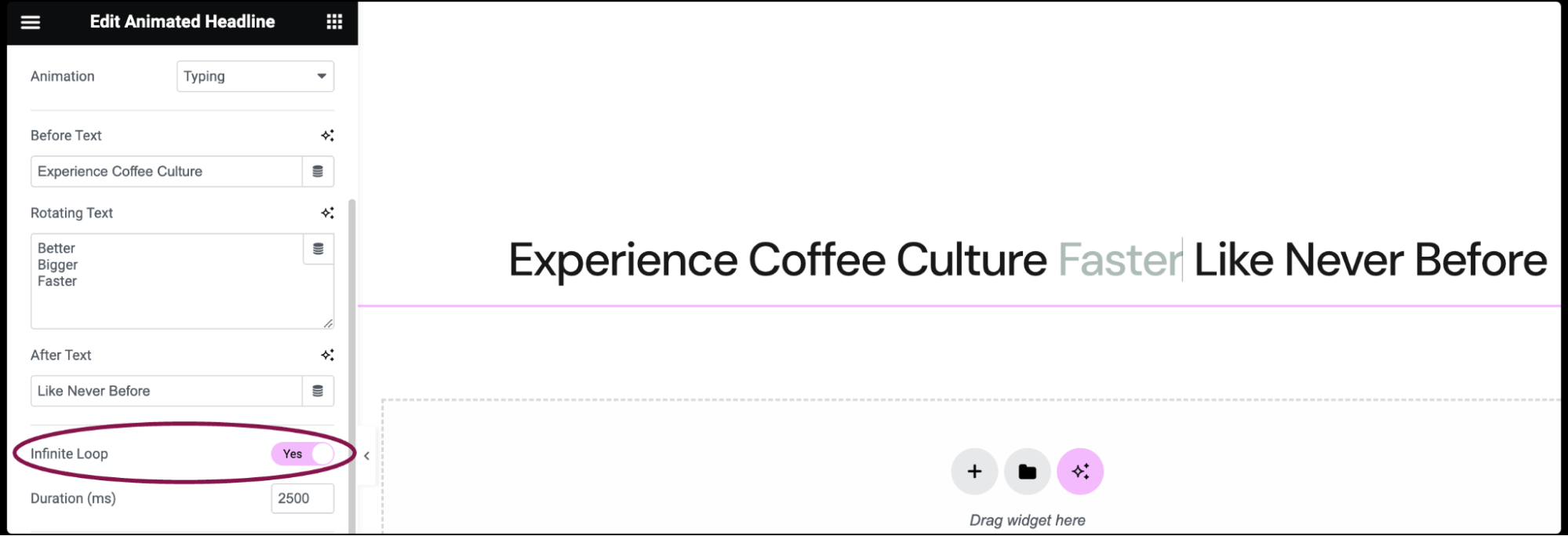
- Set the Infinite Loop field to Yes to have the animation loop endlessly or set to No to have it only play once and then remain frozen at the end of the animation.
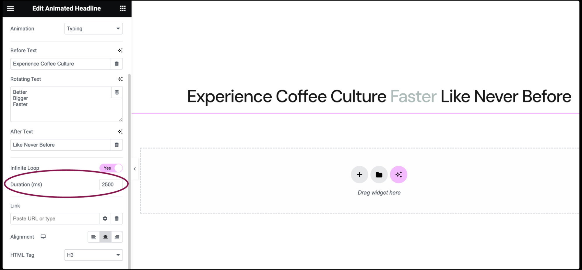
- In the Duration field, set the amount of time in milliseconds that the animation takes for one loop.
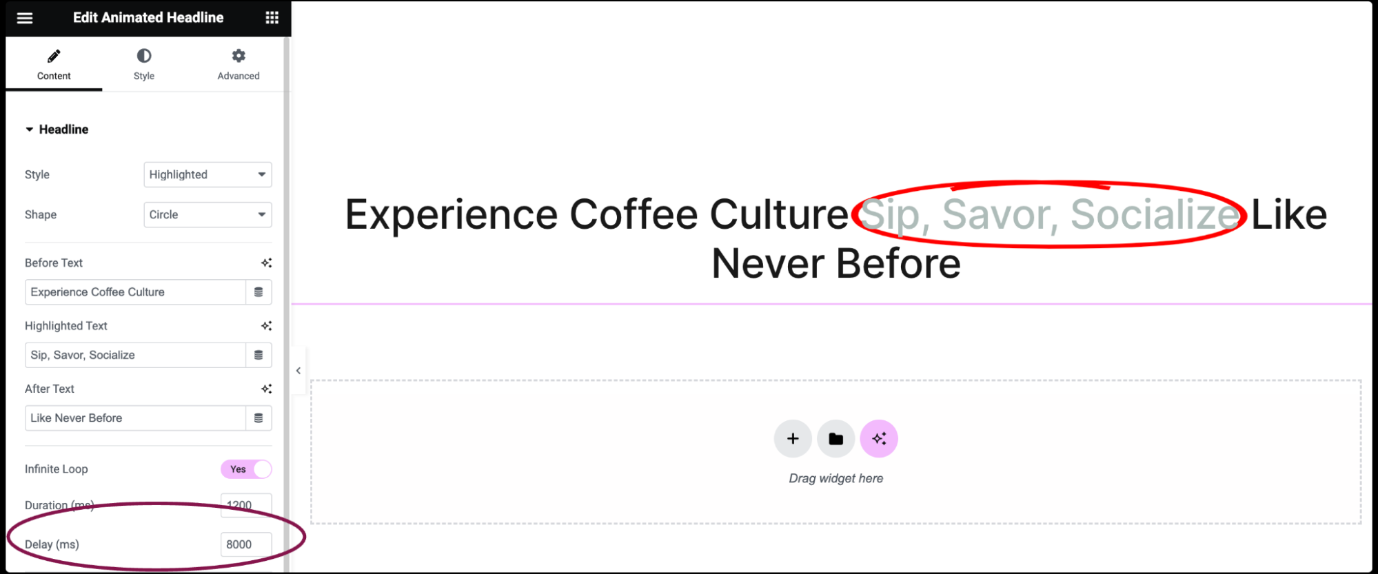
- If Infinite Loop is set to Yes, and Highlighted style is chosen, the Delay field becomes available. Set the amount of time in milliseconds between each loop.
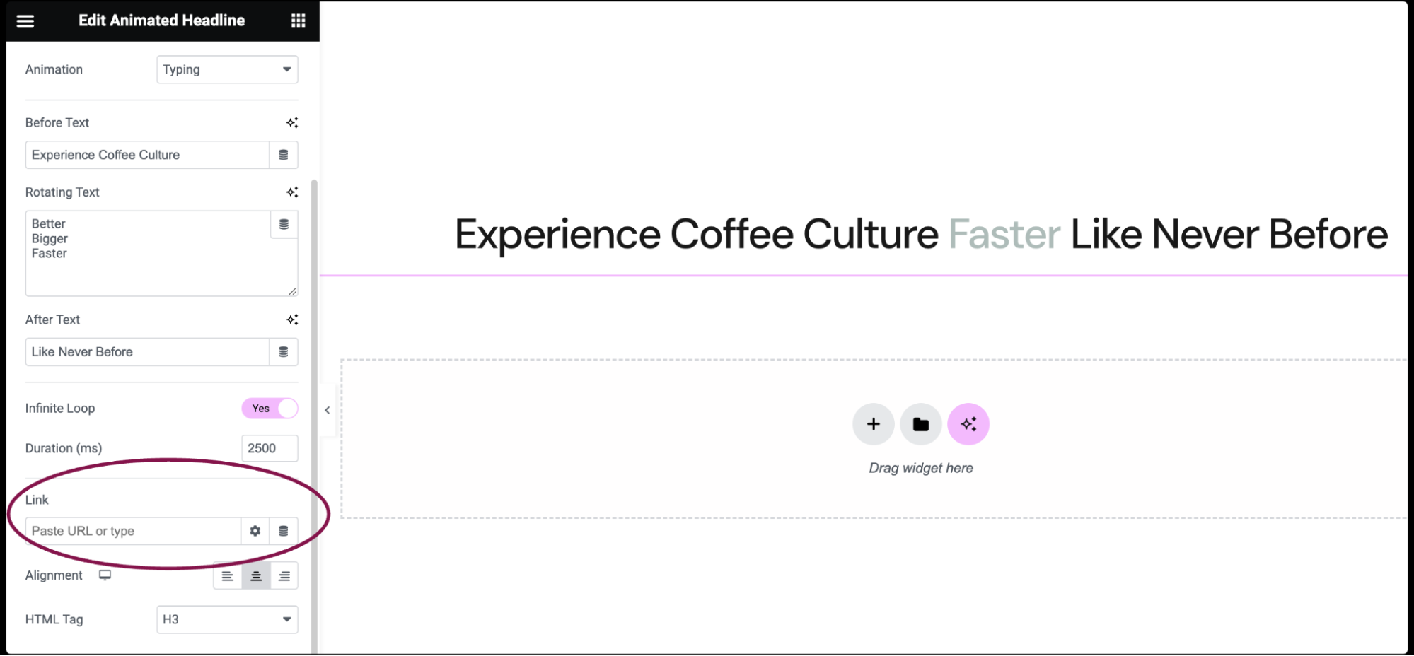
- In the Link field, enter the URL to make your headline clickable. Click the icon
 to set more link options.
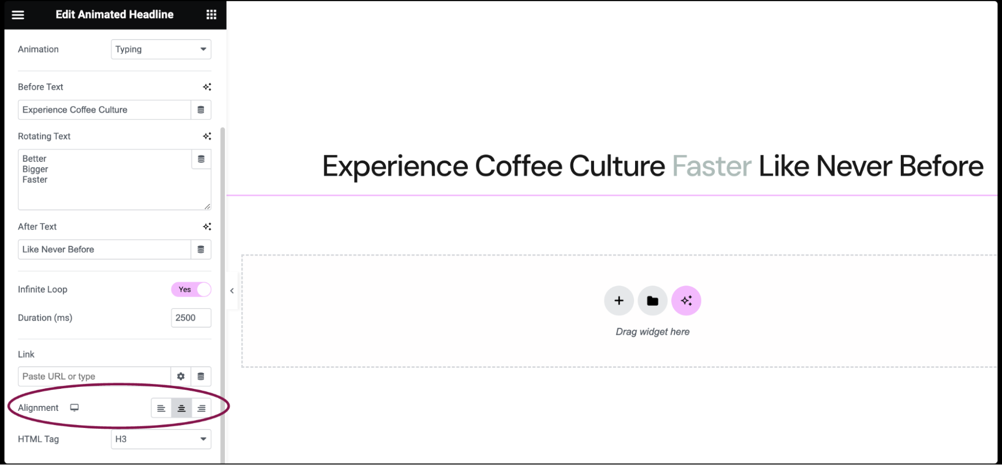
- Use the Alignment field to set the alignment of the headline. Options available are left, right, or centered.
- Use the HTML Tag field to define the type of HTML tag for your heading. Choices include H1 to H6, Div, Span, or Paragraph.

Settings for the Heading widget
You can customize your widgets using content, style, and other advanced parameters, offering you great flexibility in tailoring them to your needs. Click the tabs below to see all the settings available for this widget.
Content tab
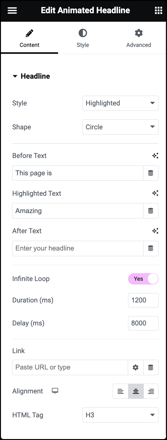
Style
Select either Highlighted or Rotating style for the headline animation.
Highlighted Style Options
- Shape: Choose from various shapes for the highlight, such as Circle, Underline, Double, etc.
- Before Text: Enter text to appear before the highlighted section.
- Highlighted Text: Enter the text to be highlighted.
- After Text: Enter text to appear after the highlighted section.
Rotating Style Options
- Animation: Choose from various animations like Typing, Flip, Slide, etc.
- Before Text: Enter text to appear before the rotating section.
- Rotating Text: Enter the list of texts to rotate through.
- After Text: Enter text to appear after the rotating section.
Infinite Loop (ms)
Choose whether the animation loops endlessly or plays once.
Duration (ms)
Set the duration of the animation loop.
Delay (ms) (Highlighted only)
Set the delay between each loop.
Link
Add a URL link to the headline. Click the icon ![]() to set more link options.
to set more link options.
Alignment
Set the alignment of the headline text.
HTML Tag
Choose the HTML tag for the headline.
Style tab
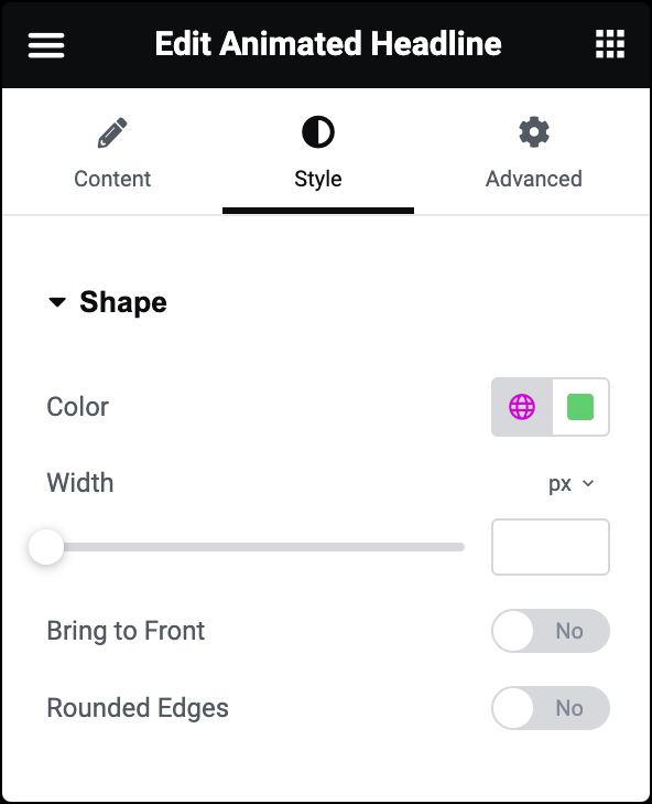
Color
Choose the color of the highlighted shape.
Width
Set the width of the highlighted shape.
Bring to Front
Slide to Yes to Bring the shape to the front.
Rounded Edges
Slide to Yes to round the edges of the shape.
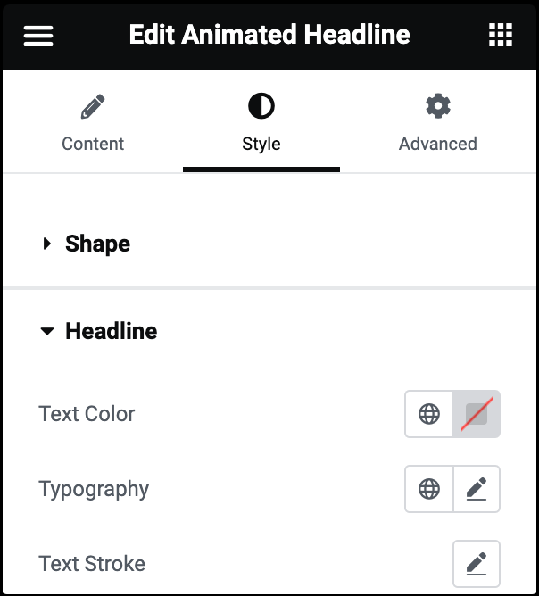
Text Color
Choose the color of the headline’s before and after text.
Typography
Set the typography options for the headline’s before and after text. For more details, see Typography.
Text Stroke
Click the 🖋️ icon to apply a stroke effect to the headline before and after text. Learn more about Text Stroke.
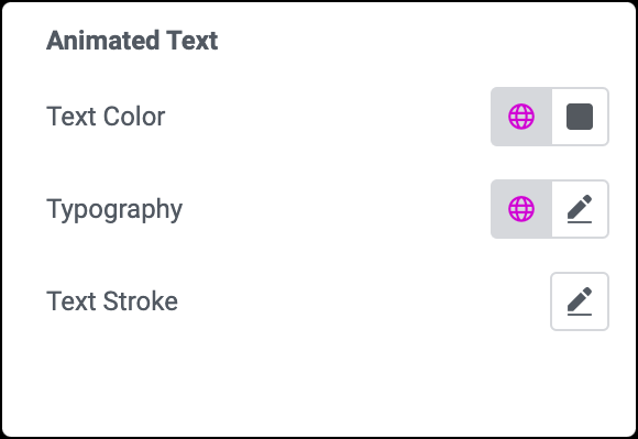
Text Color
Choose the color of the animated text.
Typography
Set the typography options for the animated text. For more details, see Typography.
Text Stroke
Click the 🖋️ icon to apply a stroke effect to animated text. Learn more about Text Stroke.
Advanced tab
The Advanced tab provides options to control the animated headline position, adjust the spacing, add custom code, and more.
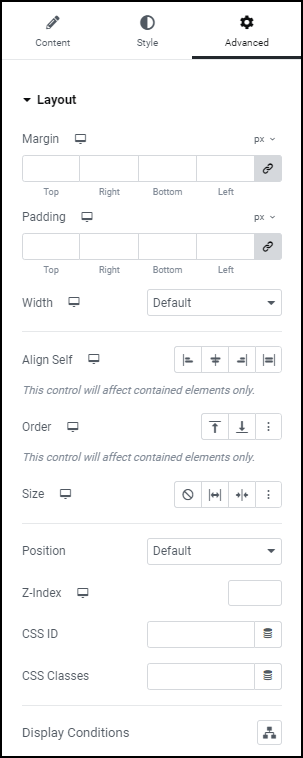
Advanced
Learn more about the Advanced tab settings.

