This year’s second showcase is a testament to the diversity of what Web Creators can come to expect as every client comes knocking with unique needs. This month’s websites include fairytale-inspired NFTs, a cutting-edge supply chain management company, a variety of creative web agencies and studios, an English language school, a graffiti artist, a waxed cotton manufacturer, and a proud community theater.
Take notes on best practices for mouse, hover, and scroll effects; study how color combinations can be used seamlessly across texts and backgrounds; understand how micro animations bring life to a website; see how text sizes and layout styles affect the atmosphere of a service; and experience how clever copy breathes life into any piece of website content.
Check out a fabulous February showcase that celebrates originality!
10
Aldam Street Art
by Giuseppe Cangiano
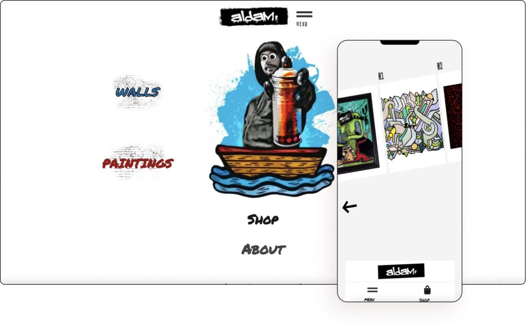
Inspired by hip-hop culture, Aldam founded a crew, consolidating his desire to dedicate himself to an artistic-musical path. Armed with spray cans, a microphone, words, and paintings, he converts feelings such as anger, frustration, and sadness into creative artworks.
A website that lets you play with colored spray paint as you hover? What else would be more appropriate for a graffiti artist website! Animated streams of spray paint can also be seen shooting out of the spray can periodically. Aldam Street Art is a fun interactive website that creates a lively youthful vibe with a dynamic touch.
The button menu uses icons that correspond to the toolkit of graffiti artists with the same four colors used to highlight each category utilized across the website. There is also a nice sticky effect on the doodles page where each doodle neatly stacks beneath the newer ones.
There is a clever use of asymmetry when displaying the painting page’s second section. Hover effects are used on each of the main paintings which open up within a specific popup. There is also a slide that moves diagonally across the page.
Aldam’s work is given a fitting website that captures the essence of urban art and underground street culture.
Design & Development: Giuseppe Cangiano
Theme: Hello
Plugins: Elementor Pro, dynamic.ooo
09
Percy & York
by Percy & York
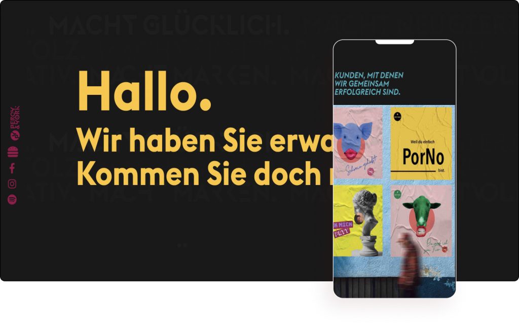
Percy & York is an advertising, creative, and digital agency that prides itself on being an out-of-the-box thinker. They get personal when it comes to topics such as communication, campaigns, corporate design, and brands because their passion is to find the best concept for their clients, every time.
The website’s color scheme is perhaps inspired by the agency’s German roots, borrowing black, red, and yellow along with a touch of blue, all with a minor twist. The contemporary color tint is utilized equally on large-sized texts and backgrounds. As is the use of horizontal scrolling which nicely shows off their best work.
The sidebar features a hamburger menu (interestingly shaped like a hamburger) and includes a link to the agency’s Spotify podcast which is something rarely seen. It is also noticeable that there’s some photo editing using the color schemes on different employees, including the company dog, Matilda.
The text also crosses across background colors yet doesn’t affect the reading experience. This is down to the careful color combination which works and blends well with each of the theme’s colors. There is also a nice font pairing of large upper case letters for titles set over smaller lower case letters for descriptions.
Just like the cuckoo delight on the homepage’s footer, Percy & York will have potential clients say, “We like that” before getting in touch.
Design & Development: Percy & York
Theme: Hello
Plugins: Elementor Pro, Borlabs Cookie – Cookie Opt-in, Code Snippets, Essential Addons for Elementor – Pro, Instagram Feed Pro Developer, MailPoet 3 Premium (New), OoohBoi Steroids for Elementor, WP Rocket, Rank Math SEO Pro
08
Halley Stevensons
by Liam Bonar
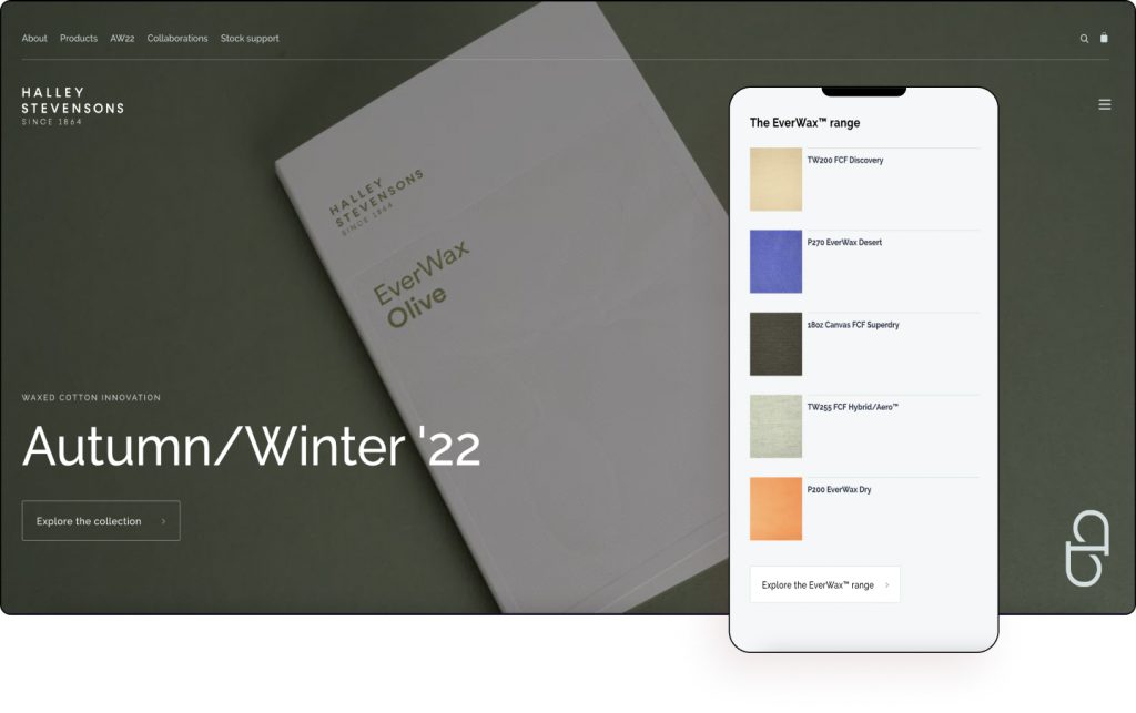
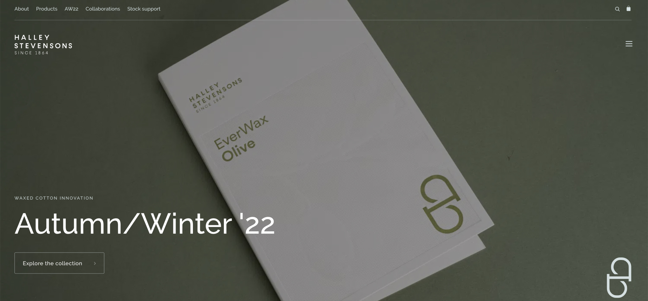
Halley Stevensons is the world’s leading manufacturer and innovator in waxed cotton and weatherproofed fabrics. As an independent firm with over 150 years of expertise, the organization has amassed unique technical knowledge and manufacturing experience.
The legacy of the company is woven into the fabric of the website with snippets of the past, present, and future visible on the homepage. Even when using a full-width layout, the website still feels elegant due to its light pastel-colored backgrounds.
Hand-drawn images give the look and feel of a high-end fashion designer’s workshop, as does its no-nonsense, clean, conventional style. The monochromatic color scheme also allows the patterns to speak as the design doesn’t distract from the content.
The mega menu cleverly uses the waxed cotton material with droplets sitting on top that show off its weatherproof selling point. This is a nice way to highlight the uniqueness of the product.
With products exported around the world and showcased each season at London, Paris, New York, Munich, and Milan, Halley Stevensons rightly lets its world-class products do all the heavy lifting using a simple interface to complement it.
Design & Development: Liam Bonar – lbd.studio
Theme: Hello
Plugins: Elementor Pro, Yoast, WP Rocket, Autoptimize, ACF, Imagify
07
An Grianán Theatre
by Tommy Callaghan / Manna Design
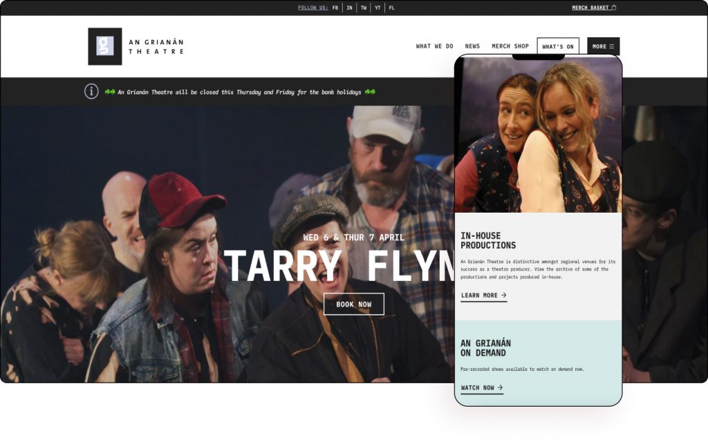
An Grianán Theatre is distinctive amongst regional venues for its success as a theatre producer actively celebrating its rich Irish cultural heritage. It has staged many full-scale productions over the years. Its creative partners to date have included Yew Tree Theatre Company, Cork Opera House, Pavilion Theatre, Civic Theatre, and The Lyric, Belfast.
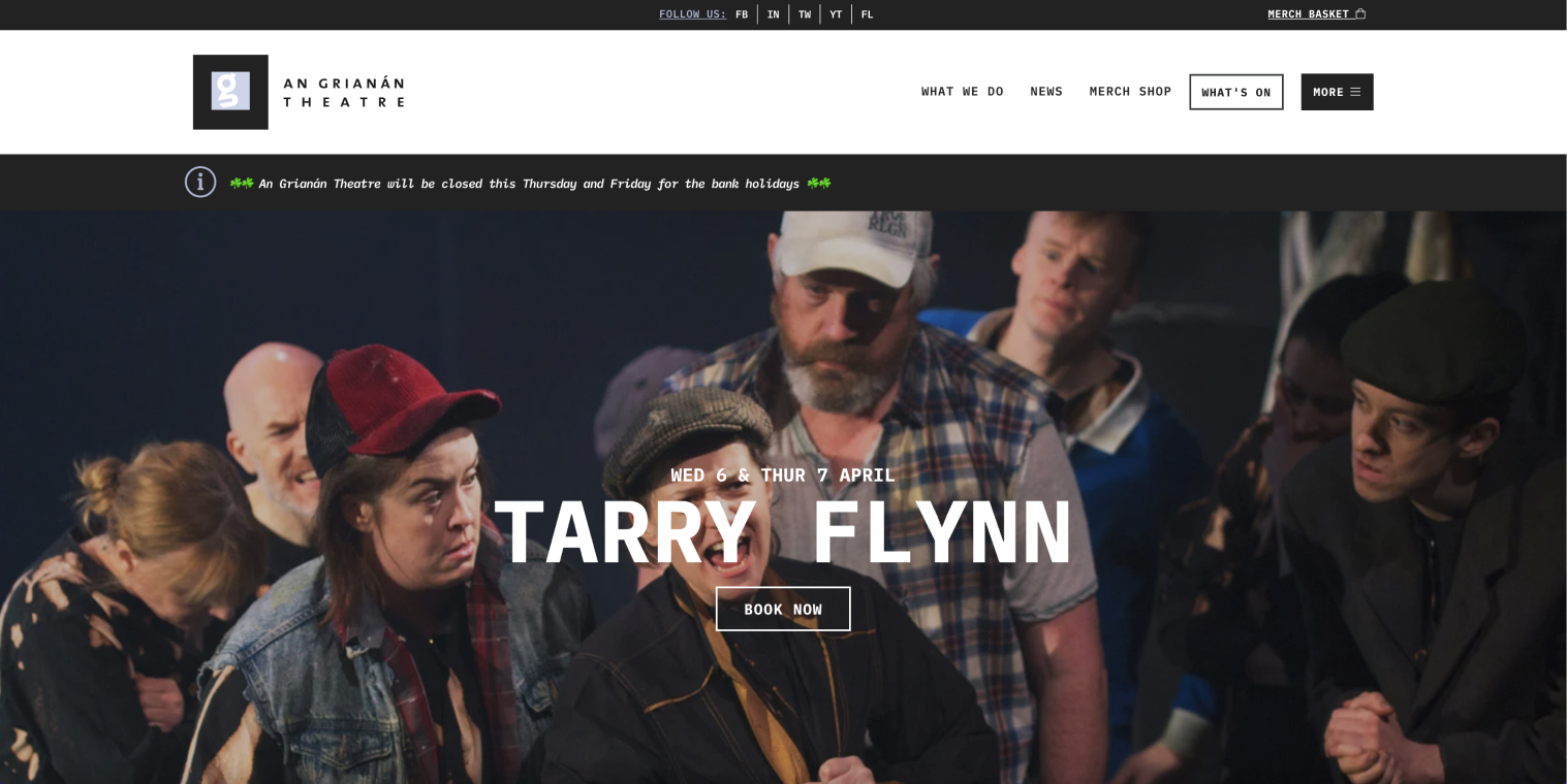
Celebrating local, national, and international arts and entertainment events, the theater also prides itself on supporting local artists who are featured throughout the website. A website that has been rebuilt using Elementor, that is minimalistic, easy on the eyes, effortless to navigate, and resembles a cultural magazine or blog.
The flat, minimalist, black and white design ensures the attention is solely on the latest news and content which adds color and vibrancy to the page. Using thin newspaper-like typography the website’s information-heavy approach makes it easier to digest and is perhaps catered to older audiences who might be less technologically inclined.
This is a website that serves its local community audience by keeping elements in check without going overboard. Proudly displaying its wide-ranging support from famous institutions on its footer, the theater is a focal artistic and cultural point for its community.
An Grianán Theatre is a flagship website for a flagship venue in the North West of Ireland.
Design & Development: Tommy Callaghan
Theme: Astra
Plugins: Elementor Pro, Advanced Custom Fields, JetEngine, JetSmartFilters, WooCommerce, WP Rocket
06
Studio Grit
by Chris Forsyth
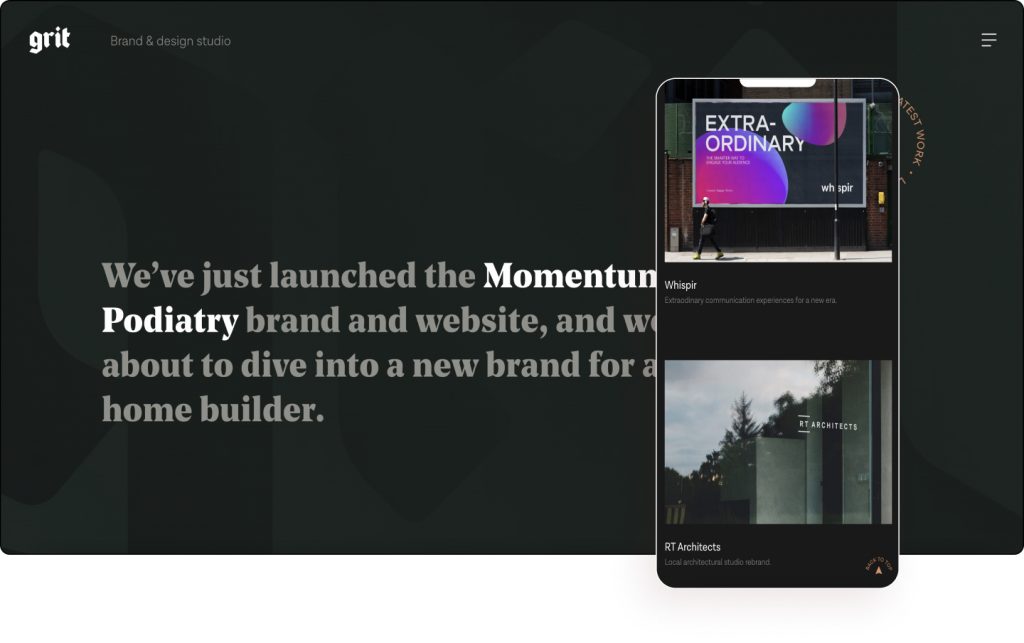
Grit brings together a band of creative specialists; copywriters, illustrators, video producers, animators, photographers, and digital experts who work closely with clients to deliver meaningful and impactful creative solutions.
Utilizing an unusual Rangoon Green color for its background, and unique fonts, the website features pockets of scroll animations and hover animations that keep viewers’ attention active. The dark background also gives the website a high-end look and feel, with a nice serif and sans serif pairing ensuring the copy has a nice hierarchy.
The use of scrolling effects gives the feeling the viewer is being taken on a journey similar to an exhibition, with each project acting as a showcase and not following a typical symmetrical design. The clickable project pages themselves are intricately detailed. In fact, the website interestingly mentions its latest big project, Momentum Podiatry, within the hero itself.
The minimalist take allows the projects to speak for themselves with larger projects receiving more real estate than smaller ones. Visitors also have the ability to view the studio’s entire portfolio on its index page, turning their full portfolio into a standalone page.
While Grit might consider itself a small studio, its website highlights big capabilities.
Design & Development: Chris Forsyth
Theme: Hello
Plugins: Elementor Pro, Code Snippets, Extras for Elementor, Custom Post Type UI, Piotnet Addons for Elementor Pro, Simple Page Ordering, SVGator, Yoast SEO
05
Studio DoublePoint
by Nicolas Meyer
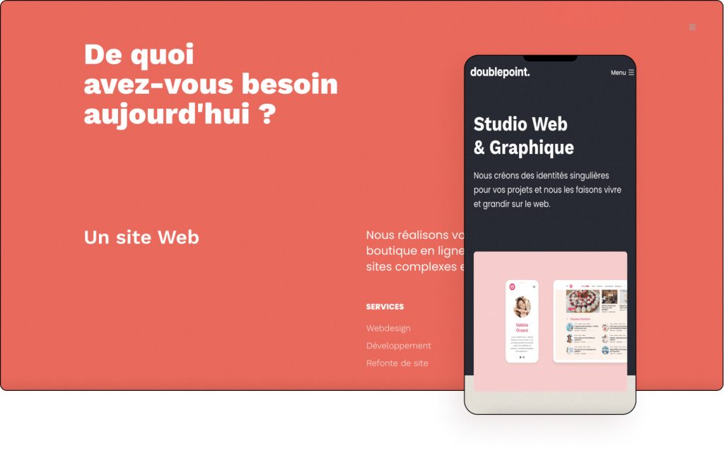
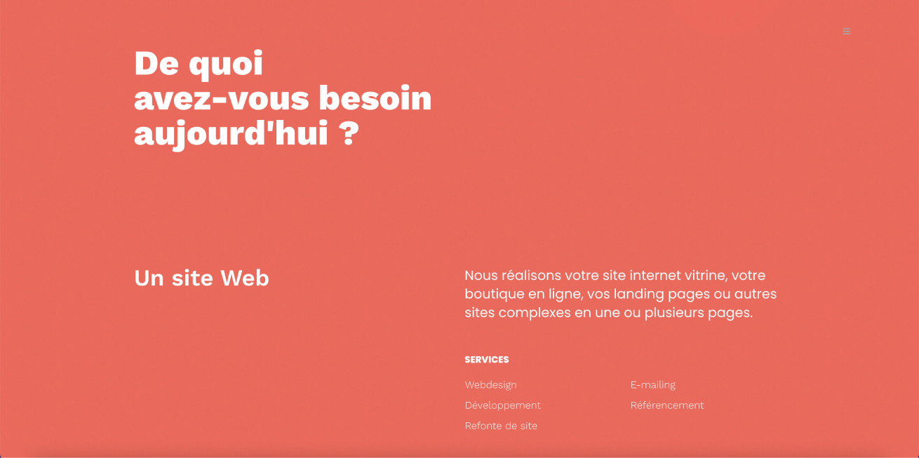
Studio DoublePoint works with clients from all walks of life for users around the world. Whether it’s optimizing current websites or creating a new website, their web services allow clients to increase their audience and obtain better engagement rates with customers.
Using strong colors, scroll effects, and GIFs, the studio showcases its projects in a fun way. The subtle use of zoom-out effects with images growing as we scroll down is a nice way to bring attention to the studio’s success stories. There is also a nice soft Sans Serif font which helps accentuate the contemporary look and feel of the website.
The background color changes from beige to orange changes as you scroll down just as attention is brought to the rotating emblem. Orange is a recurring color to highlight key areas. There is also a nice hover effect on the rotating contact CTA as well as the email and phone contact options. The colors of the project pages similarly borrow from the projects themselves.
The menu uses a nice modern font style with hollow outlined text when hovered over, while the studio page uses the Graphic & UI Designers still facial images that change based on the accompanying text. This shows a little bit of his personality too, making the website more relatable.
Studio DoublePoint creates unique identities for projects and makes them live and grow on the web.
Design & Development: Nicolas Meyer
Theme: Hello
Plugins: Elementor Pro, JetEngine, Premium Addons, WP Rocket
04
Logico
by Haim Benisty
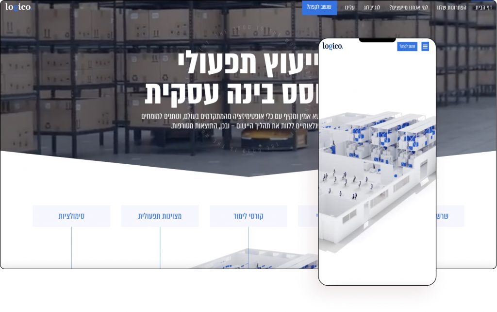
Logico provides business consulting based on business intelligence. They combine reliable and comprehensive data with the most advanced optimization tools in the world and let international experts accompany the application process.
Built by Haim Benisty, whose portfolio website was featured in last month’s showcase, Logico’s high-tech website sets the tone using a high-end background video, drawing in visitors and highlighting its cutting-edge technology. The use of the color blue likewise conveys a message of technical and technological advancement and is popularly used by startups.
The use of scrolling effects takes us inside the distribution center and offices while highlighting several international shipping companies the organization utilizes. Each room appears as a 3D model and highlights its supply chain management services, highlighting its operational excellence.
Robots are seen transporting objects as the video demonstrates how the organization works with the most advanced optimization tools. The use of scrollytelling is beautifully applied and gives the page an almost animated movie-like effect. Each of the pages opens using a wipe effect inviting the viewer in, while the “g” of “Logico” acts as a consistent transition effect.
Logico is a company with an energetic and young spirit that brings a refreshing approach in the field of operational consulting and its world-class website effectively showcases its strongest points.
Design & Development: Haim Benisty
Theme: Hello
Plugins: Elementor Pro
03
Chalk Talk
by Addictive Design Creative Studio
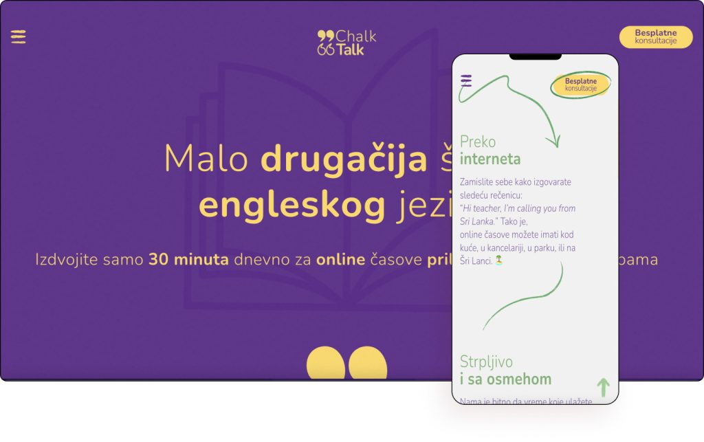
ChalkTalk is a joint venture of two longtime colleagues who were inspired by many years of experience and success working with students. The duo came up with the idea to create an environment where students not only learn the language but also exchange their ideas without fear and pressure, and enrich their knowledge of other people and cultures.
The website intelligently uses four colors throughout each of its pages. With Global Styling, this can be updated and altered seamlessly. Using combinations of Porcelain, Naples Yellow, Faded Green, Eminence (Magenta), each section of the website’s background changes as you scroll.
Similarly, hover effects are used to capture attention by utilizing colors and animation. There are seamless segues from section to section with subtle transitions, doodles, as well as quotation marks which are used as a motif. Emojis can also be seen which would indicate the website’s younger target audience.
Looking closely, it is evident the illustrations are tied to the text with copy that is more personal used to engage the audience. The menu too resembles an old-school chalkboard that opens with a micro animation.
ChalkTalk sees itself as a slightly different school of English, and with a website that breaks convention, the school definitely sets itself as a class apart.
Design & Development: Marko and Marija Djurdjevic
Theme: OceanWP
Plugins: Elementor Pro, Ocean Extra, Quiz And Survey Master, MouseWheel Smooth Scroll
02
Eyepples
by General Condition & Milkink Creative Studio
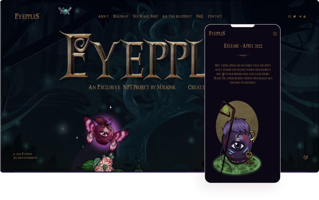
Eyepples are a collection of hundreds of unique NFT collectibles inspired by fantasy-world, fairytales, darker aesthetics, classical art, and photography. It is a unique magical project built around the Ethereum blockchain where digital art, photography, and illustration merge together almost as an alchemist’s potion.
You might recognize the unique fingerprints of General Condition, our End-of-Year Showcase 2021 Winner, on this fairytale-inspired website design. The fabled apples resemble that often seen in the portrayal of Snow White and evoke feelings of childhood nostalgia as does the center alignment of the text that looks like a storybook.
There is a very effective use of copy to sell the product. With feelings of magic and fairytales, witty phrases, and a touch of marketing nous, the design and copy blend beautifully to bring together a unique world that looks something out of a Disney movie.
Apples (or should we say Eyepples) are prevalent throughout the website, from the use of hover effects on the hero down to the footer. Although not every element of the website is yet live, such as the shop, Eyepples Apples does enough to create great enthusiasm and anticipation due to the high-quality illustrations and storytelling.
All that’s left is to pick an Eyepple and simply enjoy the magic.
Design & Development: Jovan Lakic and Stefan Kokovic
Theme: Hello
Plugins: Elementor Pro, Jet Elements, JetEngine, Premium Addons Pro, The Plus Addons for Elementor Pro
See Live Website
01
Barrel Marketing
by Barrel Marketing Ltd.
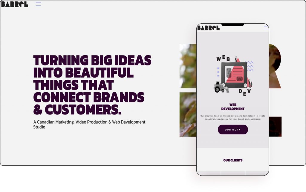
Barrel Marketing is a marketing, video production, and web development studio helping businesses grow by authentically telling their stories and producing unique and creative experiences. They turn big ideas into beautiful things that connect brands and customers.
This is actually the second time the website is featured in our showcase following a redesign. The first time was back in September 2019. The website looked vastly different then and the new design is likewise up to the mark.
The use of punchy copy paired with a gorgeous video covered in mask shapes captures the attention immediately. The minimalistic look and feel of the website, highlighted by the use of white space give it a modern vibe. The meet the team page also shows that the company has a fun vibe and a warm and inviting personality.
The composition of real images paired with colors effectively uses zine design to give the website a fun, relatable, and friendly feeling. Displaying its big-name clients is also a great way to achieve social proof, particularly high up on the page which also adds credibility.
On project pages, there is a nice system of presenting the challenge and the solution which helps potential clients understand Barrel Marketing’s process. The background images and colors also come from the projects themselves, indicating the level of detail that went into the website. Similarly, the contact page also creates a great visual language such as the cat reaching for the phone.
Barrel Marketing helps businesses grow by telling their stories with creative and strategic solutions and with a website that’s equal parts creative, fun, and informative, clients will be quick to click “send”.
Design: Daniel Fexa
Development: Shayne Plesa-Naden, Daniel Fexa, and Sebastien Ringuette
Theme: Hello
Plugins: JetEngine, JetSmartFilters
