Table of Contents
There is one website category that requires a special kind of design. One that is clean, professional-looking, distinguished and evoking trust.
I am talking about law firm sites.
As opposed to more flexible categories, this one has the challenge of giving the impression:
‘This firm offers the highest level of professionalism’.
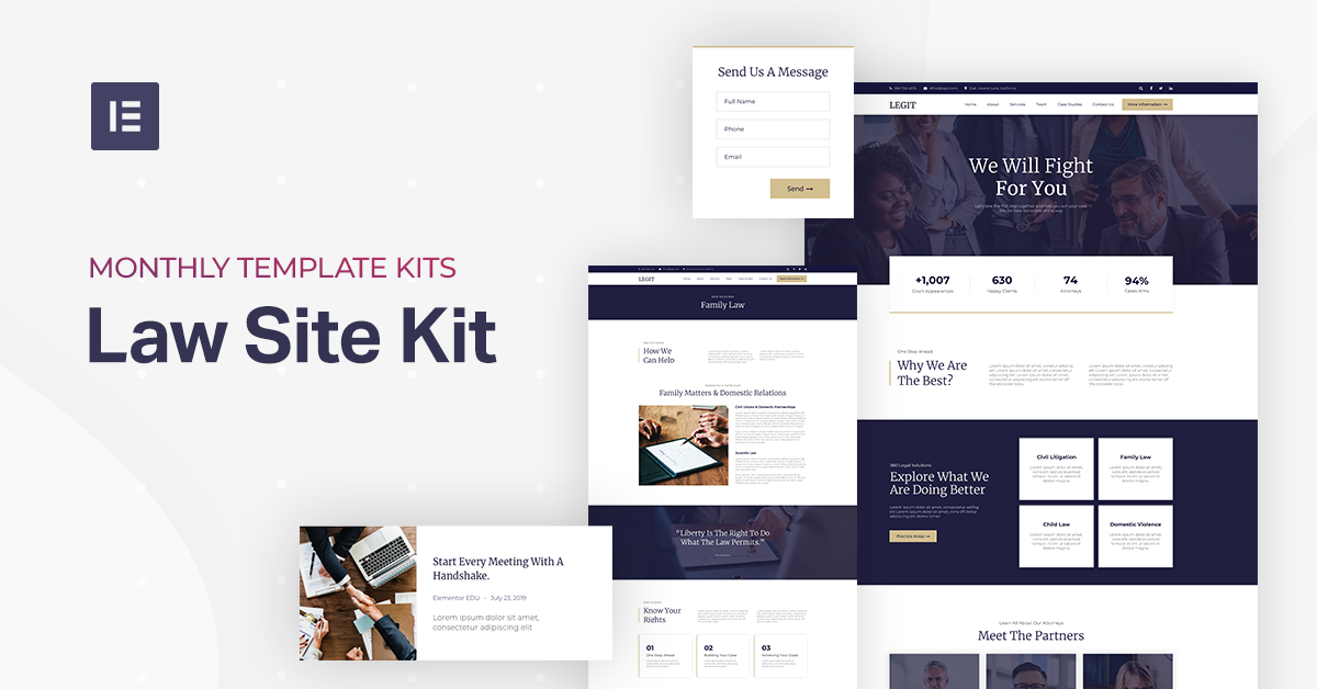
For this very reason, we’ve decided that for our fourth template kit release, we need to deliver a professional, clean and, one could even say, regal template that will greatly improve the way users view your business.
Say Hello to the Law Firm Template Kit
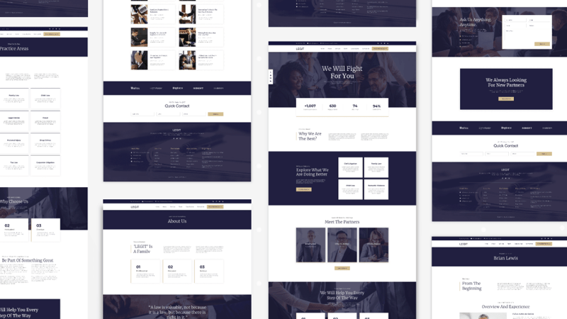
While this template is aptly named the Law Firm Template Kit, it was designed for any and all businesses that require a high-quality, professional-looking website. It is very versatile and is applicable to anyone who deals in law, accountancy, consultancy, or similar professions.
It was designed with content in mind and as such, focuses on delivering a lot of space for the content, all the while maintaining a slick, organized, and easy-to-navigate design. To that end, the header and the footer were heavily expanded to add mass and space.
All Rise for the Honorable Law Firm Template Kit! #WordPress #Elementor
We’ve chosen a set of three colors that compliment this kit and elicit a sense of formality, straight-forwardness, and respect. The dark blue color, in concurrence with the gold, delivers a sense of prestige while the white color enforces the sense of cleanliness and professionalism. In addition to the colors, the combination of the Merriweather and Montserrat fonts, add to the high-end feeling of this website.
But the true beauty of it lies in the fact that with just a few tweaks in the customization options, you can make sure that it fits your brand and sends the message you want while still maintaining the vision behind it.
It is perfectly customized for mobile devices, and by using this template, we are certain that you will end up raising the level of your brand’s sophistication.
Homepage
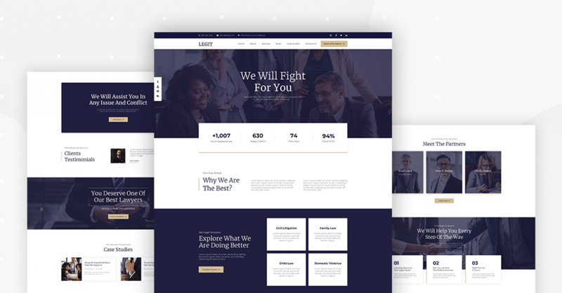
Let’s take a look at the homepage.
At first glance, you can see that the top part of the homepage was designed to capture the user’s attention immediately upon landing, with a clear message and metrics regarding the success of the firm. By providing some figures about your success, your visitor will certainly view your firm as a results-oriented business and subconsciously trust it more than others.
By scrolling down, you will encounter more content and info about the firm. This includes information about partners’ testimonials and posts, with sections clearly divided by interchanging backgrounds — dark blue and white.
You will also notice that on the left-hand side, there is an Icon List widget, with the content divided into sections that are easily accessible with a simple click (as opposed to scrolling). This was done to improve the user’s experience in terms of navigation and access to information. You will have the option to define these anchors and make the most of it in any way you see fit.
Take notice of how the inserted gold color in key strategic locations, bolsters the professional and prestigious look of the page.
By landing or accessing this page, your user will get the right tone and the most relevant information about your company.
Header & Footer
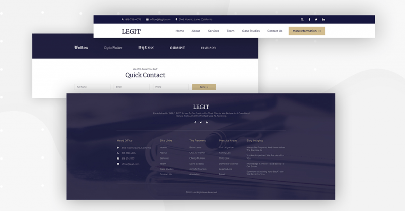
This time around, the header and footer are extra-thick, providing a consistent source of information and navigation throughout the user’s journey on your website.
As the heading in all the pages is on a dark blue background, you will notice a smooth transition and a clearly defined border between the header and the page. The footer is especially thick, even more so than the header, and provides almost all the information available on the website, which is a clear, navigational benefit to your users.
In the header, you will also notice the ‘More Information’ button in gold, which, upon clicking, will bring up the popup menu.
Popup Menu
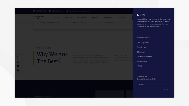
When the popup opens, you will notice something of stark contrast to the other design elements. The background is exclusively blue with white text and gold highlights. This way, the popup stands out and introduces a change in pace. The dimmed website in the background further enforces the focus on the popup, allowing you to introduce an important message or a call to action within it.
Search Results
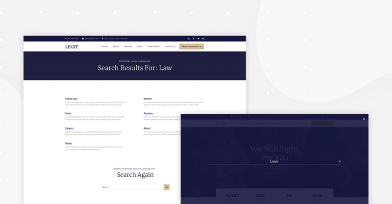
In this template kit release, we are introducing a search results page. This follows many requests we received from users, as well as reports from others that Elementor is widely used for this purpose. Take a note of the simple, straight forward design. Should the search turn empty, you will be encouraged to continue your search with a simple offer to search again. If the search is successful, you’ll be greeted with simple text and link to the appropriate results.
As befits a search page, there should be no other unnecessary information shown. However, since our header and footer are so thick and full of information, your user will get the best of two worlds — a simple answer and a myriad of information.
About, Contacts & Careers
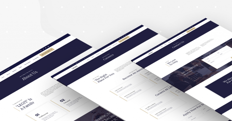
The about, contacts and careers pages are all similar in their design, with minor modifications to meet the needs of each section. Here you can add as much information as you need. Each has a clear title on a blue background, with a three-columns introductory part. The about page obviously has more information, and you can see how our design team masterfully implemented the geometrically square features.
Services & Family
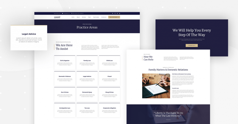
The services and family pages are designed in such a way that all the available services are shown in a nice, grid-like representation using the call to action widget, giving the user the ability to find what they need and read more about it. By clicking on the individual boxes, you are taken to the service description pages, which will include full details. This is an excellent example of how to showcase, on one page, all the different services you offer in a professional-looking way that is easy to understand.
Team & Partners
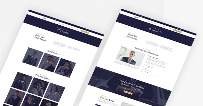
The team and partners pages use a similar concept, with a grid-like option at the front, and a more detailed page once clicked. This grid is not as packed as the services grid, and features pictures, giving the due focus and representation to each of your team members. Notice the effects it has, of cleanliness and of focus with no unnecessary junk and with an invitation to join the team. Who wouldn’t want to be a part of a team that’s being represented in such a beautiful way?
Blog & Posts
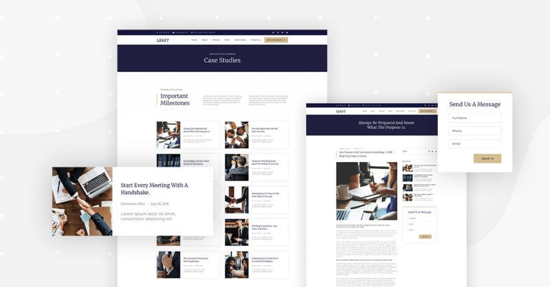
Let’s move on to the blog and individual posts. If you take a look at the ‘Case Studies’ page, you will get the classical blog page with access to all available posts.
What we see is the familiar three-columned introductory paragraph with a heading, but when you scroll down, you will notice the implementation of a simple, two columned grid, which holds rectangular boxes, with images, headings, and test in each one of them.
This way, in addition to a well-written title and an equally well-written excerpt, you will be able to make sure that your reader has the easiest access with the most information available.
Of course, once you click on the box, you will be taken to the single post page, which, with its white background, provides an easily readable experience. Furthermore, easy navigation is provided via the available posts on the right and the arrows at the bottom of each post.
404 Page
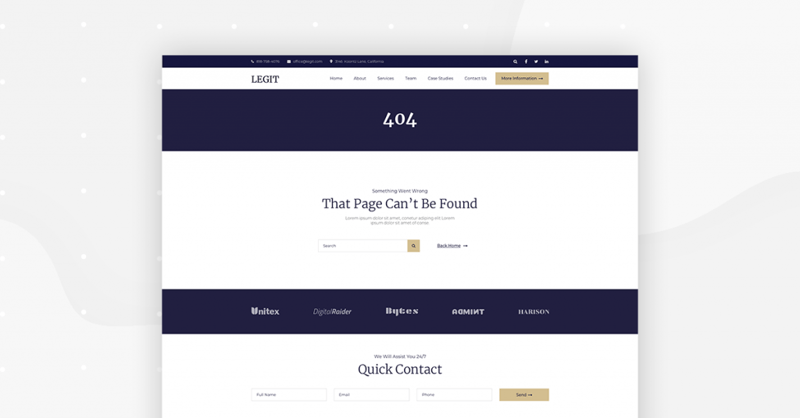
The 404 page is very simple in design, focusing, instead, on providing the option to search. Even when there is a problem loading a page, you will send a professional massage and keep your companies reputation unscathed.
We the Jury Find This Template ― Gorgeous!
Get this amazing Law Firm Template Kit now and create an outstanding, professional website that will not go unnoticed.
This kit is different from the others as it was designed to provide space for a lot of content while maintaining a slick, even minimal, design.
Its visual aspects are there to show that you know what you are doing and by using this template kit, you are sure to improve the way your business is perceived.
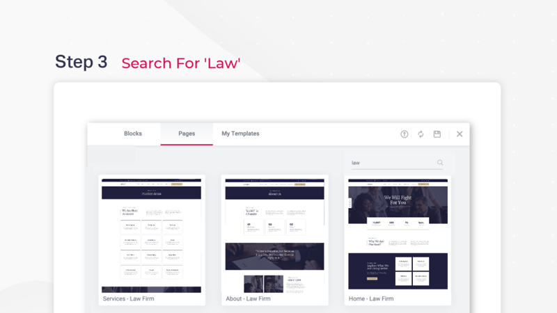
How to install this kit? Easy. If you have Elementor Pro, you can open the template library and search for ‘Law Firm’.
Now that you’ve had the chance to read about it, why don’t you take a look at a demo website we’ve set up for you. If you want to quickly set it up on your website, be sure to get Elementor Pro.
What templates would you like to see next? Let us know in the comments below.
Looking for fresh content?
By entering your email, you agree to receive Elementor emails, including marketing emails,
and agree to our Terms & Conditions and Privacy Policy.
