Table of Contents
Elementor 3.6 Pro demonstrates another leap forward in new ecommerce capabilities while simultaneously allowing you to strengthen your brand’s identity while improving performance.
Branding is a crucial part of any business. It’s the first impression users have of your business, as well as the feeling they’re left with, setting the tone for your relationship with them. Every element, including the logo, colors, fonts, and even the tone of voice, work together to create your business’s identity.
This goes for websites too, as branding helps increase engagement and establishes a solid identity for online businesses. But branding doesn’t stop there — it also plays a role in how websites attract traffic, generate leads, and convert those leads into customers, especially when it comes to ecommerce.
Brand identity is why this release focuses on adding Page transitions and extending the customization options for the shopping experience on your website. In doing so, you’re able to align the look and feel across your website, resulting in a seamless and engaging experience.
Page Transitions — Create Branded Visual Continuity
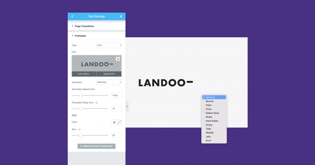
Brand awareness is one of the best ways to generate loyalty and encourage users to visit your website again and again. Displaying your logo as users browse through your website keeps your brand top of mind throughout their experience, which simultaneously increases brand recognition and user retention.
With Page Transitions, you have greater design flexibility, allowing you to customize the page loading experience and increase brand recognition without relying on additional plugins. Design your own preloader with an icon, image, logo, or one of Elementor’s animations to indicate the loading process. You can also use Page Transitions to display a full-screen canvas and choose whether or not to animate the entrance and exit of the transition canvas.
To improve performance by up to 30% in websites using page transitions, the content of the next page is prefetched when users hover over a link and rendered after they click it.
Shopping Experience that Meets Your Brand’s Look and Feel
New WooCommerce Purchase Summary Widget to Increase Users Retention
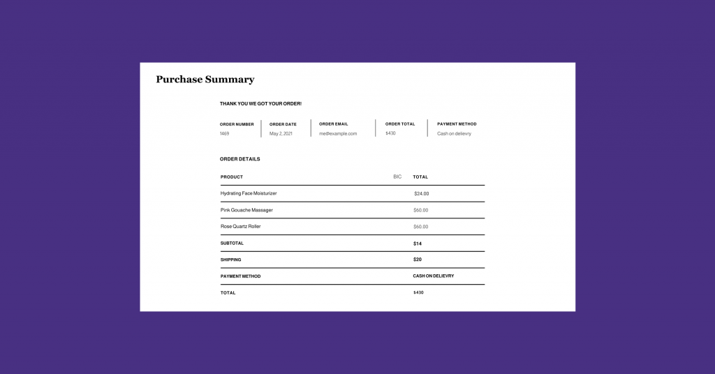
For online stores, every part of the user’s experience contributes to whether or not they make a purchase. Every stage dictates whether the user will continue and come back from a well-designed archive and product page to the Summary Page that appears after a user completes their purchase.
The new WooCommerce Purchase Summary widget is more than just a widget, it allows you to create and customize a dedicated Purchase Summary page. This allows users to review the order details after the purchase, ensuring full transparency and trust in your brand. The details of the Purchase Summary widget include all WooCommerce order information: confirmation message, payment, order, billing, shipping, and more.
Using this widget, you can rename the title of each section, adjust the style of the sections uniformly, choose your typography, and even individually customize certain sections. That way, your Summary Page matches the rest of your online store, keeping your branding consistent from start to finish.
Alternatively, you can configure any page as your WooCommerce Summary Page in Elementor’s Site Settings and have it appear as soon as users complete their checkout. For example, you can add a widget that will show ‘recommended products’ to increase conversions, provide coupons for the next purchase or even add a short survey to learn more about their shopping experience.
New WooCommerce Notices Widget and Styling to Facilitate a Seamless Shopping Experience
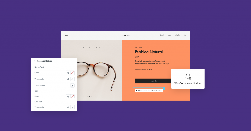
With the new WooCommerce Notices widget and styling in Site Settings, you can customize WooCommerce’s three notice types: Error, Message, and Info. These notices range from informing users they’ve successfully added an item to their cart to notifying them that they’re missing details in the Checkout form.
Using the WooCommerce Notices widget, you can choose where the WooCommerce notices appear on each page. From the WooCommerce Notices section in Site Settings you can also customize the style of each notice, including typography, background color, borders, links, and buttons to create a seamless visual shopping experience that matches your brand and strengthens your website’s identity.
New Add to Cart Widget Layout Options
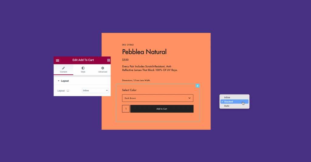
Businesses worldwide integrate various payment methods like Stripe, Apple, or Google Pay to offer customers different ways to purchase items.
The New layout options in the Add to Cart widget allow you to enhance the appearance of the Add to Cart section when using integrations like the ones mentioned above or other addons. Choose one of three layouts: Auto, Inline or Stacked, and have your website’s style remain the same throughout, creating a consistent design experience even when using integrations.
Another Leap of Performance Improvements
This release also includes performance improvements, as we extend our Improved CSS Loading experiment to include WooCommerce and Theme Builder widgets. When the experiment is turned on, CSS is reduced by 126kb from 137kb to 11kb.
Additionally, we removed an ‘elementor-section-wrap’ by adding it to the Optimized DOM Output experiment.
Leverage Your Brand Across Your Website
Elementor 3.6 Pro introduces multiple ways to increase brand recognition and improve the experience users have when shopping or simply browsing on your website. Leverage the new customization capabilities to ensure your website matches the look and feel of your brand and creates an engaging experience that keeps your customers coming back for more.
Try out these new features and tell us in the comments below how they helped you create consistency across your website and increase brand awareness.
Looking for fresh content?
By entering your email, you agree to receive Elementor emails, including marketing emails,
and agree to our Terms & Conditions and Privacy Policy.
