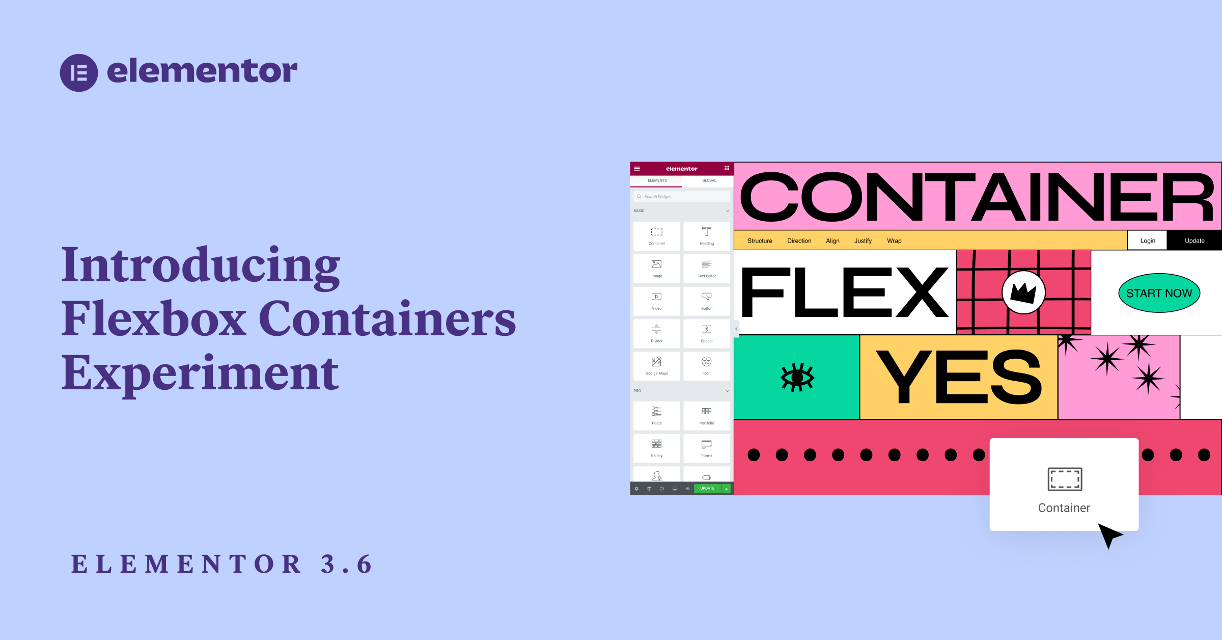
In Elementor 3.6, we introduce Flexbox Containers, a new lean layout structure that brings CSS Flexbox into the Editor. This structure allows you to achieve pixel-perfect responsive designs and highly advanced layouts quickly, and with a much slimmer markup, which improves performance significantly. This feature marks a transformative shift in how websites are built using Elementor’s builder and is the foundation of a variety of additional, advanced capabilities.
Flexbox Containers is a new building block in Elementor that empowers you to efficiently lay out, align and distribute items in a Container in a lightweight and responsive manner. With Flexbox Containers, you can place widgets directly inside the Container, as well as nest Containers infinitely. Then, you can control the layout and distribution of widgets within the Container, and adjust your content to every screen size, resulting in greater responsiveness, without compromising on speed, and without writing a single line of code.
Following several months in the Dev Edition, and having implemented a lot of feedback from the community, we introduce Flexbox Containers as an Alpha Experiment.
When the experiment is turned on, you will be able to add new Containers to a page instead of Sections, Columns, and Inner Sections. You’ll also be able to add Containers to an existing page that was previously built with the Section-Column layout. With the experiment turned on, you will not be able to add new Sections or Columns to your pages.
Try It Out First in the Flexbox Containers Playground
Since Containers are a new way of building website structures in Elementor, this release is accompanied by additional education material, including the Flexbox Containers Playground. This playground includes 10 lessons, to help you get accustomed to designing layouts with Flexbox Containers.
Please Note: Experiments should be used with caution — features are introduced as Experiments when they include infrastructural changes that can impact your website in unforeseen ways. Learn more about experiments here.
If you deactivate the experiment, every Container you create will be removed from your website, you will be able to restore them if you reactivate the experiment and roll back to a previous revision.
Important Note About Version 3.6 of Elementor
When Elementor 3.6 was first released on March 22nd, some users encountered technical issues due 3rd party plugin incompatibility. We immediately released a patch with Elementor 3.6.1, which should resolve most occurrences of this issue by reducing the error enforcement rules, and will allow the Editor to load.


What’s the Difference Between Containers and Sections?
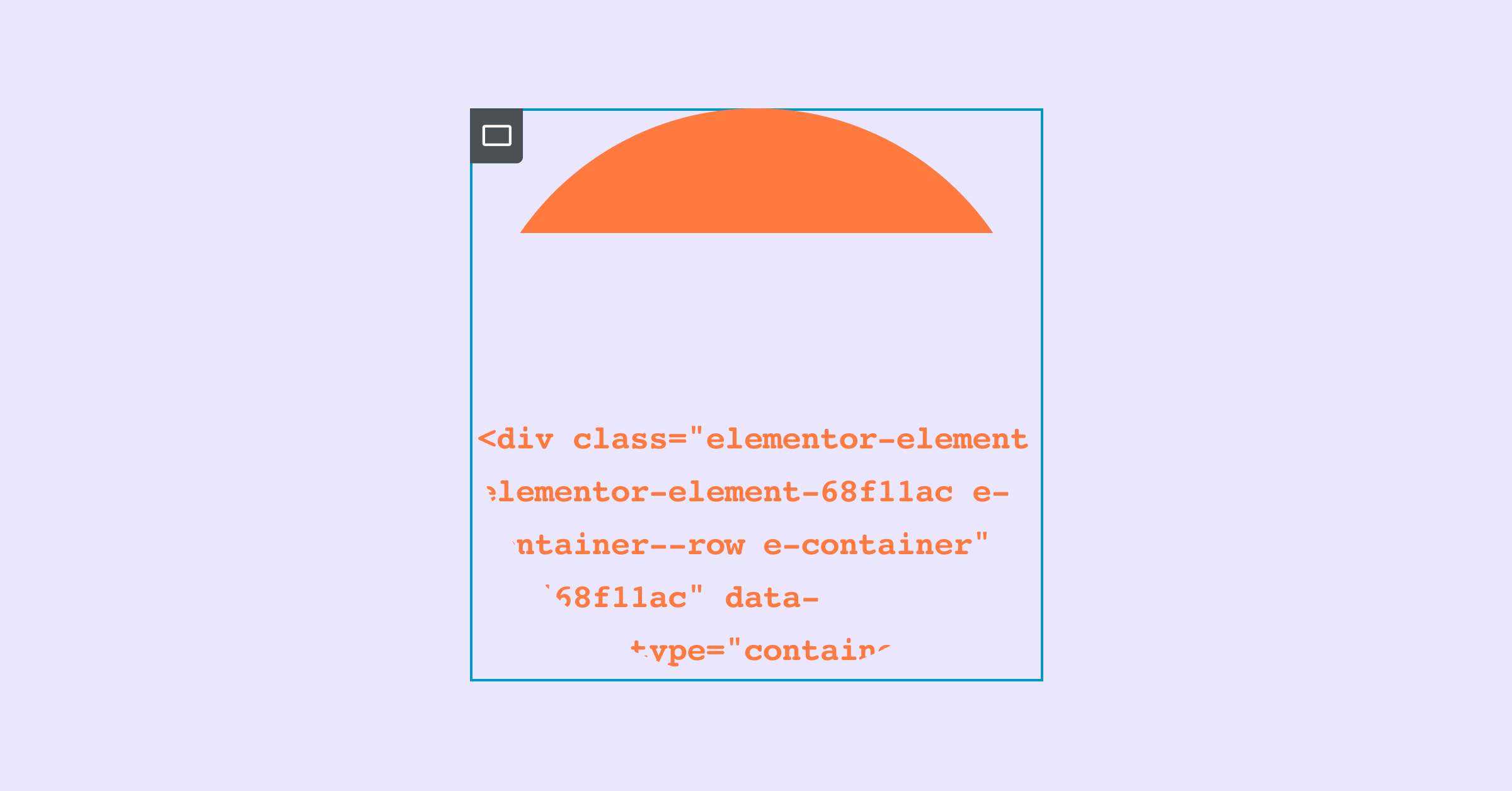
When you activate the Container experiment, you will be able to add Containers to your page, as well as drag Containers to the Canvas, or into another Container using the widget from the Editor Panel. You will also notice that the Container’s borders are a darker shade of blue than the Section’s borders.
Below are a few additional, technical differences between Containers and Sections.
| Flexbox Containers Structure | Section-Column Structure | |
| Adding it to your page | Add a Container in the Editor with the ‘+’ symbol, or drag the Container widget to the Editor | Add a section in the editor with the ‘+’ symbol |
| Widget location | Directly inside a Container | In a Column, within a Section |
| Widget Width | Inline by default | Full width by default |
| Nesting | Infinite Nesting | One Inner Section |
| Widget direction | Column, Row, Column Reverse, or Row Reverse | Column, or Inline Positioning |
| Responsive design | Custom order of widgets or Containers to each device | Reverse Column or Duplicate Sections |
| Alignment | Flex-Start, Flex-Center, Flex-End | Left, Center, Right |
| Hyperlinking | Wrap the container to hyperlink it | Hyperlink a widget, not a section or column |
Flexbox Containers Will Transform How You Build Websites
With Flexbox Containers you can quickly create simple and advanced layouts, and improve user experience and performance. Below are a few examples of how:
Create Pixel-Perfect Layouts With a Lean Markup, Quickly
Previously, if you wanted to create a website layout that included a number of widgets in a row, you would have to either set the width of each widget to inline, which creates a redundant workflow or create a section with a number of columns inside it, which harms performance. For example, if you wanted to create a logo section with 4 logos in a row, with sections and columns you would either have to set the width of each logo to inline, or create a section with 4 columns and place a logo in each one.
With Flexbox Containers, you can use a single container, add all the logos you want, and change the Container’s direction from column to row, to see all your logos in one row, in a single click. You can also leverage the Justify Content control to distribute the logos as you’d like within the Container.
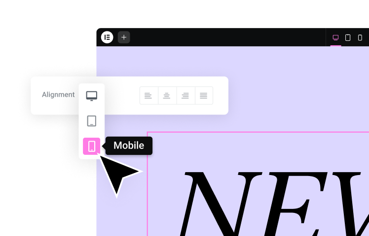
Fully Customize Your Design to Each Breakpoint
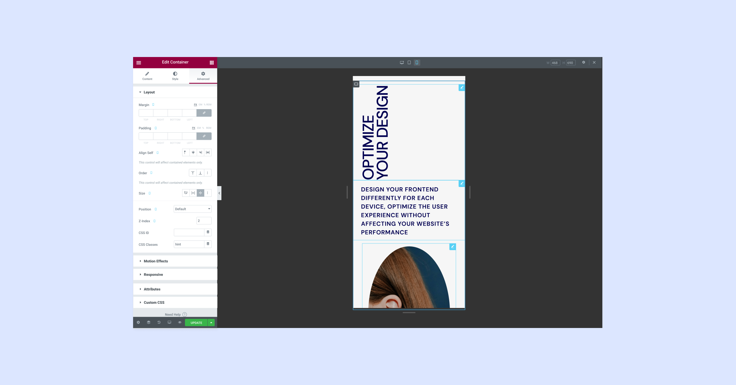
As you design your website, it is important to consider what it looks like on different devices. A design that works on desktop may not provide the same user experience on a smaller screen, like mobile. Leveraging the power of CSS Flexbox, you can customize your website’s design to each device. You can change the direction, order, alignment and distribution of items within your Container for each device, without having to create duplicate Containers. This results in an improved user experience, without affecting your website’s performance.
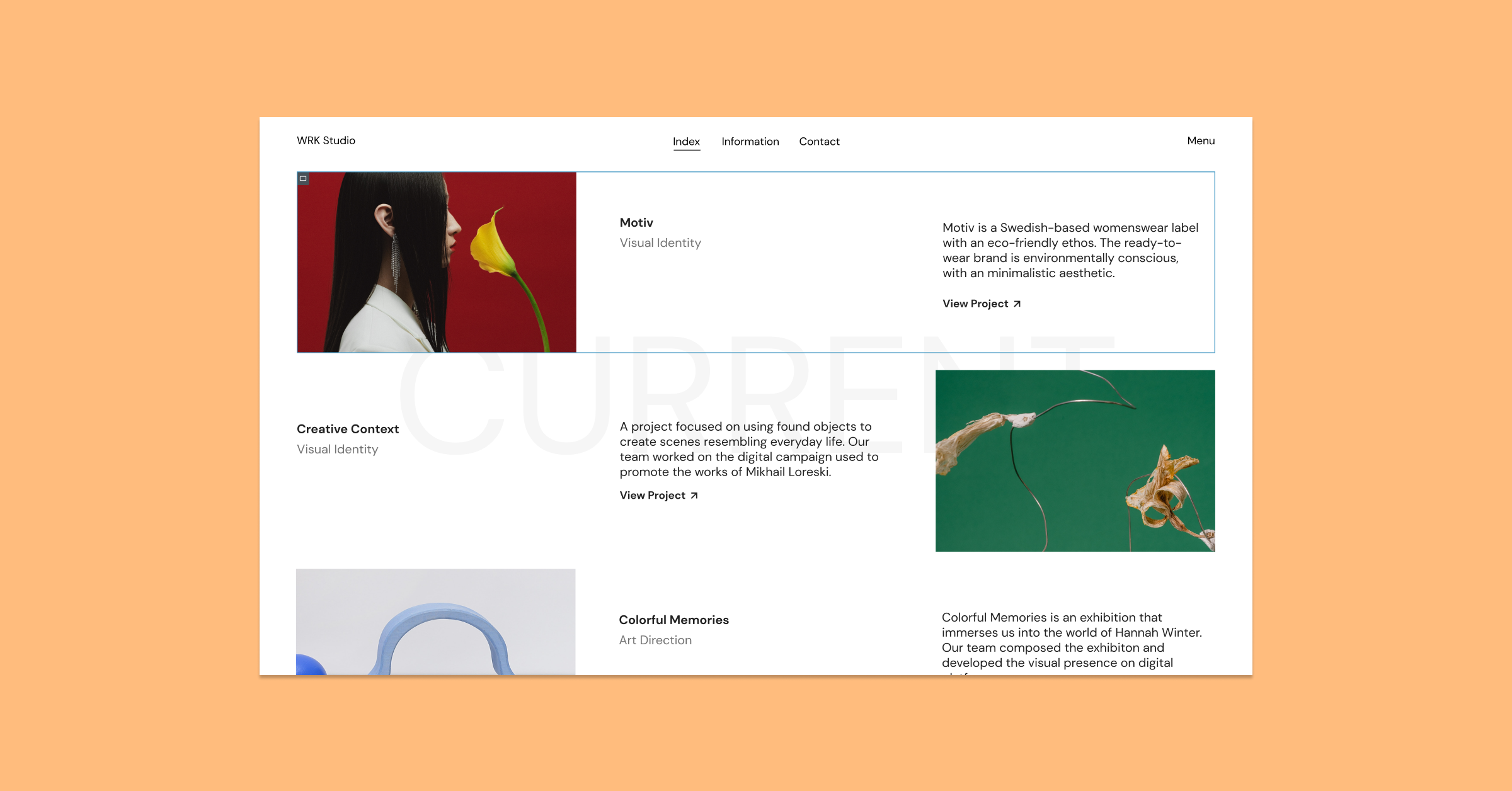
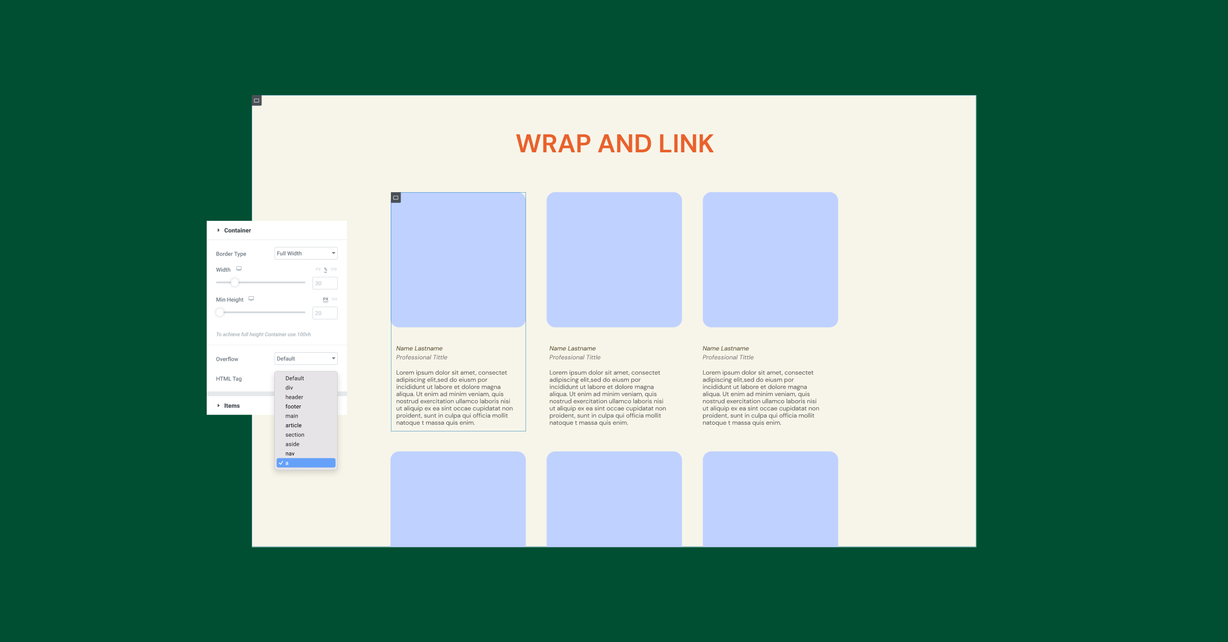
Facilitate Intuitive User Experiences With Clickable Containers
Some designs make visitors think that the entire content area will be clickable – such as a card. However, when they try clicking it, they have difficulty finding the area of the card that is actually clickable. With Containers, you can wrap the entire Container and add a link to it, making the entire Container clickable, which creates a highly intuitive experience for your visitors.
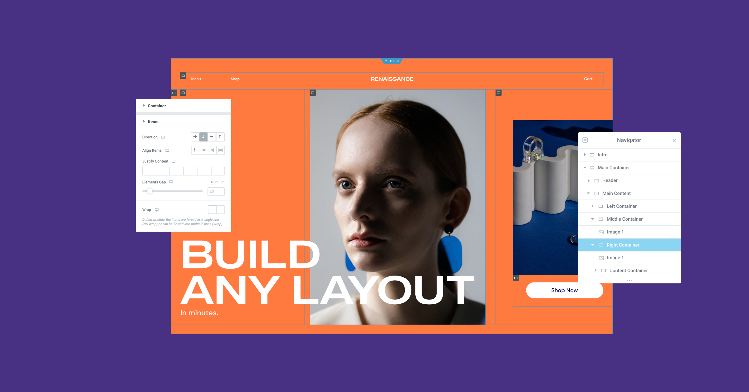
Nest Containers Infinitely To Create Advanced Layouts
Flexbox Containers empower you to create advanced layouts faster. While with the Section-column layout, you would only be able to place a single inner-Section within a Column, with Flexbox Containers you can Nest Containers infinitely. Nesting Containers will allow you to set different directions and alignments for each one, to quickly create highly advanced layouts.
Harness the Power of CSS Flexbox in Elementor’s Editor
Flexbox Containers, introduced as an experiment, represent a quantum leap in design flexibility. With the experiment activated, you will be able to leverage all the benefits of CSS Flexbox in Elementor’s Editor, which will empower you to create sophisticated designs much faster, and with much less DOM output. Aside from the immediate design flexibility benefits, Containers are also the foundation of several upcoming exciting features, so stay tuned, and try it out first in the Playground.
