Table of Contents
Brand New Color Picker
Better Saving, Deleting & Rearranging Colors
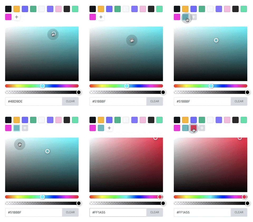
Save Unlimited Colors
Keep your favorite colors, and have them follow you across Elementor.
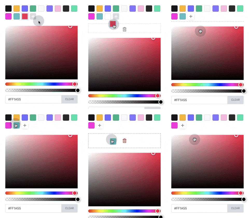
Get Rid of Unneeded Colors
Simply drag down a color to delete it from the picker.
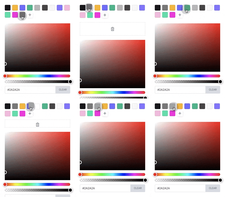
Rearrange Your Pallete
Move colors around to get the order just right.
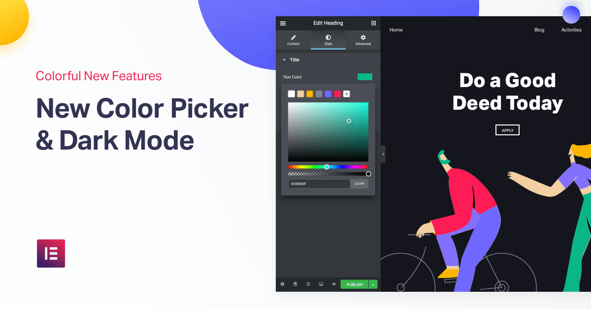
We’ve built a brand new color picker, that significantly improves how you save and arrange your favorite colors.
If you’ve built Elementor sites before, you know that the color picker is used dozens of times throughout every project. It took a lot of work, but we’ve completely rebuilt our color picker in order to make your workflow more efficient.
From now on, you can save your favorite colors straight from the picker itself. In fact, save a color on any picker across Elementor, and it will automatically sync with every other picker across your site.
Deleting and rearranging colors is also quite intuitive. The familiar drag and drop functionality will let you set the proper order of colors, and the trash is for deleting the colors you don’t need anymore.
What if you REALLY love colors, and want to pick a wide range for your design? No problem! You can save as many colors as you like. Turn your site into a canvas!
Dark Mode
New UI Theme: Party Starts When Lights Go Off
Hello darkness my old friend, I’d love to design with you again…
I am happy to announce that Elementor now offers a whole new interface appearance – Dark Mode. Elementor’s Dark Mode is not just for you night owls, goths, and Star Wars fans.
There are a lot of practical advantages to using this setting. When you’re designing a dark-themed website, it’s much easier to have a similarly dark editor with a calm and subtle color scheme. It saves your laptop’s battery life, it’s good for the environment, and it has a smooth look and feel to it. Plus, it’s a lot easier on the eyes, so you can work into the wee bit hours of the night building beautiful websites.
Following Apple, Facebook, Google Chrome and soon to be WhatsApp, it’s time Elementor joins the celebration and give users the hottest thing in app UI.
A group that is sure to love this feature are Elementor developers, since most coding is done in dark apps. Guys and gals, this is your chance to put even more efforts into developing spectacular addons for Elementor!
Get this — while you can manually set the editor to dark or light mode, you can also set it to automatic, meaning it will adjust the editor to dark or light according to your native OS setting.
New Responsive Editing
Muted Hidden Elements & Switcher for Responsive Editing
If you loved the color-related improvements, I’m sure you’ll also dig the improvements we’ve added to responsive design.
For responsive editing, we wanted to offer a way to hide sections, columns and widgets from certain devices, and still have those elements visible while editing.
After hiding an element and switching to the view it’s hidden on, you will see that this element in “muted” mode. This way, you can stay aware of every element on the page, even the hidden ones.
Want to get a precise layout and hide out the muted elements? Simply click on the ‘Hide Panel’ icon and you will see a preview of what the page looks like to users.
Another responsive feature we changed was the device switcher.
You know how when you switch from mobile to desktop, the switcher runs horizontally? In many cases, this cause some distortions in the display, and also limited us from extending the switcher. This is why we’ve turned the switcher from a horizontal into a vertical menu. Doing this takes us a step closer to develop more customized breakpoints which so many users requested.
Template Library Connect
The Future of Elementor Templates Looks Bright
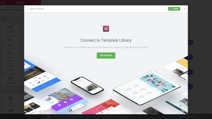
The Elementor Library was one of the first features we released, and has grown to become one of our most substantial features. Its functionality has expanded to include block and page templates, popups, dynamic templates and more.
As part of our continuous efforts to improve this feature, as of version 2.8, we have added the infrastructure for a smarter library that will incorporate remote access, login capabilities, and a more personalized experience in the future. The Library Login will enable us to add valuable personalization features such as ‘favorites’ and ‘recently used’ views, so you can have easy access to the templates that you really want.
Connecting to the library prevents abuse and helps improve user authentication. If you’re a user who already activated your Elementor Pro license, we have you covered. You’ll have instant access to the library and won’t need to connect.
Elementor 2.8: Hello Dark Mode, My Old Friend!
Elementor Version 2.8
The Last Core Release Before the End of the Decade!
Many of the features listed above, as well as other features added in this version, serve as the foundation for more advanced features coming up in 2020.
With the features we have lined up, it seems that 2020 is going to be Elementor’s biggest year yet… Stay tuned for some amazing surprises that will rock your web design business!
Now’s the time to try out Elementor Pro, and start the new year with the most powerful site builder in the world, that’s just about to get even better.
Looking for fresh content?
By entering your email, you agree to receive Elementor emails, including marketing emails,
and agree to our Terms & Conditions and Privacy Policy.
