Table of Contents
In any website, the main headline has a tremendous influence over effectively delivering the message across to the visitor. Headlines should draw the visitor in, convincing them to either read more or opt-in to your service.
Top brands use creative animated and highlighted headlines to further draw the attention of the visitor to the headline. Now, you too can add animated and highlighted headlines, using Elementor’s new Pro widget: Animated Headline.
Highlighted headlines
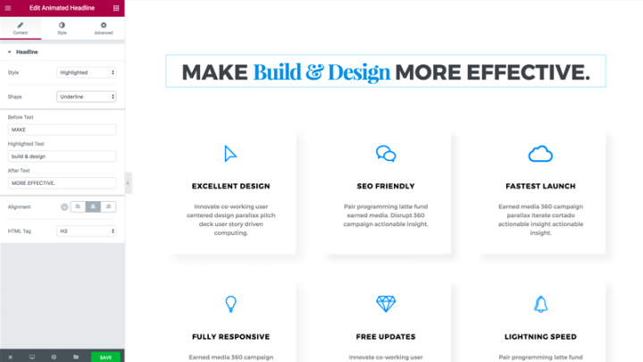
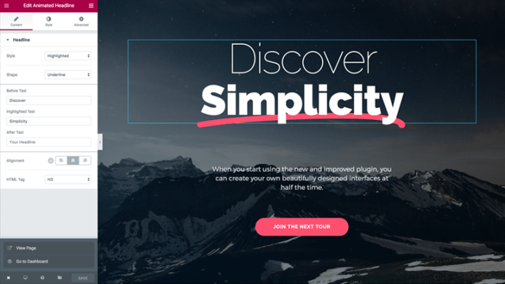
Put the focus on the important part of your headlines with the following options of highlighted and animated shapes.
Circle Me
Curly Line
Double
Doubleline
Strike
Zigzag
Diagonal
Underline
Delete
Rotating Headlines
Rotating Headline lets you take better advantage of your website real estate, delivering more than one message under the same space.
Better Bigger Faster
Typing
Better Bigger Faster
Clip
Better Bigger Faster
Rotating
Better Bigger Faster
Swirl
Better Bigger Faster
Blinds
Better Bigger Faster
Drop-In
Better Bigger Faster
Wave
Better Bigger Faster
Slide
Better Bigger Faster
Slide Down
Style Settings for the Headlines
You can designate a separate style for the animated text and the rest of the headline. Set different color and typography for each section of the headline.
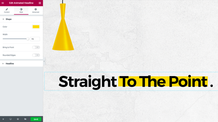
If you choose the highlighted style, you can set the marker color, the stroke width, as well as rounded edges for the marker. You can also bring the line to front, to cover over the headline.
Special Uses of Animated Headlines
We covered the main uses in the video above, but here are some special uses of Animated Headlines, along with a short explanation how to set them.

Headline with marker effect
With this feature, you can create a marker effect, as if the headline is a line in a page that is highlighted by a marker.- Set a centered marker
- Increase the stroke size to 100
- Set the color to yellow
Remove the before or after text
The widget is flexible enough as to allow you to remove the before, after or both text parts, and just leave the animated part.- Leave the before and after text blank
- Set the rotating or highlighted effect for the middle text

Heading with two separate styles
You could use this widget not only for animated headlines, but for headlines with two separate colors and typography.- Under the Style tab, set a different typography or color for the animated text and the rest of the text,
Why Use Animated Headlines
You might be wondering what are the scenarios that would be the best fit for using animated headlines. Here are just a few benefits of using this feature:
Increase conversion rate
The most obvious place to use this feature is on landing pages and homepages, where conversion rates matter the most.
In KlientBoost’s post about conversion optimization, they mention 3 design principles targeted at increasing conversions. Two of these principles can be achieved using animated headlines: creating visual emphasis and using guiding horizontal lines.
Focus visitors on what’s important
If you run a business, there is usually one benefit or pain point that should get the biggest focus and have the most relevance for your audience.
For a lawyer business, that focal point might be trust. For a plugin developer, it might be superior support.
Using highlighted headlines lets you bring more focus to that specific benefit, by underlining the single word that targets that benefit.
This way, you increase the chances your site visitor gets that specific message across.
Deliver more messages within the same space
Long form content is all the rage right now, and you can hardly find articles shorter than 2,000 words these days.
The problem is that long form content tends to bore users, so the likelihood of someone reading past the first 200 words is slim. You can use animated headlines to create an interesting break in the flow of content. This method is used by one of my personal favorite blogs, the Outline. They have headlines with top and bottom curly lines, that make the whole blog design more engaging and fun to read. It’s animated, so you don’t feel like you’re reading a Wikipedia article.
You can also check out how brands like SendGrid and Hotjar use highlighted and rotating headlines for their homepages to get their users more engaged.
Create a break for long copy articles
If you run a business, there is usually one benefit or pain point that should get the biggest focus and have the most relevance for your audience.
For a lawyer business, that focal point might be trust. For a plugin developer, it might be superior support.
Using highlighted headlines lets you bring more focus to that specific benefit, by underlining the single word that targets that benefit.
This way, you increase the chances your site visitor gets that specific message across.
What's Next
Using any one of the options in animated headlines can result in some unique and spectacular headline designs. Customizing the headline animation is easy and visual, so you can experiment and create a headline design that suits your style and audience.
With the recent additions of Animated Headlines and Text Shadow Headlines, you now have a whole spectrum of new design possibilities to explore.
Animated headline is the first of several upcoming Pro releases, so stay tuned to get a lot more from your Elementor Pro.
Test this feature yourself and see how it affects your landing page conversion rate and engagement.
Let me know how you are planning to use it in the comments below.
Looking for fresh content?
By entering your email, you agree to receive Elementor emails, including marketing emails,
and agree to our Terms & Conditions and Privacy Policy.


