Table of Contents
Last month, we released the first in our monthly series of Elementor template kits. The response from our community has been amazing. Many users got super-amped up with the release and wanted more:
This month, we decided to get in shape and release an entire website kit dedicated to a professional gym. Grab your protein shake, flex those biceps and pump that iron! This kit is sure to get you buffed.
This kit is 100% FREE to all Elementor Pro users and includes:
Why Use This Kit
As with our previous kit, we’ve cut no corners in the process of perfecting this template kit. It’s built for a lot more than just being an eye-candy. Here are the benefits that make Elementor’s kits stand out in the sea of templates:
- Professional design – Every page, section, and widget have been used and edited with the best practices in mind.
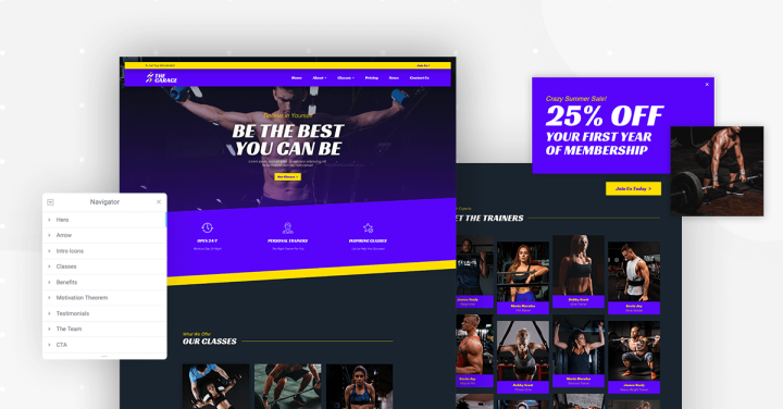
- A rich array of elements – The kit comes included with a wide range of Elementor features. These include popups, blend modes, parallax scrolling, navigator, and more.
- Image optimization – All image sizes have been optimized.
- Named sections – We named each layer in the Navigator, so you can easily pinpoint and pick out every element on the page, and know what does what.
- 100% mobile responsive – All assets have been built with mobile responsiveness in mind.
The Gym Template Kit: A Bold & Vibrant Design
With our monthly template kits, we want to make sure that we offer our users a broad spectrum of designs. This is why we decided on releasing a Gym template kit, which is quite different from the previous Digital Agency kit.
The previous kit was minimalistic and simple, whereas this one is bold and includes vibrant colors and striking elements. Since we are talking about exercising and sports, we’ve incorporated movement into many of the elements in the templates. We’ve also included many images since sports and recreation fall under the visual category.
The bright blue and yellow neon colors contribute to the bold design. They also correspond to the colors that athletes are often seen wearing in gyms across the world.
The typography is also appropriate to our design, and features ‘Racing Sans One.
The bold, vivid design of the kit might make it hard to customize it for other fields. However, it may be an excellent fit for topics like coaching, yoga, and other activity-related areas.
Let’s go over the assets and see what it includes.
The Gym Homepage Template: Cool Parallax Effect
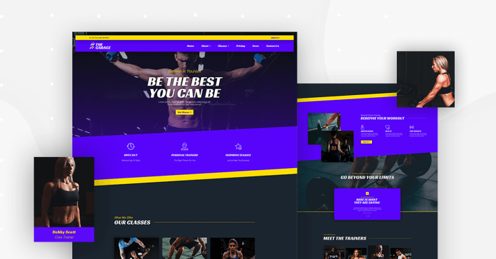
You have to love the first hero section you see on the homepage. The image of the shirtless and buffed exercise enthusiast cannot be ignored, and it grabs the attention of the visitor right away. The messaging fits the same idea, with motivational power sentences like ‘Be the best you can be.’
When you scroll, the image moves in a way that simulates the actual movement of the exercise machine.
There are many notable elements all through the rest of the page like the use of subtle animations that continues the movement theme; the card-like images positioned one in front of the other and the dividing lines that break up the different areas on the page.
About & Trainers Pages: Spotlight on the Gym Crew
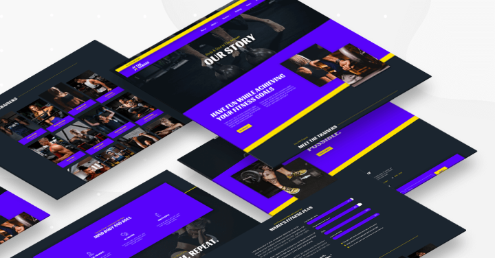
You can get much more visual in the Gym’s about page. The page tells the story of our gym using few words and a whole lot of images, spread across widgets and backgrounds.
Every proper gym should highlight its most valuable possession — the trainer. In this template, we highlighted Maria Morales, our TRX trainer. The page depicts Maria’s skills using a progress bar and includes another call to action alternative at the bottom.
Classes & Fitness Pages: Creative Ways to Show Info
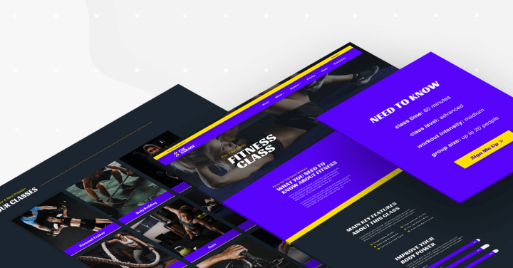
Are you a bodybuilder or more of a CrossFit person? On this page, you will find a nice layout that could be used for classes, lists, or even posts. The testimonial carousel at the bottom serves as social proof for the effectiveness of our gym.
Even though this page is for a fitness class, it can serve as a great example of how to build a content-rich page in a way that is easily digestible and readable for the visitor. The clear separation of each section, using a different background color, as well as the clever uses of icon lists, progress bars, accordions, and columned content help make this page look great. The page also includes a sticky sidebar that follows the visitors as they scroll and entices them to sign up.
Pricing, News & Contact Pages: Completing the Kit Pages
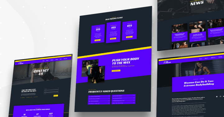
In this page, we repeated the match between the exercise and the scrolling effect. This helps create the weight lifting effect. For the sports fanatics who have to get a daily dose of gym updates, we created a news page that visually displays recent articles about all things fitness.
No gym can survive without a constant flow of new subscribers. This is why our contact page includes opening hours, a contact form, the address, and other contact details.
Before you take care of your body, take care of what’s inside (sorry for the bad pun).
404 page: The Images Serve As the '0'
This page features a creative use of our image carousel, which has been placed creatively between the ‘4’ and ‘4’ that make up the 404 page.
Header & Footer: You Can't Miss Those Neon Colors
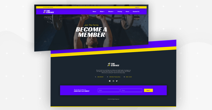
The Gym’s header is a sticky one and follows the same design of the entire kit. For the footer, we went for a prolonged design, which includes a USP, contact details, a contact form, and social media links.
Popup: Cool Animated Boxes
If you click the Join Us link in the header, the popup will appear. For this kit, we stepped out of the usually boxed popup and created a more interesting layout for the Gym’s special summer sale.
How to Get the Kit
What templates would you like to see next? Let us know in the comments below.
Looking for fresh content?
By entering your email, you agree to receive Elementor emails, including marketing emails,
and agree to our Terms & Conditions and Privacy Policy.
