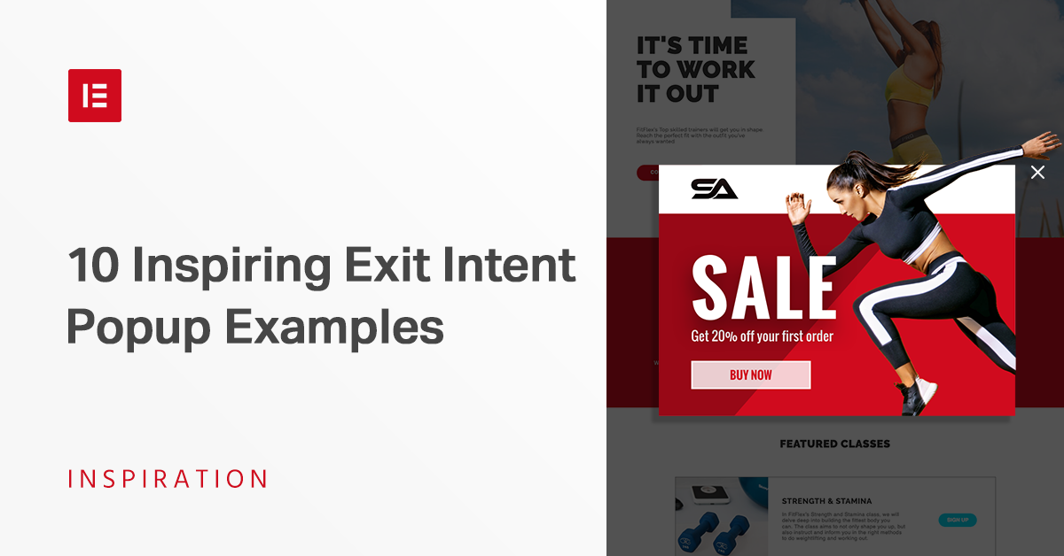
Exit intent popup examples can be a great source of inspiration for your own marketing efforts. This technology is very useful to catch visitors who are about to leave your site. When their cursor moves to close the tab or hit the back button, it triggers one last call to action.
Exit intent popups can be very useful to:
- Help you convert visitors who are on their way out and might never come back
- Do so in an unobtrusive way (what are visitors going to do, leave twice?)
- Allow segmentation (for example, to create a list of hesitant clients for lead generation)
This can be very powerful. When you do a google search for exit intent popup conversion rates, you can find results of up to 1,300%. Not bad, right?
So, how do you make them most effective? Well, the first step is learning how to create high-converting popups in general. After that, we will show and discuss a number of excellent exit intent popup examples that demonstrate what you can do with this type of interstitial.
Let’s get going.
Use These Exit Intent Popup Examples to Optimize Your Marketing
All of the examples below have been proven in real life. They are present on websites that use them to build email lists, recover abandoned shopping carts and more.
1. GQ: Make Your Exit Popups Topically Relevant

GQ’s exit intent popup is well designed, as you would expect from a publication like this. It features a photo of Ryan Gosling, plus a message that conveys you could be as stylish as him – provided that you join the newsletter list.
Note the line at the bottom, pointing visitors to the magazine’s privacy policy. In times of heightened awareness about user data security, this is necessary reassurance.
However, more importantly, notice that the popup goes together with the blog topics in the background. This goes to show that popups are a great way to segment subscribers.
If you are already on the Style page, it’s a good guess that a newsletter on this topic would be relevant to you. GQ could also do similar things for their Culture and Fitness sections.
Who to Target: Popups like this are a great way to target visitors by interest. However, it could also make sense to add an option that allows them to subscribe to the general newsletter if they want.
Where to Use: If you want to segment subscribers, make sure to use the popups on topically relevant pages.
2. Xero Shoes: An Exit Popup That Creates a Sense of Urgency

There is a lot of good stuff going on with Xero Shoes‘s particular popup. First of all, the guy in the photo is doing an X (you know, like in Xero Shoes). Secondly, instead of the usual middle-of-the-screen modal, it’s a full-screen in-your-face interstitial. Very hard to miss.
In addition to that, the popup contains a great offer. Who doesn’t want a $100 gift certificate? While I think the button colors are debatable, the best thing about this example is located at the bottom: the countdown.
Visitors leaving the site have just three minutes to decide whether they want to take Xero Shoes up on their offer. After that, it vanishes forever – supposedly. Will this get visitors to click on the button faster? You betcha.
Who to Target: As far as I can tell, this popup only appears when you have something in your cart. This makes sense. You don’t need to offer a gift certificate to someone who hasn’t shown any interest in making a purchase This is, after all, a cart abandonment popup).
Where to Use: This type of popup is probably best suited for product and shopping pages on eCommerce/online stores. Not so much for homepages or blogs, where people are not as close to buying.
3. Roadside Vapes: Use Appealing Visuals and Copy

Roadside Vapes‘s popup is genuinely one of the best exit intent popup examples I have seen – and I don’t even vape! The picture of the hugging lion and the copy above it are spot on and has an emotional appeal. Besides those, the 10% off is just an afterthought.
I’d actually be tempted to hand over my email address just to show appreciation for this popup design.
Who to Target: Everyone should see this!
Where to Use: Everywhere, you fool!
4. Green Mountain Mustard: Recover Shopping Carts With Humor

Humor is always a good ingredient if you can pull it off. The company above does this beautifully.
“You’re leaving without your mustard!” is such a good message that is amplified by the 10% discount and, more importantly, the refusal link at the bottom. This type of popup is an excellent way of recovering abandoned shopping carts and further underscoring your branding.
Unfortunately, it wasn’t enough to keep Green Mountain Mustard going. Consequently, this is an exit intent popup example from the archives.
Who to Target: Clients who have populated their shopping cart but are about to leave your site.
Where to Use: At least on the checkout pages but, if possible, any page that people with a full cart try to drop out from.
5. Coschedule: Move Visitors to a Landing Page

Popups themselves can function as mini-landing pages. However, they don’t have to. Instead, they can also work as an entry point for a real landing page, such as in CoSchedule‘s example above. When users click on the button, they land here:

The page provides details about the offer mentioned in the popup and also contains a detailed form that users need to fill out to take advantage of it. Doing so helps segment them into the right list, allowing you to send them targeted messages later. Also, all of this content would clearly be too much material for a popup, so it makes sense that the interstitial just acts as a redirect.
Who to Target: You can use this for your general audience. However, it’s also possible to create different popups for different topics and then send visitors to separate landing pages.
Where to Use: If you use it like described above be sure to show the right popups in the right places.
6. Social Triggers: Use Ample Contrast

Contrast is a good method to get your message across. It helps make the right information stand out right away.
Derek Halpern does this very well on his site Social Triggers. His popup creates contrast both via color as well as with font weight and size.
With just one glance you understand that he can help you get 5,000 subscribers and that there is a free ebook in it for you. The rejection message isn’t even really visible like it’s not an option you should seriously consider. A great way to lead users to your desired action.
Who to Target: This message appears to be geared towards those just starting out in the area this blog covers. Therefore, it’s probably suitable as a general message.
Where to use: Depending on the topics on your blog, you could actually segment this to appear only on relevant posts with a different lead magnet for other categories.
7. Zodeys: Turn Popups Into a Game

Honestly, what an awesome idea! The Zodeys site managed to turn a potentially annoying popup into a fun and entertaining game. Instead of demanding your email address, Zodeys allow you to exchange it for a chance to play and potentially win a prize! Gamification at its best.
Sure, this takes some programming chops to pull off, plus I would suppose that the game is rigged (they are not really giving away $1,000,000, are they?). However, for the novelty factor, I would definitely try it out. It’s a great spin on the usual discount message, too (Spin – see what I did there?).
Who to Target: Who doesn’t like to play? Exactly, nobody. However, be sure not to show this to repeat visitors whose email address you already have.
Where to Use: Sitewide! This is one of the best exit intent popup examples out there.
8. Timothy Sykes: Use Proof

Stock trader Timothy Sykes’ claim to fame is that he turned his bat mitzvah money into a fortune. So, why not lead with that, which is exactly what he does in his popup.
Using facts and numbers is always a good idea to show your authority. Many websites rely on social proof, meaning follower numbers on social media networks and the likes.
However, when you have something even bigger such as the mentioned feat, out with it! It’s certainly impressive and will stoke the interest of those who see the message.
Also, the copy combines well with the image that conveys peace, serenity and freedom – everything those looking for financial security long for. It also goes to show how important fitting your visuals to your message is.
Who to Target: Again, a good message for anyone coming to your site. It’s a great way to introduce yourself and your website’s purpose. Even those who haven’t found anything interesting yet will take note of a goodbye message of this kind.
Where to Use: You can use this both on the homepage for first-time visitors as well as for people who take the time to read your blog post. However, don’t show it to repeat callers. Those are probably familiar with what you can do.
9. Kindlepreneur: Be Concrete in Your Message

Kindlepreneur‘s exit intent popup example has a similar direction as the last point. It appears on a site that helps you self-publish ebooks on Amazon and gives you the above message when you try to leave. So far so standard.
One of the things to take in is the “Wait!” at the beginning. It’s a good way of getting your visitors to pay attention.
However, the most important thing is the part of the copy in orange. Here, the popup is giving you a concrete number for how the information can help increase your book sales. It’s very convincing and makes it look like they have evidence to base this on. Plus, getting it only takes “one little step”, what’s not to love?
Who to Target: Everyone. This is a general thing that any self-publisher would be interested in. If they are already on your site, chances are pretty good they are part of that target group.
Where to Use: You get to see it right on the homepage. This underscores the impression that it is for the masses. A great hail-mary message for hooking potential clients.
10. Copy Hackers: Use Different Kinds of Media

When you are about to leave Copy Hackers, you get hit with the above popup. It’s pretty standard in that they try to get you to hand over your email address. However, the lead magnet is somewhat unusual: access to a video course.
The popup comes with a screenshot from the actual video so you know what to expect. In addition, on the left, you get a description of the benefits you will walk away with.
Overall it’s quite good because of the subtle colors and that it’s just a friendly nudge. Plus, they have a great value proposition. Also, note the opt-out link. It suggests that the only excuse not to view it is if you have already seen it.
The site has an alternative version that I like as well:

Who to Target: The course they advertise is for beginners, so it’s for anyone interested in copywriting. That’s why Copy Hackers make it their default popup.
Where to Use: You only get this on the blog, not the homepage. The visitor has to show some level of interest before getting to see it, which makes sense.
Conclusion
Exit intent popups have a special position in online marketing. They are a great tool for sending the last message to your visitors before losing them, potentially forever.
There are many ways to use this message effectively and the exit intent popup examples above have shown you several ways to do so.
As usual, it’s best to think through what you are trying to achieve and who you are trying to appeal to. This will allow you to come up with the most appropriate message. Then, it’s about testing what works and continuing to learn.
Do you have more awesome exit intent popup examples or additional tips on how to make them more effective? Please let us know in the comments section below!
Looking for fresh content?
By entering your email, you agree to receive Elementor emails, including marketing emails,
and agree to our Terms & Conditions and Privacy Policy.

