Table of Contents
This month’s template kit was designed for dance studios and similar businesses whose website informs existing and prospective students about their studio and the classes that they offer. The kit’s urban, modern, and informal style communicates to visitors what they can experience at the dance studio. Just as the website visualizes, what characterizes the 810 Dance Floor Studio is its combination of classic dance with modern dance — modern ballet, hip hop, acrobatic dance, contemporary, and so on.
The template kit’s designer, Rachel Skiba, described the theme and concepts that went into building and designing the kit, and how it represents the dance studio as a business:
“Every design choice and detail that we used for the kit is based on its unique theme of the fusion of classic and modern dance styles. This is true for the font choices, the neutral, minimal color scheme, the grid layout, and the candid headshots of the studio’s instructors. Our goal is to inspire the template kit users to define their brand identity and uniqueness as a studio, or as any business type that finds the kit suitable for their needs.”
More than just representing the studio’s own style in the world of performing arts, the website’s simple color scheme, containing three colors alone (greyish beige, white and black) — illustrates what makes the studio unique, on many levels: its dance styles are classy on the one hand, yet not boring while also being modern.
Finally, the versatility and simplicity of these color schemes are also what makes the template kit itself easily adaptable to many business-types and industries, such as exercise clubs and studios, recreational facilities of all sorts, and even smaller education institutions looking to attract students. And it goes without saying that the color scheme makes the kit usable for both modern and classic brand styles.
Homepage: Introducing Your Business

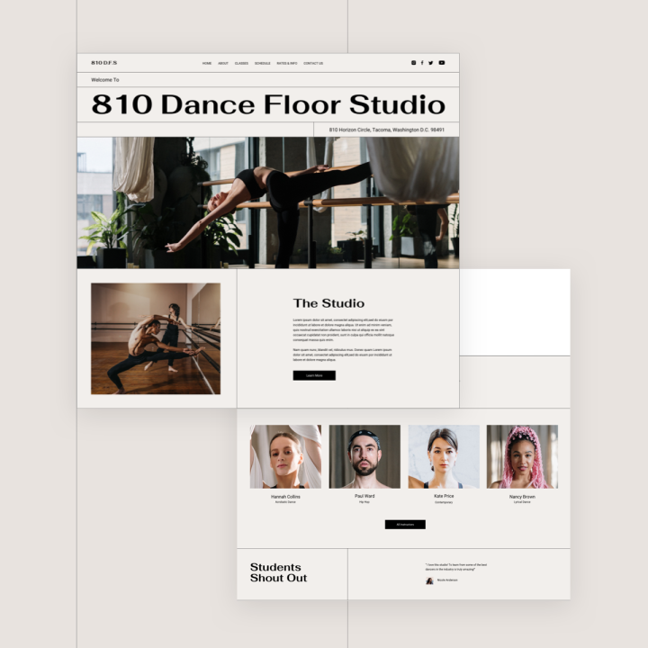
The studio website’s homepage boasts all kinds of personality: the studio’s urban, downtown-like vibe, the high caliber of its dance instructors, along with minimalism, authenticity, and the value of freedom of expression. The usage of real, authentic footage of dancers practicing their expert skills — both through static images and videos, gives the website visitor a perspective as if he is sitting right there in the room observing them.
On the whole, it’s actually the simple, subtle design touches that you’ll find throughout the homepage which give it its artistic edge. Whether it’s the hero section’s background image that’s set 100% width or the unique combination of a traditional sans-serif font with a unique sans-serif font: Fahkwang for the headings and Roboto for the paragraphs, menu items, and button texts. This typography combination certainly mirrors the studio’s brand identity of a place where modern art and classic art meet and work together in a way that complements one another.
The Homepage template is a Page template.
You can download it from Editor > Open Library popup > Pages tab > scroll the page and find it or search for “Dance Studio”.
Popup: Minimum Content, Maximum Information

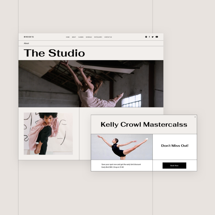
The “Kelly Crowl Masterclass” popup on the homepage shows just how out of the box and creative you can be when designing a small and simple popup. Thanks to the cleverly crafted black lines that are used both for the outer border and as dividers within the popup frame, every website visitor is able to digest the multiple pieces of information that the popup contains: the name of the class, a brief message, early-bird discount information, a medium-size image and a clear call to action button.
As we know, the fine art of creating a popup calls for a delicate balance of not being too aggressive or disruptive, yet still grabbing the user’s attention in an unexpected way. The simple design, neutral color scheme, and neat, broken grid layout of the popup window do just that.
The Popup is a Popup template.
You can download it from WP left panel > Templates > Popups > Add New > Choose “Popup” > Library popup > scroll the page and find it or search for “Dance Studio”.
Classes: Combining Multiple Column-Widths

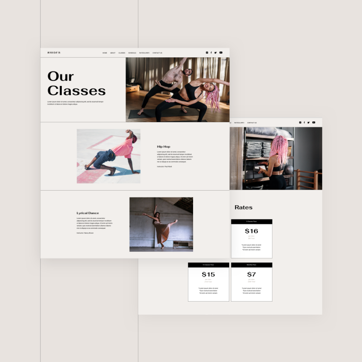
Some of our favorite features of the Classes page are its unique layout as well as the way it combines video content with static images. The scrolling experience down the page shows how a narrow content width, surrounded by copious negative space, can actually accentuate the seemingly small-scale images and texts that are centered throughout the page. The page declares its uniqueness and originality by showing how we can combine multi-column layouts with single column layouts.
Finally, what we especially like about the centered content is how seamlessly the video containers blend into the page, both when looking at the page in its entirety and when watching the video when scrolling vertically, and even when viewing each horizontal section on its own.
The Classes page is a Page template.
You can download it from Editor > Open Library popup > Pages tab > scroll the page and find it or search for “Dance Studio”.
Sticky Bar on Schedule Page: Navigation That Stays Together
The template kit’s sticky bar, which, as you may know, are most commonly used for sticky headers, keeps the primary navigation of the entire site with the website visitors at all times. In this Template Kit, the sticky bar is actually created using the nav menu widget, preventing the issue of the many switching between days on a weekly schedule layout being overwhelming, due to the many time slot options throughout the week. This navigation technique enhances the user experience of the Schedule page in general — making it significantly easier for any prospective studio go-er to understand their options in terms of which classes the studio offers and when they are available.
The Schedule page is a Single Page template.
You can download it from Editor > Open Library popup > Pages tab > scroll the page and find it or search for “Dance Studio”.
Time To Get Moving
The floor is yours, and the template kit is ready for you to make your first design move. Design studios and fitness businesses alike can reach new heights by using the template kit — with the chance to truly represent what their studio has to offer and how members can enhance their lifestyle by attending studio classes.
Calming, neutral website styles never fail — especially for those looking to become a part of a community who joins together to express themselves through sophisticated dance and rejuvenating exercise techniques. We’re looking forward to seeing how you portray your studio and communicate to visitors all you have to offer.
To see the full Dance Studio Template Kit, check out this demo.
If you have Elementor Pro, all you have to do to enjoy this cutting-edge kit is to go into Elementor, open the template library, and search for “Dance Studio”. This kit includes Home, About, Classes, Schedule, Rates & Info, Contact, and 404 pages.
Here’s a short gif showing how to search for the kit:
Which templates would you like to see next? Let us know in the comments below.
Looking for fresh content?
By entering your email, you agree to receive Elementor emails, including marketing emails,
and agree to our Terms & Conditions and Privacy Policy.


