Table of Contents
Long-Form content has been around for as long as we’ve had the ability to compile and record large amounts of information and narrative. Occasionally it falls out of fashion, but it’s back and judging by its online presence and level of engagement it cannot be ignored.
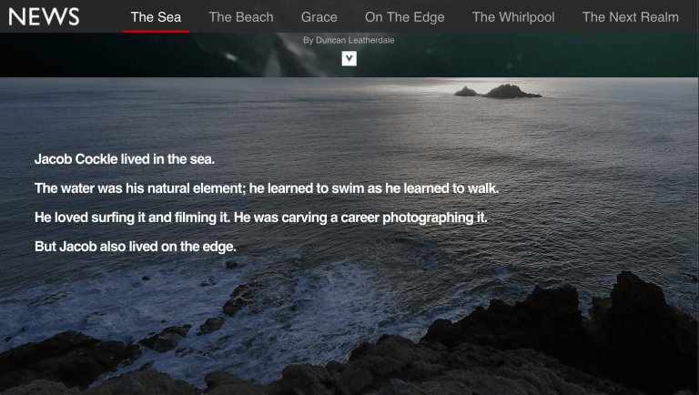
After seeing some great examples of Long-Form content, the resounding conclusion should be:
Good content + Great visuals = Great long form post
Visuals aren’t merely for decoration, they create spacing elements that provide the written matter with a pace and rhythm.
The various techniques used, work like cliffhangers in TV shows, teasing the audience with an open-ended piece of information, or a question that gets their minds buzzing.
But, as great as your writing may be, you still need eye candy.
Getting this visual aspect of long-form content right is crucial. You’ll want to break up your wall-to-wall mass of text. You’ll want to make it easy to navigate, so be sure to include headings, anchors and a table of contents. By merely adding some basic visuals such as photos, videos, and other media (e.g. the very trendy infographics, or the less trendy regular charts and graphs) content will increase views by an average 77%, according to MDG Advertising’s analysis of 10,000 press articles.
How to Approach Designing your Epic Post Layout
Our suggestion is to approach your design only after your second draft.
Whether your article is heavy on data, or more of a story piece, you should be able to identify the weaker, ‘boring’ parts. The moments when you are most likely to lose the reader’s attention and interest.
We feel that every visual element should have a reason. Will it draw interest? Will it keep the reader engaged? Every post has its own personality.
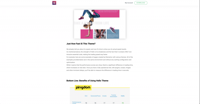
The Visual Assets to Keep on Your Accessory Belt
Because we’re talking about a blog post, we’ll want to maintain a certain level of consistency and familiarity across all of our posts, and we can achieve that by saving the section and page designs we want to keep using as Templates and saving widget styles and configurations as Global Widgets.
Spacing
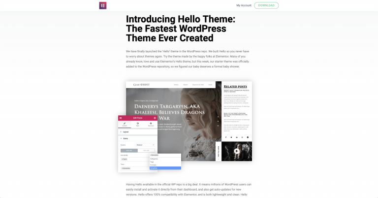
I still feel that space is an overlooked visual asset, and deserves as much attention as any of the assets we’ll be mentioning here. Space is an integral part of design, and has been ever since the first cave-dweller drew the very first line. Just as certain lines, composition, and color have fallen in and out of fashion, so too has certain uses of space. Currently, we like lots of space; because of the streamlined, almost surgically-clean, fresh feeling that we get as a result.
Design your space, around and in between blocks of text, paragraphs, and headings. You could do this as an initial sketch on paper, but it’s probably easier to by pasting your bare text (without any formatting) on to your page in the Elementor Editor. Using the Text Editor and Heading widgets you can divide and space sections of text, and see the effects in realtime.
You’ll want to take advantage of the padding and margin settings of columns, sections, and widgets, in each element’s respective Advanced tab. (There are also spacing parameters that you could use in the Style tab.)
Table of Contents (TOC) and Lists
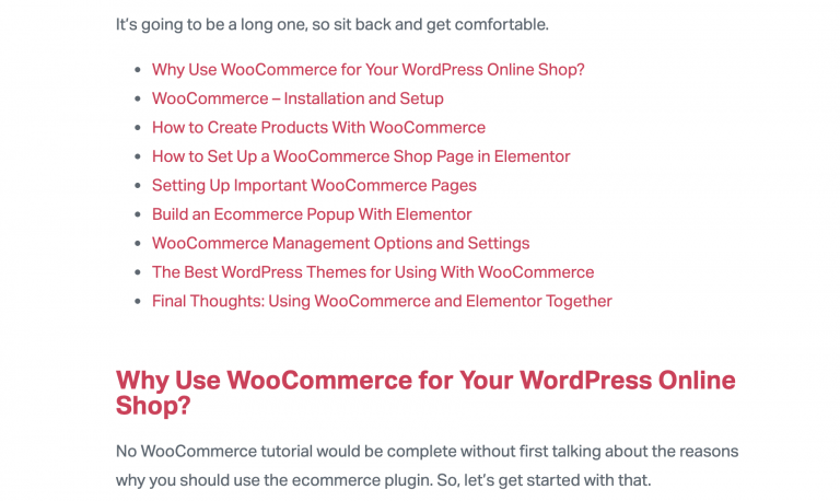
Earlier this year, Backlinko and BuzzSumo published their analysis of 912 million blog posts, proving that list posts do exceptionally well on social media. However, the level of readers’ engagement with lists does not end with sharing.
Even the basic format of a TOC will break up the monotony of block paragraphs and create some of that much-needed space. It requires the reader to pause and reassess what is in front of them. A TOC, indeed any anchored list, also gives the reader the freedom to jump ahead, jump back, even revisit the page at some future point.
Lists are great when you want to summarise your main points, or list pros and cons.
Don’t forget that as human beings we tend to enjoy lists because they help us organize detailed information so that we can remember it better.
This is true for any list: numbered lists, bullet lists – following these list, trying to commit them to memory is, again, part of the reader-engagement we’re striving for.
In fact, you might want to consider turning one of your detail heavy paragraphs into a list.
Remember that long-form posts are written and designed for longevity. We want readers to enjoy coming back to it and locating the information easily.
Images and Collages in Blog Posts

This may seem obvious to many of us, but it’s still worth mentioning that we love images.
We’ve been enjoying images since before we could read, and in our early years of reading, the few pictures in a storybook would lure us to read further. Let me save you the embarrassment and, on behalf of the majority of readers, admit that I too skip ahead to look at the illustrations and images in a book or article before coming back to the beginning and reading it through.
We know our own behavior, and we already know that combinations of images a text generate engagement. The trick is to use this information to our advantage and place images or collages of images in a way that flirts with the need for images.
Some prefer to places a big cover image at the top of the text, above the heading, or in the middle of the introduction paragraph. The design is up to you. You know your material and audience.
But you may want to consider using a collage as your opening image. Perhaps your collage will be comprised of images that will be using individually later in the article. Perhaps they are examples of what can be done with a certain technique or tool you’ll be discussing. The goal here is to whet the appetite of the reader.
Block Quotes Improves Blog Post Readability

Yes, block quotes are essentially text, but I don’t see them as text because they have a more decorative aspect. The change in font size, style, and position, like the space they create on the page, provides a pause for the reader. The quotes themselves should be powerful, perhaps provocative, enough to tease the reader into reading further and understanding the context in which this quote was said. By turning the block quote into a clickable link, we get even more engagement from the reader sharing it on social networks.
Videos, Motion effects, GIFs in Blog Posts

For many content creators, videos and motion effect animations are considered the ‘big guns’. This could be because of the level of engagement that they create, or because of the resources that go into creating them. (As you can see, we’ve also added a video to this article to prove this point.)
As with all of these visual elements you can place them anywhere. Some will always place videos at the top of their post. Others in the middle. You could use them as a background.
You might consider using short videos running in a loop, similar idea to embedding a GIF image (which is another great way to break up chunks of written matter). However, video offers better quality and more detail than a GIF.
We also suggest storing your videos on your hosting platform. The advantage of embedding videos this way, as opposed to using, YouTube videos, for example, is that commercial video platforms will always carry a distinct look in their UI. They don’t always loop nicely either. This way your post will have a nice organic-looking feature running smoothly and seamlessly on a loop.
Adding Data Visualisation to Blogs: Graphs, Tables, Infographics
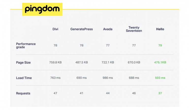
Adding visual data, such as graphs and tables is another great way to break up a mass of text, and make the experience just that more engaging. This way, readers get a break from constantly reading left-to-right, now they can read top-to -bottom. We also enjoy that moment when we try to decipher the structure of the graph, like solving a puzzle.
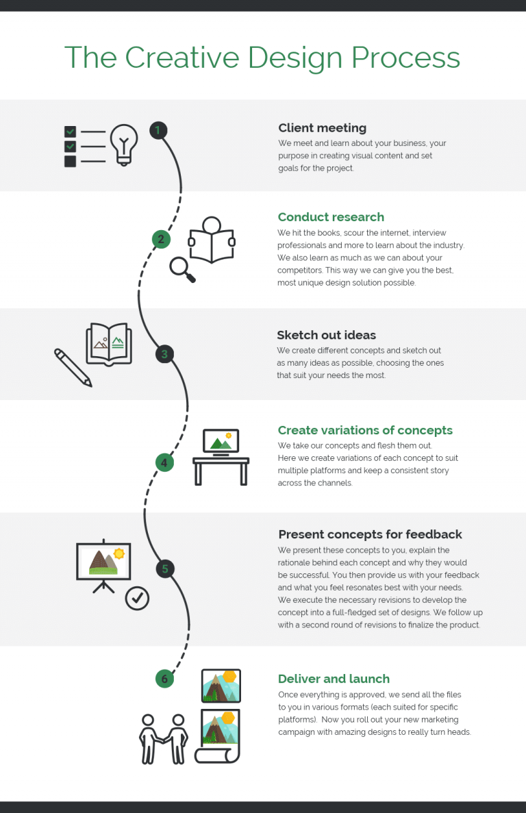
This is especially true of infographics that in recent years have been proving to be very helpful in providing engagement. Websites like Venngage and Visme are a great resource to quickly make your own custom-made infographics.
Blocks of Color As a Way of Differentiating Your Posts
Even in the background, blocks of color will rattle the monotony of a page. They help to highlight paragraphs, to make them appear more important or interesting. Even if they are angled regions of color floating behind your text, they will still help by adding life to the look of your article.
They are also used to help certain parts of information more memorable. For example, a ‘Top Tip’ or a significant ‘takeaway’ might be more noticeable in a color box.
Bottom Line: Write Epic Blog Posts!
Looking for fresh content?
By entering your email, you agree to receive Elementor emails, including marketing emails,
and agree to our Terms & Conditions and Privacy Policy.
