This post focuses on UX and design best practices. It is not legal advice. Cookie consent requirements vary by jurisdiction, so please consult legal counsel to make sure your specific implementation is compliant.
For many websites, the cookie consent banner is one of the most under-optimized parts of the user experience.
It is often the first thing a visitor sees. It shapes their first impression of your brand. And in just a few seconds, it can affect the quality of the data your business relies on, from analytics and attribution to retargeting and campaign optimization.
And yet, many cookie banners still feel like an afterthought.
A generic box. Dense legal copy. Buttons that do not match the site. A “Reject” option, hidden behind extra clicks. A mobile layout that covers the whole screen.
That is a missed opportunity.
Improving cookie consent opt-in rates does not have to mean using manipulative design or dark patterns. In fact, the strongest consent experiences are usually the clearest ones. When visitors understand what they are being asked, can make a real choice, and feel that the banner belongs to the site they are using, they are more likely to trust it.
The goal is not to pressure people into accepting cookies. The goal is to create a consent experience that is clear, accessible, brand-aligned, and easy to use.
Here are the best practices that can help.
1. Start with trust, not tricks
Before thinking about button colors, placement, or copy, it is worth grounding the strategy in one simple idea:
A higher consent rate is only valuable if the consent is meaningful.
If users accept because the reject option is hidden, confusing, or harder to find, that may create legal risk and erode trust. It can also give you lower-quality consent because users did not make a clear, informed choice.
A better approach is to optimize for clarity.
That means:
- Visitors can understand what cookies are used for
- Accepting and rejecting are both easy to find
- Preference controls are available when users want more detail
- The banner is usable on desktop and mobile
- The experience feels like part of the site, not a third-party interruption
This creates a better experience for visitors and better data for your business.
2. Choose the right banner placement
Where your cookie banner appears has a major impact on whether visitors interact with it at all.
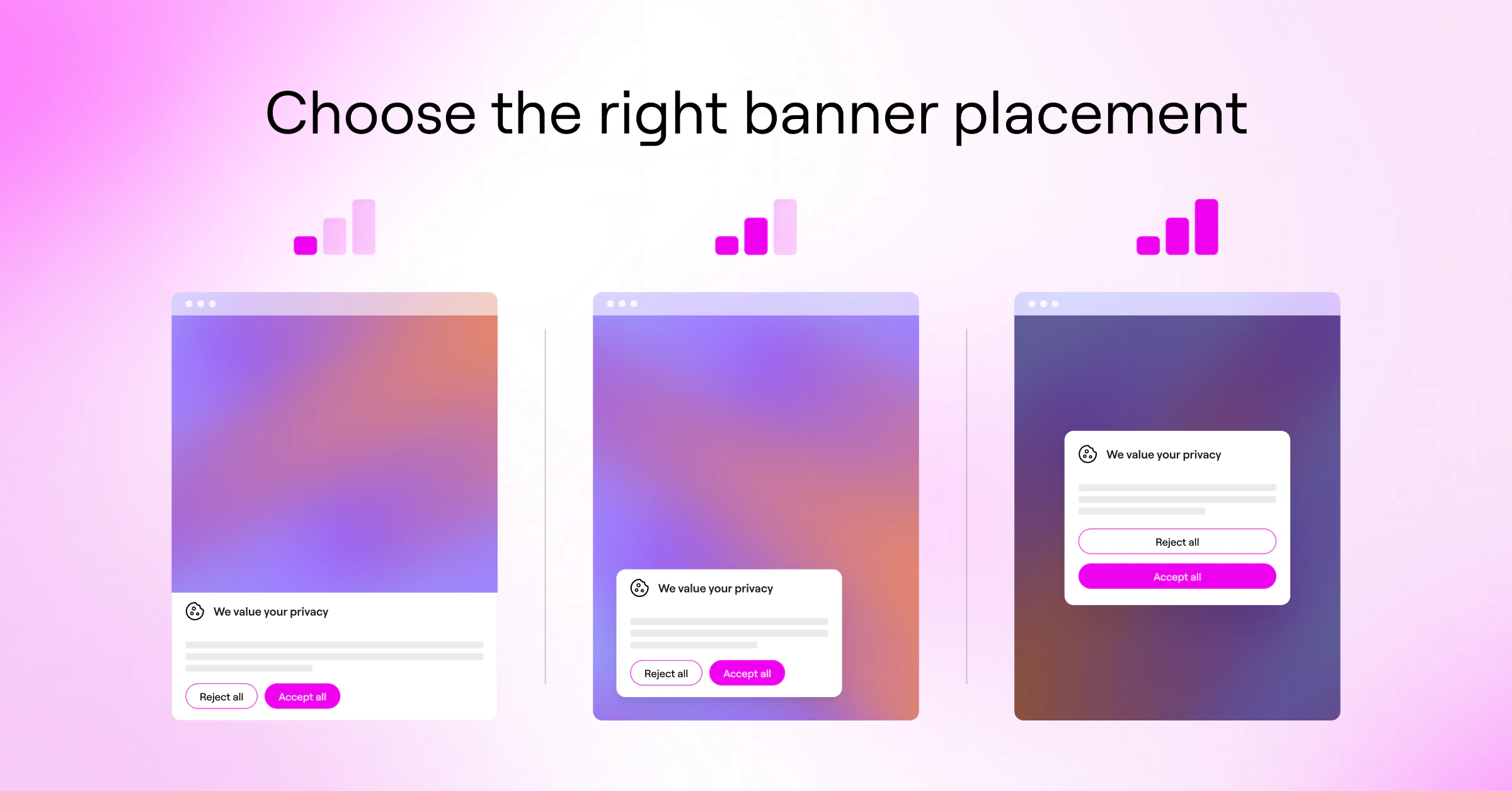
There are three common approaches: center modals, bottom bars, and corner widgets. Each one has a different tradeoff between visibility and friction.
Center modal: high visibility, higher friction
A center modal is hard to ignore. It usually appears over the page and asks visitors to make a choice before continuing.
This makes it one of the strongest formats for prompting an explicit decision. Industry research suggests center-modal banners average 55-60% opt-in rates compared to 35-40% for bottom bars. If your business depends heavily on clear consent for analytics, advertising, or attribution, a modal may help more visitors actively respond.
The tradeoff is friction. A modal interrupts the visitor’s journey, especially if it appears before they have had any chance to understand your site. On content-heavy pages, some users may bounce rather than engage.
A modal can work well, but it needs to be short, clear, and easy to act on.
Bottom bar: low friction, easier to ignore
A bottom or top bar lets visitors continue browsing without much interruption. From a pure browsing experience perspective, this can feel smoother.
The downside is banner blindness. Many visitors simply ignore it. If your setup requires explicit consent before certain cookies or scripts run, ignored banners may leave important tracking blocked.
A bottom bar may be the right choice for brands that prioritize a low-friction experience, but it may not create enough interaction for sites that need stronger consent visibility.
Corner widget: a useful middle ground
A floating corner banner or widget can offer a balance. It is more visible than a passive footer bar but less disruptive than a center modal.
It can also double as a persistent privacy settings entry point, giving visitors an easy way to revisit their preferences later.
There is no universal best format. The right placement depends on your audience, traffic source, business model, and legal requirements.
Best practice: Test placement carefully. Measure consent rate, reject rate, bounce rate, conversion rate, and mobile behavior together. A higher opt-in rate is not automatically better if it also hurts the overall experience.
3. Use plain language instead of legalese
Cookie banners often fail because the copy is technically accurate but impossible to understand.
Most visitors do not want to decode phrases like:
We use third-party identifiers for cross-contextual behavioral advertising and optimization purposes.
That may describe what is happening, but it does not help the user make a clear decision.
Instead, use simple, direct language:
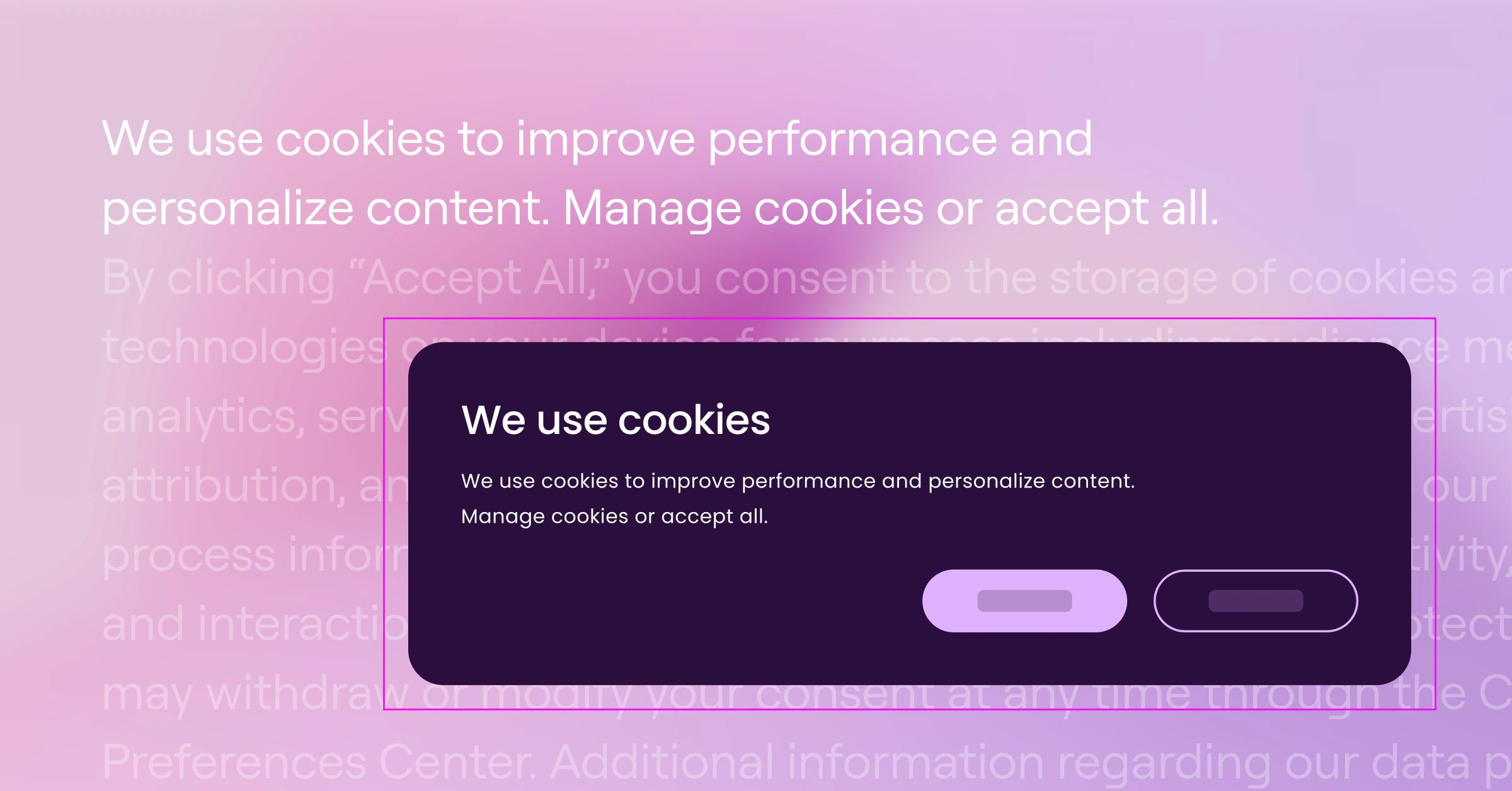
We use cookies to keep our site running, understand how it is used, and personalize your experience.
Or:
We use cookies to remember your preferences, improve performance, and show relevant content.
The point is not to oversimplify or hide important information. The point is to explain the value exchange in language people can actually understand.
Your banner copy should answer three questions quickly:
- Why are you using cookies?
- What does the visitor get from accepting?
- How can they control their choice?
A strong first-layer message might be:
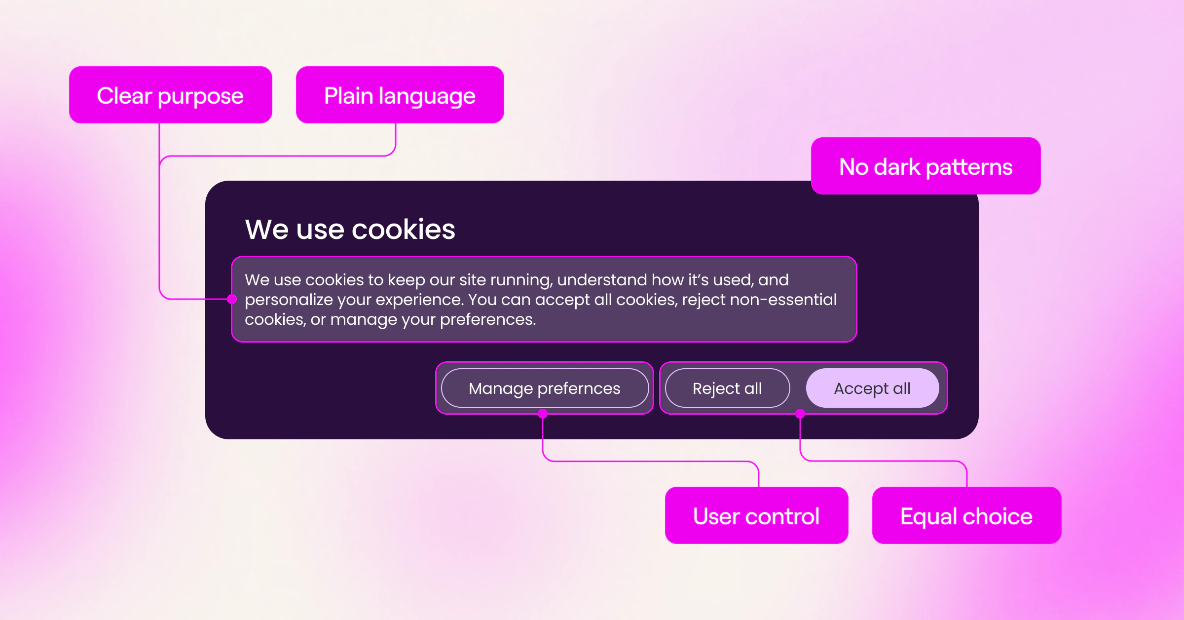
We use cookies to keep our site running, measure performance, and personalize your experience. You can accept all cookies, reject non-essential cookies, or manage your preferences.
That is clear, neutral, and useful.
Best practice: Keep the first layer short. Save detailed cookie categories, vendor information, and policy links for the preferences panel or cookie policy.
4. Make the choices clear and balanced
Visitors should immediately understand their options.
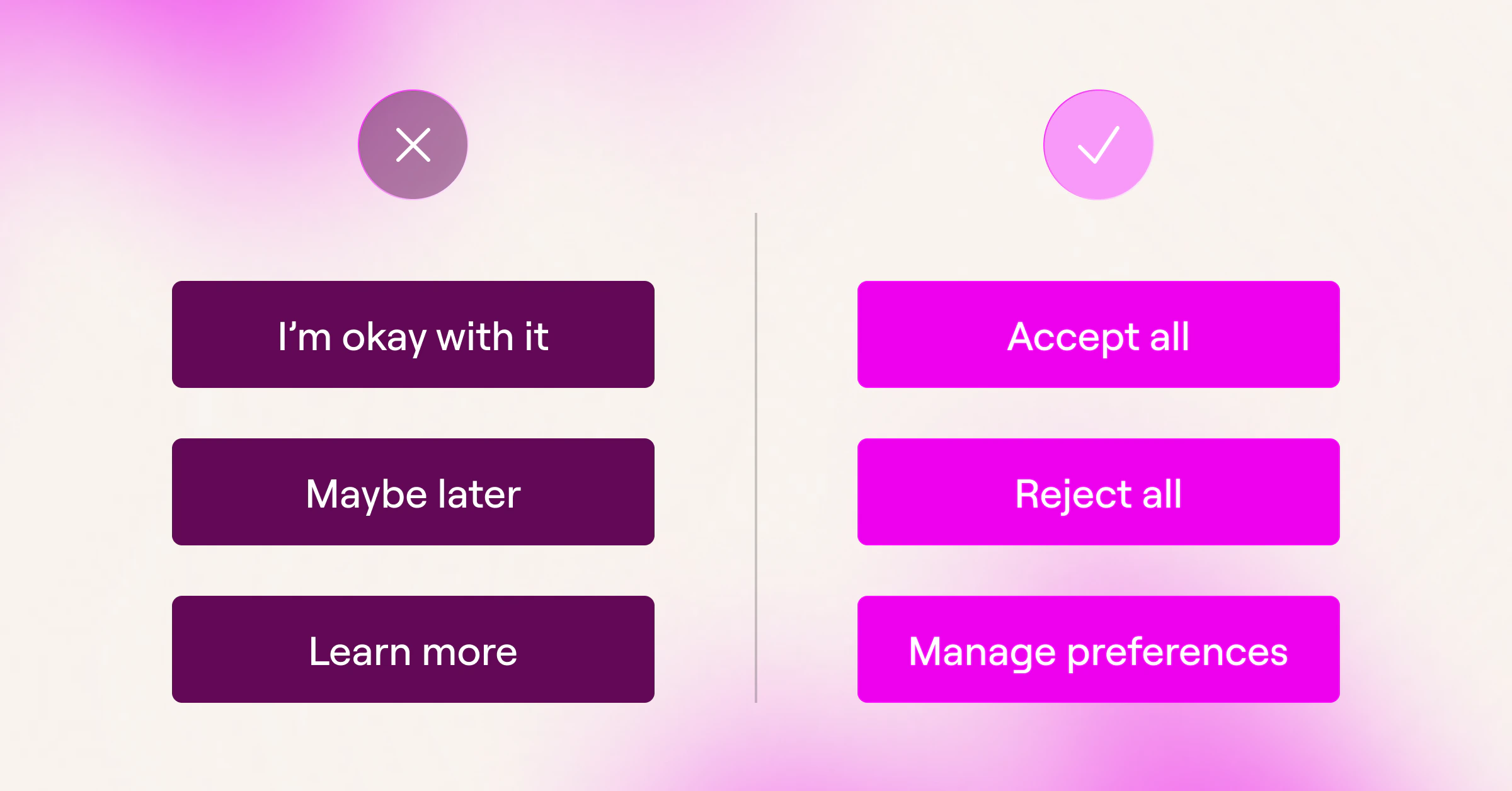
Clear button labels are usually best:
- Accept All
- Reject All
- Manage Preferences
- Save Preferences
Avoid vague or asymmetrical labels like:
- “I’m okay with it”
- “Learn more”
- “Maybe later”
- “Continue”
- “Don’t not track me”
These may feel more conversational, but they can make the actual choice less clear.
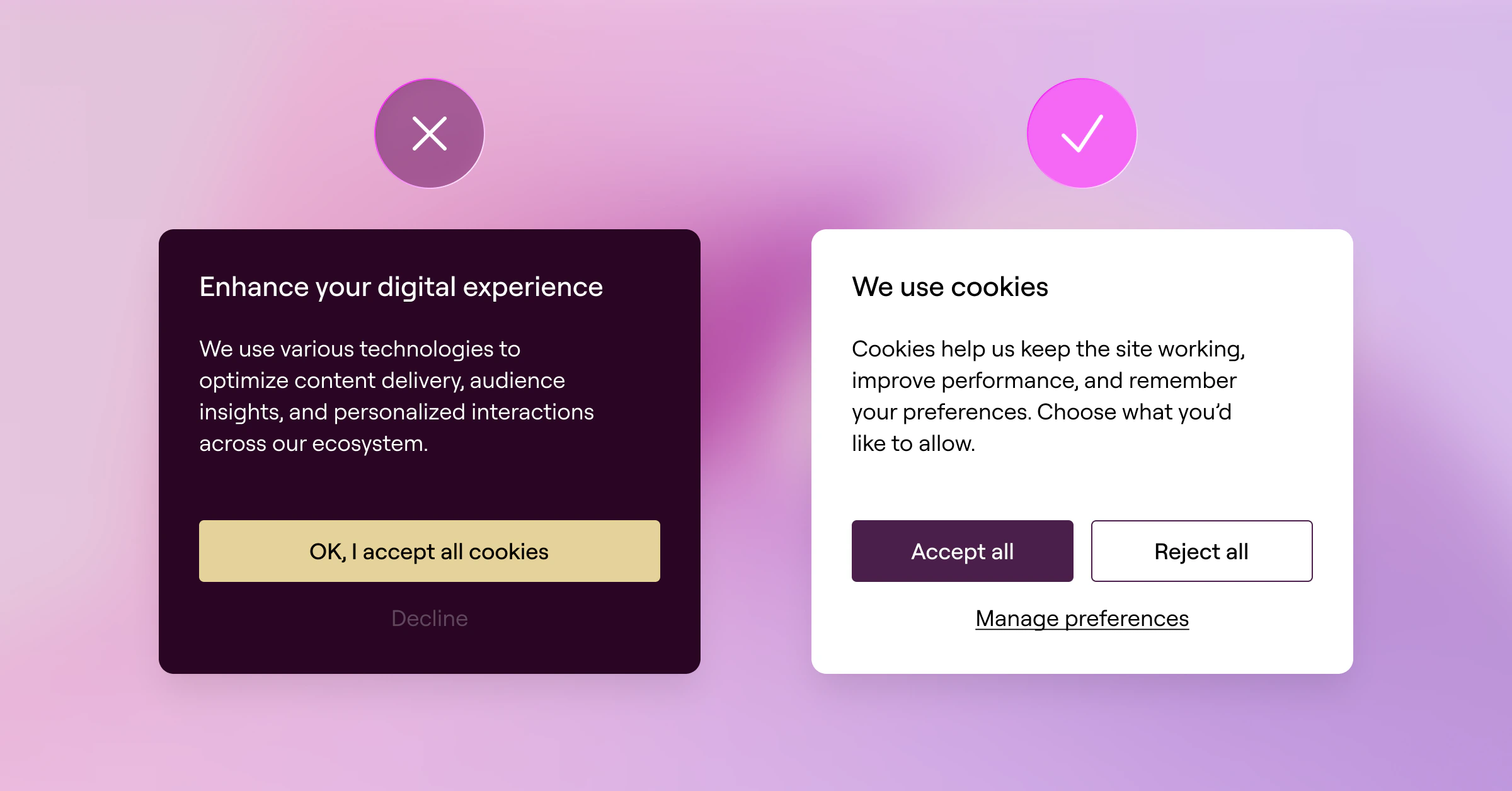
The same applies to button hierarchy. You can still guide attention, but you should not hide meaningful options. A common approach is to make “Accept All” a solid brand-colored button and “Reject All” an outlined or secondary button, as long as both are visible, readable, and easy to click.
What to avoid:
- Making “Reject All” a tiny text link
- Using low-contrast colors for privacy-friendly options
- Placing “Accept All” on the first layer but hiding “Reject All” in a second layer
- Requiring one click to accept but multiple clicks to reject
- Making “Manage Preferences” look like a footnote
Regulators have called out each of these specifically. The Swedish IMY issued formal warnings in 2025 to companies whose banners made ‘Accept All’ prominent while burying the reject option behind extra clicks.
A useful gut check: if someone glanced at the banner for two seconds, would they understand how to accept, reject, or customize?
If not, the design needs work.
Best practice: Use visual hierarchy to guide the eye, not to limit choice.
5. Design the banner to match your brand
A cookie banner that looks like a generic third-party popup can make visitors suspicious.
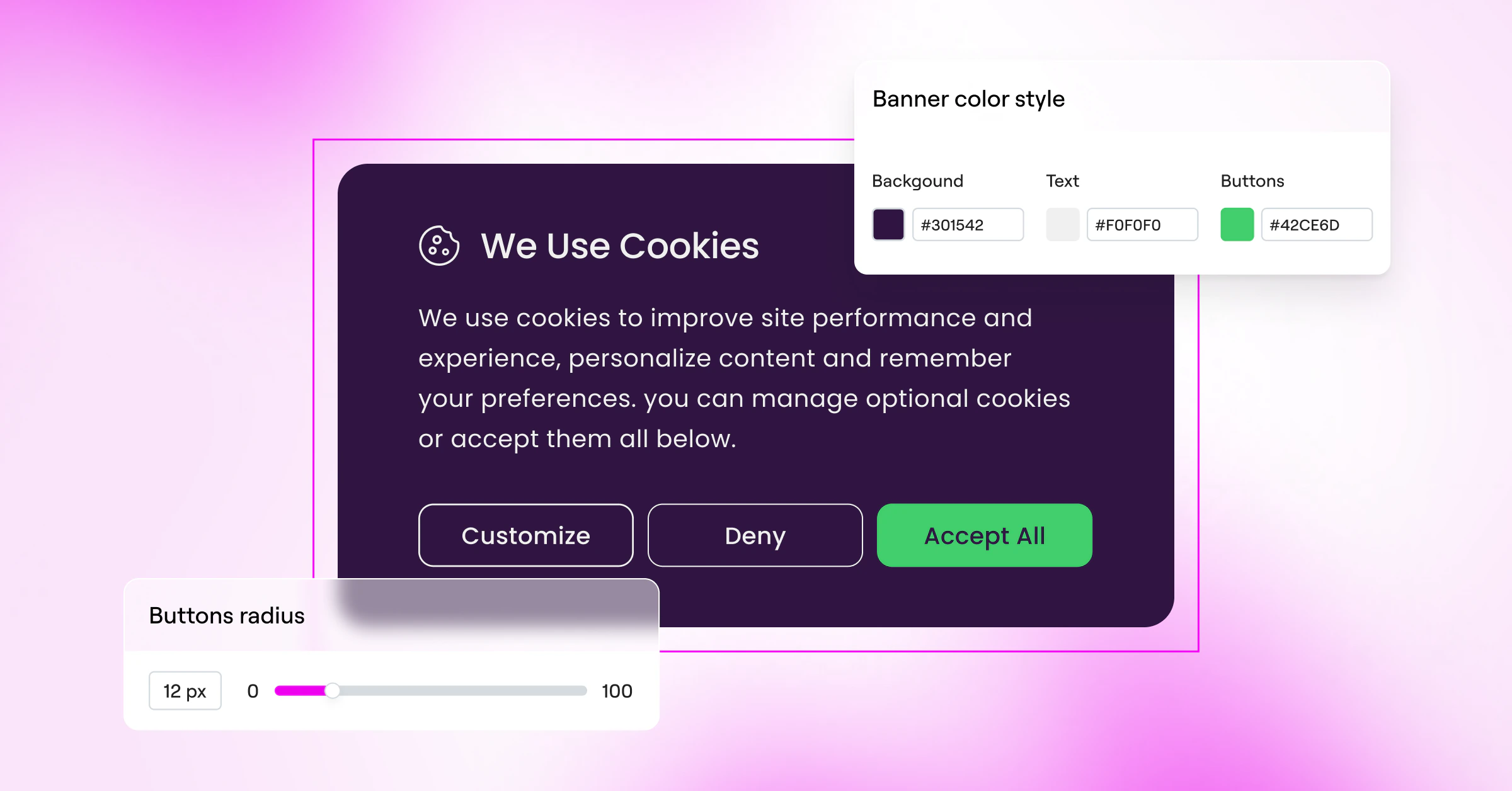
If the rest of your site feels polished and branded, but the banner is a grey box with mismatched fonts and awkward buttons, it creates a disconnect. It can feel like something was bolted onto the site at the last minute.
Your cookie banner should feel native to the experience.
That means aligning it with your:
- Typography
- Brand colors
- Button styles
- Border radius
- Spacing
- Tone of voice
- Mobile design patterns
This does not mean making the banner overly decorative. It means making it feel intentional.
If your site uses rounded buttons, your banner buttons should probably be rounded too. If your brand voice is friendly and direct, your banner copy should not suddenly sound cold and legalistic.
This is one of the reasons design flexibility matters. With Elementor’s Cookie Consent capability, you can design your banner directly in the Elementor Editor, using the same visual tools you already use to build the rest of your site. That makes it easier to create a consent experience that matches your brand, feels native to the page, and still gives visitors clear choices.
The more the banner feels like part of your site, the less it feels like an interruption.
Best practice: Treat your cookie banner as part of your product and brand experience, not just a compliance layer.
6. Prioritize mobile UX
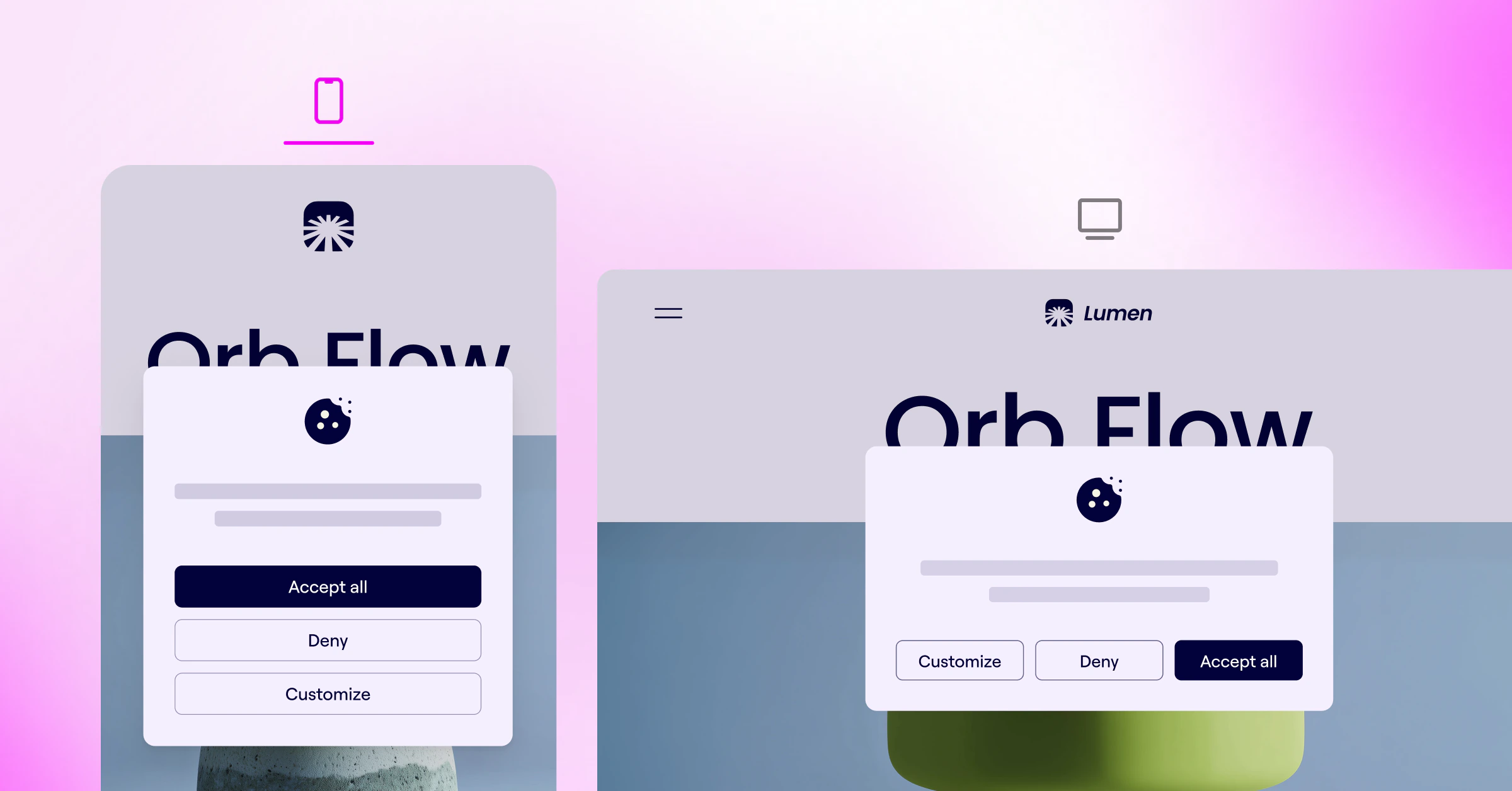
A banner that works on desktop can easily fail on mobile.
On a small screen, a cookie banner can cover the entire viewport, make buttons hard to tap, hide important navigation, or force users to scroll inside a small modal. That creates frustration and can lead to accidental choices or quick exits.
Mobile consent UX should be designed intentionally.
Check that:
- Text is readable without zooming
- Buttons are large enough to tap comfortably
- Accept, reject, and preferences options are easy to reach
- The banner does not block critical navigation or important links
- The preferences panel is usable on a small screen
- Users can scroll and save choices without confusion
This is especially important because cookie banners often include multiple layers. The first banner may look fine on mobile, but the preferences panel may become difficult to navigate.
Best practice: Test the entire consent flow on real mobile devices, including the preferences panel, toggles, save button, and privacy settings access point.
7. Make accessibility non-negotiable
Since the European Accessibility Act came into force on June 28, 2025, accessibility on key digital services across the EU is a legal requirement, not just a best practice. Cookie banners, as the first interaction on most sites, fall squarely within scope.
If the banner is not accessible, some visitors may not be able to use the site at all.
A banner should be usable by people navigating with a keyboard, screen reader, switch device, or touch interface.
At minimum, check that:
- The banner is fully keyboard navigable
- Focus states are visible
- The tab order is logical
- Buttons and toggles are clearly labeled
- Screen readers can understand the banner structure
- Users can reach and activate every action without a mouse
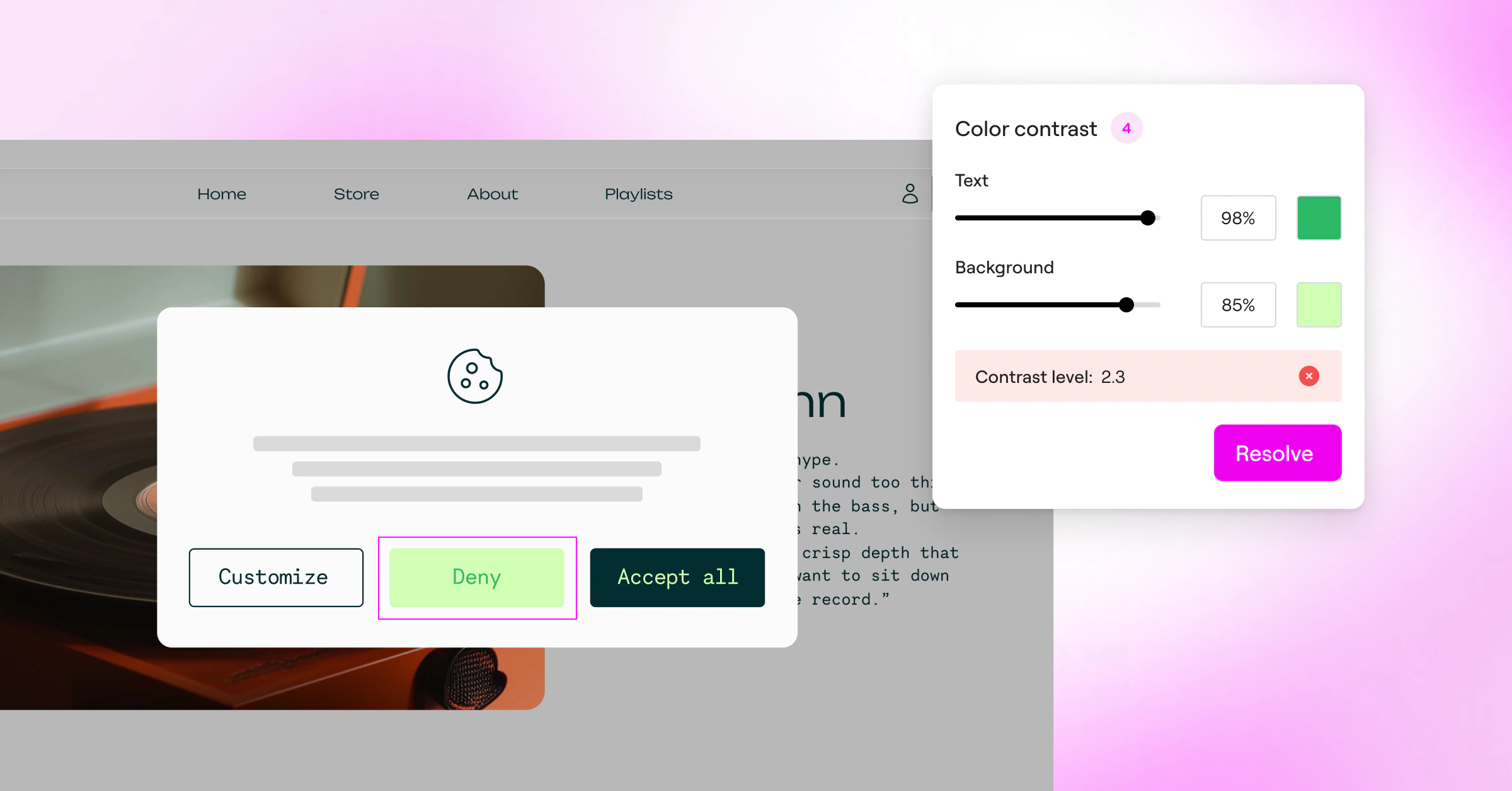
- Text and buttons meet appropriate contrast standards
- Tap targets are large enough on mobile
Accessibility is not just a technical checklist. It directly affects consent quality. A user cannot give meaningful consent if they cannot read, reach, understand, or operate the banner.
It also affects trust. An accessible banner signals that your site respects all visitors, not just the easiest ones to design for.
Best practice: Audit your cookie banner like any other critical user flow. Do not assume your consent tool is accessible out of the box.
8. Use a layered information structure
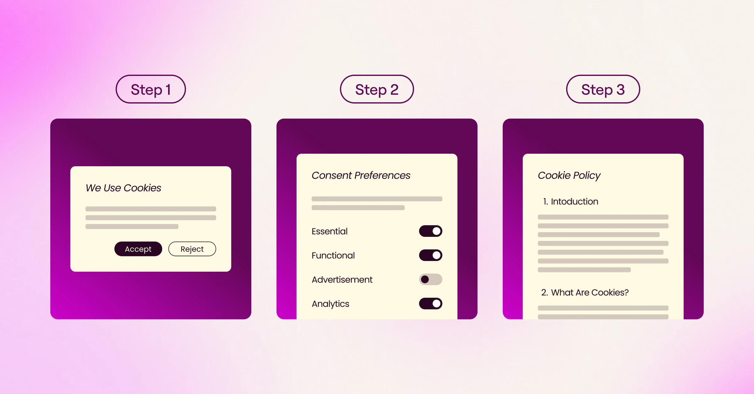
A cookie banner should not try to do everything at once.
If the first layer contains too much text, users may ignore it. If it contains too little information, users may not understand what they are choosing.
A layered approach works better.
First layer: quick explanation and core choices
This is the main banner. It should include a short explanation and clear action buttons.
For example:
We use cookies to keep our site running, improve performance, and personalize your experience. You can accept all cookies, reject non-essential cookies, or manage your preferences.
Second layer: preference controls
This is where users can review and adjust cookie categories.
Common categories may include:
Essential cookies
Required for the site to work properly. These are usually always active.
Functional cookies
Help remember user choices and improve site functionality.
Analytics cookies
Help understand how visitors use the site so you can improve performance and content.
Marketing cookies
Help personalize ads, measure campaigns, and show more relevant content.
The exact categories should reflect what your site actually uses. Do not include categories just because they are common.
Third layer: full policy
This is where users can access your cookie policy or privacy policy for more detailed information, including vendors, retention periods, and other legal details.
Best practice: Keep the first layer simple, make the second layer useful, and link clearly to the full policy for users who want the details.
9. Let users change their minds
One of the best ways to build trust is to make it clear that the user’s choice is not permanent.
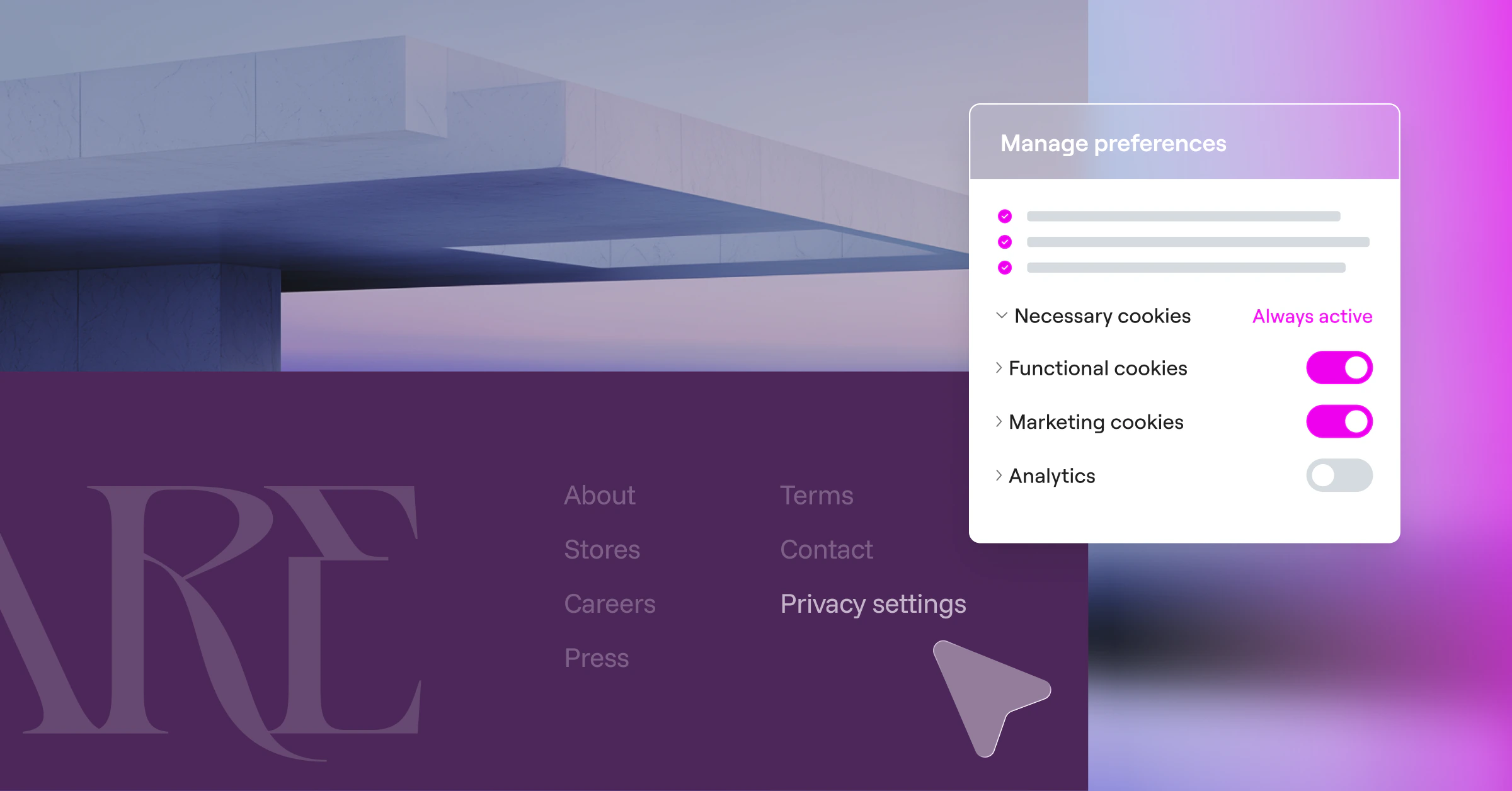
A persistent “Privacy Settings” or “Cookie Preferences” link gives visitors a simple way to revisit their consent choices later. This can appear in the footer, as a small icon, or as part of a privacy menu.
This is useful for two reasons.
First, it supports transparency. Users know they are not being trapped into a decision.
Second, it can make visitors more comfortable accepting cookies in the first place. When people know they can change their mind, the decision feels lower risk.
Best practice: Make cookie preferences easy to access after the banner is dismissed. Do not force users to search through the privacy policy to update their choices.
10. Be careful with timing and re-prompting
Timing can affect how users respond.
Showing a banner immediately may be necessary if certain cookies or scripts cannot run before consent. But from a UX perspective, asking for consent before a visitor has seen anything can feel abrupt.
Where legally permissible, some sites test a short delay or trigger the banner after a user has engaged with the page. However, this needs careful legal and technical review, especially in regions where non-essential cookies must be blocked before consent.
Re-prompting also matters.
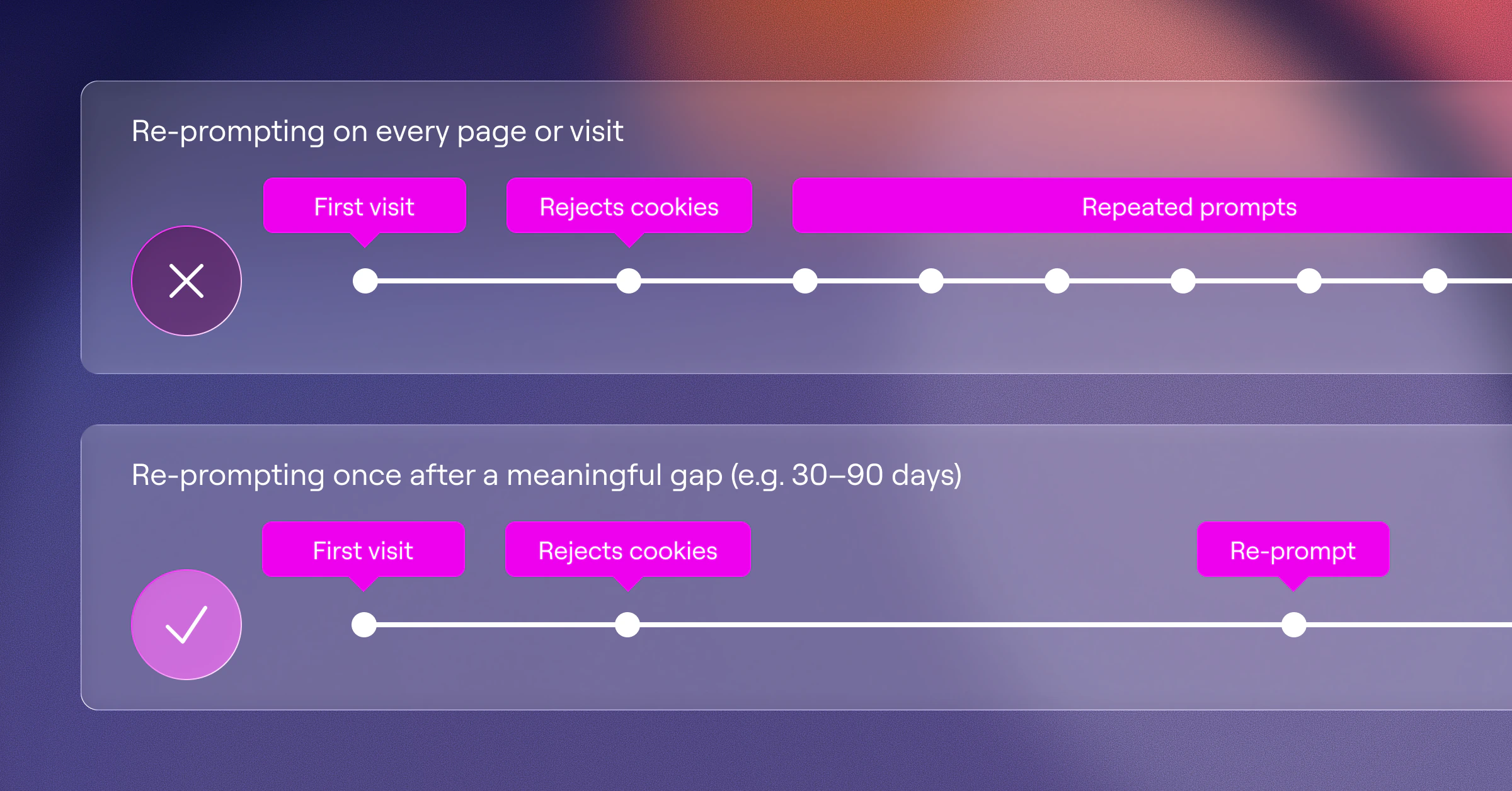
If a visitor rejects cookies, showing the same banner on every page load is not likely to build trust. It creates consent fatigue and can make the site feel aggressive. Instead, define a reasonable re-prompt interval and document the logic behind it.
You may also need to re-prompt when:
- Your cookie categories change
- You add new vendors
- Your privacy policy changes materially
- The user’s consent expires
- Local regulations require renewed consent
Best practice: Align timing and re-prompting with your legal requirements, technical setup, and user experience goals.
11. Avoid dark patterns
Dark patterns are manipulative design choices that push users toward an action they might not otherwise choose.
In cookie banners, common dark patterns include:
- Hiding the reject option
- Making rejection harder than acceptance
- Using confusing or guilt-based copy
- Pre-selecting optional cookie categories
- Using low-contrast text for privacy-friendly choices
- Making the close button act like consent
- Making “Manage Preferences” difficult to find
- Forcing users through unnecessary steps to opt out
These tactics may increase short-term acceptance rates, but they are a bad long-term strategy.
They can damage trust, frustrate visitors, and create compliance risk. France’s CNIL has issued orders to roughly ninety organizations since 2021 for exactly these patterns, with potential fines of up to 2% of annual worldwide turnover.
They can also hurt the quality of your data because consent gained through confusion is not the same as consent given through understanding.
Best practice: Optimize for informed consent, not accidental consent.
12. Test beyond the accept rate
Cookie banner optimization should not focus only on the percentage of users who click “Accept All.”
That number matters, but it is not the whole picture.
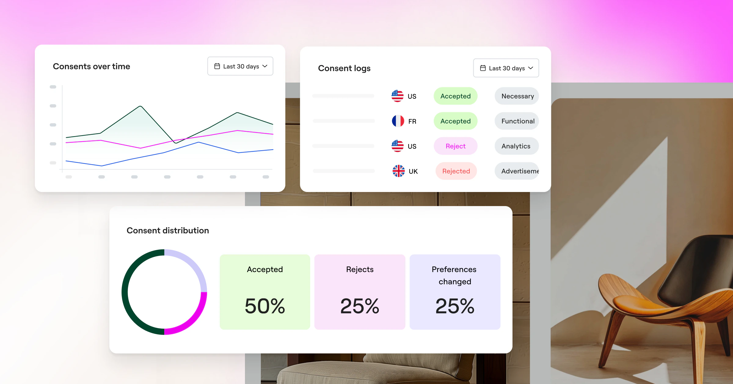
Track metrics like:
- Accept rate
- Reject rate
- Manage preferences rate
- Category-level consent
- Bounce rate
- Conversion rate
- Time on page
- Mobile vs. desktop behavior
- Region-specific performance
- Impact on analytics visibility
- Impact on paid media audiences
For example, a center modal may increase consent rate but also raise bounce rate. A bottom bar may reduce friction but leave more visitors in an undecided state. A clearer preferences panel may reduce “Accept All” clicks but increase trust and category-level consent.
The best banner is not always the one with the highest opt-in rate. It is the one that balances business needs, user trust, accessibility, and legal requirements.
Best practice: A/B test responsibly. Look at the full user journey, not just the first click.
The bottom line
Cookie consent is no longer just a legal checkbox or a generic popup added before launch.
It is a real UX moment.
It affects trust. It affects accessibility. It affects analytics quality. It affects how visitors feel about your brand before they have even explored the page.
The best-performing banners do not rely on tricks. They use clear language, visible choices, thoughtful placement, accessible design, and a look and feel that matches the rest of the site.
That is how you improve opt-in rates without damaging trust.
Make the choice clear. Make the controls usable. Make the experience feel native. And most importantly, respect the visitor’s decision.