Tackling web accessibility can feel daunting for many web creators. You know it’s the right thing to do, and with increasing legal standards, it’s also necessary, but where do you even begin? How do you know if your site is accessible? And what does a “good score” actually mean?
The internet is full of tools that promise to scan your site and give you a simple 0-100 score, but accessibility isn’t a numbers game. A perfect score doesn’t guarantee a smooth experience for someone using a screen reader or navigating without a mouse. Real accessibility is a process that combines the speed of automated technology with the irreplaceable nuance of human testing.
This guide will walk you through how accessibility is measured, explain why scores can sometimes be misleading, and provide you with actionable steps to improve both your score and your users’ experience — focusing on the changes that make the biggest impact.
Automated Audits: Fast but Limited
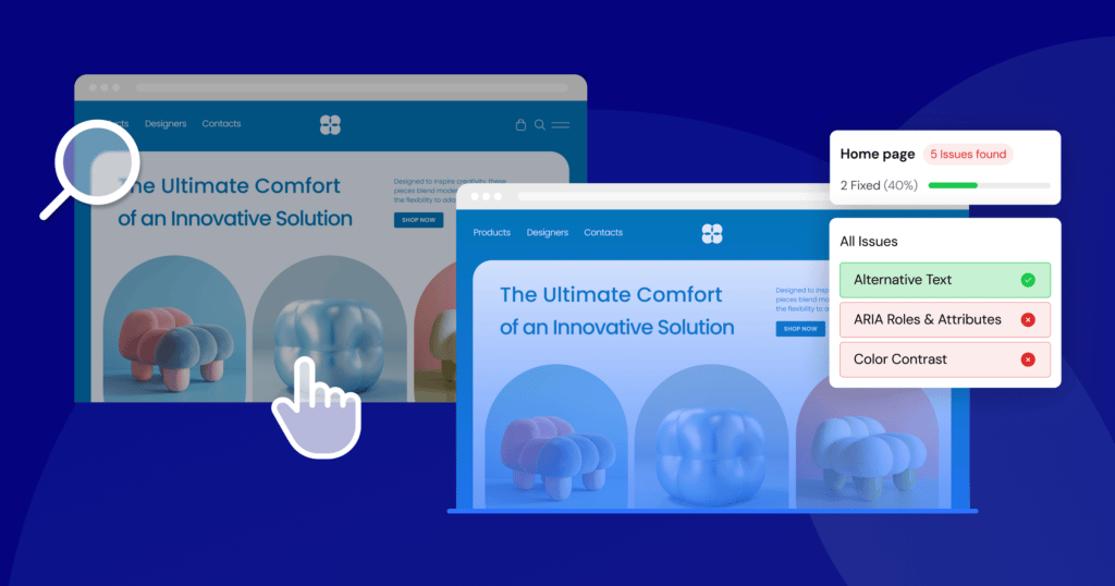
For most web creators, accessibility begins with an automated audit. Tools like WAVE, Lighthouse, or Ally’s Accessibility Assistant scan your website’s code and flag potential issues based on a set of predefined rules (most commonly, the WCAG or Web Content Accessibility Guidelines). Think of automated audits as accessibility spell-checkers: quick, efficient, and great at catching common mistakes.
These tools work by analyzing the Document Object Model (DOM) of your page. In other words, they analyze the underlying structure of your site (HTML and page elements) to check for patterns that violate WCAG criteria.
For example, it can check:
- Color Contrast: Does the text color have enough contrast against its background color?
- Image Alt Text: Does every <img> tag have an alt attribute?
- Form Labels: Is every form input associated with a <label> tag?
- Heading Structure: Are headings used in a logical, hierarchical order (e.g., an <h3> doesn’t appear before an <h2>)?
- Language Attributes: Is the primary language of the page declared in the <html> tag?
Automated audits come in many forms. Some are browser-based and scan any public URL; others integrate directly into your content management system (CMS), letting you test as you build. This proactive approach makes it easier to spot and fix problems before your site goes live.
Make your site more accessible with Ally
The Strengths: Why Automated Tools Are Invaluable
The primary advantage of automated tools is speed and scale. You can scan a single page in seconds and an entire website in minutes — something no human could ever do.For freelancers or agencies juggling multiple client sites, that efficiency is invaluable.
Here’s where automated tools truly shine:
- Catch low-hanging fruit: Automated checkers are fantastic at identifying common, clear-cut violations. Things like insufficient color contrast or missing alt text are binary (they’re either right or wrong), and a machine can spot them instantly. Fixing these issues often provides a significant boost to your accessibility score and real-world usability.
- Provide a clear starting point: If you’re new to accessibility, running an automated scan is the perfect way to start. The report it generates acts as a prioritized to-do list. Instead of feeling overwhelmed by the vastness of WCAG, you have a concrete list of problems to tackle one by one. Good tools will not only flag an issue but also explain why it’s a problem and link to the relevant WCAG success criterion.
- Fit into your workflow: The best modern accessibility tools don’t just exist on a separate website; they become part of your development process. When a tool is built into your CMS, it encourages a mindset of “building accessible from the start” rather than “fixing accessibility later.” This proactive approach saves time and results in a more robustly accessible final product.
- Track progress with data: An automated tool is impartial. It checks against a defined set of rules and reports back without bias. This is useful for tracking progress over time. You can run a scan today, make a series of fixes, and run it again tomorrow to see a measurable improvement in your score. This data is great for demonstrating progress to clients or stakeholders.
The Weaknesses: Why Automated Tools Only Tell Part of the Story
Despite their value, automated scans can only detect about 30-40% of all potential accessibility issues. That’s because machines can check code, but they can’t understand context.
Here are some of the critical areas where automated tools fall short:
- Alt text quality: An automated tool can verify that an <img> tag has an alt attribute. What it cannot do is tell you if the text inside that attribute is useful. An alt tag that says “image” or “graphic123” will pass an automated check, but it provides zero value to a screen reader user. Meaningful alt text that accurately describes the image’s content and function is a matter of human judgment.
- Keyboard navigation and usability: A tool can’t tell you if your website is logically navigable using only a keyboard. It might not detect a “keyboard trap” (where a user can tab into a component but can’t tab out), but it certainly can’t tell you if the tab order is confusing. Does the focus jump logically from the header to the main content, or does it bounce around the page unpredictably? Is the focus indicator (the outline that shows you where you are on the page) clearly visible? These are user experience questions that require a human tester.
- The clarity of link text: An automated checker can confirm that you have links, but it can’t assess the quality of the anchor text. A page with a dozen links all labeled “Click Here” or “Learn More” is technically valid but an accessibility nightmare. For a screen reader user navigating by links, this provides no context about where each link leads. Descriptive anchor text like “Learn more about our web design services” is essential, and only a human can write and evaluate it.
- Complex interactions: Modern websites are full of dynamic components like carousels, mega menus, and interactive maps. An automated tool has no way of knowing how these components are supposed to work. It can’t tell you if a custom-built dropdown menu is properly coded to be accessible to screen readers or if a video player has usable controls for someone who can’t use a mouse.
- Content readability and comprehension: Making your site more accessible isn’t just about technical implementation; it’s also about cognitive accessibility. Is your content written in plain language? Is the layout clean and uncluttered? Are complex ideas broken down into manageable chunks? A machine can’t assess if your page full of dense, jargon-filled text is overwhelming for someone with a cognitive disability.
Bottom line: Automated audits are your first line of defense, indispensable for finding quick fixes and showing progress. But relying on them exclusively can give you a false sense of security. They reveal the “what” but not the “why” or the “how it feels.” To truly understand your website’s accessibility, human testing remains essential.
Manual Testing: Why Humans Still Matter
If automated tools only catch a fraction of accessibility issues, how do you find the rest? The answer is manual testing. This is the hands-on process of stepping into the shoes of someone using assistive technology and navigating your site as they word.
While automated testing is about checking against a technical standard, manual testing is about evaluating the user experience. It answers questions like: “Can this task be completed smoothly?” or “Do I know where I am on this page?” or “Does this site make sense without visual cues?”
This human-centric approach is a great way to uncover the subtle but significant barriers that automated tools might miss.
The Core Components of Manual Accessibility Testing
Manual testing isn’t just randomly clicking around your site. It’s a structured process that involves several key techniques. The most fundamental of these are keyboard-only navigation and screen reader testing.
1. Keyboard-Only Navigation:
Many users with motor disabilities cannot use a mouse. They rely on a keyboard or other assistive devices that emulate keyboard functionality (like sip-and-puff devices or switches) to navigate the web. Furthermore, many screen reader users are power keyboard users. Therefore, if a website isn’t fully navigable with a keyboard, a large portion of users are immediately locked out.
Testing for keyboard accessibility is straightforward but requires patience. Unplug your mouse or put it aside, and try to use your website using only these keys:
- Tab: Moves focus to the next interactive element (link, button, form field).
- Shift + Tab: Moves focus to the previous interactive element.
- Enter: Activates a link or button.
- Spacebar: Checks a checkbox or activates a button.
- Arrow Keys: Navigates between options in a dropdown menu, radio button group, or slider.
- Escape: Closes a modal window or a dropdown menu.
As you navigate, ask yourself these questions:
- Can I reach every interactive element? You should be able to tab to every link, button, form field, and custom widget on the page. If you can’t, it’s not accessible.
- Is the focus indicator always visible? There must be a clear visual outline around the element that currently has focus. If you’re tabbing through the page and the focus ring disappears, you are effectively lost. Some designers hide this outline for aesthetic reasons (outline: none; in CSS), which is a major accessibility failure.
- Is the tab order logical? The focus should move through the page in a predictable order that follows the visual layout, typically from top to bottom, left to right. If the focus jumps erratically from the header to the footer and then back to the main content, the experience is disorienting.
- Can I avoid “keyboard traps?” A keyboard trap occurs when you can tab into a component but cannot tab out of it. This is common in poorly implemented modals or third-party widgets. The only way to escape is to refresh the page, which is an extremely frustrating experience.
- Can I operate all controls? For interactive elements like carousels, video players, or custom dropdowns, can you use the arrow keys and Enter/Spacebar to fully control them?
Performing a thorough keyboard test on your main pages will surface some of the most impactful accessibility issues on your site.
2. Screen Reader Testing
A screen reader is a software application that reads the content of a computer screen aloud. It’s the primary way that users who are blind or have low vision access digital content. Testing with a screen reader is essential for understanding how your website is perceived by these users. It’s an eye-opening (or rather, ear-opening) experience that reveals how dependent we are on visual cues.
Popular screen readers include:
- NVDA (NonVisual Desktop Access): A free, open-source screen reader for Windows. It’s a great starting point for developers.
- JAWS (Job Access With Speech): The most popular commercial screen reader for Windows.
- VoiceOver: Built into all Apple devices (macOS, iOS, iPadOS).
- TalkBack: Built into Android devices.
When you test with a screen reader, you’re not just listening to the text on the page. You’re evaluating the entire auditory experience. Here’s what you should be listening for:
- Page structure and headings: Screen reader users don’t listen to a page from top to bottom. They often navigate by headings to quickly find the section they’re interested in. If your page doesn’t have a logical heading structure (<h1> for the main title, <h2> for major sections, etc.), it’s like a book with no chapter titles. The screen reader should announce “Heading level 1: [Your Page Title],” helping the user orient themselves.
- Image alt text: This is where the weakness of automated testing becomes clear. When you listen to your page, you’ll hear the alt text read aloud. Does it make sense? Does it add value? If an image is purely decorative, it should have empty alt text (alt=””) so the screen reader skips it. If it’s a critical diagram, does the alt text adequately describe it?
- Link context: You’ll hear the screen reader announce “Link: [Link Text].” If all your links say “Read More,” the user has no idea where they go. Hearing something like “Link: Read More about our Accessibility Services” provides clear, actionable information.
- Announcements for dynamic content: If a user adds an item to a shopping cart, does anything happen audibly? A visual user sees the cart icon update. A screen reader user needs an explicit announcement, like “Item added to cart.” This is achieved using ARIA (Accessible Rich Internet Applications), specifically with aria-live regions that tell the screen reader to announce changes.
Testing with a screen reader for the first time can be challenging. It’s a skill that takes practice. But even a short session with a screen reader exposes where your site is intuitive, and where it falls apart. Start by learning the basic commands for reading, navigating by headings and links, and interacting with forms. This empathy-building exercise will fundamentally change the way you think about web design.
3. Involving real users
The gold standard of manual testing is to involve people who use assistive technologies every day. Their lived experience uncovers gaps no audit can.
You can recruit participants through accessibility-focused organizations or specialized user testing platforms. During a session, you would ask the user to complete specific tasks on your site (e.g., “find the contact information,” “purchase a product”) while they narrate their process. This feedback highlights pain points and clarifies where your site succeeds or fails.
Bottom line: Manual testing takes more time and effort than running a scan, but the return on investment is immense. It shifts your perspective from passing a test to supporting real users which is the true heart of accessibility.
What Accessibility Scores Actually Reflect
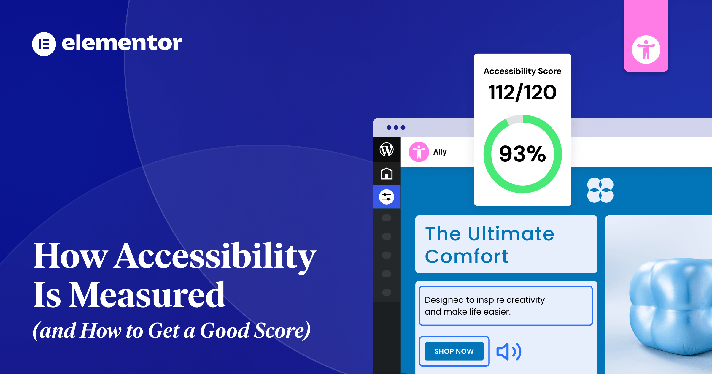
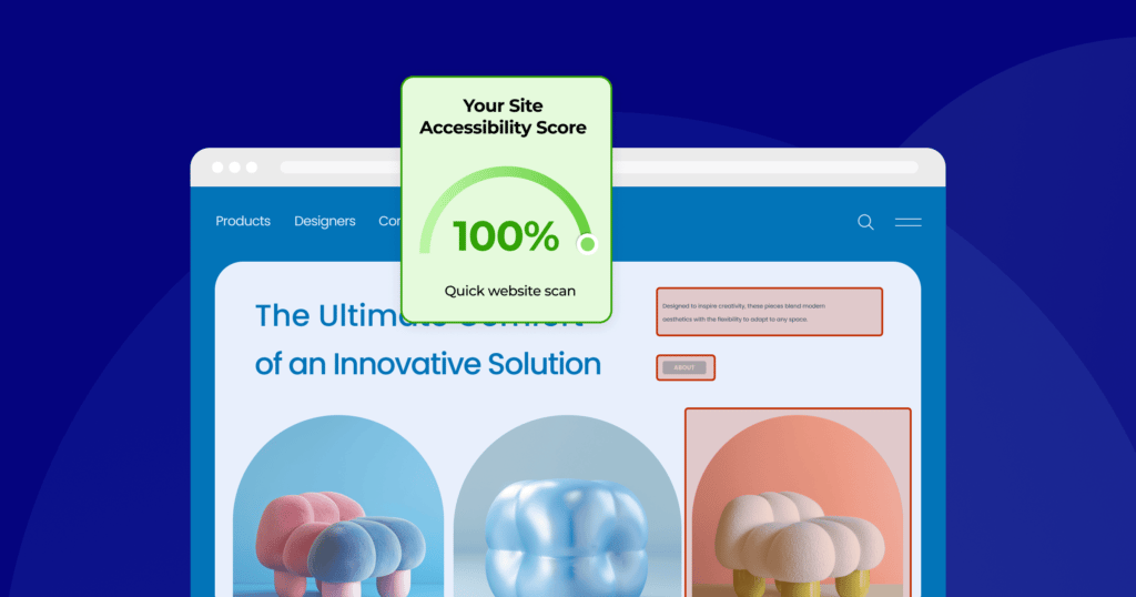
After running an automated scan, you’ll usually see a simple number out of 100. It’s tempting to treat that score as a final grade. After all, a 95 feels like an A+, while a 50 feels like a failure. But what does this number actually represent and how much weight should you give it?
Understanding what goes into an accessibility score is key to using it as a productive tool rather than a misleading vanity metric. An automated score is not a guarantee of your site’s overall usability or legal compliance. It’s just a summary of the technical issues an automated tool was able to detect—helpful for spotting obvious problems, but definitely not the whole picture.
How the Score is Calculated
Most tools follow a similar process:
- Scanning for violations: The tool crawls your page’s code and identifies every instance where it violates a known, machine-testable accessibility rule. This could be anything from a missing form label to a misused ARIA attribute.
- Assign severity: Not all accessibility issues are created equal. A missing alt text on a decorative image is a minor problem. A complete lack of keyboard navigation for your main menu is a critical one. Tools categorize detected accessibility issues as minor, moderate, serious, or critical.
- Apply weights: Critical issues will have a much heavier impact on your score than minor ones. The exact weighting formula is proprietary to each tool, but the principle is the same: the more severe the issue, the more points you lose.
- Calculate the final score: The tool starts at 100 and then subtracts points for each issue found, adjusted by its weight. A page with ten minor issues might still score highly, while a page with just one critical issue could see its score plummet.
For example, Google Lighthouse explicitly states that its score uses a weighted average of all the accessibility audits it runs. Each audit is pass/fail and is weighted based on its potential impact on user experience.
What a High Score Means
Achieving a high score (90 or above) is worth celebrating. It usually signals:
- Good structural hygiene: Clean and well-formed HTML with proper use of landmarks, headings, and labels.
- No obvious, glaring errors: Basics like alt text and color contrast have been addressed.
- A solid technical foundation: Your site is in a good position to be made truly usable through manual testing and refinement.
Earning a high score is like passing a safety inspection on a new car. The fundamentals are in place: the brakes work, the lights turn on, but the real test is how it drives on the road.
What a High Score Doesn’t mean
A perfect 100 does not equal a perfectly accessible or usable site. Here’s what that score leaves out:
- Context and meaning: An automated tool doesn’t know if your alt text is meaningful or if your link text is descriptive. Alt text that says “image123” still passes.
- Real-world usability: The score says nothing about the user journey. A checkout flow might be technically valid but entirely confusing.
- Cognitive accessibility: The score doesn’t measure if your content is easy to understand, if your layout is simple and predictable, or if you avoid distracting, auto-playing animations.
- The untested majority: Remember, automated tools can only detect a 30-40% of issues. A perfect score on 30% of the problem doesn’t mean the other 70% is fine. It just means it hasn’t been tested.
Relying solely on an automated score can create a dangerous blind spot where dev teams believe their job is done when, in reality, significant barriers still exist for visitors. The score should be treated as a diagnostic tool, not a certificate of completion.
Make your site more accessible with Ally
The Pitfalls: Passing a Test ≠ Usability
Accessibility isn’t about ticking boxes; it’s about making your site usable for everyone. This is the compliance-usability gap: a site that aces automated tests but frustrates real users. Focusing too much on achieving a perfect score can cause you to miss the forest for the trees, leading to a site that is technically compliant but practically unusable.
Let’s explore some concrete scenarios where a “perfect” score can be dangerously misleading.
Scenario 1: The form that fails humans
Imagine a complex registration form on your website. You’ve been diligent. Every single input field has a corresponding <label> tag. Every checkbox and radio button is properly grouped. You’ve even used ARIA attributes to indicate required fields. You run an automated scan, and it comes back with a perfect score for the form. Success!
But then, a user with a cognitive disability tries to use it. The labels, while technically present, are full of jargon. The instructions are written in a long, dense paragraph at the top of the form. The error messages that appear are vague, simply saying “Invalid input” without explaining what is wrong or how to fix it. A screen reader user finds that while the fields are labeled, the logical flow is confusing, and they can’t easily figure out which fields are part of which section.
The Result: The form passes the automated test, but it fails the human test. It is technically accessible but not cognitively accessible or usable.
Scenario 2: The menu that wastes time
Consider a large e-commerce website with a “mega menu” that has hundreds of links. The developers have worked hard to ensure the entire menu is keyboard accessible. You can tab to every single link, and there are no keyboard traps. The automated checker gives it a green light.
However, a keyboard-only user trying to get to the “My Account” link, which is at the very end of the header, has to press the Tab key 150 times to get there. There is no “skip to main content” link, so every time they load a new page, they have to tab through the entire menu again just to get to the page’s primary content.
The Result: The site is technically compliant with keyboard accessibility rules, but the experience is painfully inefficient.
Scenario 3: The alt text that says nothing
Let’s say you have a blog post that uses a complex chart to illustrate important data. The automated tool checks for an alt attribute on the chart’s image, and it finds one. The alt text says, “Chart showing Q3 sales data.” The tool marks this as a pass.
A blind user listening with a screen reader hears “Chart showing Q3 sales data.” This tells them what the image is, but it gives them none of the actual information contained within it. They have no access to the data points, the trends, or the conclusions that a sighted user would draw from the chart.
The Result: The alt text satisfies the automated check, but it fails the user. A better approach would be to provide a concise summary of the chart’s findings in the alt text and then offer a link to a full, accessible data table on the page. This requires human understanding of the content’s purpose.
Moving Beyond the Score
These examples highlight why automated scores must be treated as a starting point rather than the end goal. True accessibility means shifting your perspective:
- From checklist to journey: Stop asking “Did I pass the test?” and start asking “Can my user accomplish their goal without frustration?”
- From compliance to empathy: Think about the human on the other side of the screen. What would enhance clarity, predictability and ease in their experience?
- From fixing to building: Bake accessibility into your design and content from the very start.
The pitfalls of chasing a perfect score are real. But by understanding what those scores represent and where their limitations lie, you can use them as one part of a more holistic, human-centered approach to creating a truly accessible web.
How to Improve Both Your Score and Usability
The good news: many fixes are simple and high-impact. Focusing on a few foundational areas will not only boost your automated score, but will lead to immediate, tangible improvements in your site’s real-world usability. Start with these quick wins:
#1: Ensure Sufficient Color Contrast
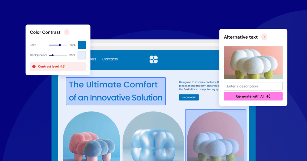
Why it Matters: Insufficient contrast between text and its background is one of the most common accessibility failures on the web. It affects people with low vision, color blindness, and even users browsing your site in bright sunlight on a mobile phone. When text is hard to read, users may struggle, experience eye strain, or miss important information entirely.
How to Check It: This is a perfect job for an automated tool. Browser extensions like WAVE or Axe can instantly flag any text that fails to meet the WCAG contrast requirements. You can also use online contrast checkers where you can manually input your text and background colors to see if they pass. WCAG 2.1 AA, the generally accepted standard, requires a contrast ratio of at least 4.5:1 for normal text and 3:1 for large text (18pt or 14pt bold).
How to Fix It:
- Adjust Your Brand Colors: If your primary brand colors don’t have enough contrast, you’ll need to create an accessible color palette for web use. This might mean darkening your text color or lightening your background color. You don’t have to abandon your brand; you just need to find the accessible shades within it.
- Avoid Placing Text on Images: Be very careful when overlaying text on top of images or gradients. The contrast can change drastically across the image, making some words readable and others impossible to decipher. A common solution is to add a semi-transparent solid background behind the text to ensure consistent, adequate contrast.
#2: Provide Meaningful Alt Text for Images
Why it Matters: Alternative text (alt text) is the single most important tool for making visual content accessible. It provides a textual description of an image for screen reader users, and it’s also displayed if an image fails to load. Without it, images are a black hole of information for people who cannot see them.
How to Check It: An automated tool can tell you if an alt attribute is present, but only a human can tell you if it’s meaningful. Go through the important images on your site and read the alt text you’ve written. Does it convey the content and function of the image?
How to Fix It:
Writing good alt text is an art, but here are some simple rules:
- Be Concise and Descriptive: Describe what’s in the image as if you were explaining it to someone over the phone. Avoid starting with “Image of…” or “Picture of…”—the screen reader already announces that it’s an image.
- Consider the Context: The best alt text depends on why the image is there. If an image of a person is on a company’s “About Us” page, the alt text should be their name and title (e.g., “Jane Doe, CEO”). If the same photo is in an article about fashion, the description might focus on what she’s wearing.
- Describe the Function of Linked Images: If an image is a link, the alt text should describe the destination of the link, not the image itself. For example, if your company logo links to the homepage, the alt text should be “[Company Name] Home,” not “Company Logo.”
- Use Empty Alt Text for Decorative Images: If an image is purely for decoration and adds no informational value (like a background pattern or a stylistic flourish), it should have an empty alt attribute: alt=””. This tells the screen reader to skip it, preventing unnecessary noise for the user.
Quick Win #3: Create Logical Navigation and Structure
Why it Matters: A clear, consistent, and logical structure is the backbone of an accessible website. Users of assistive technology rely heavily on structural elements like headings and landmarks to understand the layout of a page and navigate it efficiently. Good structure benefits everyone by making content easier to scan and comprehend.
How to Check It:
- Headings: Use a browser extension that can outline your page’s heading structure. Do you have one, and only one, <h1> per page? Do the <h2>s, <h3>s, and so on follow a logical, hierarchical order without skipping levels?
- Keyboard Navigation: Perform the keyboard-only test described earlier. Can you get everywhere? Is the focus order logical? Is the focus indicator visible?
- Link Text: Scan your pages for generic link text like “Click Here,” “Learn More,” or “Read More.”
How to Fix It:
- Use Headings Correctly: Use headings to create a true outline of your content. The <h1> should be the main title of the page. <h2>s should be the main sections, and <h3>s should be subsections within those, and so forth. Don’t choose headings based on how they look; use them for their semantic meaning.
- Write Descriptive Link Text: Instead of “Click Here,” make the link text describe the destination. Change “To read our latest report, click here” to “Read our 2025 Annual Report.” This gives screen reader users clear context when navigating by links.
- Add a “Skip to Main Content” Link: This is a link, usually the very first element on the page, that is only visible when it receives keyboard focus. It allows keyboard and screen reader users to bypass the repetitive navigation links in the header and jump directly to the page’s primary content. It’s a simple addition that dramatically improves navigation efficiency. By tackling these three areas, you will resolve a huge percentage of the issues found by automated scanners and lay a strong foundation for a truly usable and accessible website.
Make your site more accessible with Ally
Key Takeaways
- Accessibility is a blend of art and science. It requires both automated tools to find technical errors and manual testing by humans to assess real-world usability and context.
- Automated tools are fast but limited. They are excellent for catching about 30-40% of accessibility issues, such as color contrast errors or missing image alt text. However, they cannot understand context or user experience.
- Manual testing is essential for true usability. Only a human can determine if navigation is logical, if content is understandable, or if a screen reader experience makes sense. This involves keyboard-only testing, screen reader checks, and user feedback.
- Accessibility scores are a starting point, not the finish line. A score from an automated tool measures technical compliance against a checklist. It’s a useful health check but doesn’t guarantee a good user experience.
- Passing a test doesn’t equal a usable site. A website can have a perfect automated score but still be incredibly frustrating for a person with a disability to use due to confusing layout, illogical reading order, or inefficient navigation.
- Focus on impactful changes first. You can significantly improve your site’s accessibility by focusing on foundational elements: ensuring sufficient color contrast, writing descriptive alt text for images, using proper heading structures, and making sure the entire site is navigable with a keyboard.


