Table of Contents
This guide will walk you through everything you need to know about formatting your blog for success. We’ll cover the foundational principles of readability, the strategic use of visual elements, and the technical aspects that will improve both user experience and search engine optimization (SEO). By implementing these practices, you can transform your blog into a powerful tool for communication and connection.
Key Takeaways
- Prioritize Readability: Use large, clear fonts, ample white space, and short paragraphs to create an effortless reading experience. A Flesch Reading Ease score between 60-80 is ideal for most audiences.
- Structure is Everything: Employ a clear hierarchy of headings (H2, H3) and use bullet points or numbered lists to break up text and make key information scannable.
- Leverage Visuals Strategically: High-quality images, videos, and custom graphics not only make your content more engaging but also help illustrate complex points and break up long sections of text.
- Optimize for Mobile: A significant portion of your audience will be reading on mobile devices. Ensure your blog has a responsive design where text is legible and images scale correctly without the need for pinching or zooming.
- Guide Your Reader with a Visual Hierarchy: Use formatting elements like bold text, italics, blockquotes, and varied sentence structure to emphasize important points and direct the reader’s attention.
- Incorporate Calls-to-Action (CTAs): Strategically place clear and compelling CTAs throughout your post to guide readers toward the next step, whether it’s subscribing to a newsletter, reading another article, or making a purchase.
- Consistency Builds Brand Identity: A consistent formatting style across all your blog posts, from font choices to color schemes, helps reinforce your brand and creates a professional, cohesive experience for your readers.
The Foundation of Great Blog Formatting: Readability
Before a reader can appreciate your message, they must be able to comfortably read your words. Readability is the cornerstone of effective blog formatting. It’s about reducing cognitive load—the amount of mental effort required to process information—so that your audience can focus on your content, not on deciphering it.
Choosing the Right Typography
The fonts you choose have a significant impact on how your content is perceived. A font that is difficult to read can cause eye strain and lead to readers abandoning your page.
- Font Type: For body text, a simple, clean sans-serif font like Arial, Helvetica, or Open Sans is generally the safest and most legible choice for digital screens. Serif fonts, like Times New Roman or Georgia, have small lines attached to the end of strokes in their letters and are often preferred for print. However, modern high-resolution screens have made serif fonts more viable for web content, and they can lend a more traditional or academic feel. The key is to choose one and stick with it for your main body text to ensure consistency.
- Font Size: Small text is a major deterrent for readers. A good rule of thumb for body text is a minimum of 16px. For older audiences or for designs that need a more open feel, 18px or even 20px can be even better. Headings should, of course, be larger to create a clear hierarchy.
- Line Spacing (Leading): The space between lines of text is just as important as the size of the text itself. Crowded lines are difficult to follow. Aim for a line height that is about 1.5 times the font size. This gives your text room to breathe and makes it easier for the reader’s eye to track from one line to the next.
- Text Color and Contrast: Black text on a white background is the gold standard for a reason. It offers the highest level of contrast and is the easiest to read. If you choose to use other colors, ensure there is sufficient contrast between the text and the background. Tools like the WebAIM Contrast Checker can help you verify that your color choices meet accessibility standards. Avoid light gray text on a white background, as this is a common readability issue.
The Power of White Space
White space, also known as negative space, is the empty area around elements on a page. It is not wasted space; it is an active and essential component of good design. Proper use of white space can:
- Improve Comprehension: Studies have shown that strategic use of white space between paragraphs and in the margins can increase comprehension by up to 20%.
- Reduce Clutter: It gives your content a clean, organized, and professional appearance.
- Guide the Reader’s Eye: It helps to separate different sections of your content, making it clear where one idea ends and another begins.
Don’t be afraid to have wide margins and generous spacing between your paragraphs and images. This is particularly crucial for mobile viewing, where screen real estate is limited.
Keep Paragraphs and Sentences Short
Long, dense paragraphs are visually overwhelming. On the web, readers tend to scan content rather than read every word. To cater to this behavior, keep your paragraphs short and focused.
- The One-Idea Rule: Aim to have each paragraph focus on a single idea or point.
- Three to Four Sentences: A good general guideline is to keep paragraphs to a maximum of three or four sentences. It’s even acceptable to have a single-sentence paragraph for emphasis.
- Vary Sentence Length: Mix short, punchy sentences with slightly longer ones to create a more natural and engaging rhythm. This avoids a monotonous tone and helps keep the reader engaged.
Structuring Your Content for Scannability
Once you’ve established a readable foundation, the next step is to structure your content in a way that is easy to scan. Most readers will scroll through an article to get a sense of its content before committing to reading it in full. A well-structured post allows them to quickly identify the key points and find the information that is most relevant to them.
The Importance of a Strong Headline
Your headline is the first, and sometimes only, impression you make on a potential reader. It needs to be compelling enough to grab their attention and accurately reflect the content of the article. A great headline is:
- Specific and Benefit-Oriented: It should tell the reader exactly what they will gain from reading the post. Instead of “Blog Formatting,” a better title is “How to Format Your Blog for Maximum Impact.”
- Intriguing: Use numbers, ask a question, or create a sense of curiosity. “7 Common Blog Formatting Mistakes and How to Fix Them” is more engaging than “Blog Formatting Tips.”
- Keyword-Rich: Include the primary keyword you are targeting to improve your SEO.
Using Headings and Subheadings (H2, H3, etc.)
Headings are the signposts of your article. They break the content into logical sections and create a clear hierarchy of information.
- H1 (Title): Your blog post title should be the only H1 tag on the page. Most WordPress themes and website builders handle this automatically.
- H2 (Main Sections): Use H2 tags for the main topics of your article. They act as mini-headlines for each major section.
- H3 (Sub-sections): Use H3 tags to break down the points within your H2 sections. This allows you to add another layer of organization to your content.
- Consistency is Key: Keep the formatting of your headings consistent throughout your site. Your H2s should all look the same, as should your H3s. The Elementor Theme Builder allows you to set global styles for your headings, ensuring this consistency across your entire website.
Proper heading structure is not just for readers; it’s also crucial for SEO. Search engines use headings to understand the structure and topics of your content, which can help your post rank for relevant search queries.
Lists: Bullets and Numbers
Lists are one of the most effective ways to make information easy to digest. They break up monotonous blocks of text and signal to the reader that they are about to receive a series of related points in a concise format.
- Bulleted Lists: Use bullet points for lists where the order of items does not matter. They are perfect for listing features, benefits, or examples.
- Numbered Lists: Use numbered lists when you are outlining a step-by-step process or a sequence of events. The numerical order provides a clear path for the reader to follow.
When creating lists, keep the items concise and parallel in structure. For example, if one list item starts with a verb, all items should start with a verb.
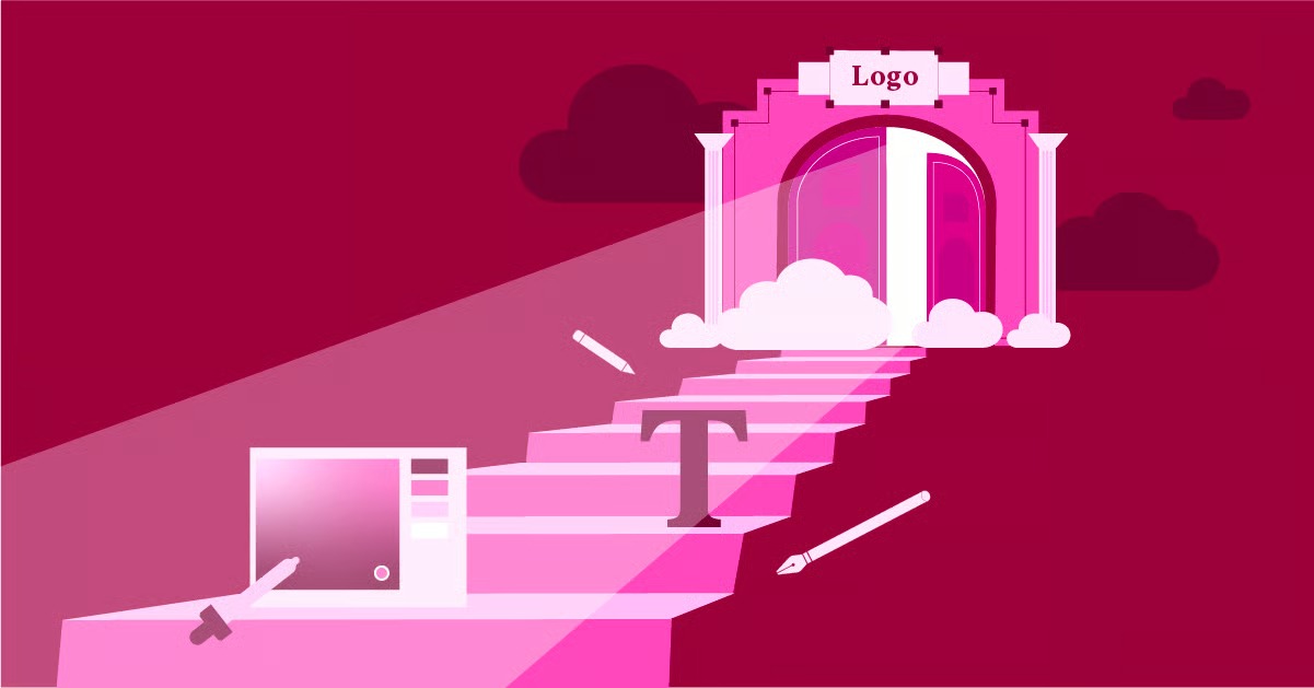
Creating Visual Hierarchy and Engagement
Beyond text, the visual elements of your blog post play a massive role in how it is perceived and consumed. A strong visual hierarchy guides the reader’s attention to the most important elements on the page and makes the content more engaging and memorable.
Using Images, Videos, and Graphics
Images do more than just make your blog post look pretty. They serve several important functions:
- Break Up Text: A well-placed image provides a visual break, preventing reader fatigue in long articles.
- Illustrate Points: A screenshot, chart, or diagram can often explain a concept more effectively than words alone.
- Evoke Emotion: A powerful image can connect with the reader on an emotional level, making your content more impactful.
- Increase Engagement: Blog posts with images receive significantly more views and shares than those without.
When using images, make sure they are high-quality and relevant to the content. Always optimize your images for the web to ensure they don’t slow down your page loading time. A tool like the Image Optimizer by Elementor can automatically compress images without sacrificing quality.
Videos are another powerful tool for engagement. Embedding a relevant YouTube video can provide additional value to your readers and increase the amount of time they spend on your page, which is a positive signal to search engines.
Emphasizing Key Information
Within your body text, you can use formatting to draw attention to specific words, phrases, or sentences. However, this should be done sparingly to be effective. If everything is emphasized, then nothing is.
- Bold Text: Use bolding to highlight key terms or important takeaways. It signals to scanning readers that this is a crucial piece of information.
- Italics: Italics are best used for subtle emphasis, for titles of works, or for introducing a foreign word. They are less jarring than bold text.
- Blockquotes: When you want to feature a quote or a particularly important paragraph, use the blockquote format. This will typically indent the text and set it apart visually, giving it more weight.
As web creation expert Itamar Haim notes, “Effective formatting is not about decoration; it’s about communication. Every choice, from font size to the use of bold text, should serve the purpose of making your message clearer and more impactful for the reader.”
Incorporating Calls-to-Action (CTAs)
A call-to-action is a prompt that encourages the reader to take a specific action. Without clear CTAs, even the most engaged reader may simply leave your site after finishing the article. Your CTAs should be visually distinct and use action-oriented language.
You can format CTAs in several ways:
- Text Links: The simplest form is a hyperlink within a sentence, like “To learn more, check out our guide to advanced SEO techniques.”
- Styled Buttons: Buttons are more visually prominent and are highly effective for important actions like “Download Now” or “Subscribe.”
- Graphic Banners: For major promotions, a custom-designed banner can be very effective.
You can use a tool like Elementor Pro to design and place visually appealing CTAs anywhere in your blog post without needing to write any code.
Technical Formatting for SEO and User Experience
Great formatting is not just about aesthetics; it also involves technical considerations that impact how search engines and users interact with your site.
Mobile-First Optimization
With more than half of all web traffic coming from mobile devices, your blog must be formatted for a small screen. This is known as responsive design.
- Test Your Blog: Use your own phone to navigate your blog. Is the text easy to read without zooming? Do the images fit within the screen? Are buttons and links easy to tap?
- Use a Responsive Theme: Most modern WordPress themes are designed to be responsive. The Hello theme from Elementor is a lightweight and highly flexible option that provides a perfect foundation for a mobile-friendly blog.
- Single Column Layout: For mobile, a single-column layout is almost always the best choice. It allows for a simple, linear scrolling experience that is easy for users to follow.
Image SEO: Alt Text and File Names
Search engines can’t “see” images the way humans do. To understand what an image is about, they rely on the information you provide.
- Alternative (Alt) Text: Alt text is a short, descriptive sentence that you add to an image’s HTML tag. It serves two purposes: it is displayed if the image fails to load, and it is read aloud by screen readers for visually impaired users, making your content more accessible. It also gives search engines context about the image, which can help it rank in image search results.
- Descriptive File Names: Before you upload an image, give it a descriptive file name. Instead of IMG_12345.jpg, rename it to something like blog-formatting-visual-hierarchy.jpg. This provides another clue to search engines about the image’s content.
The Role of a Website Builder in Blog Formatting
While you can format a blog post using the default WordPress editor, a website builder like Elementor gives you a much higher degree of control and flexibility. With its drag-and-drop interface, you can:
- Create Custom Layouts: Easily create complex layouts with multiple columns, background images, and more.
- Design Reusable Templates: Design a custom template for your blog posts to ensure consistent formatting across your entire site. The Elementor Library also provides pre-made templates to get you started.
- Add Dynamic Content: Pull in information like author bios, related posts, and custom fields automatically.
- Build an Entire Site: For those looking for an all-in-one solution, platforms that bundle a builder with managed WordPress hosting can streamline the entire process of creating and maintaining a blog.
For those looking to build more complex sites, especially for ecommerce, a specialized builder can be invaluable. For instance, the WooCommerce Builder feature allows for complete customization of product and shop pages.
Examples of Excellent Blog Formatting
Let’s look at a few examples of blogs that excel at formatting.
1. HubSpot Blog HubSpot is a master of content marketing, and their blog formatting is a key part of their success. They use:
- Clear headings and subheadings.
- Short, scannable paragraphs.
- High-quality custom graphics and charts to illustrate data.
- Prominent blockquotes to highlight key takeaways.
- Visually distinct CTAs at the end of each post and within the content.
2. Backlinko Brian Dean’s blog, Backlinko, is famous for its in-depth SEO guides. To make these massive articles digestible, he relies heavily on formatting:
- A “table of contents” at the beginning of long posts for easy navigation.
- Frequent use of screenshots with annotations to guide the user through processes.
- “Bucket brigades” – short, conversational phrases ending in a colon (like “Here’s the deal:”) – to keep readers engaged and scrolling.
- Bold text to emphasize key strategies and results.
3. The Verge A technology news site, The Verge uses a magazine-style layout with a strong visual focus.
- Powerful hero images at the top of each article.
- A multi-column grid that allows them to feature multiple stories.
- Unique typography and color schemes that reinforce their brand identity.
- Embedded videos and photo galleries to provide a rich media experience.
Final Thoughts: Formatting as a Form of Respect
Ultimately, taking the time to format your blog post is a sign of respect for your reader. It shows that you value their time and have made an effort to present your ideas in the clearest and most accessible way possible. It transforms your blog from a simple collection of articles into a professional, engaging, and user-friendly resource.
By focusing on readability, creating a clear structure, leveraging visual elements, and ensuring technical optimization, you can dramatically improve the performance of your blog. Your readers will stay longer, engage more deeply with your content, and be more likely to return in the future.
Frequently Asked Questions (FAQ)
1. How often should I use images in a blog post? There’s no magic number, but a good guideline is to add at least one image for every 300-400 words. The goal is to break up long stretches of text and provide visual context. For a 1,500-word article, 4-5 relevant images would be appropriate.
2. Is it okay to use more than one font on my blog? It’s best to stick to a maximum of two fonts: one for headings and one for the body text. Using more than two can make your design look cluttered and unprofessional. Ensure the two fonts you choose are complementary.
3. What is the ideal length for a blog post? The ideal length depends on your topic and audience. However, longer, in-depth posts (1,500-2,500 words) tend to perform better in search engine rankings. The key is to cover the topic comprehensively. No matter the length, proper formatting is essential to make the content digestible.
4. How do I make my blog accessible to people with disabilities? Good formatting is a great start. Use proper heading structures (H1, H2, H3), add descriptive alt text to all your images, ensure high contrast between text and background colors, and use clear, descriptive link text instead of “click here.” Using a tool like Ally by Elementor can help you scan your site for accessibility issues.
5. Can I use AI to help with my blog formatting? Yes, AI can be a powerful assistant. Tools like Elementor AI can help you generate content, rewrite paragraphs for clarity, and even suggest headlines. While AI can speed up the process, you should always review and refine the output to ensure it aligns with your brand’s voice and meets quality standards. The initial planning phase can also be accelerated with tools like the AI Site Planner.
6. What’s the difference between a category and a tag in WordPress? Categories are for broad groupings of your posts. Think of them as the main sections of your blog (e.g., “Marketing,” “Web Design,” “SEO”). A post should only be in one or two categories. Tags are for describing specific details of your posts. They are more like keywords (e.g., “social media,” “content marketing,” “Google Analytics”). You can have multiple tags for a single post.
7. How do I choose the right images for my blog? Choose images that are relevant, high-quality, and consistent with your brand’s aesthetic. Avoid generic stock photos if possible. If you do use stock photos, choose ones that look authentic. Creating your own custom graphics or using high-quality product photos is often the best approach.
8. Should I include a table of contents in my blog posts? A table of contents with jump links is highly recommended for long-form articles (over 2,000 words). It improves user experience by allowing readers to quickly navigate to the sections that interest them most. It can also help you earn “sitelinks” in Google search results, which can increase your click-through rate.
9. How can I ensure my formatting is consistent across all posts? The best way to ensure consistency is to use a template. If you’re using a website builder like Elementor, you can design a single post template that defines the layout, fonts, colors, and spacing for all your blog posts. This way, every new post you create will automatically have the same professional formatting.
10. What is the most common blog formatting mistake? The most common mistake is creating long, dense paragraphs of text with no visual breaks. This “wall of text” is the quickest way to make a reader click the back button. Always prioritize short paragraphs, headings, lists, and images to make your content inviting and easy to read.
Looking for fresh content?
By entering your email, you agree to receive Elementor emails, including marketing emails,
and agree to our Terms & Conditions and Privacy Policy.


