Add the widget
Add the widget to the canvas
To access and use a widget:
In Elementor Editor, click +.
All available widgets are displayed.Click or drag the widget to the canvas. For more information, see Add elements to a page.
What is the Text Editor widget?
The Text Editor widget is a versatile tool that allows you to add and customize text content on your website. It uses the TinyMCE WYSIWYG editor, which is similar to the classic WordPress visual editor. You can add headings, paragraphs, lists, and even include images and videos seamlessly.
In addition to the features that generally appear on the TinyMCE editor, this widget also gives you more styling options that let you change settings like font weight, line height, letter spacing, alignment, and more.
Common use case
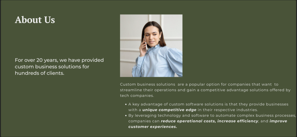
Andrew is building a website for a company that offers custom business solutions. They wanted to create a standout About Us section reflecting the vision and aspirations. To achieve this, Andrew uses the text editor’s features to highlight important content. They make text bold and italic and arrange them in a way that grabs attention.
Andrew also uses bullet points in the text editor to keep the content neat and clear. This allows them to showcase the company’s achievements and areas of expertise.
Additional use cases
- Enhance product pages using the text editor to write detailed and enticing product descriptions. Include bullet points, emphasize key features, and add images for a comprehensive presentation.
- Showcase your work effectively using the text editor to create project descriptions in your portfolio. Use formatting options to emphasize your role, skills utilized, and project outcomes.
- Create informative resource pages using the text editor. You can structure and format the information easily, whether it’s a list of helpful links, downloadable files, or educational content.
- Customize error pages (404 pages) with the text editor to guide users back to your site. Add a friendly message and navigation links, turning potential frustration into a positive experience.
Add a Text Editor widget: Step-by-step
- Add the text editor widget to the canvas. For details, see Add elements to a page.
- In the Content tab, under the Text Editor section, type or paste your text. You can format your text using the options provided, similar to a basic word processor.
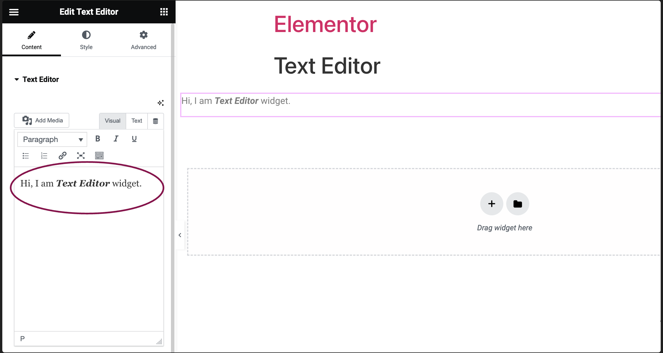
- (Optional) Slide on the Drop Cap option to set the first letter of the text bigger and styled independently from the rest of the text content.
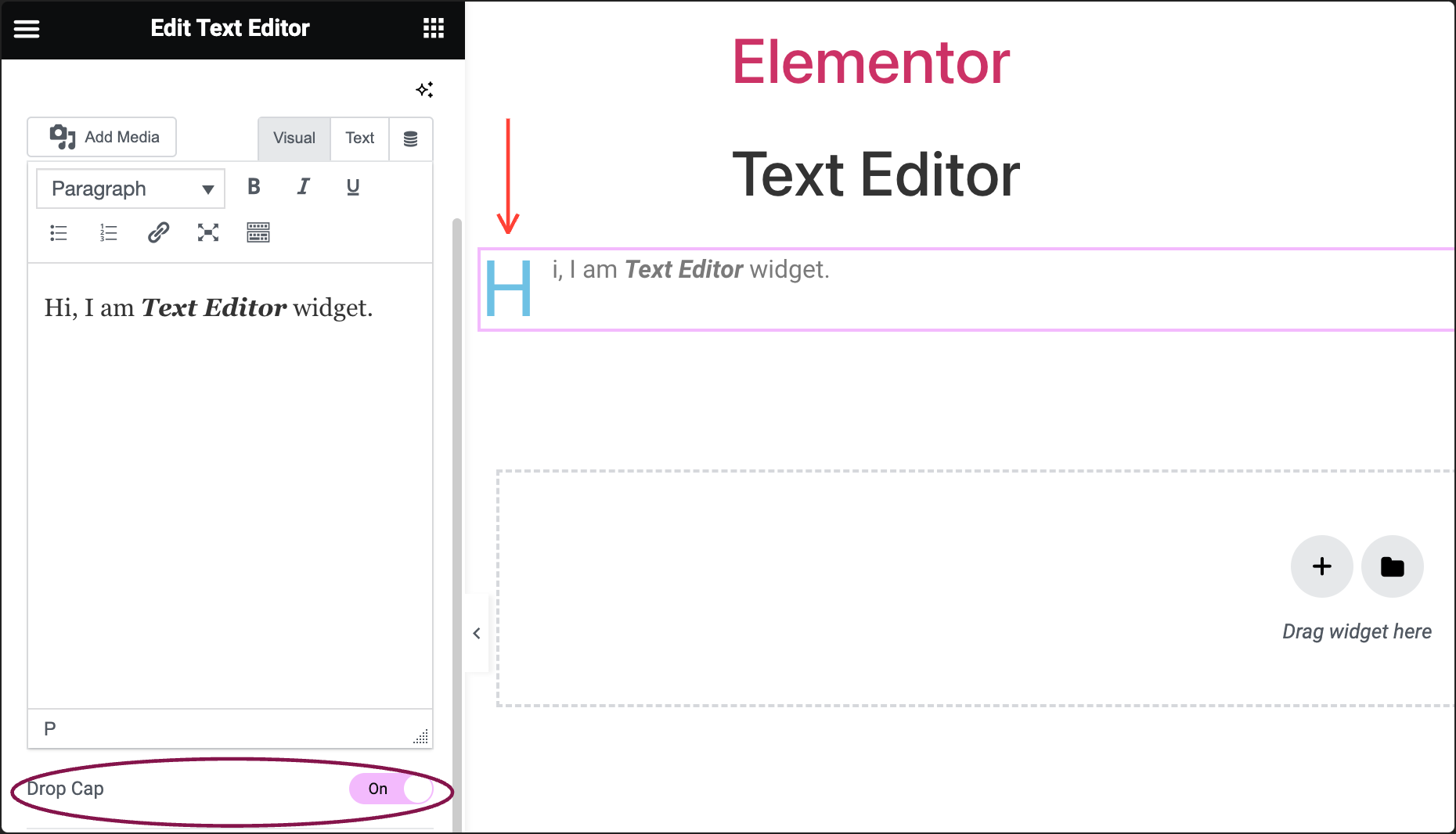
In the Columns field, select the number of columns to split the text into.
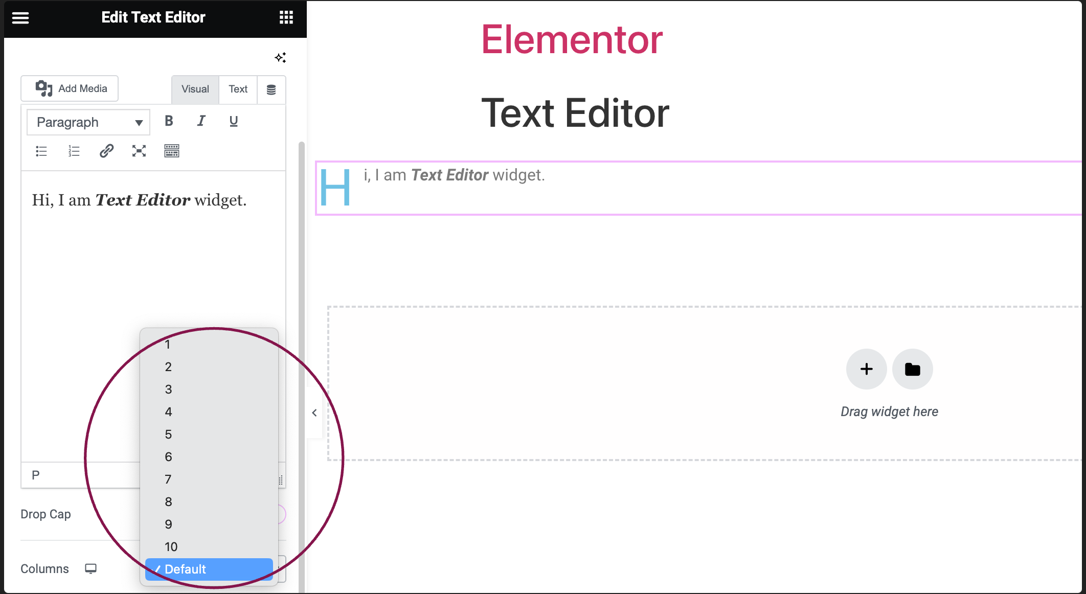
- In the Column Gap field, use the slider to adjust the space between columns.
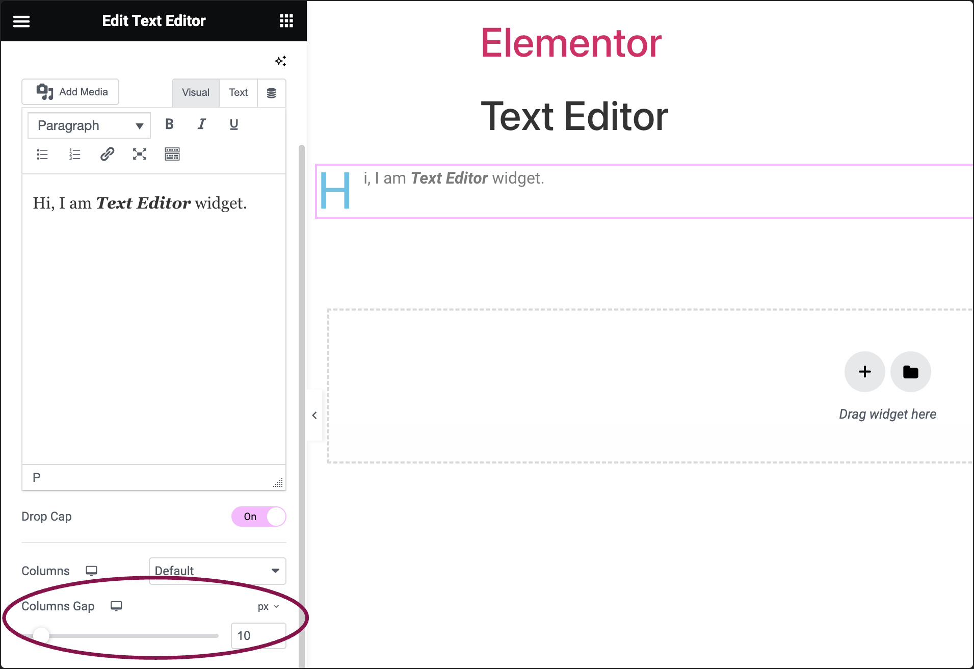
Actions you can perform with Text Editor
Settings for the Text Editor Widget
You can customize your widgets using content, style, and other advanced parameters, offering you great flexibility in tailoring them to your needs. Click the tabs below to see all the settings available for this widget.
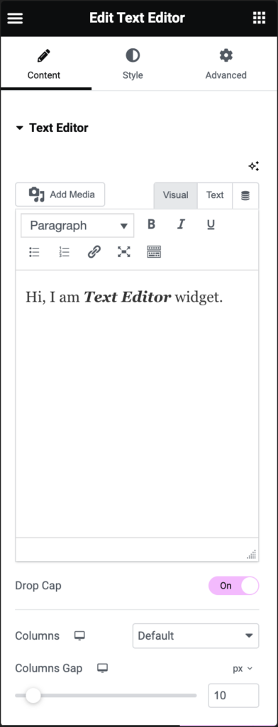
Text Editor
Type or copy/paste the text content. You can add text, images, and even WordPress shortcodes.
Drop Cap (Optional)
This option lets you make the first letter bigger and style it independently from the rest of the text content.
Columns
Split your text into multiple columns.
Columns Gap
Adjust the space between columns.
Does not appear if there is only one column.
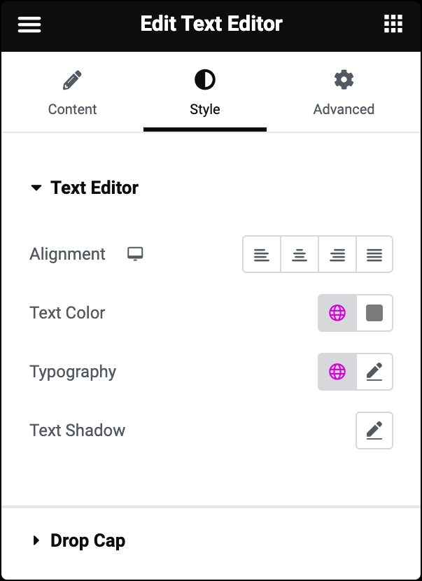
Alignment
Choose if your text should be on the left, right, center, or justified.
Text Color
Pick the color of your text.
Typography
Set the overall look and feel of your text. For more details, see Typography.
Text Shadow
Add a shadow to the text. For more details, see Shadow, Text Shadow and Boxed Shadow.
Drop Cap
If you enable the Drop Cap option in the content tab, you further get the following styling options:
-
View: Select the view style of the drop cap, choosing from Default, Stacked, or Framed.
-
Primary Color: Choose the color of the drop cap.
-
Text Shadow: Add a shadow to the drop cap. For more details, see Shadow, Text Shadow and Boxed Shadow.
-
Space: Select the exact distance between the drop cap and the rest of the text.
-
Border Radius: If Stacked or Framed is chosen as the View, set the border-radius to control corner roundness.
-
Typography: Set the typography options, such as font and weight, for the drop cap. For more details, see Typography.
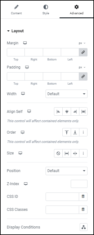
Advanced settings
To learn more about advanced settings, see Advanced Tab.

