help center

On this page

Off-Canvas widget

Last Update: June 2, 2024

Add the widget

The widget itself Off-Canvas widget 313

To access and use a widget:

  1. In Elementor Editor, click +.
    All available widgets are displayed.

  2. Click or drag the widget to the canvas. For more information, see Add elements to a page.

What is the Off Canvas widget?

The Off Canvas widget allows you to create containers that do not appear when the page initially loads. These containers only appear after a visitor has taken a defined action such as clicking a button. For instance, you could create a button asking users to check out images of sale items . The button would then open an Off Canvas widget with a slideshow of sale items.

Note
In order to use an Off Canvas widget, you must have Flexbox Containers and Nested Elements active.

See all the options available with the Off Canvas widget.  

Common use case

Alex is creating a site for a dog adoption agency. They want the page to display a small portrait of the dogs and when visitors click the portrait, it will display a larger image of the dog at play with an in-depth bio. 

Additional use cases

  • Bring up a slideshow when a visitor clicks a link
  • Display a long text when a visitor clicks a link
  • Any time you want to show more detailed information without taking visitors to a new page. 

Adding an Off Canvas widget: Step-by-step

In the example below, we’ll create a menu with four menu items – Home, Store, Blog and Contact Us.

By default, the Layout section of the Content tab, Contains three menu items: Item #1, Item #2 and Item #3.

In this example, we’ll rename these menu items and then add a fourth item. 

Add an Off Canvas widget

To add an Off Canvas widget:


  1. Add the Off Canvas widget to the canvas. For details, see Add elements to a page.
    1 drag the widget to the canvas Off-Canvas widget 315
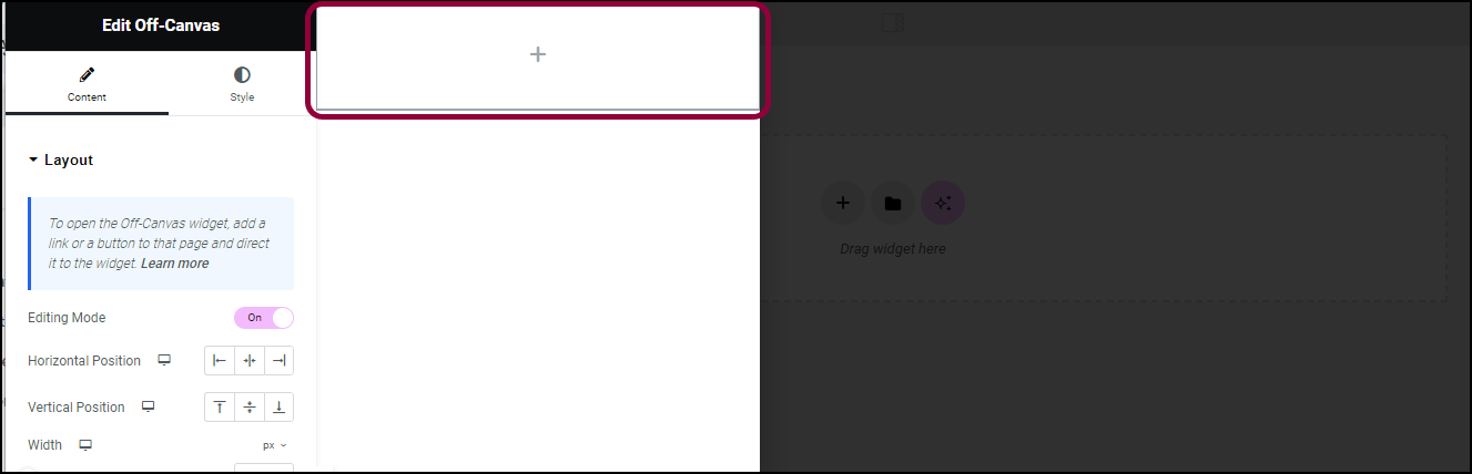
    The canvas section of the page is grayed out and a new container is automatically created. 
  2. Add widgets to the container. For details, see Create a container.
    2 The conainer Off-Canvas widget 317

  3. Click the shaded area to access options for the Off Canvas widget. For details, see the Options section below.
    4 change the settings Off-Canvas widget 319
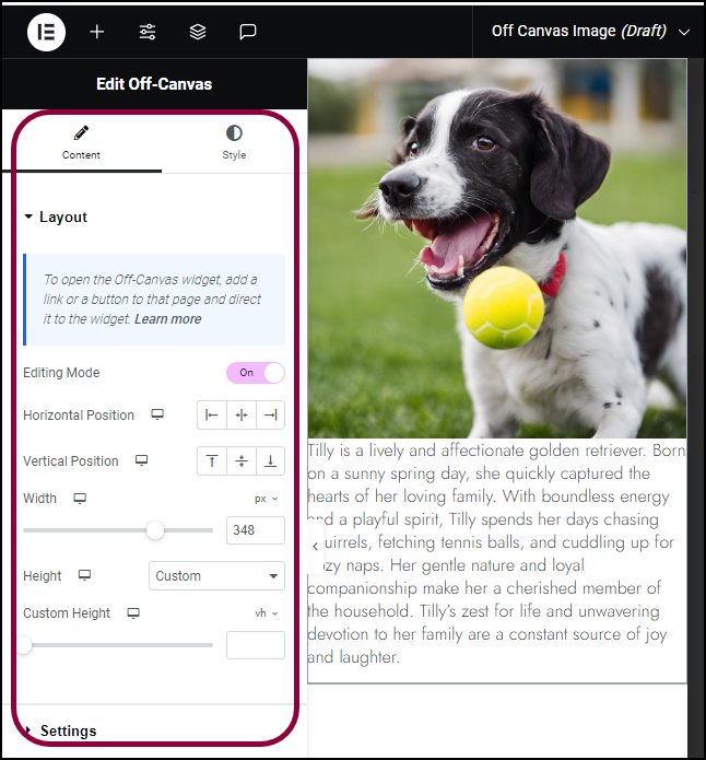
    (Optional) There are a number of options you can use to design the Off Canvas widget. In this case, we’ll center the widget so it will appear in the middle of the screen.
    5 Click the center icon Off-Canvas widget 321
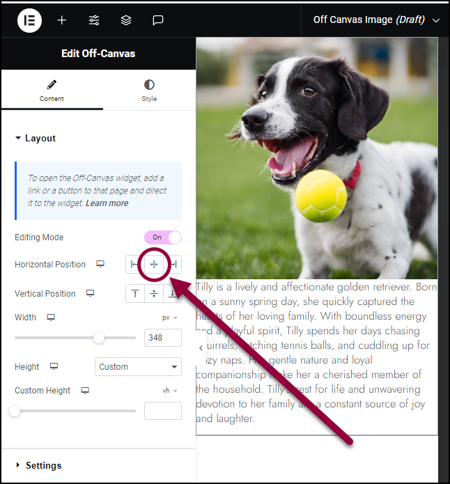
  4. In the panel, in the Horizontal Position field, click the center icon.

    6 the image is centered Off-Canvas widget 323
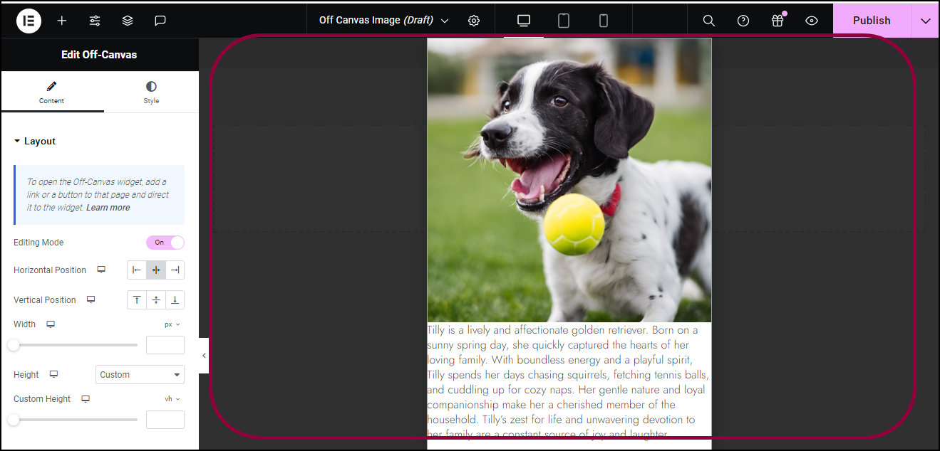
    The Off Canvas widget is centered.
    Now we must create a way to trigger the Off Canvas widget.
    7 Turn off edting mode Off-Canvas widget 325

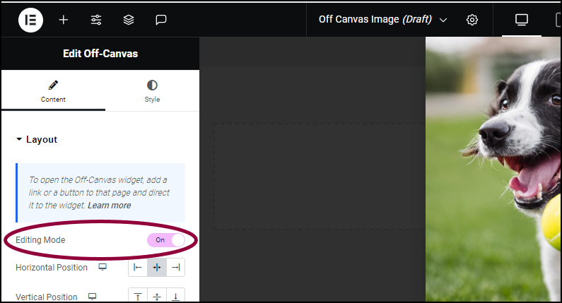
  5. In the panel, under the Content tab, switch Editing Mode to Off.
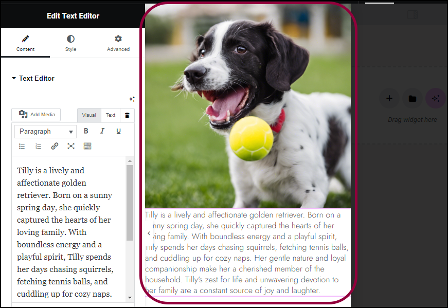
    This closes the Off Canvas widget.
  6. Create a container with any widget that can include a link.
    8 create an image widget Off-Canvas widget 327
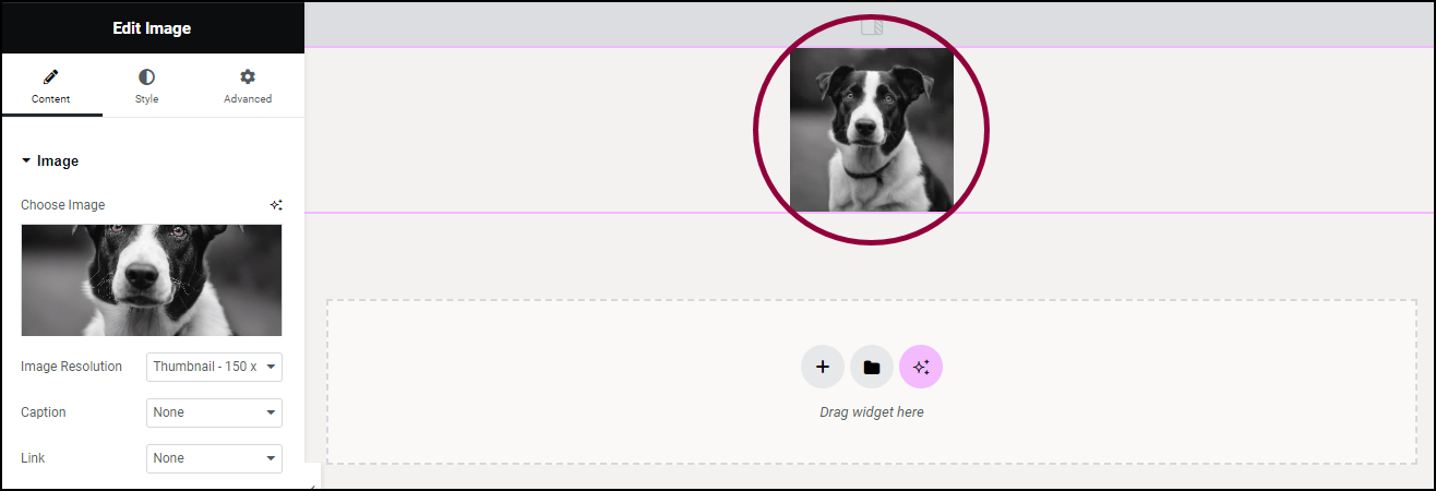
    In this case we’ll use an image widget.
    9 Selkect Cusotm URL Off-Canvas widget 329
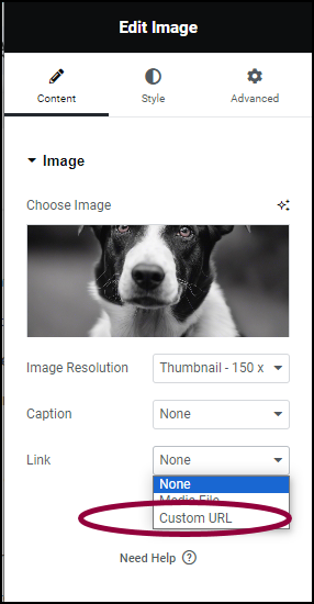
  7. In the panel, in the Link field, use the dropdown menu to select Custom URL.
    Click the dynamic icon Off-Canvas widget 331
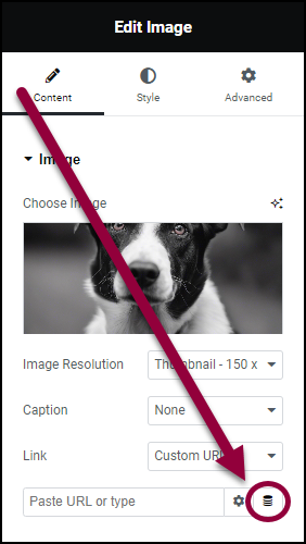
  8. Click the dynamic link icon.
    11 From the dropdown select Off Canvas Off-Canvas widget 333
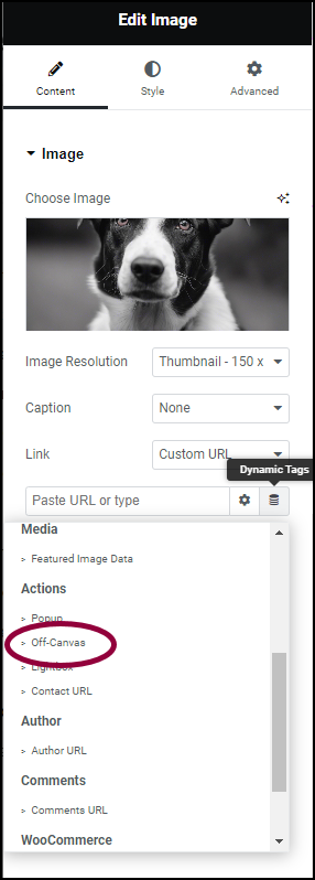
  9. From the dynamic link dropdown menu, in the Actions section, select Off Canvas
    12 click the wrench icon Off-Canvas widget 335
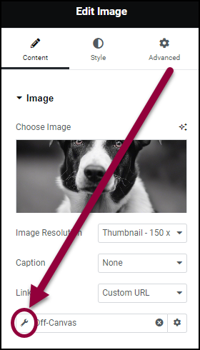
  10. In the Off Canvas text box, click the wrench icon.

    13 Choose which off canvas widget Off-Canvas widget 337

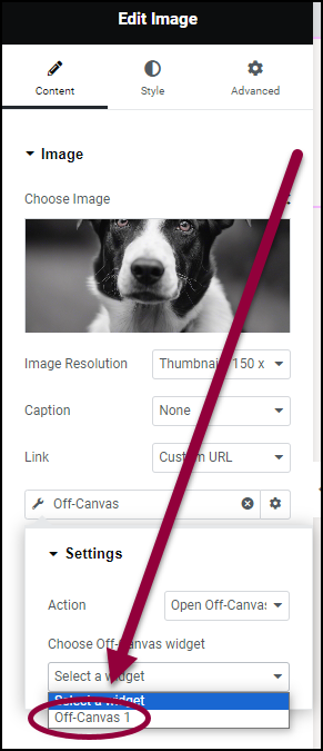
  11. Use the Choose Off Canvas widget dropdown menu to select Off Canvas 1. 
    Note
    If there are more than one Off Canvas widgets on a page they will be named in numerical order starting with the Off Canvas widget at the top of the page. For example, if a page has three Off Canvas widgets, the topmost one will be Off Canvas 1, the middle one will be Off Canvas 2 and the bottommost one, Off Canvas 3.

When a visitor clicks the image, the Off Canvas widget appears.
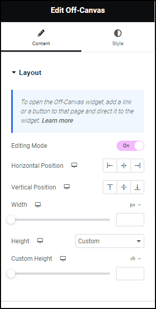
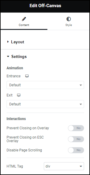
Settings for the Off Canvas widget

You can customize your widgets using content, style, and other advanced parameters, offering you great flexibility in tailoring them to your needs. Click the tabs below to see all the settings available for this widget.

Content tab

Add, delete, and edit menu items and controls. 

Content tab Layout Off-Canvas widget 339

Toggle Edit Mode Off  to stop editing your Off Canvas widget. Toggle it back on again if your want to start editing it again. 

Choose to have your Off Canvas widget appear on either the:

  • right Off-Canvas widget 341 right
  • left Off-Canvas widget 343 left
  • center Off-Canvas widget 345 center

Choose to have your Off Canvas widget appear on either the:

  • Up Off-Canvas widget 347 top of the screen
  • Vertical center Off-Canvas widget 349 center of the screen
  • Down Off-Canvas widget 351 bottom of the screen

Us the slider to change the width of the Off Canvas widget. 

Use the dropdown menu to select:

  • Fit to Content – This will allow the editor to automatically determine the best height.
  • Custom – This allows you to set a specific height for the the widget. 
Content tab Settings Off-Canvas widget 353

By default, the widget will appear on screen when triggered, and disappear when closed. You have the option to add a special effect to the widget’s appearance and disappearance. 

Use the Entrance and Exit dropdown menus to animate the Off Canvas widget.

  • Fading
    • Fade In
    • Fade In Down
    • Fade in Left
    • Fade in Right
    • Fade In Up
  • Zooming
    • Zoom In
    • Zoom In Down
    • Zoom In Left
    • Zoom In Right
    • Zoom In Up
  • Bouncing
    • Bounce In
    • Bounce In Down
    • Bounce In Left
    • Bounce In Right
    • Bounce In Up
  • Sliding
    • Slide In Down
    • Slide In Left
    • Slide In Right
    • Slide In Up
  • Rotating
    • Rotate In
    • Rotate In Down Left
    • Rotate In Down Right
    • Rotate In Up Left
    • Rotate In Up Right
  • Attention Seekers
    • Bounce
    • Flash
    • Pulse
    • Rubber Band
    • Shake
    • Head Shake
    • Swing Tada
    • Wobble
    • Jello
  • Light Speed
    • Light Speed In
  • Specials
    • Roll In

Be default, an Off Canvas widget closes when:

  • The visitor clicks on the page outside the borders of the Off Canvas widget. Toggle the Prevent Closing on Overlay to Yes to stop the widget from closing on these clicks.
  • The visitor hits the Escape key.  Toggle Prevent Closing on ESC Overlay to Yes to prevent the widget from closing when the visitor hits Escape.

By default, the widget prevents visitors from scrolling down the page while the Off Canvas widget is on screen. Toggle Disable Page Scrolling to Yes to turn this feature off. 

Choose the HTML tag for your heading. Choices include H1 to H6, Div, Span, or Paragraph.

Style tab

Determine the look and feel of menu items and controls.

Style tab Background Off-Canvas widget 355

Controls the background of the container created by the Off Canvas widget. For more details, see Create a Background

Controls the border surrounding the container created by the Off Canvas widget. For more details, see Border type.

Controls the corners of the border surrounding the container created by the Off Canvas widget. For more details, see Border radius tools.  

Give the container created by the Off Canvas widget more depth by adding a shadow effect. For more details, see, What is Shadow?

Style tab Overlay Off-Canvas widget 357

By default,  when an Off Canvas widget is activated, the surrounding page is grayed out. This area is called the overlay. 

Toggle Overlay to Off to prevent this overlay from appearing.

Add a background to the overlay. For more details, see Create a Background


Add a color to the overlay. For more details, see Choose a color or Use global fonts and colors

Have an image appear in the overlay. For more details, see Adding images and icons.

Have more questions? We’re more than happy to assist.

Link is copied to clipboard!
On this page

Is this article helpful?

Share this article