Add a Link In Bio
To add the Link In Bio widget: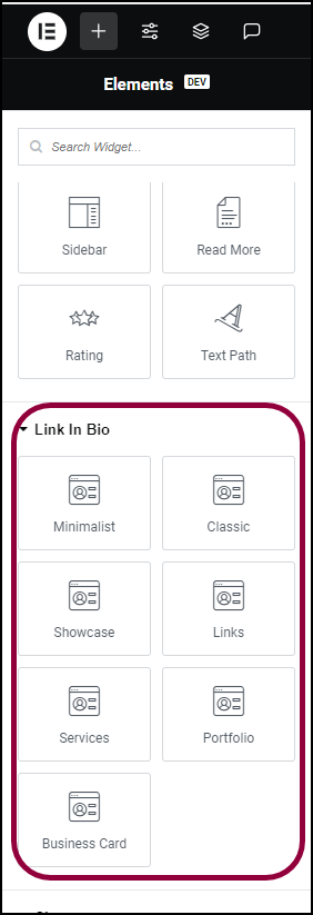
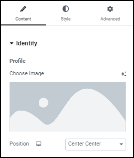
- In the panel, scroll down to the Link In Bio section.
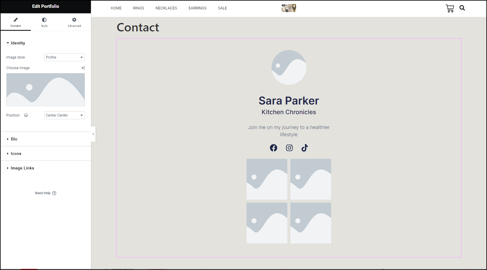
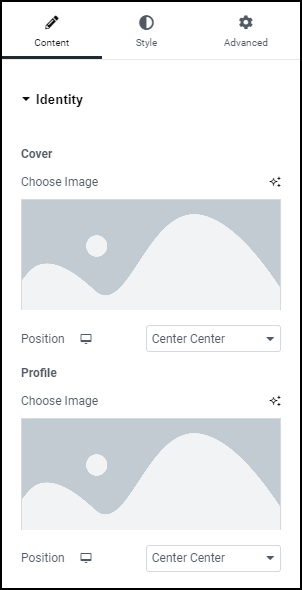
- Add the Portfolio Link In Bio widget to the canvas. For details, see Add elements to a page.
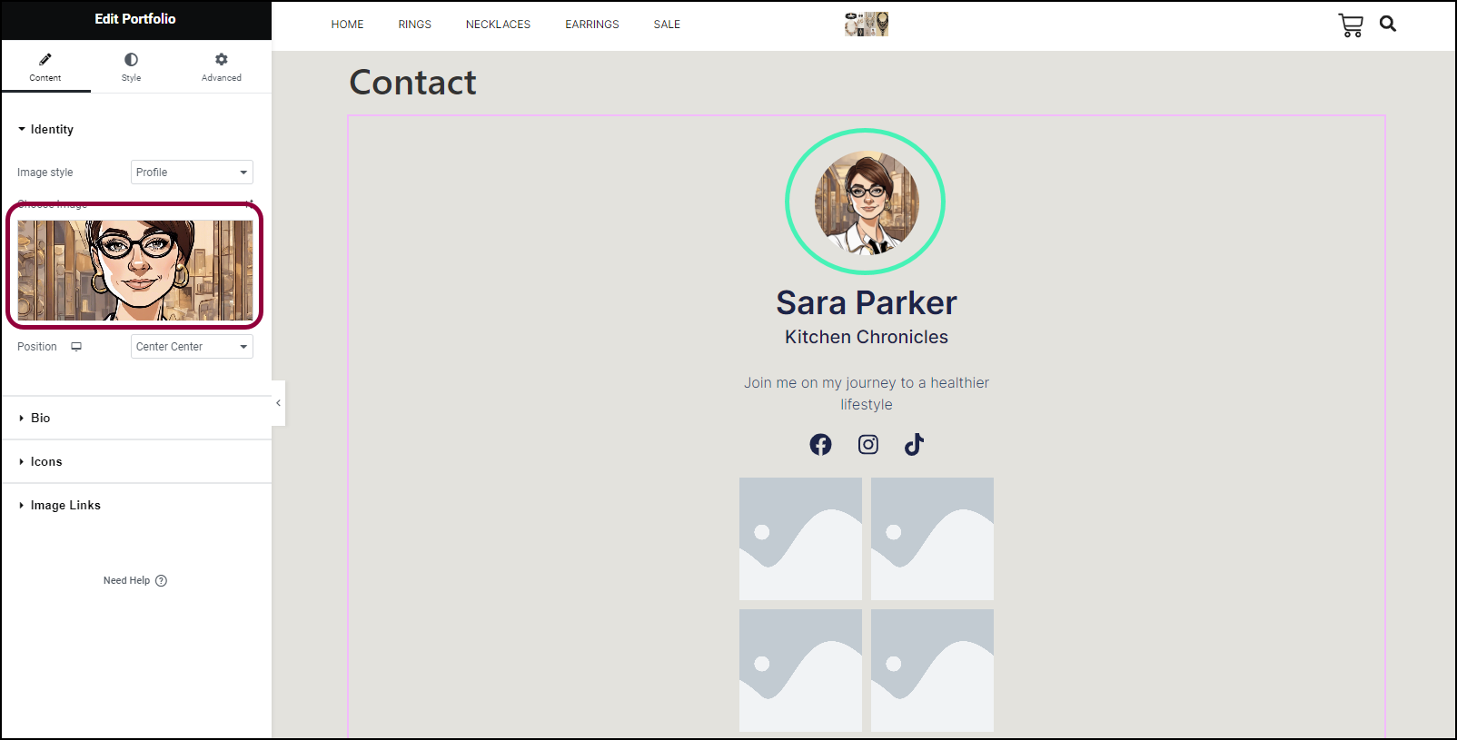
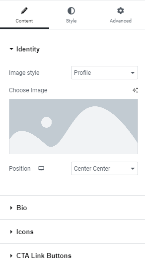
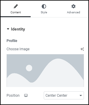
- In the panel, click the image area and add an image of the jeweler. For details, see see Adding images and icons.
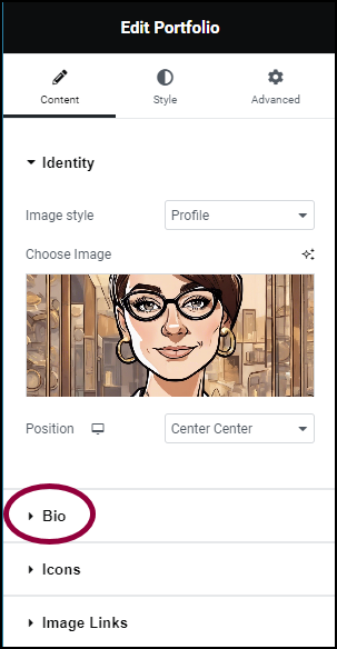
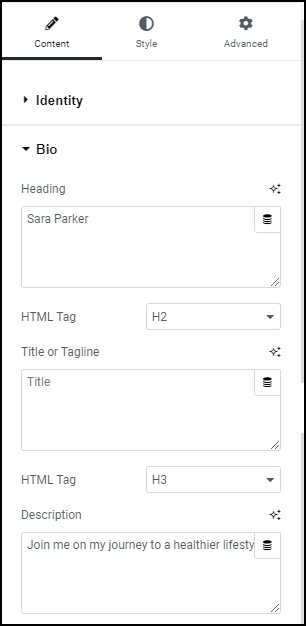
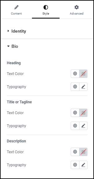
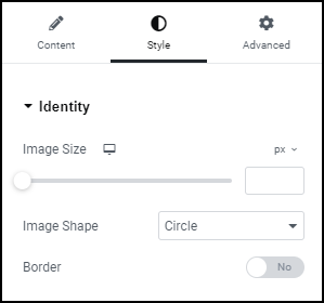
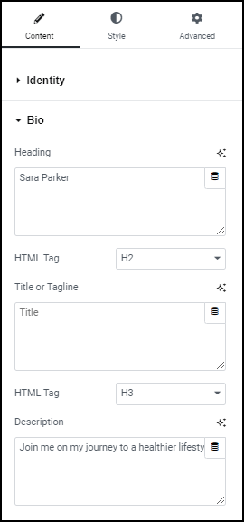
Personalize the Link In Bio
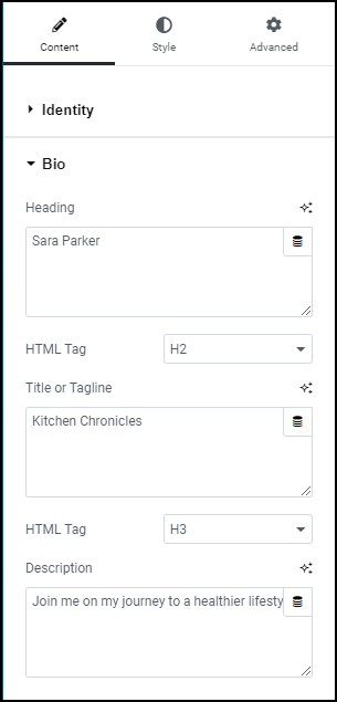
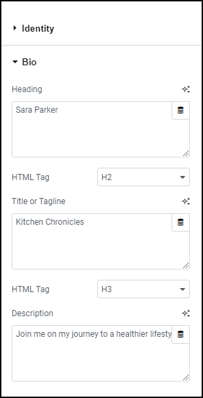
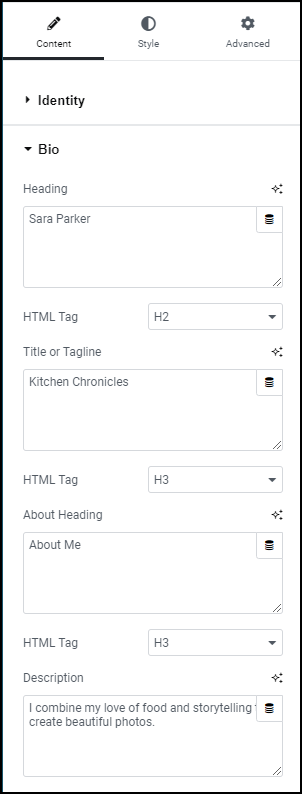
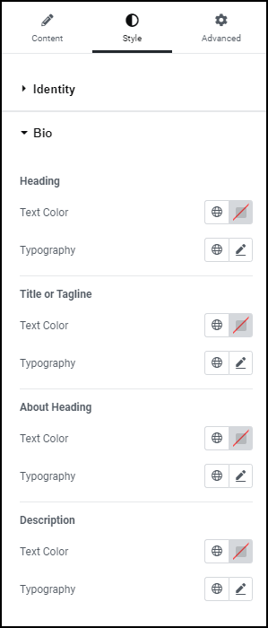
Now we’ll customize the Link In Bio. First we’ll change the biographical information.
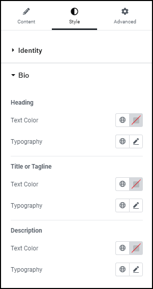
- In the panel, open the Bio section.
This lets you edit the biographical text.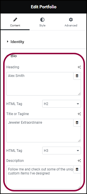
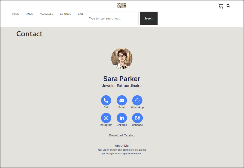
- In the Heading field, enter the name Alex Smith.
- In the Title or Tagline field, enter Jeweler Extraordinaire.
- In the Description field, enter Follow me and check out some of the unique custom items I’ve designed.
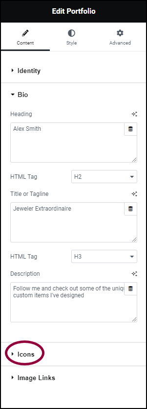
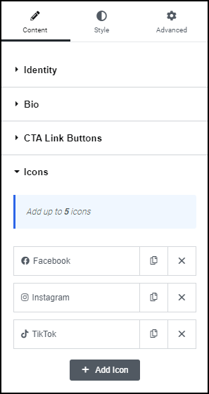
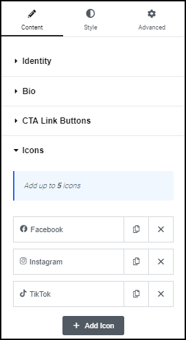
- In the panel, Open the Icons field.
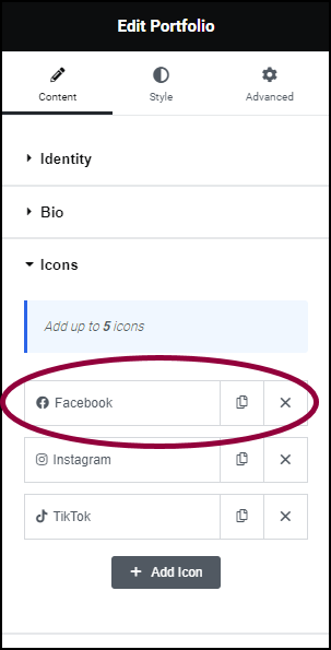
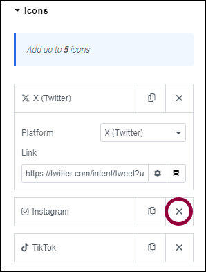
For this example, we’ll assume Alex only has TikTok and X (Twitter) accounts.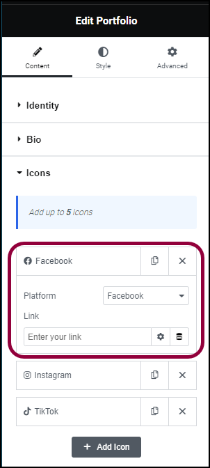
- In the panel, click Facebook.
This opens up a list of options.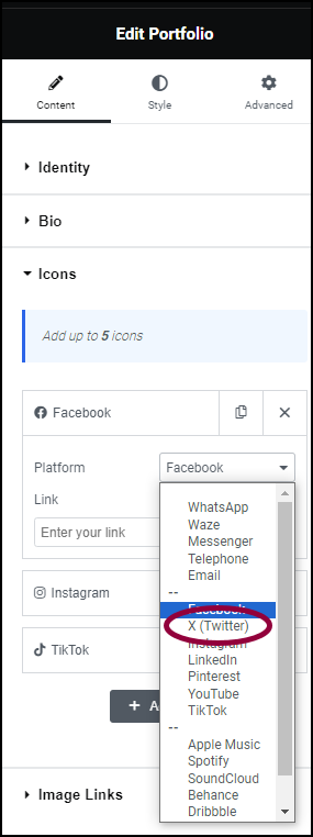
- Use the Platform dropdown to select X(Twitter).
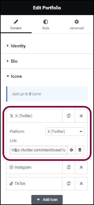
- In the Link field, enter the link to the account.
- Click the
 icon to delete the Instagram logo.
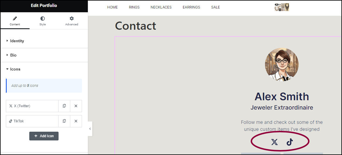
Only the X and TikTok logos remain.
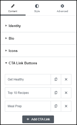
Now we’ll add links to the different types of custom jewelry Alex has created.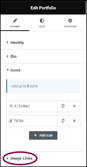
- In the panel, open the Image Links section.
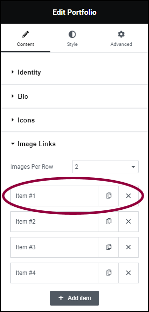
- Click Item #1 to open the options section.
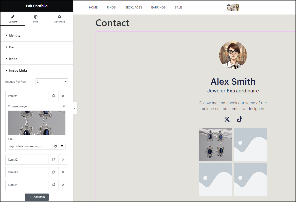
- Add an image of earrings. For details, see Adding images and icons.
- In the link section, add a link to the earrings page.
- Add appropriate images for the other four items.
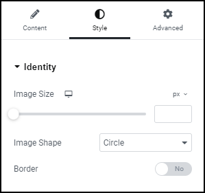
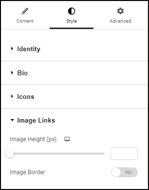
To change the look of the Link In Bio, click on the Style tab and change the settings. For details see the Style options below.
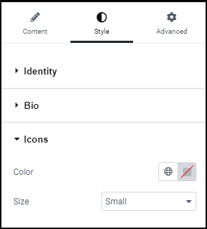
Icons
Add links to your social media or other apps. You can include up to five icons.
- Click
 to copy an icon
 - Click to delete an icon
- Click
 to add an icon.
 - Click an icon to edit the settings
The settings include:
- Platform: A dropdown menu used to select the icon you want to use.
- Link: Contains the link to your presence on the selected site/app.
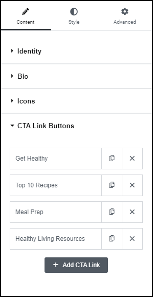
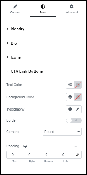
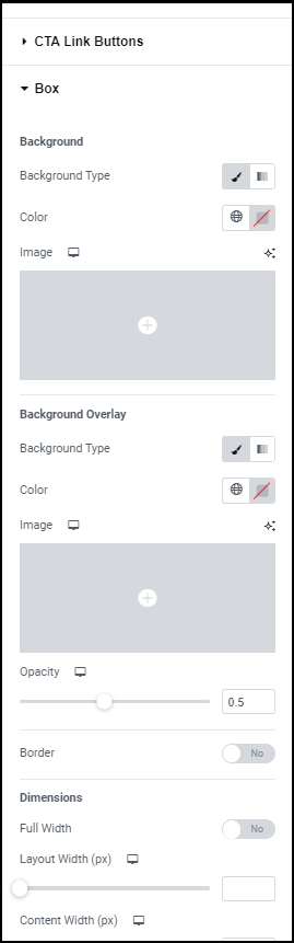
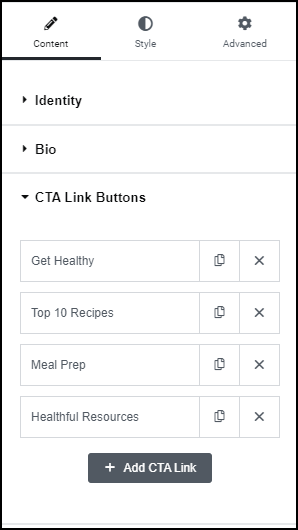
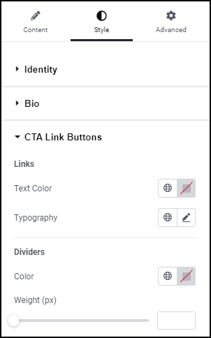
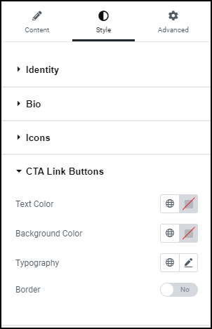
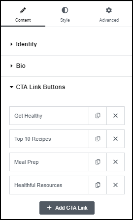
CTA Link Buttons
Call to Action (CTA) buttons can:
- Link to important pages
- Download a file
- Link to an app
By default the widget includes four CTA buttons:
- Click to copy a CTA button
- Click to delete a CTA button
- Click
 to add a button.
 - Click the CTA button to edit the button’s settings
The CTA button settings include:
- Text: The name that appears on the button.
- Link Type: Types of links available are:
- URL: links to a webpage.
- File Download: When visitors click the button, a file downloads to their PC.
- WhatsApp: Sends a WhatsApp message to a WhatsApp user
- Waze: Opens a link to Waze location to help visitors find your location.
- Messenger: Sends a message through Facebook Messenger.
- Telephone: Calls a predetermined telephone number.
- Email: Sends an email using the visitors email program.
CTA Link Buttons
Call to Action (CTA) buttons can:
- Link to important pages
- Download a file
- Link to an app
By default the widget includes four CTA buttons:
- Click to copy a CTA button
- Click to delete a CTA button
- Click to add a button.
- Click the CTA button to edit the button’s settings
The CTA button settings include:
- Text: The name that appears on the button.
- Link Type: Types of links available are:
- URL: links to a webpage.
- File Download: When visitors click the button, a file downloads to their PC.
- WhatsApp: Sends a WhatsApp message to a WhatsApp user
- Waze: Opens a link to Waze location to help visitors find your location.
- Messenger: Sends a message through Facebook Messenger.
- Telephone: Calls a predetermined telephone number.
- Email: Sends an email using the visitors email program.
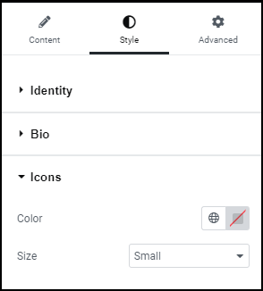
Icons
Add links to your social media or other apps. You can include up to five icons.
- Click to copy an icon
- Click to delete an icon
- Click to add an icon.
- Click an icon to edit the settings
The settings include:
- Platform: A dropdown menu used to select the icon you want to use.
- Link: Contains the link to your presence on the selected site/app.
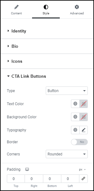
CTA Link Buttons
Call to Action (CTA) buttons can:
- Link to important pages
- Download a file
- Link to an app
By default the widget includes four CTA buttons:
- Click to copy a CTA button
- Click to delete a CTA button
- Click to add a button.
- Click the CTA button to edit the button’s settings
The CTA button settings include:
- Text: The name that appears on the button.
- Choose Image: For details, see Adding images and icons.
- Link Type:
- URL: links to a webpage.
- File Download: When visitors click the button, a file downloads to their PC.
- WhatsApp: Sends a WhatsApp message to a WhatsApp user
- Waze: Opens a link to Waze location to help visitors find your location.
- Messenger: Sends a message through Facebook Messenger.
- Telephone: Calls a predetermined telephone number.
- Email: Sends an email using the visitors email program.
Icons
Add links to your social media or other apps. You can include up to five icons.
- Click to copy an icon
- Click to delete an icon
- Click to add an icon.
- Click an icon to edit the settings
The settings include:
- Platform: A dropdown menu used to select the icon you want to use.
- Link: Contains the link to your presence on the selected site/app.
CTA Link Buttons
Call to Action (CTA) buttons can:
- Link to important pages
- Download a file
- Link to an app
By default the widget includes four CTA buttons:
- Click to copy a CTA button
- Click to delete a CTA button
- Click to add a button.
- Click the CTA button to edit the button’s settings
The CTA button settings include:
- Text: The name that appears on the button.
- Choose Image: For details, see Adding images and icons.
- Link Type:
- URL: links to a webpage.
- File Download: When visitors click the button, a file downloads to their PC.
- WhatsApp: Sends a WhatsApp message to a WhatsApp user
- Waze: Opens a link to Waze location to help visitors find your location.
- Messenger: Sends a message through Facebook Messenger.
- Telephone: Calls a predetermined telephone number.
- Email: Sends an email using the visitors email program.
Icons
Add links to your social media or other apps. You can include up to five icons.
- Click to copy an icon
- Click to delete an icon
- Click to add an icon.
- Click an icon to edit the settings
The settings include:
- Platform: A dropdown menu used to select the icon you want to use.
- Link: Contains the link to your presence on the selected site/app.
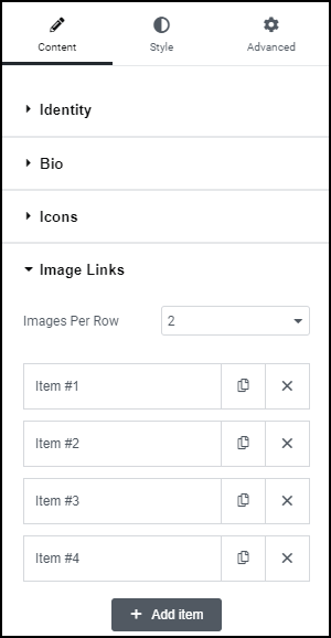
Image Links
The items in this Link In Bio widget feature an image and can link to a webpage.
Images Per Row: Use the dropdown menu to create one, two or three columns for your items.
To add, copy or delete items:
- Click to copy an item
- Click to delete an item
- Click
 to add an item.
 - Click the item button to edit the button’s settings
The CTA button settings include:
- Choose Image: For details, see Adding images and icons
- Link: Link to a webpage
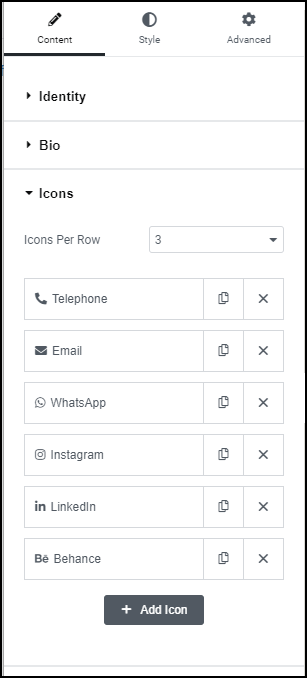
Icons
Add links to your social media or other apps.
Icons Per Row: Use the dropdown menu to set the number of columns for your icons. You can choose two or three columns.
- Click to copy an icon
- Click to delete an icon
- Click to add an icon.
- Click an icon to edit the settings
The settings include:
- Platform: A dropdown menu used to select the icon you want to use.
- Link: Contains the link to your presence on the selected site/app.
Telephone: Allows you to add a phone number allowing visitors to call you from your site.
Email: Allows visitors to send you an email from your site.
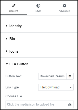
CTA Link Button
The Call to Action (CTA) button in the Link In Bio Business Card is usually used to download a file.
A Business Card only contains one button.
- Button Text: The name that appears on the button.
- Link Type: By default the CTA is set to download a file, however your can switch link types.
- URL: links to a webpage.
- File Download: When visitors click the button, a file downloads to their PC.
- WhatsApp: Sends a WhatsApp message to a WhatsApp user
- Waze: Opens a link to Waze location to help visitors find your location.
- Messenger: Sends a message through Facebook Messenger.
- Telephone: Calls a predetermined telephone number.
- Email: Sends an email using the visitors email program.
Click  to upload the file you want visitors to download.