Add the widget
Add the widget to the canvas
To access and use a widget:
In Elementor Editor, click +.
All available widgets are displayed.Click or drag the widget to the canvas. For more information, see Add elements to a page.
What is the Social Icons widget?
The Social Icons widget makes sharing links to your social media profiles on your website easy. It allows you to showcase icons representing popular social platforms such as Facebook, Twitter, and Instagram, encouraging your audience to connect with you on social media for the latest updates on your posts.
Common use case
Matt is creating a blog with articles on different marketing topics. He wants to make it easy for readers to stay updated on his latest posts and thoughts by connecting on social media. To do this, he decides to add social icons to the bottom of his blog.
In the settings of the Social Icons widget, Matt adds the links to his social media profiles. He also tweaks the color and size of the icons to make them match the overall look of his blog. This way, visitors can easily find and click on the icons to connect with Matt on social media.
Additional use cases
- Enhance your business website using the social icons widget to link to your company’s LinkedIn, Twitter, and YouTube profiles.
- Showcase your creative work on a portfolio site. Use the social icons widget to link to your Behance, Dribble, and Instagram accounts, allowing potential clients to explore your artistic projects.
- Promote an event effectively by placing the social icons widget on your page, linking to event-specific social media pages on platforms like Facebook, Instagram, and Twitter for real-time updates and engagement.
Video
See a video demonstrating the widget in action.
Add a Social Icons widget: Step-by-step
- Add the Social Icons widget to the canvas. For details, see Add elements to a page.
- In the Content tab, under the Social Icons option, click the + Add Item button to add a social network icon. You can even edit the default items just by clicking on them.
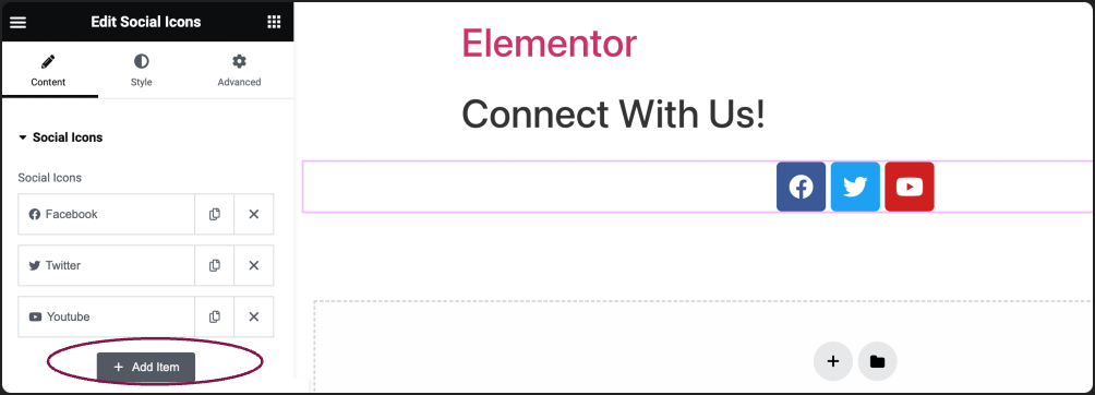
Upon clicking the button, you will find customization options such as:
- Icon: Select the social media icons from the Icon Library or Upload SVG. You can choose from various platforms such as Facebook, Twitter, LinkedIn, Instagram, etc.
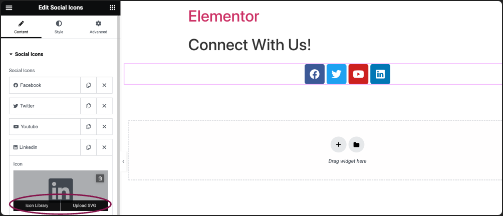
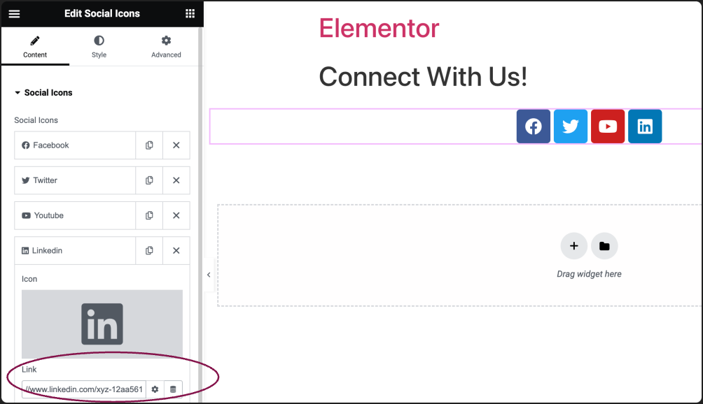
- Link: Here, add the URLs of your social media profiles (e.g., Facebook, Twitter, Instagram). Input the appropriate links into the respective fields. You can also use the Dynamic Content selection to choose a link dynamically if you prefer.
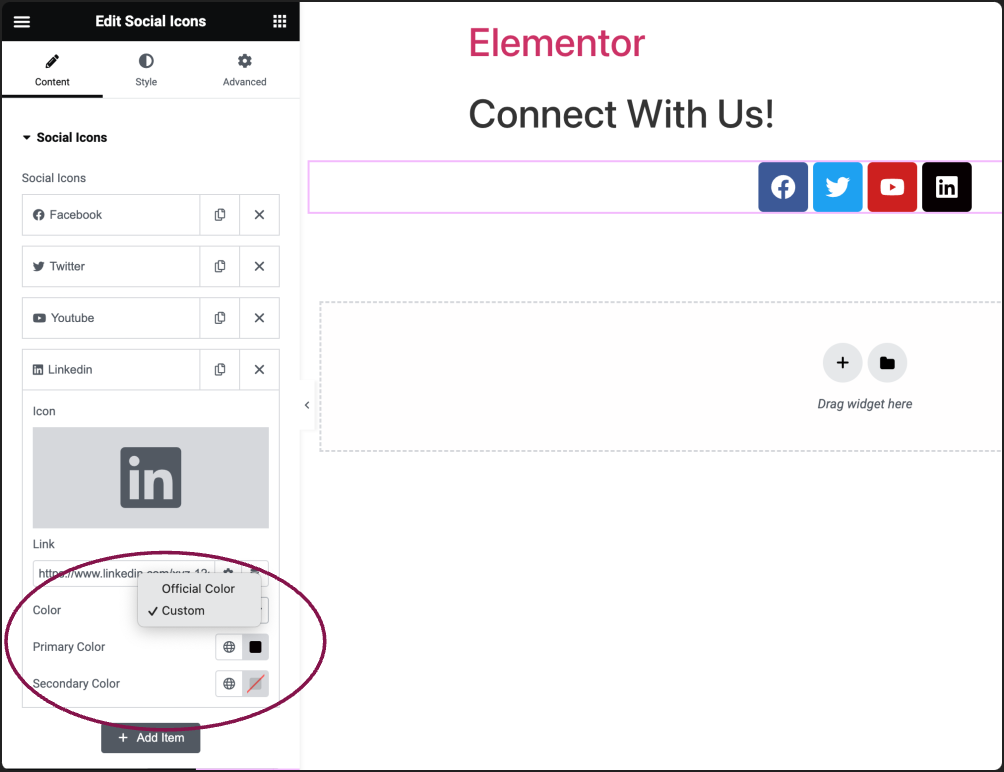
- Color: Pick the official color for social media logos, or go for a custom color. If you choose custom, you can also select primary and secondary colors for the social icon.
Repeat these steps for each social icon you want to include. Choose icons from the library, enter the corresponding link URLs, and customize as needed.
- Icon: Select the social media icons from the Icon Library or Upload SVG. You can choose from various platforms such as Facebook, Twitter, LinkedIn, Instagram, etc.
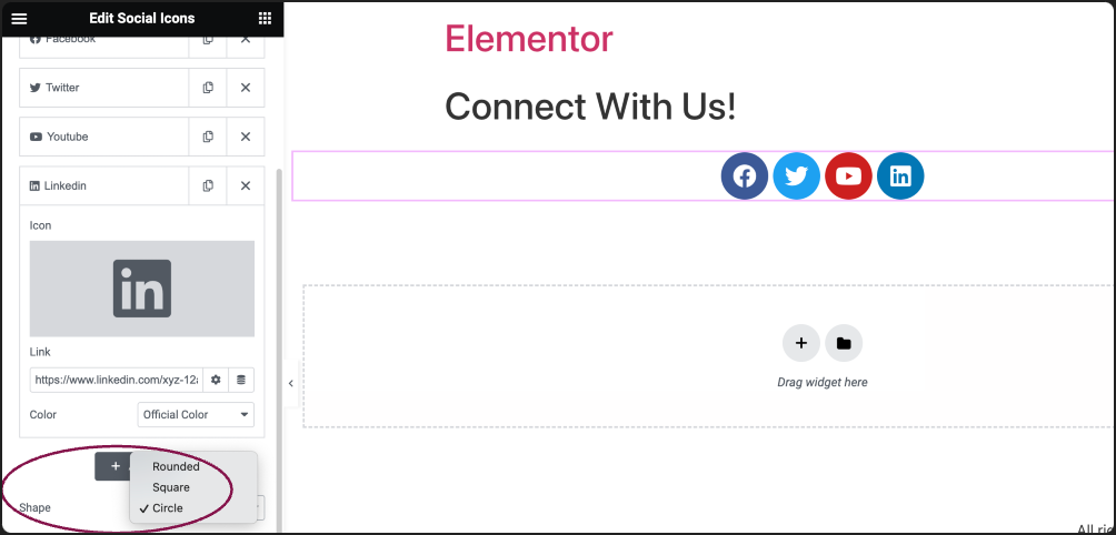
- In the Shape field, select the icon shape from options like Rounded, Square, or Circle.
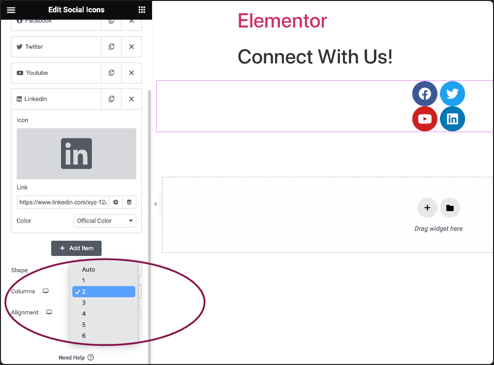
- In the Columns field, specify the number of columns (Auto, 1 to 6).
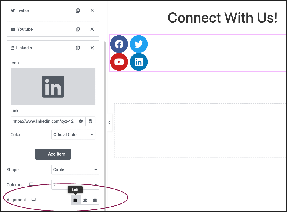
- Use the Alignment field to set the alignment of the icons to Left, Center, or Right.
Settings for the Social Icons Widget
You can customize your widgets using content, style, and other advanced parameters, offering you great flexibility in tailoring them to your needs. Click the tabs below to see all the settings available for this widget.
Content tab
Social Icons
Under the Social Icons option, click the + Add Item button or the default social icon items to open its settings.
- Choose an icon from the Icon Library or Upload SVG.
- Enter the URL of your social network profile. If you want to dynamically select the link, you can use the Dynamic Content option. This is useful if you have dynamic content or want to pull in links from other sources
- Choose the Official Color (the default color associated with each social media platform) or add a Custom color of your choice.
Shape
Select the icon shape from options like Rounded, Square, or Circle.
Columns
Specify the number of columns (Auto, 1 to 6).
Alignment
Set the alignment of the icons to Left, Center, or Right.
Style tab
Color
Choose between the Official Icon’s Color or add Custom color, allowing you to define Primary and Secondary Colors for all the icons.
Size
Adjust the size of the icon.
Padding
Determine the inner spacing of the icon.
Spacing
Define the spacing between icons.
Rows Gap
Set the gap between rows.
Border type
Choose the Border Type, specify Border Width, and set Border Color. Learn more about border types.
Border Radius
Round the corners of the border if you added one.
Primary Color
Secondary Color
Specify the secondary color for when the mouse hovers over the social icon.
Hover Animation
Displays an animation to occur when the mouse is over the social icon.
Advanced tab
The Advanced tab provides options to control social icons’ position, adjust spacing, add custom code, and
more.
Advanced
Learn more about the Advanced tab settings.

