Add the widget
Add the widget to the canvas
To access and use a widget:
In Elementor Editor, click +.
All available widgets are displayed.Click or drag the widget to the canvas. For more information, see Add elements to a page.
What is the Form widget?
Forms allow website owners to collect information from visitors. Visitors enter this information into the form and submit it to the website owner. These submissions can either be sent to the website database or as an email.
There are many different styles of forms from simple ones embedded in a page, to multi-step forms that change according to the information submitted by the user. You can even create animated forms to draw visitors’ attention.
Common use case
Alex is building a webstore and is trying to build up a list of potential customers. On the front page of their store, they create a form offering visitors a 10% discount on future purchases if they register with the site by submitting their name and email address.
Additional use cases
- Create a list of attendees for a party
- Start a subscription list for your blog
- Collect user feedback about your site or products
Video
See a video demonstrating the Form widget in action.
Adding a Form widget: Step-by-step
Add a Form widget
To add a Form widget:
- Add the Form widget to the canvas. For details, see Add elements to a page.
By default, the widget creates a form with three fields – Name, Email and Message.
We’re going to make a few changes to the form:
- Rename the form
- Divide the Name field into First name and Last name
- Make sure users have to enter a valid email in the email field
- Add a note in the message field telling users we’d like their feedback.
Add another field
To add another field to the form:
- In the panel, in the text box under Form Fields change the name of the form to “My Form”
- In the panel, under the form name, click the Name field.
Clicking the field brings up a number of settings. For more details about these settings, see Settings for the Form widget.
- In the Label field, change the name of the field to “First Name”.
Now we need to add a new field for the last name.
There are two ways to add a new field:
1. Click the copy icon to make an exact duplicate of an existing field.
2. Click +Add Item to add a blank field. - Click the copy icon of the First Name field.
In the panel, a new field appears under the First Name field. This is a duplicate of the First Name field.
- In the panel, click the bottom First Name field.
- In the Label section, rename the field, Last Name.
We now have the correct fields, but it looks a little strange to have the first and last names on separate rows. Let’s make them a bit shorter and put them both on the same row.
Add multiple fields
To put multiple fields on the same row:
- In the panel, click the First Name field.
- Change the Column Width to 50%.
- In the panel, click the Last Name field.
The First Name and Last Name fields are now side by side.
Set the Field type
To set the field type:
Each field in the form has a type. The type can be used to limit the answers visitors can input. A common example of this is in the email field. By selecting email as the field type, visitors can only input valid email addresses. For more details about these types, see Settings for the Form widget.
In our form, the email field should default to the email type, but let’s double-check to make sure.
- In the panel, click the Email field.
- In the Type section, make sure it’s set to email.
Edit the placeholder
To edit the placeholder:
The faded text inside the field is called the placeholder text. It can be used as instructional text, helping visitors know what to input in the field. In our example, we’ll add some instructional text to the Message field.
- In the panel, click the Message field.
- In the text area of the Placeholder section, enter, “Please send us any feedback, good or bad and include as many details as possible”
The message area now includes information that will help visitors fill in the information you need.
Settings for the Form widget
You can customize your widgets using content, style, and other advanced parameters, offering you great flexibility in tailoring them to your needs. Click the tabs below to see all the settings available for the Form widget.
Content tab
Add, delete, and edit form fields, steps, buttons and controls. Determine what happens after visitors submit their responses.
Form name
Give your form a name.
Form Field
Edit and create fields for your form,. Each field represents data you collect from your visitors such as Name, and Email.
There are two icons that appear to the right of the field name:
– Duplicate this menu item. Using copy helps maintain consistency in your menu.
– Delete this menu item.
When you click a field name, additional options appear under two tabs – Content and Advanced.
Form Field-Content
In the Content tab, the following options are available:
- Type: Set the type of field to help filter out irrelevant data. For instance, setting the type to email, means visitors must submit valid email addresses. See Field types for more details.
- Label: Create a name for the field, such as Name, to tell users what information to enter.
- Placeholder: Also known as ghost text, this is text that appears in the field to give more detailed information about the field, for example, in a field called Favorite movies, the ghost text could be, “List your three top choices.”
- Required: Use the toggle to determine if users must fill in this field to submit the form.
- Column width: Set how much space the field will take up. This can be used for fields where you expect short answers or if you want several fields to appear on one line. For example, if you want two fields to appear on one line, give them each a width of 50%.
Form Field - Advanced
In the Content tab, the following options are available:
- Default value: Add information that will automatically be put in a field unless the user overrides it. For example, if you have a form that everyone in the Personnel department needs to fill out and 99% of the people filling out the form are in the Personnel department. You can have the Department field automatically filled in with the word Personnel.
- ID: Give your field a unique identifier to help use submission information.
- Shortcode: Use a shortcode in your field to save from repeatedly entering the same information. repeatedly.
+Add item
Create a blank field for your form.
Input Size
Determine both the field height and the size of data entered in the field.
Label
Use the toggle to either Show or Hide the name of the field.
Required Mark
Use the toggle to either Show or Hide whether or not the field is required. Standard practice is to mark these fields so visitors know they need to fill them out.
Form buttons
There are two types of buttons on forms – Submit and Step. Submit buttons send information back to the website owner and Step buttons move visitors to the next page of the form.
Each page of a form will have either a submit or step button.
Size
Set how big you want your buttons. Form buttons can be:
- Extra Small
- Small
- Medium
- Large
- Extra Large
Column width
Column width: Set the size of the area allocated for the button. This will affect the placement of the button.
For example, If your column size is 100% and align the button to the right, the button will be on the right. However, if you set a column width of 50% and align the button to the right, it will appear in the center of the form.
Alignment
Place the button in the right, left or center of the area allocated for the button.
Step Buttons
Step buttons take visitors forward to the next page of the form or back to the previous page. On the first page of the form there is no Previous button and on the last page of the form there is no Next button.
If you don’t want to label the buttons Next and Previous, use the text box to enter a different label.
Submit button
The Submit button sends the information in the form to the website owner. It is added to the last page of the form.
If you don’t want to label the button Submit, use the text box to enter a different label.
Button ID
Assign an ID for your button so you can identify it later. This will often help in processing the information you collect.
Add Action
Add actions that will be performed after a visitor submits the form (e.g. Open or close a Popup, Send an email notification, Connect to a third-party such as MailChimp, Redirect, etc.)
For more details, see Actions after a form is submitted.
Form Submissions
When visitors submit information it is usually collected and made accessible to the website owner from WP Admin.
For more information about accessing this information, see Form submissions.
Email Settings
When a visitor submits a form, you can receive the submissions as an email. Use this section to define these emails.
- To: The email address where the submissions will be received.
- Subject: The subject line of the email that will be sent to the email address in the To setting.
- Message: Any text and form information that will be sent in the email. The default setting is [all-fields], includes all the form information in the email.
- From Email: Add the email from which the email will be sent.
- From Name: Determine under what name the email will be sent. This may help you filter these emails later.
- Reply To: Edit this email address if you want to reply to these emails and have these replies sent to a different address.
- Cc: Send a copy of these emails to another address.
- Bcc: Send a blind copy of these emails to another address.
- Meta Data: By default, the emails sent by the form includes metadata such as the Time, Date, Page URL, User Agent (Browser information), Remote IP (IP address of the person submitting the form), Credit (the software that created the form).
- Send As: Use the dropdown menu to determine if the email sent by the form is in HTML or plain format.
Steps Settings
Steps Setting determines what indicators are used to show visitors what step they’re on when filling out a multistep form. There are two categories of settings, Type and Shape.
Types include:
- None gives users no sign of what step they are on.
- Text indicates the step the user is on using its label. This label is set in the Form Fields section.
- Icon indicates the step the user is on using its icon. This icon is set in the Form Fields section.
- Number indicates the step the user is on using a number.
- Progress Bar add a visual and percentage indicator to show the visitor how far they’ve advanced in a multi-step form. For example, if a visitor has filled out 1 page of a 4 page form, the progress bar will be one-quarter filled in and labeled 25%.
- Number & Text combines the properties of the Number and Text options.
- Icon & Text combines the properties of the Icon and Text options.
Horizontal Scroll
Use the dropdown menu to Disable or Enable horizontal scrolling. Disabling horizontal scrolling means that excess menu items appear as additional rows on your menu.
See the example of a menu with horizontal scroll disabled.
Breakpoint
It’s best practice to use a more compact dropdown menu for mobile and/or tablets.
Use the dropdown to select:
- None: Don’t use a compact menu
- Mobile Portrait (>767px): Switch to a compact menu if the screen is less than 767 pixels wide.
- Tablet Portrait (>1024): Switch to a compact menu if the screen is less than 1024 pixels wide.
Form ID
Custom code can sometimes require you to give your form and ID.
Make sure your Form ID is unique.
Form Validation
When users submit information, the browser usually check to see if the information is valid, for example that email fields contain valid email addresses. There are two options for validation:
- Browser Default: Uses the validation system built-into the visitor’s browser.
- Custom: Create your own validation system.
Custom messages
In general, browsers already have built in messages for form submissions indicating success or form errors. Custom messages allows you to create your own messages that will display in case the visitor’s browser does not provide these messages or the messages fail to display for some reason.
Style tab
Determine the look and feel of menu items and controls.
Form
Control the layout of your form.
- Columns Gap: If your form has more that one column, use the slider to set the space between the columns. This occurs when there is more than one field in a row.
- Rows Gap: Use the slider to raise and lower the space between fields.
Label
Control the look at feel of the form’s labels.
- Spacing: Set the distance between the label and the field.
- Text Color: Determine the color of the field name. For more details, see Choose a color or Use global fonts and colors.
- Typography: Determine the font and size of the field name.
For more details, see Typography.
HTML Field
If you add custom HTML fields to your form, use these settings to control their look and feel.
- Spacing: Control how much room there will be around the elements of your HTML field.
- Color: Set the color of the text in your HTML field. For more details, see Choose a color or Use global fonts and colors.
- Typography: Set the font size and type used in the HTML field. For more details, see Typography.
Field
This section determines the look and feel of the form fields. This includes the placeholder text, field border and more.
- Text Color: Set the color of the placeholder text. For more details, see Choose a color or Use global fonts and colors.
- Typography: Set the font size and type of the placeholder text. For more details, see Typography.
- Background Color: Set the color of field box.
- or more details, see Choose a color or Use global fonts and colors.
- Border Color: Set a color for the field’s boder. For more details, see Choose a color or Use global fonts and colors.
- Border Width: Delineate the field with a border.
- Border Radius: Round the corner of the border by increasing the border radius. For more details, see Border radius tools.
Buttons
Control the look and feel of the Previous, Next and Submit buttons.
Typography
Set the font size and type for all buttons in the form.
Border type
Add a border to all your buttons. For more details, see Border type.
Normal
Determine how buttons appear by default.
Hover
Determine how buttons appear when moused over.
Hover mode lets you set a transition duration. This is the length of time it takes for the button to change its appearance.
Next & Submit Button
The Next and Submit buttons have a similar look and feel:
- Background Color: Determine the background color of both the Next and Submit buttons. For more details, see Choose a color or Use global fonts and colors.
- Text Color: Determine the text color of both the Next and Submit buttons. For more details, see Choose a color or Use global fonts and colors.
Previous Button
The Previous buttons have a similar look and feel:
- Background Color: Determine the background color the Previous buttons. For more details, see Choose a color or Use global fonts and colors.
- Text Color: Determine the text color of the Previous buttons. For more details, see Choose a color or Use global fonts and colors.
Border Radius
Round the corners of all the buttons on the form. For more details, see Border radius tools.
Text Padding
Determine the spacing between the button border and the text for all the buttons in the form. For more details, see Padding and margins.
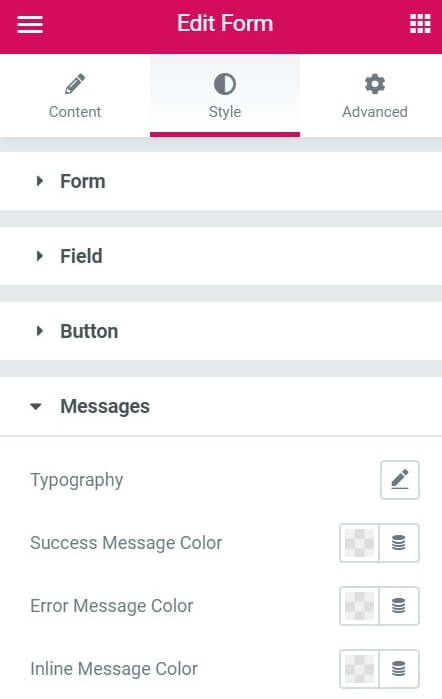
Messages
The Messages sections controls the style of the any messages shown to visitors after they submit a form:
- Typography: Determine the size and type of the font used in the message.
- Success Message Color: Set the color of the message if the visitor’s form was sent to the website owner. For more details, see Choose a color or Use global fonts and colors.
- Error Message Color: Set the color of the message if the visitor’s form was not sent to the website owner. For more details, see Choose a color or Use global fonts and colors.
- Inline Message Color: This is only relevant if you chose to display custom messages. Some custom messages appear within the form itself, these are called inline messages and this setting determines their color.
Steps
Steps are only relevant for multistep forms which display to visitors what page of the form they are on. For example, a large 2 can indicate to visitors that they are on page two of a form.
The section allows you to design the look and feel of the step display.
- Typography: Set the size and style of the font used for the step display.
- Spacing: Set the distance between the steps in the step display.
- Padding: Determine the amount of space between the step indicators and the body of the form. For more details, see Padding and margins.
Inactive
Determine the primary and secondary colors of the step display when it is neither selected not completed.
- Primary Color: The color of the step indicator. For example, if you are using numbers for your steps, the numbers will be the primary color. For more details, see Choose a color or Use global fonts and colors.
- Secondary color: The background color of the step indicator. For example, if you are using numbers for your steps, the area surrounding the number will be the secondary color. For more details, see Choose a color or Use global fonts and colors.
Active
Determine the primary and secondary colors of the step display that the visitor is on.
- Primary Color: The color of the step indicator. For example, if you are using numbers for your steps, the numbers will be the primary color. For more details, see Choose a color or Use global fonts and colors.
- Secondary color: The background color of the step indicator. For example, if you are using numbers for your steps, the area surrounding the number will be the secondary color. For more details, see Choose a color or Use global fonts and colors.
Divider Width
Use the slider to determine the width of the horizontal line between the individual steps. Setting this to zero means there is not horizontal line.
Divider Gap
Use the slider to determine the amount of space between the step indicators and the horizontal line between steps. Only applicable if there is a horizontal line.
Advanced tab
Control the placement of your widget, insert links, add custom code and more.
Advanced
Learn more about the Advanced tab settings.
Field types
Text : A simple text field. For example, a name.
Email: Must be a valid email address.
Textarea: Allows visitors to submit multiline text, commonly used for capturing longer pieces of information such as comments or messages.
URL: Must be a web address.
Tel: Must be a telephone number.
Radio: Add a graphical control element that allows visitors to choose only one option from a predefined set of options. or more details, see Custom labels & values in Select, Radio and Checkbox form fields.
Select: Create a dropdown menu with a list of options. Can be set to select multiple options. For more details, see Custom labels & values in Select, Radio and Checkbox form fields.
Checkbox: Add a graphical user interface element that allows users to select or deselect a specific option independently from others. or more details, see Custom labels & values in Select, Radio and Checkbox form fields.
Acceptance: Add a field that combines a text area for acceptance text and a checkbox for visitors to agree to the acceptance text.
Number: A field that will only accept numbers.
Date: Add a date picker to the field. Will only accept dates.
Time: Add a time picker to the field. Will only accept times.
File Upload: Allows visitors to send files to the website owner. There are three options for uploading files:
- Email with link: Keeps a copy of the document on the server which makes it easier to track but is less secure.
- Email with attachment: Sends the document to the website owner the document by email without saving a copy to the server. Makes the document more difficult to track but more secure.
- Email with both
Password: Create a password field. When users enter information it is hidden unless they choose otherwise.
HTML: Let’s you customize your form by adding your own HTML code.
Hidden: Add a field that visitors cannot see but the website owner can.
reCAPTCHA: Add a reCAPTCHA field to help prevent bots from submitting fake forms. reCAPTCHA fields weed out bots by requiring visitors to identify words or objects.
reCAPTCHA V3: Add a reCAPTCHA v3 field to help prevent bots from submitting fake forms. reCAPTCHA v3 fields weed out bots by analyzing visitor behavior on the page.
Honeypot: Adds a Honeypot to your form. A honeypot is a hidden field designed as a decoy for spambots that are filling out forms. Humans won’t see the field, so they won’t fill it out. Because a bot cannot tell that the field is hidden, it will fill it out. If a honeypot field is not empty upon submission, the form is obviously a bot-filled spam submission and will be automatically rejected.
Step: Adds a page to the form, similar to the way a page break is used to start a new page.