The Call to Action is a basic building block of many websites. This is generally an important announcement or offer. It may also be used in collecting a subscription. The button may be linked to another page or, if you are a Pro user, use dynamic tags to open a popup.
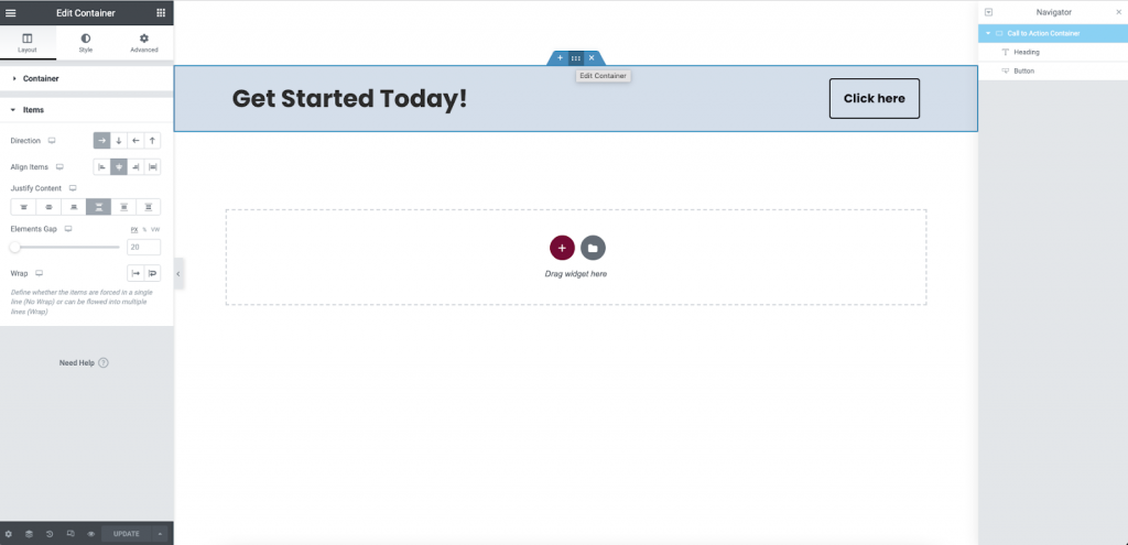
Getting started
Begin by creating a new page on your website or editing an existing one.
Add a container
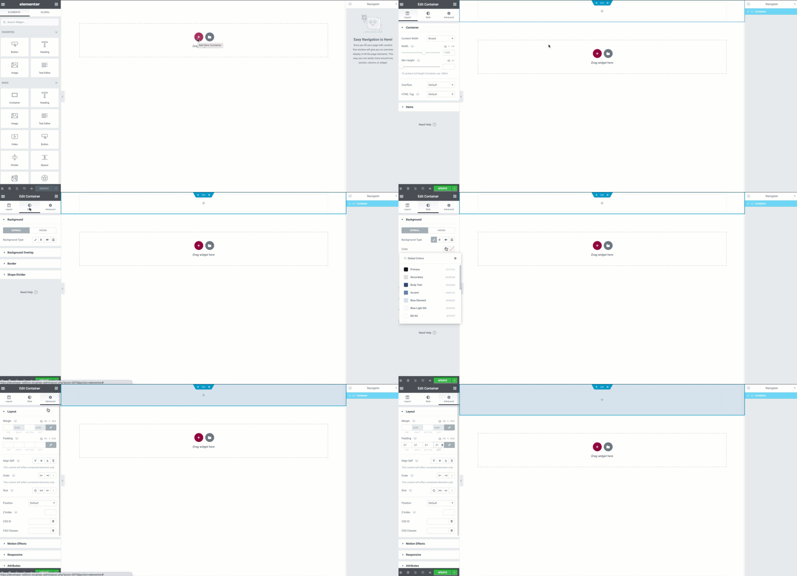
- Add a new container by clicking on the + icon on your screen
- For the container width, the boxed width is used in the example but a Full Width may be used if desired
- From the Style tab, you may give your container a background color or other style features. If you have stored global colors, these can be quickly applied to save you time
- In the Advanced tab, give your container some padding (example: 21PX)
Add the content
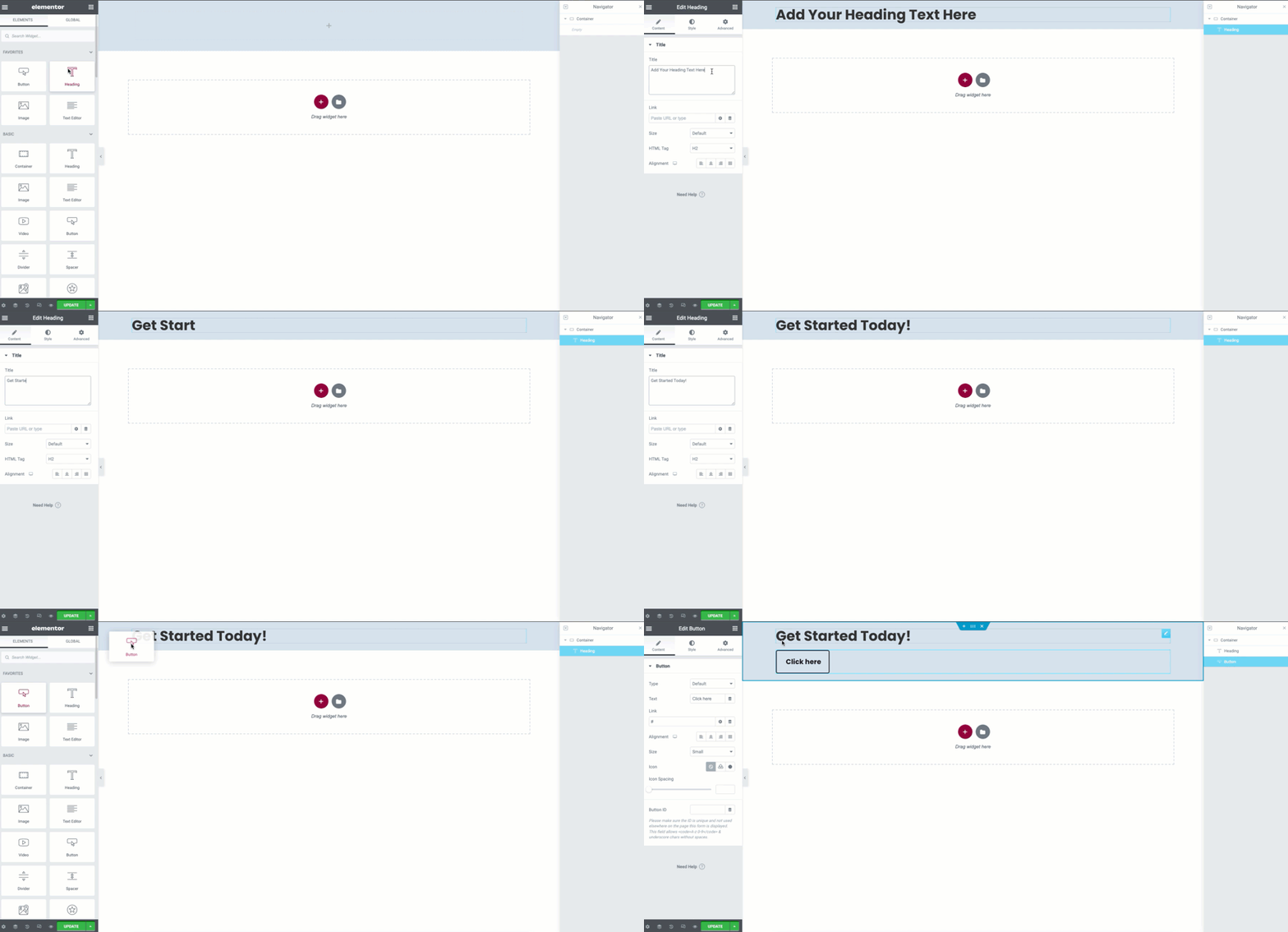
- From the Panel, drag and drop a Heading widget to your container and edit the content
- Next, drag a Button widget under the heading widget and link it if desired before proceeding.
Use the flex properties for alignment
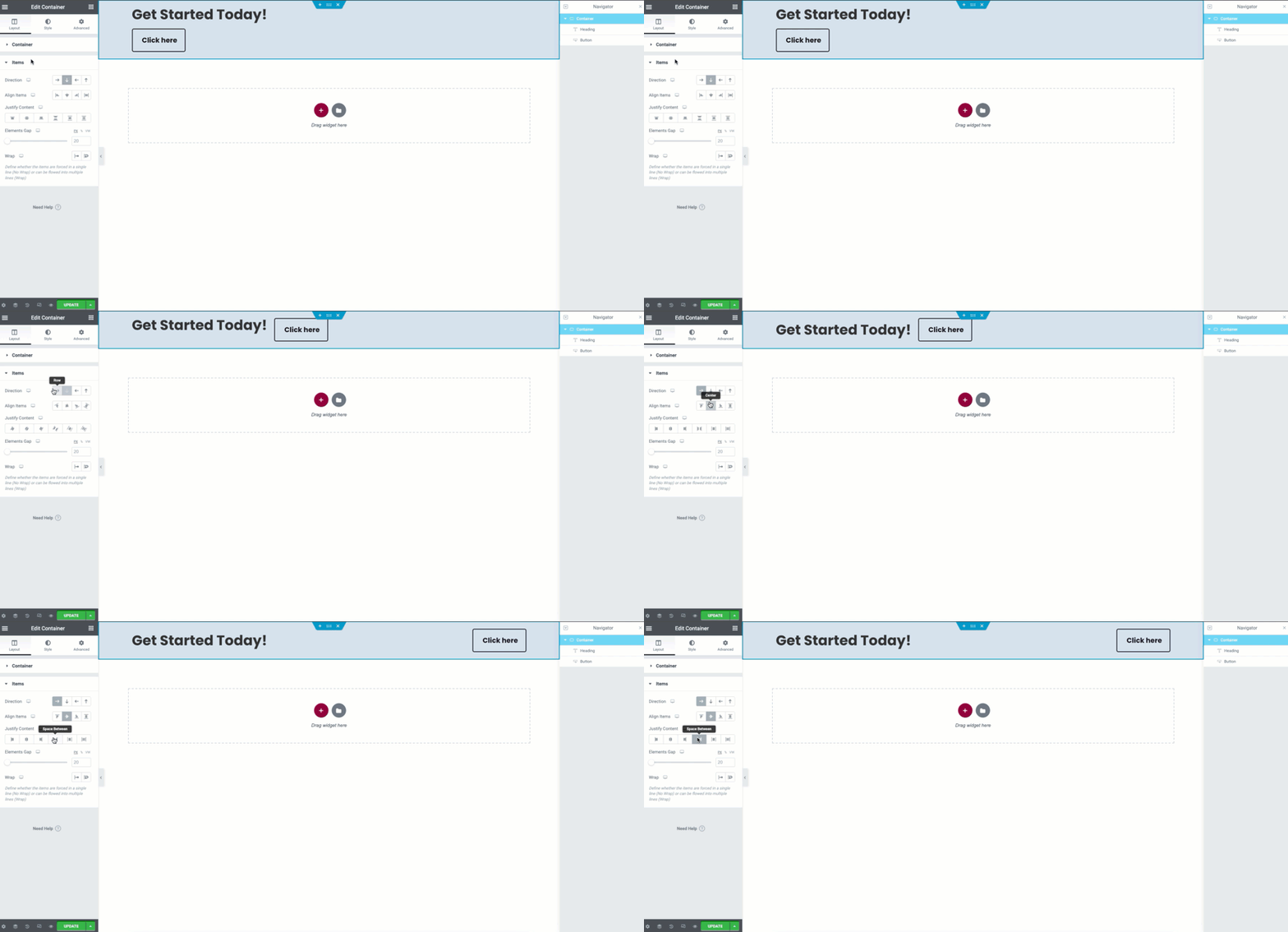
- Select the container
- Click the Items accordion to expand it
- Change the Direction to Row. This will allow the widgets to be horizontally positioned
- Use the Align Items property to Center the widgets vertically
- You may now use the Justify Content property to set the space between the Widgets
Responsive settings
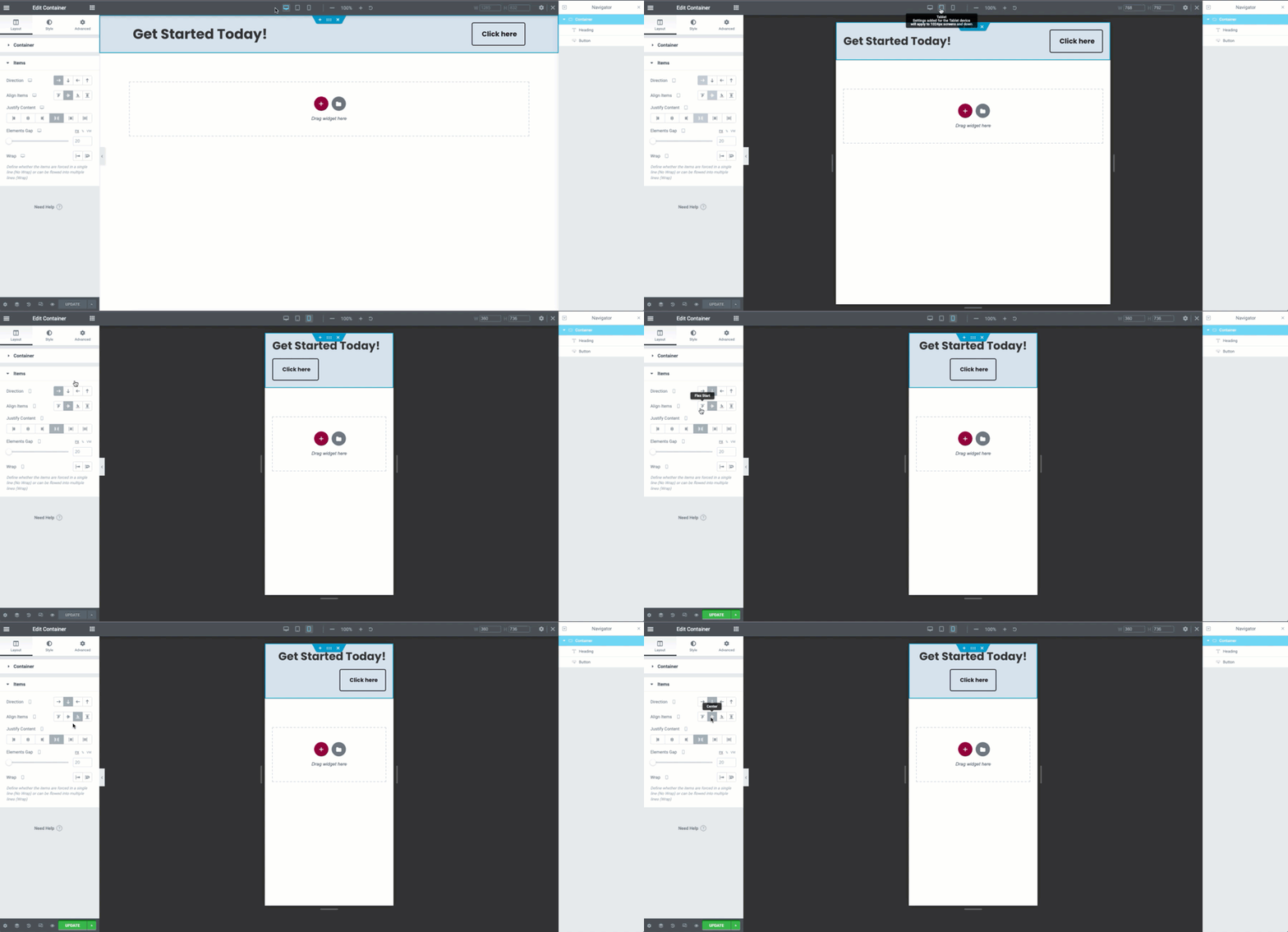
Click to open the Responsive mode from the bottom of the Panel. Select the available viewports and make the needed changes. For tablets you may find only minor changes are needed.
For the mobile viewport, you may wish to change the container direction to row. You may then use the Align Items property to change the widgets to best fit your design
Additional content
Now that you have the foundations already, you may also need additional content in your container. This may be achieved by adding a child-container.
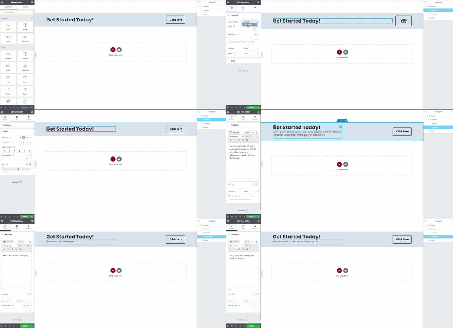
- Drag a Container widget from the Panel to your parent container
- Drag the Heading widget to the inside the child container
- Edit the Layout Tab properties of the child-container
- Change the Width dropdown to Full Width
- Use the slider to adjust the width of your container it will still respect the Justify Content properties of the parent container
- Use the Items properties to align the content to best fit your design if needed
- The Gap function may also be used to provide space between your widgets
Next steps
Check out some other layouts you can create with containers:
Creating an Intro Section using Flexbox Containers
Creating a Hero Section using Flexbox Containers

