Add the widget

Add the widget to the canvas
To access and use a widget:
In Elementor Editor, click +.
All available widgets are displayed.Click or drag the widget to the canvas. For more information, see Add elements to a page.
What is the Counter widget?
The counter widget on a website is an element that displays a numeric value which can either increase or decrease. It is often used when you want to display numbers on your site in an animated style. Â
Â
Common use case
Alex’s online consulting firm wants to impress visitors with the number of sites they’ve improved, the number of clients that have consulted with them, and the number of experts they employ. They decide to use counter widgets to really draw attention to these numbers.Â
Video
See a video demonstrating the widget in action.Â
Adding a Counter widget: Step-by-step
In the example below, we’ll create a counter displaying the number of sites improved, number of clients and the number experts working for the company.Â
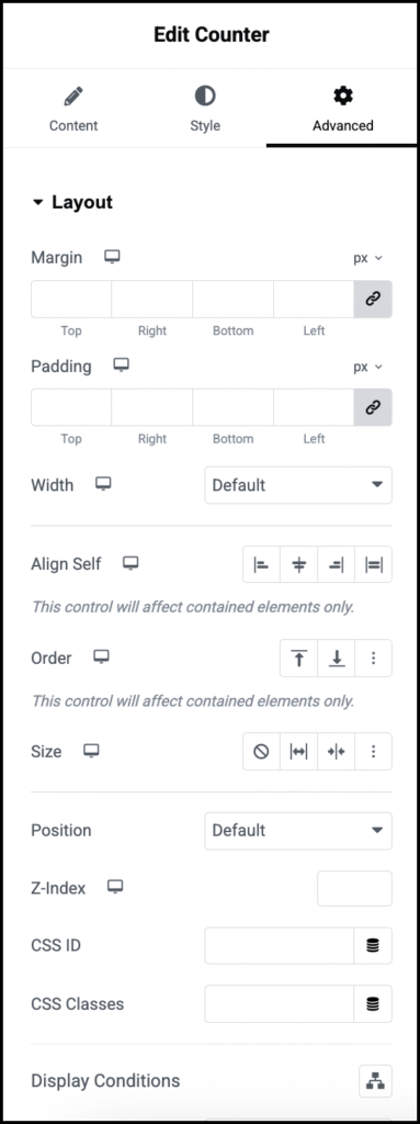
Add a Counter widget
To add a Counter widget:
- Create a grid container that includes three side by side containers. Each container should be set to add elements vertically. For details, see Create a Grid Container.
- Add a counter widget to each container. For details, see Add Elements to a page.
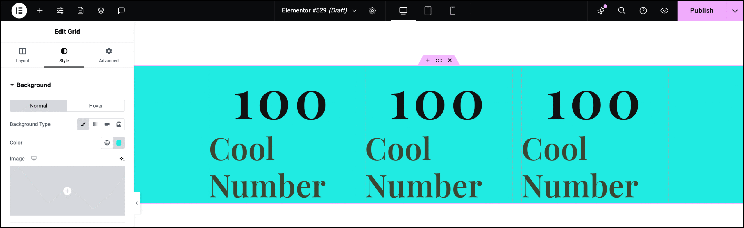
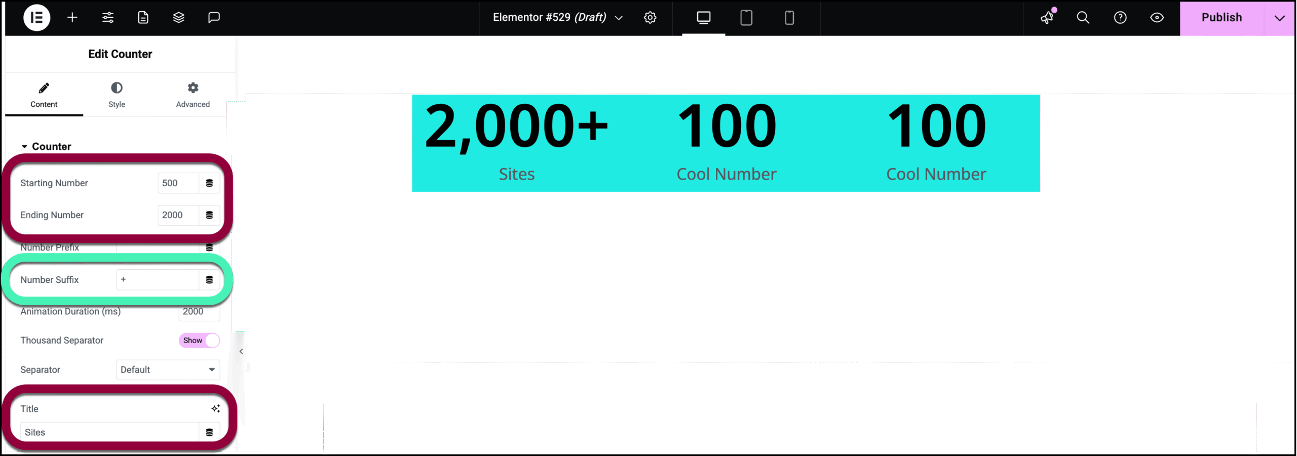
- Select the first counter widget.
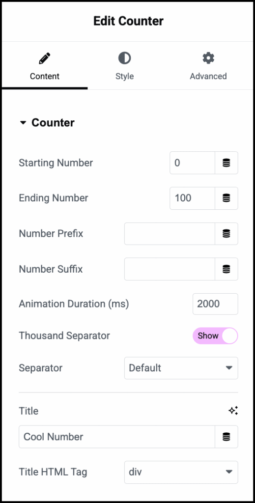
- We’ll use this counter for the number of sites. Since this is a large number we won’t start from zero. In the Starting Number field enter 500.Â
- In the Ending Number field, enter 2000.
- Since the firm is constantly increasing the number of sites worked on, in the Number Suffix field, add a +.
- In the Title field, enter Sites.
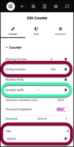
- Select the middle counter widget.
- Enter the following:
- Ending number: 200
- Number suffix: +
- Title: Clients
- Select the final Counter widget and enter the following:
- Ending number: 35Â
- Animation Duration: 4000
- Title: Experts.
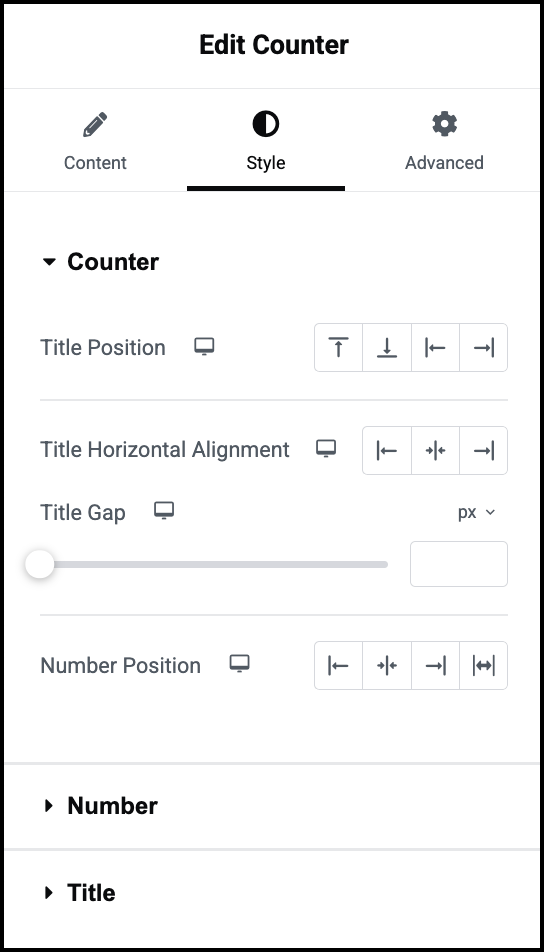
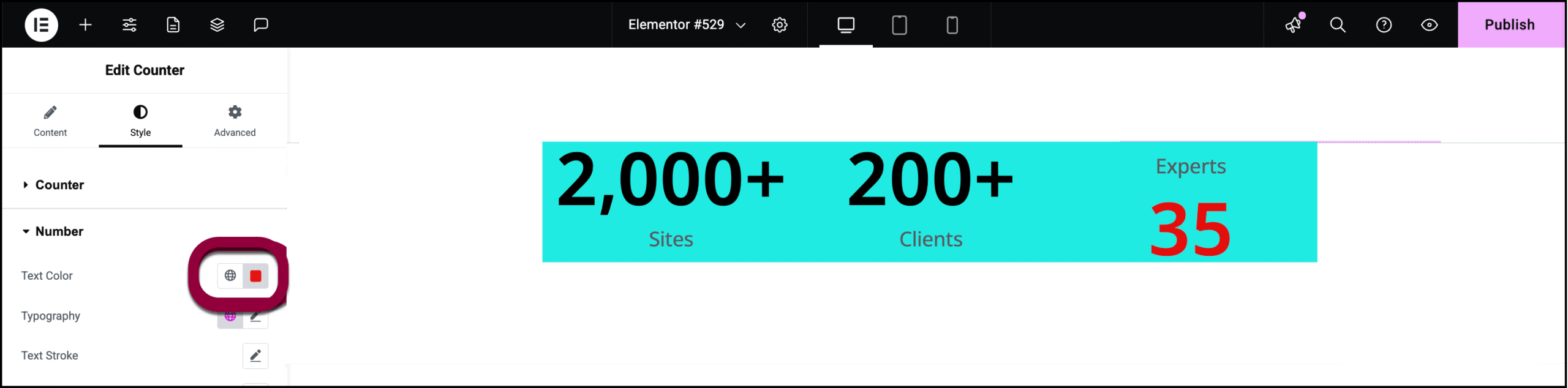
We changed the Animation length so the counter takes longer to reach its limit. We’ll also make some style changes to help draw attention to this counter.
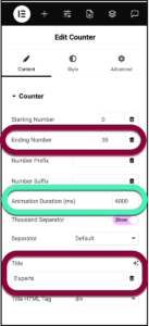
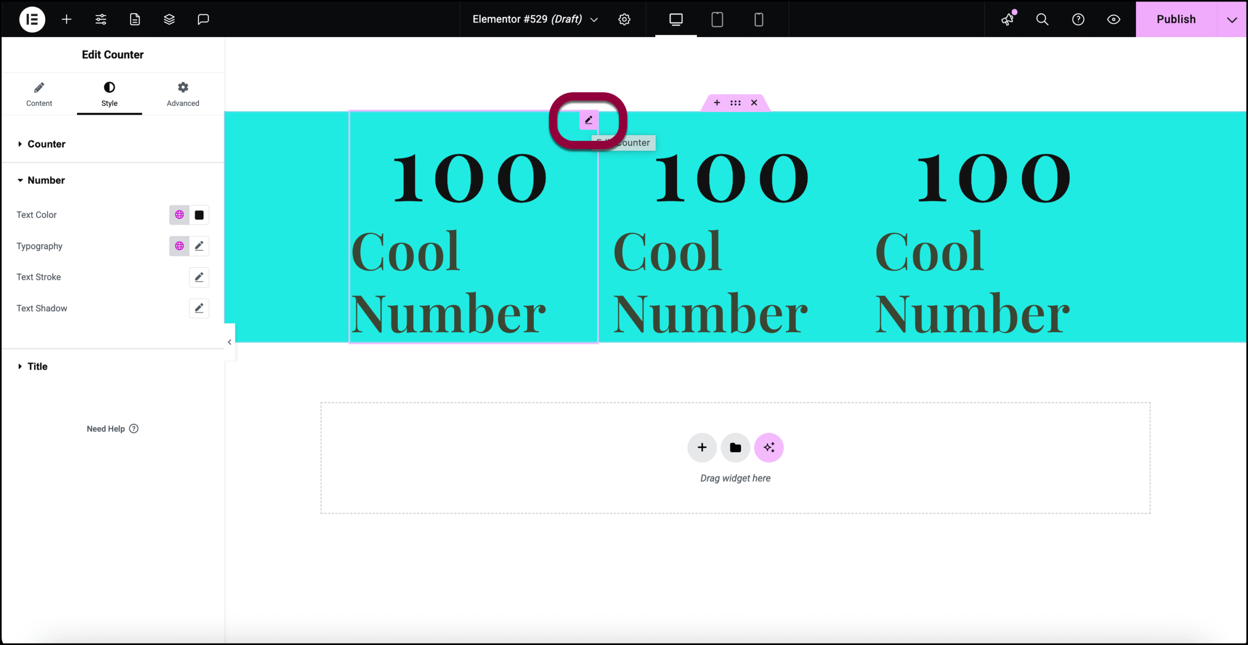
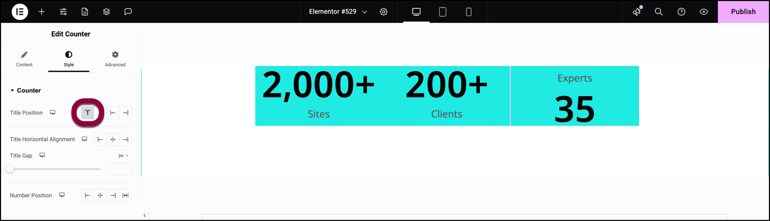
- Click the Style tab.
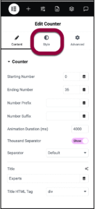
- In Title Position, click the before icon.
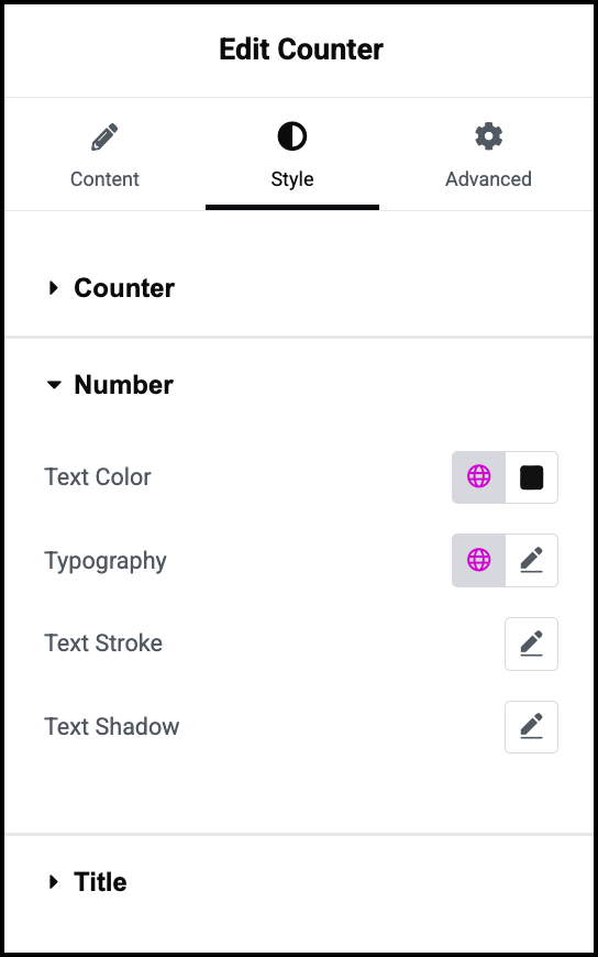
- Open the Number field.
- Change the color to red. For details, see Choose a color or Use global fonts and colors.
The counter widgets are ready.
Â
Settings for the Counter widget
You can customize your widgets using content, style, and other advanced parameters, offering you great flexibility in tailoring them to your needs. Click the tabs below to see all the settings available for this widget.
Content tab
Add, delete, and edit menu items and controls.Â

Starting number
Set the starting number of the counter.
Ending number
Set the ending number of the counter.
Number Prefix
Enter text to appear before the number, if any, such as a dollar sign.
Number Suffix
Enter text to appear after the number, if any, such as a plus sign.
Animation Duration
The time in milliseconds for the running animation to complete.
Thousand Separator
Show or hide the thousands separator.
Separator
Select default, dot, or space for the thousand separator character.
Title
Type the title that will appear below the number.
Title HTML Tag
Choose the HTML tag for your heading. Choices include H1 to H6, div (default), span, or p (paragraph).
Style tab
Determine the look and feel of the counter, numbers and titles. If no title is entered, the title section will not appear.

Title Position
Place the title above, below, right of or left of the number on the counter.
Title Horizontal Alignment
Place the title on the right, left or center of the Counter widget.
Title Gap
Determine the space between the title of the counter and the number on the counter.
Number Position
Place the number on the counter to the right, left or center of the Counter widget. There is also a stretch option which will affect the spacing if you use a Number prefix or suffix. These options are found in the Content tab.

Text Color
Choose the color of the number text.
Typography
Set the typography options for the number text. For details, see Typography.
Text Stroke
Color the outline of your text and images. Learn more about text stroke.
Text Shadow
Add depth to the text. For more details, see, What is Shadow?

Text Color
Choose the color of the title text.
Typography
Set the typography options for the title text. For details, see Typography.
Text Stroke
Color the outline of your text and images. Learn more about text stroke.
Text Shadow
Apply a shadow using color, blur, and offset options. For more details, see, What is Shadow?
Advanced tab
Control the placement of your widget, insert links, add custom code and more.

Advanced
Learn more about the Advanced tab settings.